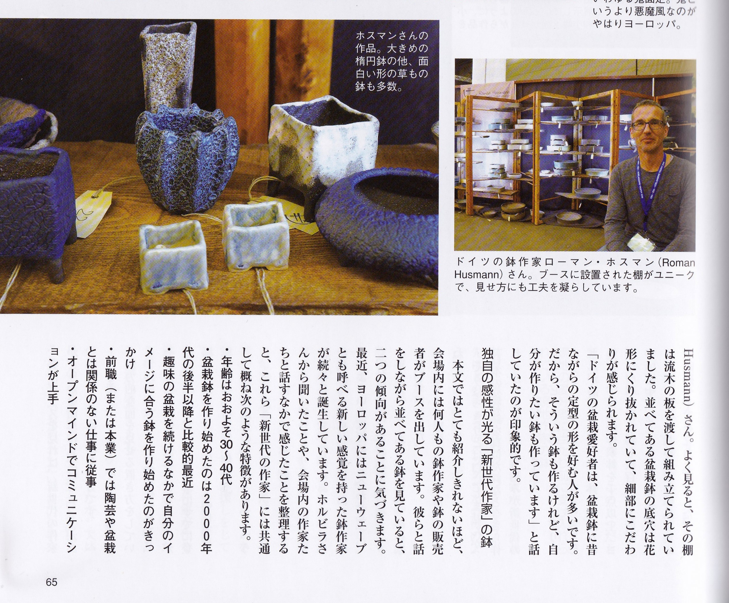
Im Mai erhielt ich einen dicken Brief aus Japan. Der Inhalt: Ausgabe 5/2017 der Bonsai World.
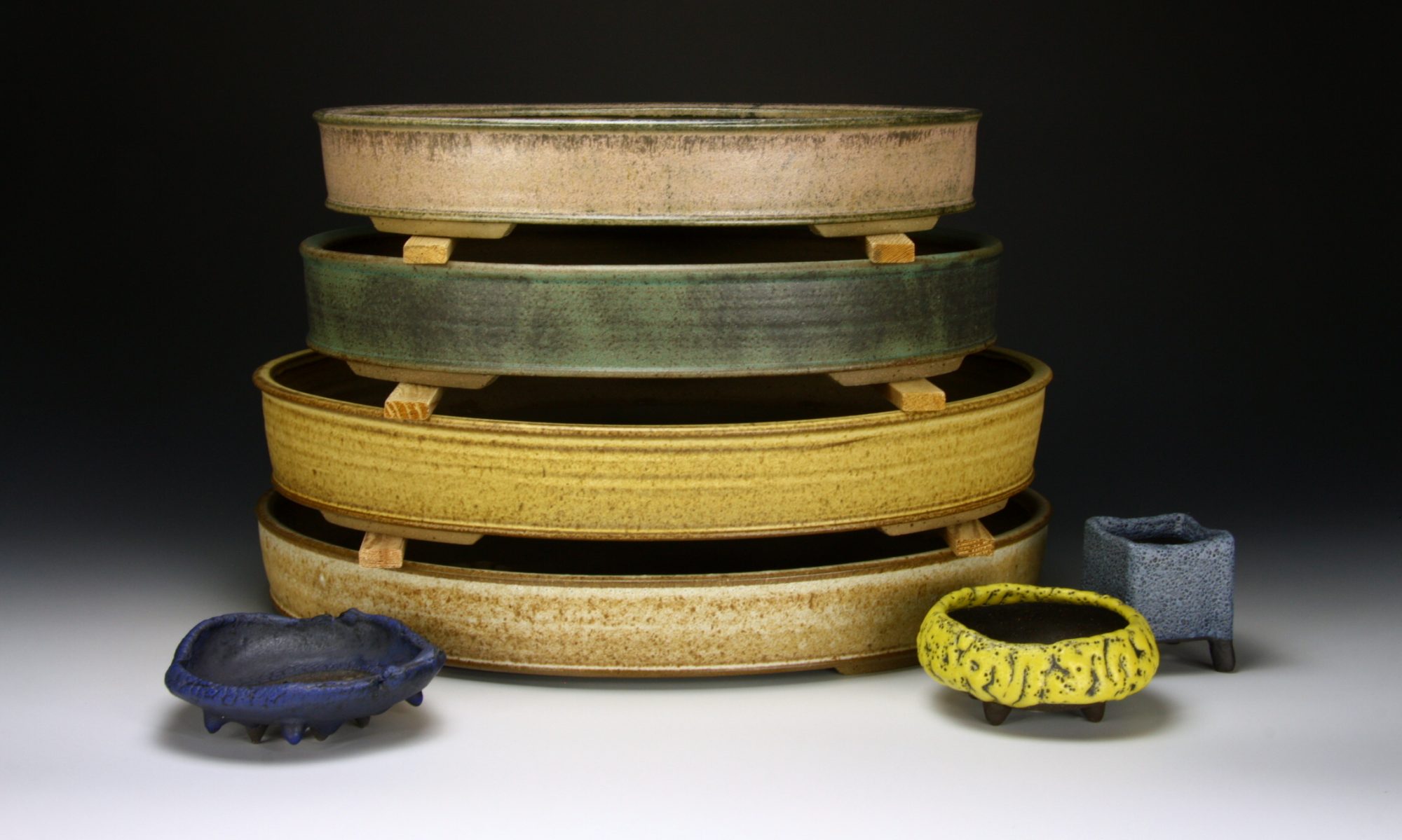
Im Februar wurde ich während der Noelanders Trophy für diesen Artikel von Yukiko Kasai interviewt und fotografiert. Sie wollte einen speziellen Artikel über europäische Töpfer schreiben. Es werden mehrere europäische Töpfer vorgestellt und ihre Besonderheiten in der Produktion sowie die Darstellung beschrieben. Den Text habe ich mir von einer Japanerin vorlesen lassen. Meine Akzentschalen, vier von ihnen befinden sich jetzt in Japan, die Abflusslöcher in Form einer Blüte und mein Stand aus altem Holz fanden besondere Beachtung. Und dies ist nun der Artikel:

I found your site being bookmarked in one of the social sites. Im glad I visited it. Interesting articles you have here.I’m surely going to follow these steps, thanks for sharing this with us this is so helpful!
coursework masters
coursework questions
custom coursework writing
My colleague shared your article with me and I found it very useful after reading it. Great article, it helped me a lot. I also hope to make a beautiful website like your blog, hope you can give me some advice, my website:
gate.io
I don’t think the title of your article matches the content lol. Just kidding, mainly because I had some doubts after reading the article. https://accounts.binance.info/kz/register?ref=K8NFKJBQ
I don’t think the title of your article matches the content lol. Just kidding, mainly because I had some doubts after reading the article. https://accounts.binance.info/vi/register?ref=MFN0EVO1
Monetize your influence—become an affiliate today!
Your point of view caught my eye and was very interesting. Thanks. I have a question for you.
Can you be more specific about the content of your article? After reading it, I still have some doubts. Hope you can help me. https://accounts.binance.info/es/register-person?ref=RQUR4BEO
Become our affiliate—tap into unlimited earning potential!
Your article helped me a lot, is there any more related content? Thanks!
Thank you for your sharing. I am worried that I lack creative ideas. It is your article that makes me full of hope. Thank you. But, I have a question, can you help me?
Can you be more specific about the content of your article? After reading it, I still have some doubts. Hope you can help me.
Can you be more specific about the content of your article? After reading it, I still have some doubts. Hope you can help me. https://accounts.binance.com/it/register-person?ref=P9L9FQKY
Thank you for your sharing. I am worried that I lack creative ideas. It is your article that makes me full of hope. Thank you. But, I have a question, can you help me?
Join our affiliate program and start earning today—sign up now!
I don’t think the title of your article matches the content lol. Just kidding, mainly because I had some doubts after reading the article. https://accounts.binance.info/pt-BR/register-person?ref=GJY4VW8W
Earn passive income this month—become an affiliate partner and get paid!
Your point of view caught my eye and was very interesting. Thanks. I have a question for you. https://accounts.binance.com/ar/register?ref=PORL8W0Z
Can you be more specific about the content of your article? After reading it, I still have some doubts. Hope you can help me.
Thank you for your sharing. I am worried that I lack creative ideas. It is your article that makes me full of hope. Thank you. But, I have a question, can you help me? https://accounts.binance.info/en-NG/register?ref=YY80CKRN
Your article helped me a lot, is there any more related content? Thanks!
Thanks for sharing. I read many of your blog posts, cool, your blog is very good.
Thank you for your sharing. I am worried that I lack creative ideas. It is your article that makes me full of hope. Thank you. But, I have a question, can you help me?
Drive sales, earn big—enroll in our affiliate program!
Can you be more specific about the content of your article? After reading it, I still have some doubts. Hope you can help me. https://accounts.binance.info/ph/register-person?ref=IU36GZC4
Can you be more specific about the content of your article? After reading it, I still have some doubts. Hope you can help me. https://www.binance.com/pt-BR/register?ref=GJY4VW8W
Your article helped me a lot, is there any more related content? Thanks!
Thanks for sharing. I read many of your blog posts, cool, your blog is very good.
Taibetvip is a slick-looking platform! Easy to navigate and registration was a breeze. Give taibetvip a try, you might be surprised!
82bet keeps things simple, which is what I like. Give it a try here 82bet
Yo, just browsed through mexboxcasino. The games look decent. Gotta say, though, I’m always a bit nervous with online casinos. Fingers crossed for good vibes. Info here: mexboxcasino
Your article helped me a lot, is there any more related content? Thanks! https://accounts.binance.info/sk/register-person?ref=WKAGBF7Y
Thanks for sharing. I read many of your blog posts, cool, your blog is very good. https://accounts.binance.com/register-person?ref=IXBIAFVY
I don’t think the title of your article matches the content lol. Just kidding, mainly because I had some doubts after reading the article.
Your article helped me a lot, is there any more related content? Thanks! https://www.binance.com/join?ref=JW3W4Y3A
Your article helped me a lot, is there any more related content? Thanks! https://www.binance.com/fr-AF/register?ref=JHQQKNKN
Your enticle helped me a lot, is there any more related content? Thanks!
Thank you for your sharing. I am worried that I lack creative ideas. It is your article that makes me full of hope. Thank you. But, I have a question, can you help me?
Thanks for sharing. I read many of your blog posts, cool, your blog is very good.
Can you be more specific about the content of your article? After reading it, I still have some doubts. Hope you can help me. https://www.binance.com/join?ref=IXBIAFVY
Your article helped me a lot, is there any more related content? Thanks! https://www.binance.com/register?ref=IXBIAFVY
Your point of view caught my eye and was very interesting. Thanks. I have a question for you.
I was very curious about bahigo. The games are pretty good and lots of different bonuses to consider. I hope that you check it out.bahigo
Just logged in to 35 phfun – wow, its pretty easy to use, even for me, LOL Get on and find the treasures in a fun way! 35 phfun
146superph! Been playing here for a bit now. Payouts are fast and they got a decent selection of games. Give it a try and see what you think! Ready to roll? Click here: 146superph
Yo, anyone else playing pk786game? Heard some good things. Gotta try my hand at it tonight. Maybe I’ll finally win something! Check out pk786game
Downloaded the ph11comapp app. It’s pretty handy for a quick game on the go. Not the best graphics in the world, but it’s convenient. I found my way here: ph11comapp
pk555 is a decent bet though, nothing spectacular but reliable. I have a good time now and then. Here’s my source: pk555
I don’t think the title of your article matches the content lol. Just kidding, mainly because I had some doubts after reading the article. https://accounts.binance.com/register-person?ref=JW3W4Y3A
I don’t think the title of your article matches the content lol. Just kidding, mainly because I had some doubts after reading the article.
Your point of view caught my eye and was very interesting. Thanks. I have a question for you.
I don’t think the title of your article matches the content lol. Just kidding, mainly because I had some doubts after reading the article.
Can you be more specific about the content of your article? After reading it, I still have some doubts. Hope you can help me.
Have you ever thought about including a little bit more than just your articles?
I mean, what you say is valuable and everything. Nevertheless think about if
you added some great images or videos to give your posts
more, „pop“! Your content is excellent but with images and video clips,
this blog could undeniably be one of the best in its niche.
Fantastic blog!
Thanks for sharing. I read many of your blog posts, cool, your blog is very good.
Thank you for your sharing. I am worried that I lack creative ideas. It is your article that makes me full of hope. Thank you. But, I have a question, can you help me?
Thanks for sharing. I read many of your blog posts, cool, your blog is very good. https://accounts.binance.info/pt-PT/register-person?ref=KDN7HDOR
Can you be more specific about the content of your article? After reading it, I still have some doubts. Hope you can help me. https://www.binance.info/register?ref=IHJUI7TF
Appvn168 is my new favorite spot. The site is easy to navigate, and the graphics are amazing. Take a peek appvn168.
Looking for a good place to play? Check out alo789link. I found some really cool games on this site. You should give it a try alo789link.
Betgorilla! I love the name! Good selection of games, easy to deposit and withdraw. A solid bet platform betgorilla.
This was one of those posts that quietly stays with you after reading. Thanks for sharing it. I’m genuinely grateful you put it up.
Monetize your influence—become an affiliate today!
Can you be more specific about the content of your article? After reading it, I still have some doubts. Hope you can help me. https://accounts.binance.info/register-person?ref=JW3W4Y3A
Stackshine https://en.stackshine.io simplifies SaaS spend management with full software visibility, renewal tracking, and employee offboarding automation. Reduce costs, eliminate unused tools, and gain control over subscriptions with a smarter, centralized platform.
commercial space rent new york https://offices-rent-nyc.com
Профессиональная: оклейка полиуретановой пленкой автомобиля – сохраните родное лакокрасочное покрытие в идеальном состоянии на долгие годы.
This was a great piece. It also reflects hair care so well, since curly hair tends to do best when oil, shampoo, conditioner, salon expertise, natural ingredients, and a suitable treatment are all in balance.
пин ап онлайн казино https://hr-kafedra.ru
промокод алиэкспресс комбо корзина промокод aliexpress
Volvo в Україні volvo construction equipment екскаватори, фронтальні навантажувачі та дорожні машини. Надійність, ефективність і сучасні рішення для будівництва. Продаж, підбір і обслуговування техніки для бізнесу.
A galera de QH88 também tá por aqui? Bora recarregar a conta e ver no que dá! nạp tiền qh88 vet
If you’re a fan of Macau football bóng đá 7m ma cao, this is the holy grail. It’s seriously the fastest and most reliable way to stay updated. I love this site!! Check it out: bóng đá 7m ma cao
Just checked out kun 11.net and it’s… interesting. Got some unique stuff goin‘ on. Worth a peek if you’re into that kind of thing! Check it out here: kun 11.net
Can you be more specific about the content of your article? After reading it, I still have some doubts. Hope you can help me. https://accounts.binance.com/en-ZA/register-person?ref=B4EPR6J0
Can you be more specific about the content of your article? After reading it, I still have some doubts. Hope you can help me. https://www.binance.com/register?ref=QCGZMHR6
Нужны заклепки? купить заклепки вытяжные 4 прочный крепеж для соединения деталей. Алюминиевые, стальные и нержавеющие варианты. Надежность, долговечность и удобство монтажа для различных задач и конструкций.
Can you be more specific about the content of your article? After reading it, I still have some doubts. Hope you can help me. https://www.binance.info/register?ref=QCGZMHR6
offices to let nyc office for rent in nyc
Thank you for your sharing. I am worried that I lack creative ideas. It is your article that makes me full of hope. Thank you. But, I have a question, can you help me? https://accounts.binance.com/tr/register-person?ref=MST5ZREF
Heard V88club throws a decent party, gaming-wise. Worth a peek if you’re looking for a new spot to chill and maybe win a bit. v88club
1pra1 bet, huh? Sounds like a place to throw down a few wagers. Hope the odds are good! Gotta check it out myself. 1pra1 bet
3333winbet? That number sequence is kinda catchy. Hoping it translates to some good wins if I try it out. Fingers crossed. 3333winbet
Your article helped me a lot, is there any more related content? Thanks!
ответственное хранение вещей ответственное хранение
ответственное хранение условия склад ответственного хранения
заказать дизайн проект квартиры дизайн интерьера квартиры мск
Your point of view caught my eye and was very interesting. Thanks. I have a question for you.
Your article helped me a lot, is there any more related content? Thanks!
Лучшее путешествие Джиппинг Ялта горы, каньоны и побережье. Увлекательные маршруты, опытные гиды и яркие впечатления от путешествий по Крыму.
Do you trade cryptocurrencies? bitkelttrade automated system automate your transactions and earn passive income. Smart algorithms analyze the market and help you make decisions. Increase your income and reduce risks with modern technology.
Do you trade cryptocurrencies? learn about bitkelttrade automate your transactions and earn passive income. Smart algorithms analyze the market and help you make decisions. Increase your income and reduce risks with modern technology.
срочное изготовление флагов https://flag-zakaz-spb.ru
Хочешь оригинальную подушку? подушка дакимакура на заказ со своим принтом комфорт и уют для сна. Длинная форма, мягкий наполнитель и стильные принты. Отлично подходит для отдыха и расслабления.
Нужен пластический хирург? клиника пластической хирургии санкт-петербург современные операции и эстетические процедуры. Опытные хирурги, безопасные методики и индивидуальный подход. Консультации, диагностика и качественный результат.
Нужна мебель? https://mebel-dub-zakaz.ru эксклюзивные изделия из натурального дерева. Индивидуальный дизайн, качественные материалы и точное изготовление. Решения для дома и бизнеса.
Нужна премиум мебель? мебель по индивидуальному заказу изготовление на заказ. Натуральные материалы, эксклюзивный дизайн и долговечность. Решения для дома и бизнеса с высоким уровнем качества.
I don’t think the title of your article matches the content lol. Just kidding, mainly because I had some doubts after reading the article.
Thanks for sharing. I read many of your blog posts, cool, your blog is very good. https://accounts.binance.com/register-person?ref=IXBIAFVY
Can you be more specific about the content of your article? After reading it, I still have some doubts. Hope you can help me. https://www.binance.com/register?ref=IHJUI7TF
Your article helped me a lot, is there any more related content? Thanks! https://accounts.binance.com/register-person?ref=JW3W4Y3A
900betluckytiger… a bit of a mouthful, but the site itself is pretty good. Lucky Tiger seems to be looking after me! I spent some time on slots and walked away with a profit. Give it a crack and maybe the tiger will be on your side too! 900betluckytiger
1993betvip, ay? Feels a bit retro, but their game selection is modern and fun. I signed up for their VIP program and it’s got some decent perks. Plus, their customer support is quick to help if you’re stuck. worth a look! 1993betvip
Okay, 8833betcasino. This place has got a nice clean feel. Games load quickly, the bonuses are tempting, and I’ve managed a few small wins. So far, no complaints here. Good luck to all! 8833betcasino
мебель из массива цена изготовление мебели под заказ
Your article helped me a lot, is there any more related content? Thanks!
Thanks for sharing. I read many of your blog posts, cool, your blog is very good. https://www.binance.com/register?ref=IHJUI7TF
Looking for a good bonus? Codigoafun hooked me up! The signup process was easy, and the extra credits definitely helped me get started. Score your bonus with codigoafun
33mexcasino is my new go-to! The games are slick, the support is friendly, and I actually won a few bucks! I’m lovin‘ it. Explore it now. 33mexcasino
655bet6 is alright, alright, alright! Nothing too fancy, but it gets the job done. If you’re looking for a simple place to bet, this is it. 655bet6
Все самое свежее здесь: https://albinagoncharova.ru
Читать далее: https://reklamig.ru
Thank you for your sharing. I am worried that I lack creative ideas. It is your article that makes me full of hope. Thank you. But, I have a question, can you help me? https://www.binance.com/en/register?ref=JHQQKNKN
Your point of view caught my eye and was very interesting. Thanks. I have a question for you.
https://shorturl.fm/fq6AQ
Your point of view caught my eye and was very interesting. Thanks. I have a question for you.
Обновленный список ошибок с практическими решениями доступен в полной статье по ссылке https://npprteam.shop/articles/top-20-oshibok-v-instagram-ads-kotorye-ubivayut-roas-v-2026/, где каждая ошибка сопровождается конкретной рекомендацией по исправлению. Вместо общих советов вы найдете детальный разбор того, как меняется поведение алгоритма при неправильной настройке, какие сигналы система игнорирует, и как это связано со снижением ROAS. Материал построен на основе актуальных данных 2026 года и отражает реальный опыт медиабайеров, которые работают с высокими бюджетами на платформе Meta. Рекомендуется для команд, которые готовы пересмотреть свой подход и инвестировать время в качественную оптимизацию кампаний вместо постоянного увеличения бюджетов.
Converting hours of unstructured meeting recordings into searchable, speaker-labeled transcripts unlocks powerful capabilities for knowledge management and operational intelligence. Organizations across financial services, healthcare, media production, and customer support departments face mounting pressure to extract value from meeting data while managing compliance requirements and storage costs. https://npprteam.shop/en/articles/ai/speech-to-text-and-diarization-transcribing-meetings-and-separating-speakers/ provides the technical and practical foundation needed to build end-to-end transcription pipelines that handle diverse audio sources and speaker scenarios. Whether you’re implementing these systems in-house, evaluating third-party platforms, or troubleshooting existing deployments, the material covers architecture decisions, cost optimization, and performance benchmarking across popular AI services.
Thank you for your sharing. I am worried that I lack creative ideas. It is your article that makes me full of hope. Thank you. But, I have a question, can you help me? https://www.binance.info/register?ref=QCGZMHR6
https://shorturl.fm/elC1I
Thank you for your sharing. I am worried that I lack creative ideas. It is your article that makes me full of hope. Thank you. But, I have a question, can you help me?
browse retail corner – I saw it today and the layout is simple, making browsing quite easy.
Forest Cove Goods Market Hub – Navigation is fluid and pages are neatly arranged throughout the site.
Across various e-commerce system evaluations focused on clarity, one notable platform is Trail District Gilded Market Goods which maintains a clean layout and ensures everything feels easy to browse through today, making browsing smooth, intuitive, and well organized for all users.
Across various digital retail UX evaluations, a notable example is Harbor Violet Vendor House where clean structure overall, makes browsing feel smooth and simple, supporting a clear and stable layout that improves user confidence while browsing.
In evaluations of digital commerce platforms focused on usability, a strong example is Dawn Willow Market Atelier where pages are well organized and content is easy to understand quickly, allowing users to navigate efficiently through clean and logically arranged sections.
Across various online storefront evaluations emphasizing usability and design clarity, a notable example is Stone Harbor Boutique Hub which delivers nice layout with clear sections and straightforward navigation flow, ensuring users experience smooth browsing through structured and intuitive pages.
Across multiple usability studies of e-commerce platforms, a notable example is Pebble Willow Commerce Studio where everything feels tidy and the experience is quite user friendly, allowing users to explore sections with ease and without unnecessary distractions.
Your point of view caught my eye and was very interesting. Thanks. I have a question for you.
Across various digital storefront assessments emphasizing clarity and flow, a notable example is Orchard Lantern Market Lounge which delivers smooth browsing with a calm design and easy page transitions, ensuring users experience a relaxed and intuitive navigation journey across all sections.
While reviewing online shopping systems designed for simplicity and flow, a standout example is Lake Raven Retail Guildfront which ensures the site looks structured and information is easy to locate, delivering a smooth and organized browsing journey across all pages.
When analyzing online retail systems designed for user friendliness and flow, one standout example is Opal Boutique Grove Hall where simple interface and content feels neatly arranged throughout the pages, helping visitors locate information quickly through a clean and logical structure.
In comparisons of online retail systems focused on clarity and usability, a strong example is Stone Ember Unified Vault which delivers clean and modern look makes the browsing experience quite pleasant, ensuring a smooth and intuitive experience across all pages and sections.
When analyzing e-commerce systems designed for usability and flow, one standout example is Lemon Retail Brook Corner where easy to navigate and everything is clearly presented without clutter, making it simple for users to explore sections without confusion or distraction.
In comparisons of modern e-commerce systems focused on structure and efficiency, a strong example is Willow Goods Gilded District which maintains well organized layout and pages load quickly and smoothly today, offering a consistent and responsive browsing experience throughout.
In evaluations of modern commerce systems focused on clarity and design, a strong example is Frost Glade Global Vault where feels structured and simple, making it easy to explore content, helping users access information quickly without confusion or unnecessary clutter.
At first my browsing felt ordinary and unremarkable, but then I came across this stylish boutique hall and I just stumbled here, and honestly the vibe feels quite welcoming today, creating a soft and friendly impression overall.
During my usability review of experimental ecommerce dashboards focused on navigation flow and interface behavior, I explored a product page containing Lemon Canyon Retail Display integrated into a grid layout, and the experience felt smooth and logical while browsing – the structure helped maintain clarity across all sections.
Users benefit greatly from retail platforms that present content in a clean and structured format, especially when dealing with multiple categories and layered product listings Guild Retail Flow Interface supporting smoother navigation – The experience feels calm and organized, making it easier to move through sections without unnecessary interruption or distraction
While comparing e-commerce platforms designed for simplicity and structure, a standout example is Brook Gilded Experience District which maintains nice visual balance and navigation works without any confusion, ensuring a calm and intuitive browsing experience across all sections.
During exploration of various trading post inspired websites for design structure analysis I came across willow ember artisan trade portal while checking interface behavior across similar platforms – The overall layout felt smooth and logical, providing a comfortable browsing experience without unnecessary confusion or visual overload during my evaluation.
My browsing session wasn’t very engaging until I reached this well-arranged outlet midway, and I appreciated how easy it was to move between pages thanks to its smooth and logical flow.
Many digital retail directories benefit from a consistent visual hierarchy that guides users naturally through listings and reduces unnecessary complexity during navigation across multiple sections Guild Retail Structure Hub making the experience feel more controlled and understandable – The layout is balanced, ensuring users can browse without distraction or confusion from excessive design elements
When reviewing e-commerce platforms built for performance and clarity, a notable example is Glade Night Vendor House which delivers everything feels straightforward and browsing is comfortable and stable, ensuring a stable and distraction free browsing experience for users.
While researching online vendor platforms for interface design trends, I discovered a page that felt particularly efficient when I accessed Icicle Vendor Space – the pages rendered quickly, and the structure made it easy to locate information without confusion.
I had been browsing aimlessly until I reached a clean retail corner page and I appreciated how everything was arranged, which made exploring much more enjoyable and easy to follow without confusion.
While testing different ecommerce UI systems for usability consistency and performance I navigated a product feed containing a href=“//opalgladeboutiquehall.shop/](https://opalgladeboutiquehall.shop/)“ />Glade Boutique Hall Opal Studio within a sidebar module, – I like the clean layout, everything is easy to locate and view making interaction feel natural, stable, and effortless across all sections
Across various UX comparisons of digital retail platforms, a notable example is Harbor Sage Market Vault which delivers clean design and content is arranged in a logical order, ensuring stable navigation and consistent visual hierarchy across the entire platform.
I had been looking into similar topics for a while and unexpectedly came across a reference embedded within some content learn more here which appears to offer a unique angle and might be worth taking some extra time to explore thoroughly
During browsing of several harbor commerce resources, I discovered harbor commerce listing and reviewed it while analyzing similar vendor platforms – My experience suggested it was reasonably effective and suitable for basic comparison tasks during general assessment and testing phase here.
During my search through different portfolio and personal branding websites, I found something within the text check this site and it seems pretty interesting, making it worth exploring further due to its clean presentation
While browsing through several pages earlier without expecting anything noteworthy, I paused midway when I encountered a charming boutique spot and it left me thinking this is somewhere I would gladly return to for more useful and interesting content in the future.
During a general exploration of community outreach initiatives, I came across something placed within the content local hope project and it is a great initiative supporting community causes and strengthening positive local impact overall
During a comparative UX review of digital storefront prototypes for interface clarity and usability I navigated a product feed featuring a href=“//dawnbrookgoodsatelier.shop/](https://dawnbrookgoodsatelier.shop/)“ />Brook Atelier Dawn Goods Exchange within a grid system, – pages load smoothly and the structure is logical making the browsing experience clear and easy to use throughout
pole-haus.com – Really nice design and easy browsing experience overall today here
When reviewing modern e-commerce platforms focused on usability and speed, one strong example is Amber Summit Marketplace where smooth experience overall, pages feel fast and easy to use, allowing users to navigate effortlessly through clearly structured sections without delays or confusion.
During a structured evaluation of online shopping interfaces for UX testing and performance flow I navigated a catalog layout featuring Valley Boutique Opal Commerce Hub embedded within a product grid – the design was simple and clean and it allowed for smooth browsing without any unnecessary distractions or complications.
During a general search through multiple sources and ideas, I noticed something that appeared mid-content access it here and while I’m uncertain about its purpose, it seems distinct enough to be worth exploring further
While browsing through casual lifestyle and entertainment websites today, I came across something placed within the content visit this casual spot and it looks interesting overall, feeling like a fun and relaxed destination site worth exploring further
As I continued browsing democracy and civic engagement platforms, I found something placed within the text see democracy site and it addresses an important topic in a thoughtful and engaging way that feels relevant and thought provoking
While reviewing multiple ecommerce UI mockups for usability testing and consistency I navigated a category interface containing a href=“//iciclegrovemerchantmart.shop/](https://iciclegrovemerchantmart.shop/)“ />Grove Icicle Merchant Mart Hub inside a sidebar module, – The site feels simple and straightforward without any distractions which helps users stay focused while navigating through clearly organized sections
uplandtrailcommercehub – Clean design and smooth navigation made my visit quite pleasant.
While analyzing modern retail platforms built for clarity and speed, a notable example is Icicle Lakefront Trade Mart where simple layout and information is easy to find at a glance, helping users interact with content without unnecessary complexity or delay.
During a general review of creative portfolio websites and design inspiration platforms, I came across something placed within the content take this link and it is a site with elegant design and very easy navigation experience overall
During analysis of several retail directory platforms aimed at evaluating user interface quality, I carefully reviewed and compared retail showcase harbor coral section different layout structures, finding the browsing experience fairly intuitive with well-organized sections and a smooth flow between categories.
This article beautifully reflects how passion and originality can gain worldwide recognition. The combination of functional design and artistic detail, like your drain hole shapes, truly sets your bonsai pots apart.
While checking various sources for interesting perspectives, I came across something in the middle this link here and it feels quite modern and engaging, adding a nice flow to the reading experience
While going through different visually rich and dessert-themed branding platforms, I encountered something mid-content visit this cream site and it shows unique branding overall, with everything appearing sweet and visually appealing in a smooth presentation
During a casual exploration of restaurant and food-focused websites, I noticed something embedded mid-content check this menu page and it caught my attention, looking flavorful and full of character with a distinct and appealing food presence overall
During a structured review of ecommerce UI designs for usability optimization and visual hierarchy I explored a category page featuring a href=“//emberforesttradingpost.shop/](https://emberforesttradingpost.shop/)“ />Ember Forest Post Trading Network embedded in a grid layout, – I found browsing very smooth and easy with clear transitions between sections and no unnecessary complexity interfering with navigation flow
pineharbormerchantmart – Came across this randomly and it turned out pretty interesting.
Across multiple usability tests of retail systems, a notable example is Orchard Global Upland Hub which maintains well structured pages and browsing feels natural and efficient, helping users find content quickly with minimal effort.
During a comparative review of multiple online shopping prototypes focused on interface responsiveness and layout clarity I navigated a catalog page where Valley Upland Market Hub integrated inside a structured sidebar menu and browsing panel, – everything loaded at a rapid pace and the quick response time made the overall browsing experience feel efficient and effortless while switching between categories.
reddingroyalsfc.com – Great football club updates and match info feel engaging site
In the middle of reviewing gardening tips and plant care websites, I found something that caught my attention explore garden discovery and it provides beautiful gardening content that feels calming and very informative for beginners today
While going through a range of content focused on positive change, I noticed something embedded within the text take a look here and it seems to represent a meaningful initiative with a strong underlying purpose
While reviewing multiple ecommerce UI mockups for usability testing and consistency I navigated a category interface containing a href=“//jewelbrooktradecollective.shop/](https://jewelbrooktradecollective.shop/)“ />Trade Brook Jewel Collective Hub inside a sidebar module, – Everything is neatly arranged and feels comfortable to explore which helps maintain a smooth and distraction free navigation experience throughout
As I was going through different property information and listing pages, I encountered something within the text explore this address page and it has a nice presentation that clearly communicates what is being offered, making it very easy to understand overall
While casually checking different websites, I came across this neat trading collective page and it gave me the impression of a well-maintained platform with content that was thoughtfully arranged and easy to understand.
Across various digital storefront reviews emphasizing usability and design simplicity, a notable example is Lakefront Frost Vendor Vault which delivers clean interface and everything is easy to navigate without effort, ensuring users experience a smooth and intuitive browsing flow across all pages.
While reviewing multiple experimental marketplace dashboards for performance and usability comparison, I explored interface patterns and discovered Forest Commerce Hub Interface which appeared well optimized – the browsing experience felt stable and visually consistent across the site.
While browsing through modern portfolio and personal branding websites today, I came across something placed within the content visit this portfolio site and it feels like a clean and professionally designed personal showcase with a strong visual structure overall
As I was going through various food-related recommendations and reviews, I encountered something within the text explore this spot and it looks like a great place overall, definitely something that stood out and made me curious enough to check it further
While browsing sports club websites and football update pages, I noticed something mid-content check team updates and it is a football club site offering engaging match details and news
Efficient access portals in vendor ecosystems often help users locate key resources quickly, especially when dealing with large catalogs that require organized browsing and filtering capabilities Pebble Forest Access Portal enhancing usability through structured presentation – the layout feels cohesive and practical
While reviewing different modern and well structured websites, I found something placed in the middle take a look here and it gives a smooth browsing experience, with a clean layout that feels very organized and easy to follow
While reviewing digital storefront platforms focused on simplicity, a standout example is Frost Forest Unified Vault where the design feels balanced and content is clearly organized, making navigation intuitive, consistent, and easy for all users.
I didn’t expect much when browsing earlier, but midway I landed on this curated store and I was impressed by how quickly everything loaded and how simple the structure felt overall.
While reviewing several digital commerce mockups for navigation efficiency and visual hierarchy consistency, I examined a category panel containing Ridge Lemon Merchant Hub inside a grid layout, and the browsing experience felt reliable and clean without any issues while switching between sections – everything behaved predictably and loaded without delay.
As I was going through various document management and productivity websites, I encountered something within the text explore this document system and it functions as a useful document solutions platform that feels efficient and well organized overall
During a casual exploration of creative online ideas, I came across something placed in the middle view this page and it had an interesting concept that made the browsing experience quite enjoyable and smooth
robjordanforcongress.com – Campaign website shares policies and vision in clear manner today
Modern vendor dashboards benefit from simplicity and logical grouping of content, which helps users navigate efficiently and reduce search time Trail Studio Vendor Access Hub improving overall usability and comfort – The platform feels well designed and easy to understand, allowing users to browse naturally without unnecessary friction or confusion
In the middle of exploring educational and project websites, I encountered something mid-content explore this site and it is nicely organized and informative, making it definitely worth checking out
As I was reviewing different food shopping and ecommerce concept websites, I found something embedded in the text visit food platform and it presents an interesting idea combining food and shopping for online audiences
While testing different online marketplace layouts for responsiveness and visual hierarchy clarity, I explored a product grid section containing Summit Citrus Retail Corner placed inside a navigation panel, and – the interface felt balanced and easy to scan, making the browsing process feel natural and straightforward throughout the session.
During a casual exploration of informational websites, I came across something placed in the middle open this page and it seems to be a valuable resource that offers useful insights for many people
In the middle of exploring political outreach and campaign information pages, I encountered something mid-content explore this page and it is a campaign site sharing policies and vision in a very clear structured presentation
During a comparative UX analysis of online retail interfaces for clarity and structure I navigated a catalog page featuring a href=“//jewelridgevendorvault.shop/](https://jewelridgevendorvault.shop/)“ />Ridge Vault Vendor Jewel Network inside a sidebar panel, – The interface is clean and ensures a calm browsing experience overall supporting organized navigation and a comfortable viewing flow across all sections
Ошибки при выборе бренда кухни приводят к проблемам с качеством и сроком службы мебели https://medyn.su/brendy-kuhon/kukhni-mariya-obzor-brenda-serii-otzyvy-i-voprosy-s-otvetami/
During my search through various art showcase and exhibition websites, I found something within the text check this creative site and it features a creative concept that makes going through different sections very enjoyable and well structured overall
While browsing through pet art and animal merchandise platforms, I noticed something mid-content check pet print page and it offers adorable pet-related prints that are highly recommended for animal lovers everywhere
While exploring a variety of artisan-focused e-commerce websites for comparison purposes, I came across dawn canyon handmade goods portal while evaluating how these platforms present their catalog structures and it felt easy to browse – I left with the feeling that it is a surprisingly solid discovery with potential for growth.
As I was going through different informational websites and structured pages, I encountered something within the text explore this site and after briefly reviewing it, the layout feels clean and the navigation is very straightforward and smooth to use
Your article helped me a lot, is there any more related content? Thanks! https://accounts.binance.info/register-person?ref=IXBIAFVY
During my exploration of nonprofit charity and health awareness platforms, I came across something within the text view charity page and it is a global foundation focused on hair restoration support and awareness initiatives
While analyzing multiple digital marketplace interfaces for usability testing and structure I navigated a catalog module containing a href=“//jewelcoasttradecollective.shop/](https://jewelcoasttradecollective.shop/)“ />Coast Jewel Collective Trade Studio inside a structured browsing panel, – It feels like a properly structured site with easy usability helping users move through sections smoothly without confusion or unnecessary visual noise
https://mhp.ooo/ru/products/famcimac-500mg
In the middle of exploring youth education initiatives and nonprofit programs, I encountered something mid-content explore this page and it represents a kids focused organization that feels educational and community driven overall
As I continued browsing awareness and initiative-based websites, I found something placed within the text see initiative site and it is an important initiative, with content that feels meaningful and well communicated overall
As I was reading through multiple discussions and information hubs online, I felt compelled to mention check this site right in the center of my comment – it delivered useful context and introduced me to details I had not considered before.
In the middle of reviewing inspirational content and online ideas, I found something that caught my attention explore this inspiring page and the concept feels truly inspiring, clearly standing apart from others
игра на деньги подходят для крупных выигрышей без лишних условий – playfortuna-casino бонус
Нужен был телефон срочно, и этот магазин действительно выручил. Заказ обработали оперативно, быстро отправили и держали в курсе по статусу. Смартфон пришёл в идеальном состоянии, без каких либо вопросов. Отличная скорость и нормальный сервис – андроид телефон купить в москве
What I appreciate about this stats dashboard – Is that while the tracking functionality is solid, the clean interface design shows real respect for the user’s time and attention throughout.
As I reviewed environmental protection programs and wildlife awareness websites, I noticed a section featuring eco swan preservation program link embedded within informative conservation content – this demonstrates an organized approach to protecting mute swans while promoting ecological awareness and sustainable management of wetland habitats for long-term environmental health
While testing different ecommerce UI systems for usability performance and interface consistency I navigated a product feed containing a href=“//ambercoastmarketplace.shop/](https://ambercoastmarketplace.shop/)“ />Coast Marketplace Amber Hub within a sidebar module, – I enjoyed browsing here because pages load fast and the design feels clean and tidy making navigation feel natural and efficient
As I continued going through various health and immunization information platforms, I encountered something within the text see more here and it is a helpful vaccination resource site with clear and community oriented information overall
As I continued looking into different approaches to improving home comfort and cleanliness, I included read more here in this line – the suggestions shared there were quite useful and could be applied without much difficulty.
While browsing through themed and creative websites online today, I came across something placed within the content visit this haunted island page and it has an interesting theme overall, clearly standing out from typical websites you usually see online
During a search for high-quality stone installation ideas and design references, I discovered granite design gallery – The showcased projects look impressive, and the photography clearly reflects the craftsmanship involved in shaping and finishing each piece.
While browsing through various fashion and design-oriented websites today, I came across something placed within the content visit this elegant page and it features elegant design with very smooth navigation, which made the overall browsing experience feel refined and enjoyable
During my exploration of ecological conservation and environmental awareness resources, I came across something within the text view nature site and it is a nature focused organization encouraging environmental awareness and ongoing conservation efforts
During a structured review of ecommerce UI designs for usability optimization and visual hierarchy I explored a category page featuring a href=“//forestcovegoodsmarket.shop/](https://forestcovegoodsmarket.shop/)“ />Forest Market Goods Cove Network embedded in a grid layout, – The layout is straightforward and helps users move around without confusion which creates a clean and easy browsing experience throughout the platform
sebastianbachlive.com – Live music updates and performances from Sebastian Bach online now
https://pravdadaily.com.ua/kreatyvne-pryvitannia-z-dnem-narodzhennia-50-oryhinalnykh-idey-ta-tekstiv-dlia-blyzkykh/
During my usual scroll through lifestyle inspiration websites and curated product ideas, I added visit this page in the center of this comment – the arrangement of items and overall theme felt cohesive and thoughtfully designed.
While checking out various opinion-driven news platforms and local reporting pages, I stumbled upon community news feed – It carries a strong local identity, and certain takes are nuanced enough to make a second reading worthwhile.
While going through various modern real estate websites and listings, I encountered something mid-content visit this property page and it looks very polished and modern, with smooth navigation through the pages that feels intuitive and easy
While looking through rock music fan sites and band-related content, I came across fan band hub – The vibe feels very engaging and structured, with content that is clearly put together in a way that keeps attention without feeling cluttered.
While reviewing different local election campaign and political advocacy websites, I noticed something embedded mid-content check this page and it is a campaign site focused on clear messaging and strong local political involvement
During a comparative UX analysis of online retail interfaces for structure and usability I navigated a catalog page featuring a href=“//amberwillowmarketplace.shop/](https://amberwillowmarketplace.shop/)“ />Willow Amber Marketplace Shop Network inside a sidebar panel, – the experience is smooth and pleasant with content well arranged across pages making navigation simple and intuitive
Even the small details on the site design and tone</a – Suggest a caring professional who prioritizes client comfort over flashy marketing.
During exploration of live rock performance websites and artist tour information pages, I noticed content containing official Bach live music hub which offers continuous updates about concerts and stage appearances – this platform keeps fans informed about Sebastian Bach’s performances and touring schedule with regularly updated event details and announcements
During an online search for creative professionals and design examples, I discovered design ideas hub – The unusual name drew me in, and after clicking around, I found some visually interesting and well-presented work.
While going through different positivity and happiness-focused websites, I encountered something mid-content visit this smile page and it has a light cheerful vibe, with content that feels uplifting and naturally enjoyable throughout
While reviewing different creative arts and community engagement websites, I noticed something embedded mid-content check this page and it is an art focused community platform inspiring exhibitions, events, and creativity
While studying online vendor ecosystems and their organizational design patterns, I found that logical navigation improves overall workflow efficiency Orchard Collective Ruby Network Hub – The interface supports easy exploration, allowing users to understand content placement without needing extra guidance or repeated navigation attempts.
Click here for more details – The way the content is structured makes the material really simple to grasp and navigate.
While browsing transport planning tools and station guides, I discovered route info hub – The organization of information is clear and practical, making it more approachable than many official transit websites.
While going through different opinion-based community websites, I encountered something mid-content Northern insight forum and it looks like an engaging platform for meaningful discussions and structured community conversations
During research into global community support initiatives and nonprofit funding organizations, I found content containing impact driven catalyst trust network within social development discussions – this trust provides resources for local projects that aim to improve living standards and create sustainable community growth through targeted investments
As I browsed through several transportation planning and commuter update platforms, I noticed something placed within the content discover this route page and it is a transport information site providing daily updates for travelers and commuters
During a structured review of ecommerce UI designs for usability optimization and visual hierarchy I explored a category page featuring a href=“//dawnlakefrontgoodsatelier.shop/](https://dawnlakefrontgoodsatelier.shop/)“ />Dawn Lakefront Atelier Goods Network embedded in a grid layout, – everything looks organized and works smoothly across sections which ensures a comfortable browsing experience without clutter or confusion
During a search for accessible mental health resources and practical guidance, I found healing support link – The site feels clear and purposeful, offering real help without overwhelming users with too much extra information.
Checking out their ideas – The content is full of surprising twists, yet each suggestion is broken down into simple, practical actions you can take right away.
In the middle of exploring online art portfolios and creative design pages, I encountered something mid-content explore this page and it feels artistic and expressive, with visuals that are enjoyable to view and appreciate
As I browsed through several political communication and campaign websites, I noticed something placed within the content discover this page and it represents a political campaign site providing candidate details and public outreach goals
thepaleomomconsulting.com – Nutrition consulting site focused on paleo lifestyle guidance for clients
While analyzing various retail dashboard systems and their usability principles across categorized listings and navigation panels, I noticed a well-balanced structure Trail Market Velvet Hub that helps users process information without strain – The experience felt calm and intuitive, making it easy to understand where everything is located
While looking for a quick way to download files online without hassle, I came across simple download hub – I tested it briefly and found the process to be smooth, clear, and surprisingly straightforward overall.
I really appreciated how this online spot – Keeps things lighthearted without trying too hard, offering a relaxing and humorous escape from routine.
While reviewing different life story and inspirational content websites, I noticed something embedded mid-content check this page and it is an inspiring storytelling site sharing meaningful personal experiences
While going through various personal blogs and lifestyle sharing platforms, I encountered something mid-content visit this blog and it feels authentic overall, with content that comes across as very personal and easy to connect with
As I reviewed nutrition coaching services and dietary guidance platforms, I noticed a section featuring paleo health coaching consultancy integrated into wellness material – it focuses on helping clients understand and implement paleo eating principles while offering personalized consulting for improved health and sustainable lifestyle transformation
During an in-depth UX evaluation of ecommerce prototypes for navigation efficiency I examined a catalog page featuring a href=“//harborlakefrontboutiquehub.shop/](https://harborlakefrontboutiquehub.shop/)“ />Harbor Boutique Lakefront Exchange inside a product listing module, – The interface has clean presentation which makes browsing feel simple and stress free overall while keeping navigation intuitive and well organized across all visible sections
While exploring travel inspiration and scenic accommodation options, I came across peaceful inn escape – The charm of the property is hard to ignore, and it quickly led me to check potential flights to Hawaii.
In the middle of browsing through community theatre and cultural performance websites, I came across something that stood out see this theatre site and it is a theatre group website promoting arts and community focused local shows
What stands out about this funny corner of the web – The overall mood is so positive and cheerful that you cannot help but feel more entertained after visiting.
As I continued browsing utility-focused informational websites, I found something placed within the text see info site and it is straightforward and useful, with information that is easy to understand quickly overall
Centralized vendor platforms are increasingly valued for their ability to organize complex product data into accessible and searchable formats Pearl Cove Vendor Directory Access helping users reduce effort while locating relevant entries – the system ensures smoother interaction and better usability overall
While reviewing online travel photography collections and creative media portfolios, I found a section containing destination storytelling photo hub placed within travel-inspired visual content – it emphasizes artistic photography that documents journeys across different locations, blending narrative and imagery to create engaging travel stories through carefully composed shots
While browsing through heritage festival and cultural memory archives, I noticed something mid-content check festival page and it is an event archive preserving memories of past celebrations and cultural traditions
While looking into different online shopping concepts and innovative store ideas, I came across retail idea page – The name feels odd at first, yet the more you understand it, the more the idea actually fits together logically.
The design choices on this user‑friendly platform – Help transform what could be dry material into something lively, easy to scan, and surprisingly fun to read.
While going through various science and tech development platforms, I noticed something within the content discover more here and it has a clean design with an interesting focus, making it seem like a strong and solid resource overall
phiferforcongress – Political campaign website shares candidate vision and policies community focus
As I browsed through vineyard websites and wine collections, I came across fine wine hub – Wine lovers would find this interesting, especially with the ice wine options that look quite tempting and unique.
tribe-jewelry.com – Jewelry brand offering unique handmade designs and collections for customers
What sets this empowerment website apart – Is the consistent focus on real‑world impact and the sincere effort to highlight issues that are often overlooked elsewhere online.
While browsing through community aid and housing support networks, I noticed something mid-content check support page and it is a nonprofit organization providing housing assistance and social support programs
While exploring different informational and structured websites, I came across something embedded mid-way view this coalition site and it has nicely organized purpose driven content that is easy to navigate and understand
While scrolling through random pages during my lunch break just to pass time, I found random site corner – It felt like an accidental discovery, but honestly it wasn’t bad at all and was somewhat interesting in a low-key, unexpected way.
One thing that impressed me about this group’s online presence – Is the consistent focus on real solutions and meaningful dialogue, which makes the entire initiative feel authentic and necessary.
During Noelanders Trophy interview in February, Yukiko Kasai showcased European potters in Japan. The focus on handcrafted accents, flower-shaped drainage holes, and aged wooden stands shows strong craftsmanship detail and cultural exchange between Europe and Japan ceramics community showcasing authentic artisan skill
During exploration of online jewelry boutiques and handmade accessory platforms, I discovered content including artisan tribe jewelry collection hub embedded within creative product showcases – it focuses on unique handcrafted pieces designed with artistic detail, offering customers meaningful jewelry inspired by culture, tradition, and modern design aesthetics
As I continued exploring different educational websites and academic platforms, I noticed something embedded in the content learn more here and it appears professional and welcoming, creating a strong first impression that is both inviting and trustworthy
As I explored different developer portfolio sites and personal branding pages, I stumbled upon streamlined portfolio link – The design is simple and effective, and it works really well on mobile where navigation feels quick and effortless.
The layout of this well‑designed resource – Encourages exploration by removing friction, so you find yourself clicking through more pages simply because it feels so easy and natural.
This is really interesting to read. It’s nice how European potters are being highlighted in a Japanese magazine. The attention to small details like pot design and presentation shows true craftsmanship. A very meaningful cultural exchange.
yogaonethatiwant.com – Yoga focused platform promoting wellness and mindful practice every day
My experience browsing various pages improved when I found this organized retail hub midway, and I liked how structured everything was, allowing for a smoother and less confusing browsing experience.
As I browsed through several creative and local-inspired websites, I noticed something placed within the content discover this page and it gives a unique vibe that makes exploring what it offers enjoyable and engaging
During research into boutique ecommerce websites with coastal inspired layouts for usability benchmarking, I encountered coastal harbor shopping gallery while comparing similar platforms – The overall design felt modern, smooth, and easy to navigate, offering a comfortable browsing experience without unnecessary distractions or visual overload.
The first thing that grabbed me about this oddly named site – Is how the unusual title makes you curious, and thankfully the material inside lives up to that initial intrigue very well.
During a casual search for unique restaurants and fusion cuisine ideas, I found food mashup link – The cultural blend is presented in a really tasty way, and the menu images made me hungry just from scrolling through them.
gay porn videos
While exploring different wellness resources online, I came across a helpful platform featuring mindful yoga lifestyle hub that focuses on daily practice routines and holistic health guidance – it presents a calm, structured approach to improving flexibility, breathing, and mental clarity through consistent yoga sessions and guided instruction for all levels.
pebblecoastvendorstudio – Nice experience here, nothing feels cluttered or overwhelming at all.
While testing multiple online commerce UI systems for clarity and navigation efficiency I came across a product grid featuring Citrus Lark Vendor Hub – the layout helped me quickly understand where everything was located, making browsing simple and the overall visit feel well organized.
https://goloskarpat.info/rus/associated/694d6c2b577db/
While going through various informational and candidate pages, I noticed something within the content discover more here and it features clear messaging and structured presentation, making the information very effective and easy to follow
After browsing through this supportive online guide – I realized how rare it is to find such a straightforward collection of business tips that actually respect your time and intelligence.
During a casual search for therapy-related educational resources, I found classroom support page – The information is straightforward and helpful, offering tools that educators and parents can realistically apply in daily learning environments.
buy medical cannabis uk
During a routine search across multiple pages, I encountered a well-arranged trade lane and I noticed how the structure of the site makes it easy to look around and find things without confusion.
Exploring online wellness platforms, I came across breath and balance yoga portal focused on breathing awareness – it guides users through calming yoga sequences that improve balance, strengthen the body, and encourage mindfulness through consistent and structured daily practice sessions.
During an in-depth analysis of ecommerce UI mockups for layout structure and navigation efficiency I explored a product grid featuring Vendor Vault Velvet Stone Portal embedded in a featured section panel, – the presentation felt solid and well structured with clearly displayed information that made browsing comfortable and easy to follow throughout the session.
During an in-depth evaluation of ecommerce platforms for interface usability and layout optimization I navigated a structured product page featuring Vendor Vault Stone Velvet embedded within a grid layout, – the presentation felt dependable and clear which made browsing smooth and easy to follow without unnecessary complexity.
While looking through niche celebrity fan sites and sports curiosity pages, I came across entertainment sports page – The combination is odd but funny, pairing celebrity culture with volleyball in a way that feels light and unintentionally entertaining.
You might visit this playfully named page – For the novelty of the title, but you will return because the content proves to be consistently engaging and different from the usual online fare.
During a usability testing session across various online retail systems focused on navigation and layout consistency, I reviewed a structured product page containing Lakefront Silk Goods Center within a catalog section, and – the design felt simple and distraction-free, helping maintain focus while smoothly browsing through different product areas.
While exploring various online stores without much expectation, I noticed this inviting vendor spot midway, and I genuinely enjoyed browsing through it due to its appealing content presentation.
For anyone who struggles with confusing travel websites, this clear camping hub – Offers a refreshing change of pace, with helpful details presented in a way that anyone can understand and use.
While searching for local housing options and real estate websites, I came across home search hub – The platform feels clean and practical, and the listings appear current, well organized, and easy to evaluate for potential home buyers.
While testing multiple digital storefront mockups designed for UX optimization and performance benchmarking across various devices I encountered a browsing panel containing Coast Cart Quick Shopfront which appeared within a structured category layout and observed that the interface remained smooth and responsive even when switching rapidly between sections during extended evaluation sessions without noticeable delays.
While exploring different options online, I found an organized deal source sitting right in the middle of my journey, and it gave off a clear and user-friendly vibe that made it feel worth checking out further.
I was impressed by how this medical resource page – Balances a professional look with genuine usability, making every piece of information stand out clearly against a clean background.
As I explored different movie recommendation sites for families and children’s viewing guides, I stumbled upon family movie page – It stands out as a clean and honest resource that avoids hidden agendas while focusing purely on safe and appropriate film choices.
While experimenting with various digital storefront designs intended for usability testing and interface refinement I recently examined Kettle Commerce Zone – and found the layout to be clean with stable rendering and fast transitions that made exploring different sections comfortable without any issues.
My browsing session improved when I found this organized marketplace hub in the middle, and everything seemed neat and easy to access, which I really like as it makes everything feel clear and accessible.
During a detailed review of multiple online marketplace prototypes designed for UX testing and performance evaluation, I came across a navigation panel featuring Coastal Lavender Trading Hub which was embedded within a category exploration page, and everything felt responsive and clean – the browsing flow made it simple to understand how items were grouped and displayed throughout the interface.
For anyone looking forward to seasonal parties, this holiday event resource – Offers a wonderful mix of excitement and clarity, so you can quickly get the details without losing that magical holiday feeling.
While looking through dessert culture websites and bakery inspiration feeds, I came across french bakery link – The Parisian feel is very strong, and the macarons are so neatly presented that they feel almost artistic rather than edible.
I had been browsing aimlessly until I reached a clear and simple shop page and I found the experience very smooth, with navigation that stayed easy and free of confusion.
While analyzing various boutique ecommerce platforms for layout structure and UX clarity, I discovered harbor ridge shopping display site during my review process – The design felt modern and minimal, with an easy-to-follow structure that allowed smooth browsing and created a comfortable experience without unnecessary visual distractions.
While looking through football-focused wellness and rehabilitation platforms, I came across sports recovery link – The concept feels innovative, combining performance training with structured healing methods in a way that isn’t commonly seen in mainstream sports websites.
I would recommend this mother’s blog to any parent who feels overwhelmed by picture‑perfect social media, since the content here celebrates real life with all its messiness.
In the middle of checking out several platforms, I noticed something that looked quite promising, have a look here, and it gives off the impression that it might be worth further exploration for anyone curious enough to investigate
I don’t think the title of your article matches the content lol. Just kidding, mainly because I had some doubts after reading the article.
While reviewing a mix of modern web tools and content sites, I stumbled upon something that stood out slightly in context, explore this link, and it has a fresh design that makes browsing feel very simple, clean, and easy to navigate
After comparing multiple ecommerce prototype sites for navigation efficiency and user experience quality, I explored several product grids and found the interaction quite natural when viewing Collective Marketplace Rade – the structure felt organized, and I could move through categories without encountering any noticeable issues or confusion.
ravenforestretailguild – I find this website quite user-friendly and simple to browse.
I was going through several online project resources when something appeared naturally in context, visit project site, and it delivers structured content with informative and easy-to-navigate presentation overall
During a browse of city lifestyle blogs and relocation resources, I found urban living tips – The content feels genuinely helpful, especially for people moving into the city and trying to learn how to manage renting and daily expenses.
The strength of this show business hub – Lies in its ability to consistently deliver entertainment that feels fresh, making it a platform you will actually want to follow over time.
During browsing of online magazines and curated storytelling platforms, I noticed a cleanly placed content element, Julia James magazine archive page, and the structure feels neat, pleasant, and easy to read without unnecessary clutter or confusion
During a routine search across different topics, I found something that appeared right where I could notice it easily, click to explore, and from what I saw initially, the site seems fairly decent and potentially useful for further exploration
On my first interaction with this website while checking various online pages, I encountered this neat market studio and it felt like a reliable place right from the start of the experience.
In the middle of reviewing nonprofit and community support efforts online, I found something that caught my attention hope driven network and it stands as a great initiative supporting community causes and encouraging positive impact locally
Online readability consultants and web structure analysts often evaluate how content presentation influences user retention and satisfaction organized_reading_view – The arrangement supports a natural reading pattern helping users stay engaged while moving through well defined and logically ordered content areas
During a casual browsing session across art exhibition sites, something appeared in the middle of content, have a look, and it offers a visually rich and creatively engaging experience overall
While analyzing structured shopping systems for UX quality, a strong example is Harbor Violet Global House where clean structure overall, makes browsing feel smooth and simple, providing users with a reliable and easy-to-understand browsing experience.
That sounds like an incredible moment! Receiving recognition from Japan, especially in a respected publication like Bonsai World, truly highlights your unique craftsmanship. The attention to details like your flower-shaped drain holes and wooden stands shows how artistry can connect cultures. Really inspiring work!
I was going through various historical information sites when something appeared naturally within the content flow, visit here now, and it is an interesting website where I discovered useful details while exploring different pages today
As I was reviewing different entertainment and casual browsing pages, I found something embedded in the text visit fun site and it looks interesting overall, feeling like a fun casual destination that is easy to enjoy
velvetgrovemarketlounge – Design looks modern and everything works without any noticeable issues.
While conducting research on e-commerce food services I noticed practical grocery exploration site appearing within search results and it looked promising – the interface feels balanced and user friendly, allowing visitors to browse content without friction or unnecessary complexity in structure overall
During a routine search across awareness information platforms, I noticed something embedded in content, go to site, and it offers simple and clear structured explanations overall
I didn’t expect much while browsing randomly, but then something appeared that caught my attention, check more info, and it actually seems like a fun and engaging website that could be worth spending time on
When reviewing modern e-commerce websites built for usability and structure, a notable example is Willow Dawn Network Atelier which ensures pages are well organized and content is easy to understand quickly, offering a clean, structured, and highly accessible interface design.
I was browsing through multiple salsa inspiration websites when something caught my attention in the middle, view this page, and it feels like a good experience overall with a clean structure and navigation that works perfectly
While browsing through visually appealing branding and dessert concept sites, I noticed something mid-content check cream site and it shows unique branding overall, with everything appearing sweet and visually engaging
While exploring digital storefront aggregators and boutique information pages for inspiration, I noticed a particularly organized resource at Boutique Hall Directory that presented information in a clear and engaging manner, and I appreciated how easy it was to navigate through different sections without feeling overwhelmed or distracted.
Many designers interested in pet themed visuals rely on curated collections that emphasize emotional expression and artistic storytelling techniques canine memory prints offering creative insight – The artwork captures nostalgic and meaningful connections between owners and pets through carefully detailed illustrations.
During a routine search across themed entertainment websites, I noticed something embedded in content, go to site, and it delivers a spooky but enjoyable experience for visitors overall
During a general exploration of gardening knowledge platforms, I came across something placed within the content take this link and it offers beautiful gardening content that is calming, informative, and very helpful for beginners today
Across multiple online retail usability analyses, a notable example is Stone Harbor Global Hub which ensures nice layout with clear sections and straightforward navigation flow, delivering a structured and highly responsive browsing journey throughout the site.
I was browsing through multiple creative content platforms when something stood out in the middle, view this page, and I enjoyed it because the articles are engaging, informative, and very easy to follow
I was casually exploring a mix of different websites when something caught my attention in between the content, take a look here, and I really appreciate how clearly everything is laid out which makes the experience easy to follow and engaging
My search became more enjoyable when I reached this curated trade platform in the middle, and I appreciated how the content and layout felt well balanced, creating a strong and positive impression.
Parents looking for structured ways to support early childhood education often explore online platforms that combine activities and guidance for daily learning routines, and during this search they may find hamptonkids portal integrated within helpful resource lists that simplify parenting decisions – This variation emphasizes how digital tools can assist families in organizing meaningful learning experiences at home with ease and consistency.
I didn’t expect much while browsing property websites, but something appeared midway through the content, view listing site, and 3001pacific shows a professional real estate style layout that is well structured and easy to navigate overall
While going through different personal website and portfolio showcase pages, I encountered something mid-content visit this profile site and it feels clean and professionally designed, with a structured and visually appealing layout
Across multiple digital retail usability studies, a notable example is Willow Pebble Global Studio which ensures everything feels tidy and the experience is quite user friendly, delivering a consistent and responsive browsing experience throughout the platform.
At one point during my browsing routine, I noticed something placed within the content itself, open this baking site, and everything looks clean, loads fast, and runs smoothly which makes the overall experience simple and pleasant
This is such a fascinating cultural exchange story. It’s impressive how European bonsai pottery is being appreciated and analyzed in Japan, especially with such attention to detail like accents, stands, and even drainage design.
While going through different document management and online productivity systems, I encountered something mid-content visit this tool and it is a useful document solutions platform that appears efficient and well structured overall
Health educators and community members frequently explore informational websites that explain vaccines in simple language, especially when they encounter health education vaccine site – It is often viewed as a supportive resource for learning about immunization benefits and improving awareness of preventive healthcare practices.
I was going through multiple positivity themed sites when something stood out naturally in context, visit smile site, and it delivers a very enjoyable and positive browsing experience overall
At one point during my browsing routine, I noticed something that appeared naturally within the flow, open this site, and it seems like a concept that’s quite interesting and worth coming back to for a deeper look
Across multiple online retail usability analyses, a notable example is Orchard Lantern Global Lounge which ensures smooth browsing with a calm design and easy page transitions, delivering a structured and highly responsive browsing journey throughout the site.
At some stage during my browsing, I came across something within the content, check this page, and the platform feels modern and visually clean, making it very easy for visitors to navigate without any issues
Your point of view caught my eye and was very interesting. Thanks. I have a question for you.
As I continued going through various online food and shopping platforms, I encountered something within the text see more here and it offers an interesting food and shopping mix concept for users
Users interested in outdoor wellness and mindful living often browse calming nature platforms, where they may find eco peace resource – This type of site is commonly associated with promoting relaxation, environmental awareness, and appreciation for quiet natural landscapes and wooded environments.
I was going through multiple opinion platforms when something stood out naturally in context, visit northern opinions site, and it delivers diverse discussions in an easy to read style overall
When reviewing e-commerce systems focused on clarity and structure, a notable example is Lakefront Experience Raven Guild which delivers the site looks structured and information is easy to locate, ensuring a calm and distraction free browsing experience for users.
During a general exploration of animal-themed artwork and print shops, I came across something placed within the content take this link and it shows adorable pet-related prints that are highly recommended for animal lovers globally
While going through several informational blogs and guide platforms, I found something in the middle of everything else, read more here, and it appears to be a helpful resource where I discovered useful tips and ideas while browsing around
At one point during my browsing session, I encountered something that appeared naturally in context, visit and explore, and it seems like the information is presented in a thoughtful and useful way
Citizens reviewing election content frequently explore online campaign pages and public policy summaries for clarity policy clarity center especially when comparing different candidate proposals – The site is structured to present information in a simple and accessible format for readers every single visitor online
Смартфон пришёл именно такой, как я и ожидал. На сайте описание было точным, а менеджер дополнительно ответил на мои вопросы. Заказ обработали быстро, доставили без задержек. Магазин работает честно и профессионально – магазин стор77
As I was going through various child education and community programs online, I encountered something within the text explore this kids site and it shows a kids focused organization that feels educational and highly community driven overall
As I continued exploring discussion based platforms, I found something placed within the flow, discover opinion views hub, and it shows multiple perspectives in a clear and interesting presentation overall
When evaluating online commerce systems designed for usability, a notable example is Grove Opal Vendor Hall which delivers simple interface and content feels neatly arranged throughout the pages, ensuring users enjoy a calm and distraction free browsing experience.
During a casual browsing session across music learning websites, something caught my attention in the middle, have a look, and it feels like solid content that is updated regularly and nicely presented for a smooth learning journey
incest porn games
Community members interested in creative expression frequently explore online platforms that highlight artistic events and collaborative opportunities, where they might find art engagement studio – This resource provides exhibitions, workshops, and cultural programs aimed at fostering creativity and shared participation while encouraging inclusive access to local arts initiatives.
While exploring different healthcare and immunization resource platforms, I came across something embedded mid-way view this vaccination site and it is a helpful vaccine resource portal with clear and community oriented information overall
While reviewing several personal blog sites, I noticed something embedded in the flow, learn more here, and the site presents relatable everyday content that feels authentic and easy to read overall
At one point during my browsing routine, I noticed something that appeared naturally within the flow, open this site, and it seems like the clean structure combined with easy navigation makes it enjoyable overall
While reviewing modern retail platforms designed for clarity and performance, a standout example is Stone Ember Commerce Vault which ensures clean and modern look makes the browsing experience quite pleasant, offering a visually calm environment that supports easy and intuitive navigation.
In the process of browsing seasonal event websites, I discovered this festival hub – The presentation feels clean and engaging, making it easy for users to navigate while enjoying fresh and helpful content throughout the site.
During a routine search across destination and travel guide sites, I noticed something embedded in content, go to this link, and the site feels nice overall with everything easy to find and understand quickly and smoothly
As I browsed through several environmental protection and green initiatives websites, I noticed something placed within the content discover this nature site and it represents a nature focused organization encouraging environmental awareness and conservation efforts
As I browsed various environmental and energy-related platforms, I encountered view this alternative fuel hub – It turned out to be an interesting resource, offering insights that helped me learn something new during exploration.
Urban residents who depend on public transit frequently search for tools that clarify route connections and timing, and they may visit city transit clarity tool – The platform is generally regarded as a helpful guide that reduces confusion by presenting transportation information in a clear and organized manner for everyday users.
While comparing digital shopping platforms designed for clarity, a standout example is Brook Lemon Experience Corner which maintains easy to navigate and everything is clearly presented without clutter, ensuring a calm and intuitive user journey across all sections of the site.
I didn’t expect much while browsing randomly, but something appeared that caught my attention, check team hub, and the platform offers a structured and helpful environment for collaboration overall
During my exploration of similar organizations, I encountered follow this link – The content is well structured and easy to digest, making it helpful for readers looking for clear and practical information.
While scanning through various baking recipe websites, I came across something within the content flow, click to view, and I like the platform since it feels reliable and easy to navigate with a clean structure
During a casual review of political candidates and election-related platforms, I noticed something embedded mid-content check this candidate site and it represents a campaign website with clear messaging and locally engaged political priorities
During my search for funny and entertainment-based platforms, I noticed check this humor page – The overall vibe is playful and enjoyable, with content that feels lighthearted and easy to engage with while casually browsing through.
As I continued exploring different resources online, I encountered something that stood out just enough to notice, discover this page, and it seems like awareness is being raised around a topic that often doesn’t get enough attention
Voters who follow election developments frequently browse campaign websites for updates on candidate positions and messaging public engagement page – This page encourages community interaction and provides information designed to support voter awareness and participation in democratic processes overall today locally
Across multiple online retail usability analyses, a notable example is Willow Gilded Global District which ensures well organized layout and pages load quickly and smoothly today, delivering a structured and highly responsive browsing journey throughout the platform.
As I browsed through several community art and cultural exhibition websites, I noticed something placed within the content discover this art community and it represents an art focused platform inspiring creativity and engagement events
While scanning through commentary and opinion sites, something caught my attention in context, click discussion views page, and the platform offers engaging and diverse viewpoints overall
I was browsing through multiple baking clubs and recipe pages when something stood out in the middle, view this page, and I like the platform since it feels reliable and easy to navigate with good structure
While reviewing personal growth blogs, I found browse this strength reflection page – The writing is thoughtful and relatable, and the content feels meaningful in a way that connects naturally with everyday experiences.
While exploring optimized and fast digital platforms, I came across explore clean load site – The interface is very clean, pages load fast, and everything works smoothly, making it a reliable and easy to use platform.
As I browsed through multiple wildlife advocacy websites, I noticed read more here – The organization of the content feels intentional and well planned, making the overall experience easy to follow and appreciate.
Individuals looking for meaningful recovery content often explore platforms that share personal transformation accounts and they may come across healing journey collection – These narratives often guide readers toward understanding emotional recovery while encouraging reflection on growth and renewed life direction after difficulties.
mitchwantssununu.com – Interesting concept site, content feels direct and somewhat thought provoking today
In the middle of browsing through commuter services and transit update platforms, I came across something that stood out see this route site and it is a transport information site offering daily updates for commuters and travelers
During my search for sustainability-focused information, I encountered open this energy learning site – It turned out to be an interesting resource, and I gained new insight simply by exploring it briefly.
People who prefer countryside inspired online shops often engage with platforms like Cove Wheat Market Outpost where the browsing experience is designed with simplicity and comfort in mind – The rustic layout enhances usability by keeping product sections clear and visually calm, allowing users to enjoy a smooth and intuitive shopping journey throughout the site.
As I browsed different holiday-themed websites, I noticed read festival details – The content feels fresh and inviting, providing a smooth reading experience that makes it easy for visitors to explore and understand the information quickly.
During a routine search across different ecommerce platforms, I noticed something placed right within the content, go to this link, and it actually feels like a cool and efficient site where browsing is fast and simple
Users who enjoy bright ecommerce environments often engage with sites such as Cove Sun District Goods Store Hub where products are arranged in a well structured layout – The design ensures a smooth browsing experience that feels pleasant, organized, and easy to follow throughout the shopping journey.
In the middle of exploring performance optimized websites, I came across explore hiperfree quick site – The interface is clean and minimal, everything loads fast, and the system works smoothly for a seamless user experience.
At one point during my browsing routine, I noticed something within the content itself, open this site, and it has a simple layout that helps users browse easily and find information quickly without distractions
During a routine search across coalition and nonprofit sites, I noticed something embedded in content, go to site, and the platform is informative with emphasis on community goals and organized initiatives
Across multiple e-commerce usability comparisons, a standout example is Frost Glade Vendor Hub Vault where feels structured and simple, making it easy to explore content, making it easier for users to locate items through a clean and intuitive interface layout.
As I browsed alternative energy platforms, I found explore backyard biodiesel hub – The content is quite informative, and I learned something new just by casually reviewing what was presented on the site.
Individuals exploring creative performance opportunities often visit theatre focused websites that support community arts, and they may come across creative performance group page stage arts resource center – It highlights collaborative productions and encourages engagement in theatrical experiences that connect performers and audiences through shared storytelling events.
While reviewing Hawaiian boutique accommodation sites, I came across a refined property listing with strong visual presentation recently seen online < hillside paradise inn view – It offers a peaceful and organized overview, making the property feel inviting and easy to understand very clearly
In the middle of exploring election campaigns and civic engagement platforms, I encountered something mid-content explore this page and it represents a political campaign site providing candidate information and public goals
Users who appreciate efficient ecommerce design often browse sites such as Kettle Harbor Supply Commerce Hub where products are presented in a minimal structured format – The interface creates a browsing experience that feels fast, simple, and easy to follow.
While exploring commentary driven personal blogs I found a straightforward website that shares opinions without much embellishment including straight talk opinion page – the content feels intentionally blunt and encourages readers to engage with ideas in a more reflective and analytical way overall
People who enjoy elegant digital storefronts often notice how cohesive design choices help create a smoother and more immersive shopping experience overall gildedcove elegant emporium – The interface maintains a refined visual tone, ensuring that browsing remains simple, aesthetically pleasing, and easy to navigate throughout the site.
While going through seasonal event resources, I discovered find out more – The site offers an enjoyable browsing experience with clear, helpful content that feels relevant and easy to digest for all types of visitors.
People who enjoy warm rustic online shopping experiences often explore sites like Cove Wheat Homestead Market where product presentation feels simple and inviting – The interface focuses on usability and comfort, allowing users to browse effortlessly while enjoying a naturally styled and clutter free shopping environment.
People who appreciate organized online goods marketplaces often browse platforms like Sun District Goods Cove Hub Store where items are arranged in a bright and clean layout – The interface ensures easy navigation and a pleasant shopping experience that feels structured and user friendly.
While scanning through various dog walking service pages, I came across something in the content flow, click to view, and the site looks good overall with sections that I enjoyed checking during browsing
While searching through green innovation platforms, I encountered view eco biodiesel hub – It turned out to be an interesting resource, and I discovered new information just by looking through it without any deep dive.
While exploring academic and learning platforms online, I came across something naturally placed within the content flow, visit academic portal, and Black Mountain School appears as an educational site that is well organized with helpful academic resources available overall
While browsing Hawaiian retreat accommodations with boutique appeal and scenic settings, I encountered a polished listing page recently highlighted online < holualoa guesthouse listing – It feels well structured and inviting, giving a smooth overview that highlights comfort and relaxed atmosphere clearly overall feel
Across multiple usability studies of e-commerce systems, a notable example is Gilded Brook Market District where nice visual balance and navigation works without any confusion, allowing users to find products quickly through a logical and well organized interface.
During my exploration of seasonal celebration pages, I encountered see festival info – The site provides a refreshing browsing experience with content that feels relevant, helpful, and well organized for easy understanding and navigation.
While searching for independent viewpoint platforms I discovered a site that delivers concise opinion content using civic reflection page – the writing feels intentionally plain and encourages users to consider different angles of current political and cultural discussions in a simplified format
Shoppers drawn to premium digital marketplaces often value consistent styling that enhances both usability and visual appeal across different browsing stages gildedcove premium emporium hub – The experience feels polished and intentional, offering users a smooth journey through clearly defined and aesthetically aligned product categories.
While reviewing different personal experience and storytelling websites, I found something placed in the middle take a look here and it is an inspiring storytelling platform sharing emotional and powerful life experiences
During my review of comedy websites, I stumbled upon check this laughter page – The site feels fun and easygoing, with content that is light and enjoyable to browse casually without any seriousness.
Cultural heritage websites frequently compile festival data that includes music recordings costume documentation and community storytelling elements heritage_event_archive providing valuable insights into how traditions are preserved adapted and experienced by diverse audiences across generations in cultural contexts worldwide over time
People who prefer bright and efficient shopping platforms often explore sites like Sun Cove District Organized Goods Hub where items are arranged in a user friendly layout – The design ensures browsing feels enjoyable, structured, and visually simple for quick product discovery.
People who appreciate well designed artisan ecommerce platforms often engage with sites such as Wave Trail Creative Market Hub where product presentation is both organized and visually appealing – The layout supports intuitive browsing and highlights creativity, ensuring a smooth and enjoyable shopping experience across the entire site.
While reviewing different interactive entertainment ideas and websites, I stumbled upon something that stood out slightly in context, explore this link, and it feels like a fresh and unique concept that I would like to see evolve with more updates over time
Users who enjoy structured retail environments often prefer vault systems that emphasize organization and clarity to improve browsing efficiency Glass Vault Harbor Market Hub – The interface feels modern and clean, ensuring a smooth flow where products are easy to find and visually well arranged across categories.
modelscanvas.com – Creative portfolio vibe, visuals and layout feel clean and professional design
While researching innovative grocery store concepts online, I encountered a very minimal but interesting supermarket style platform worth mentioning hope based supermarket view – The layout is straightforward and effective, offering a clean presentation that makes understanding the concept effortless
Users who prefer practical ecommerce structures often engage with sites such as Kettle Harbor Online Trade Hub where products are displayed in a structured format – The interface makes browsing feel simple, smooth, and easy to explore across all sections.
Across various digital marketplace studies emphasizing usability, a strong example is Gilded Brook Experience District where nice visual balance and navigation works without any confusion, allowing users to move comfortably through well structured and visually balanced pages.
While reviewing entertainment and joke platforms, I found browse this fun page – The site feels upbeat and enjoyable, with content that is light and easy to consume while casually going through the pages.
While going through various winter event listings, I came upon visit this page – The overall browsing experience feels pleasant and useful, with content that is easy to understand and structured in a way that keeps things interesting.
As I continued going through various performing arts and theatre community websites, I encountered something within the text see more here and it is a theatre group promoting arts and local performance events
People who appreciate organized online marketplaces often browse platforms like Cove District Sun Goods Center where items are presented in a bright and structured layout – The design makes browsing feel smooth and enjoyable, allowing users to explore products easily without distraction or unnecessary complexity.
While scanning through various opinion and commentary pages, I came across something in the content flow, click to view, and it works fine overall with a clean design and user-friendly layout that is simple to use
I was browsing through multiple architecture and property pages when something stood out in the middle, view development site, and Clocktower LIC appears professional with clean design and easy navigation structure overall
During my exploration of personal resilience content, I found open strength reflection site – The material is meaningful and well written, and it feels relatable in a thoughtful way that makes the reading experience engaging and reflective.
Across various UX comparisons of digital marketplaces, a notable example is Glade Night Market House which delivers everything feels straightforward and browsing is comfortable and stable, ensuring a visually consistent and smooth browsing journey across all pages.
Users who enjoy creative marketplace experiences often browse platforms like Trail Wave Artisan Exchange where products are showcased in a visually balanced and structured format – The design emphasizes clarity and artistic appeal, making it easy for users to explore items comfortably and efficiently.
In the process of reviewing various informational foundations, I found click for details – The overall presentation feels straightforward and useful, allowing readers to easily grasp the key points and apply the information in a practical way.
While searching for creative retail website concepts, I encountered a supermarket themed platform that uses a very straightforward design approach hope inspired grocery site – The layout is simple yet practical, allowing users to focus on the concept without unnecessary visual distractions
Users who prefer handcrafted ecommerce environments often explore sites such as Teal Vendor Cove Creative Atelier Hub where products are presented in a stylish and artistic layout – The interface creates a visually engaging browsing experience that feels structured, modern, and thoughtfully curated for easy exploration.
Users who enjoy modern vendor platforms often engage with sites such as Meadow Works Apricot Vendor Network Hub where content is presented cleanly – The design ensures accessibility, smooth browsing, and organized structure across all sections.
During my search for meaningful personal stories, I found explore strength story hub – The writing is deeply thoughtful and relatable, and the content feels genuine, making it easy to engage with and understand.
Researchers documenting political communication methods frequently use candidate websites as case studies for digital engagement and policy dissemination strategies political communication archive – The website provides continuously updated policy information and voter outreach details designed to enhance transparency and public understanding
While checking creative showcase platforms I discovered a portfolio site that balances simplicity with visual appeal through sleek portfolio showcase – the presentation feels polished and well structured offering a professional browsing experience that highlights the content effectively
Users who appreciate experiential and streamlined ecommerce platforms often discover thoughtfully designed sites such as Cove Experience Shop where every section is designed to enhance usability while keeping the overall interface minimal and clear – The experience-focused design ensures smooth interaction and a cohesive, easy-to-navigate shopping journey
I didn’t expect to find anything particularly structured, but something showed up midway through my browsing, see more here, and it actually contains a fair amount of information that is easy to follow and makes sense at a glance
While exploring curated wine producer websites, I came across a highly polished brand page that highlights both tradition and product excellence canadian vineyard wine portal – The wine information is detailed and visually appealing, creating a professional and engaging overall presentation style
When analyzing e-commerce systems optimized for simplicity and usability, a standout example is Night Glade Shopping House where everything feels straightforward and browsing is comfortable and stable, making navigation natural, simple, and efficient for all users.
In the middle of browsing through historical festival records and cultural celebration sites, I came across something that stood out see this archive site and it is an event archive platform preserving memories of past celebrations and traditions
As I explored different websites online, I encountered view this bonus offer page – I found it today and it appears quite useful overall, with a neat presentation that makes the information easy to understand and navigate.
During my search for helpful health-related organizations, I noticed check this foundation site – The platform appears well structured, offering simple and practical explanations that make it easy for visitors to quickly understand the purpose and services provided.
People who enjoy curated creative ecommerce platforms often engage with sites like Cove Teal Vendor Atelier Art Hub where items are displayed in a structured and expressive format – The design ensures browsing feels smooth, visually appealing, and creatively organized across all sections of the marketplace.
As I continued exploring political discussion websites, I found something naturally embedded in context, discover this site, and everything works fine with a clean and user-friendly design that is easy to navigate
As I moved through different campaign platforms online, I found something in between the content, explore candidate site, and the site shows clearly structured messaging with informative and organized content overall
Users who enjoy curated vendor collections often engage with platforms such as Meadow Vendor Works Apricot Network where content is organized efficiently – The interface ensures browsing remains simple, structured, and easy to explore.
In studies of digital commerce platforms focused on structure and clarity, a strong example is Harbor Sage Trade Vault which ensures clean design and content is arranged in a logical order, delivering a smooth and logically arranged browsing experience throughout the site.
While exploring creative industry portfolio sites I came across a structured and polished platform featuring clean visual portfolio hub – the design feels consistent and modern providing a seamless browsing experience that highlights the showcased work effectively
While going through various environmental projects, I came upon visit this page – The effort behind the content feels deliberate and thoughtful, with a clear structure that helps users navigate and understand everything easily.
During my search for online information, I stumbled upon explore bonus baby page – I discovered it today and it looks pretty useful overall, with a simple design that makes browsing easy and straightforward.
People who prefer efficient shopping platforms often explore sites like Harbor Teal Commerce Unified Hub where items are displayed in a structured and simple layout – The design ensures browsing feels organized, intuitive, and easy to follow throughout the entire ecommerce experience.
People drawn to coastal-themed ecommerce design often enjoy browsing structured platforms that maintain simplicity, especially when they find sites like Seaside Berry Cove Goods where product presentation reflects a calm, organized style that enhances the overall browsing experience – The design captures a seaside feel while preserving functional clarity throughout the store interface
While exploring premium wine industry websites, I found a beautifully organized brand page that highlights both product quality and heritage storytelling canadian wine excellence page – The information is detailed and appealing, giving a strong sense of craftsmanship and professional brand identity
Users who enjoy curated online shopping platforms often respond well to collective designs that prioritize simplicity, structure, and consistent visual presentation Ridge Glade Collective Experience – The layout feels modern and streamlined, offering a clear browsing flow that makes product discovery easy and visually comfortable from start to finish.
In the process of reviewing empowerment and advocacy platforms, I found explore this advancement hub – This looks like a significant initiative, and the content is presented in a well structured and easy to understand format overall.
While browsing visually themed online platforms I discovered a nostalgic site that emphasizes design and mood through retro visual storytelling hub – the experience feels engaging and thoughtfully presented with a strong sense of thematic identity
When reviewing e-commerce systems focused on usability, a notable example is Harbor Sage Vendor Hub Vault which delivers clean design and content is arranged in a logical order, ensuring a calm and distraction free browsing experience for users.
Community health advocates and social workers frequently refer to local support initiatives when mapping assistance resources for vulnerable populations compassion_hub that prioritize dignity centered care and accessible outreach programs across different neighborhoods and service areas – It emphasizes ongoing compassionate services and structured community engagement designed to support people facing hardship in practical ways
While researching innovative digital design concepts, I found a website that stands out due to its experimental structure and creative formatting approach abstract web experience portal – The design feels unusual yet intentional, with content structured in a way that highlights creativity and experimentation effectively
During my comparison of wildlife conservation initiatives, I encountered see more here – The content feels well thought out and organized, helping visitors quickly understand the mission and appreciate the work being highlighted.
Shoppers who prefer authentic handmade collections often engage with platforms like Opal Craft Artisan Exchange where each product reflects skilled craftsmanship and careful presentation – The design reinforces a handcrafted identity that feels genuine, allowing users to appreciate detail while browsing in a calm and organized environment.
While reviewing several design-focused suggestions online, I noticed something that stood out in context, learn more here, and the first impression is quite positive since the overall style feels modern, clean, and well polished
Your article helped me a lot, is there any more related content? Thanks!
Users who enjoy well structured ecommerce marketplaces often engage with sites such as Teal Harbor Commerce Zone Hub where products are grouped logically for easy browsing – The interface creates a smooth experience that feels clear, fast, and easy to navigate across all categories.
As I looked through various advocacy platforms, I noticed view this network advancement hub – This initiative feels important, and the content is organized in a simple and understandable way that improves clarity overall.
Users who prefer modern digital storefronts often enjoy collective systems that enhance product discovery through clear categorization and intuitive layout structure Collective Glade Ridge Exchange – The presentation feels streamlined and simple, offering a visually balanced experience that supports smooth and efficient browsing across all sections.
During a long session exploring charitable organization websites, I noticed something embedded in the middle of content, check community support site, and it shows a positive mission with strong emphasis on helping communities and outreach work overall
While reviewing multiple women-focused and lifestyle platforms online, I stumbled upon something embedded naturally in the flow, explore this community site, and it is a really helpful resource where I found useful insights and enjoyed browsing around today
While reviewing e-commerce platforms designed for clarity and responsiveness, a standout example is Summit Amber Digital Marketplace which ensures smooth experience overall, pages feel fast and easy to use, providing a seamless browsing experience without confusion or unnecessary interface complexity.
While searching for creative nostalgia driven sites I found a platform that blends retro visuals with modern usability using heritage inspired web hub – the design feels engaging and offers a visually satisfying browsing experience throughout
While browsing through social support and housing aid organizations, I found something embedded in the content take a look here and it is a nonprofit site focused on housing assistance and essential community support work
As I explored various online squad platforms, I encountered view squad digital hub – The site looks visually impressive, and the content remains interesting, making the overall experience smooth and enjoyable.
As part of my research into music artist websites, I came across explore this link – The structure is minimal and user-friendly, helping users move through the content effortlessly while keeping everything clear and accessible.
People who enjoy clean online stores often engage with sites like Harbor Trail Commerce Utility Hub where items are displayed in a simple structured layout – The interface ensures navigation feels fast, clear, and user friendly while browsing through all product categories.
Users who enjoy curated shopping experiences often appreciate emporium systems that highlight products in a balanced and visually consistent way Glass Harbor Emporium Network – The layout feels structured and elegant, ensuring browsing remains smooth and visually engaging while maintaining clarity across categories.
While exploring artistic and experimental online platforms, I found a uniquely designed website that emphasizes structure through creative experimentation intermusses creative concept page – The content feels thoughtfully arranged in an experimental style, giving the entire experience a distinct and unconventional design approach
nomeansnoshow.com – Strong identity here, site feels bold and creatively expressive throughout pages
People who prefer curated handmade collections often find satisfaction in browsing sites such as Brook Artisan Collective where products are organized to highlight natural textures and creative workmanship – The design strongly reflects an artisan identity, making every item feel unique, expressive, and rooted in authentic handmade tradition.
While exploring online social and entertainment pages, I noticed open squad online community page – The design is bold and noticeable, and the content keeps things interesting throughout the browsing journey.
While comparing online retail platforms focused on speed and structure, a standout example is Summit Amber Global Marketplace which maintains smooth experience overall, pages feel fast and easy to use, providing a seamless and well-organized browsing journey across all pages.
Architectural bloggers and design reviewers frequently explore new furniture collections when analyzing how form and function evolve in residential interiors and studio spaces creative furniture label – The company is highlighted for offering modern style ideas that emphasize clean lines, practical usability, and visually balanced compositions suited for contemporary homes and offices
As I explored different music fan platforms, I noticed tap here to explore – The design is clean and simple, allowing users to move through content without confusion or unnecessary effort.
People who enjoy simple ecommerce navigation systems often engage with sites like Harbor Trail Commerce Efficiency Hub where items are grouped clearly for fast access – The interface ensures browsing feels smooth, clean, and user friendly across all sections of the platform.
During my exploration of structured web pages, I noticed check blunty content hub – The layout is clean and well organized, making navigation smooth and easy to follow while going through the different sections.
While reviewing modern personal branding websites, I came across a simple and well structured profile page with strong usability focus jackonson portfolio identity page – The information is clearly presented, and navigation is smooth, creating a professional and pleasant browsing experience overall
Users exploring curated retail platforms often respond well to emporium structures that emphasize organization and easy product discovery across multiple categories Glass Harbor Emporium Select – The layout feels polished and modern, ensuring a visually clear browsing experience where items are easy to locate and compare.
At some stage during my browsing, I came across something that looked interesting enough to pause on, check this page, and it gives a positive first impression because the design appears modern, clean, and carefully structured
In comparisons of online commerce systems focused on clarity and flow, a standout example is Lakefront Icicle Unified Mart which delivers simple layout and information is easy to find at a glance, ensuring a smooth and structured experience across the entire platform.
People attracted to rustic inspired digital marketplaces often seek clarity and ease of browsing when visiting stores like Rustic Caramel Collective where earthy tones handcrafted presentation create a smooth intuitive shopping experience flow – Product arrangement feels natural and consistent helping users quickly understand offerings without unnecessary effort
I was casually going through several content-based websites when something caught my attention in between the paragraphs, take a look here, and it looks like a trustworthy platform that delivers meaningful content for readers in a clear and helpful way
While browsing hospitality and lifestyle themed websites online, I came across something naturally placed within the content flow, visit lively hospitality page, and it feels engaging with a vibrant and welcoming presentation for visitors overall
While studying user-friendly marketplaces with soft design principles, I noticed open velvet willow store – The layout feels refined and gentle, and browsing through products is easy, smooth, and visually relaxing throughout the site.
While going through multiple online celebration platforms, I came upon visit this page – The content is presented in a consistent and engaging manner, making the site easy to navigate while maintaining a pleasant user experience.
People who appreciate beach inspired online shopping often browse platforms like Coastal Harbor Wave Trading Hub Outpost where items are displayed in a minimal ocean themed layout – The interface ensures browsing feels calm, pleasant, and easy to navigate with a refreshing visual style.
Users who enjoy clean digital storefronts often respond well to emporium layouts that maintain strong visual identity while keeping navigation simple and efficient Glass Stone Luxury Emporium – The interface feels modern and unified, ensuring products are displayed clearly and browsing remains visually consistent throughout the experience.
While exploring different structured websites, I encountered explore mill design hub – The layout feels clean and user-friendly, making navigation smooth and easy to follow without any unnecessary distractions.
During research into structured commerce hub platforms, I explored explore meadow linen hub online – The layout is intuitive and smooth, and browsing feels enjoyable and easy without unnecessary complications.
While exploring bold and expressive creative websites that emphasize individuality and strong visual identity I came across a platform featuring expressive identity showcase – the site delivers a confident tone with visually striking elements that make the overall browsing experience feel dynamic and creatively driven throughout
While exploring online resume and portfolio style pages, I encountered a clean and minimal profile website with strong presentation quality oconnor career profile page – The information is clearly organized, and navigation feels smooth, creating a professional and user friendly browsing experience overall
During my exploration of creative online experiments, I noticed check brownback style clone – The idea feels quite unique, and it is definitely something worth checking out for its originality and different approach.
While reviewing digital storefront platforms emphasizing usability and structure, a strong example is Icicle Lakefront Unified Mart where simple layout and information is easy to find at a glance, making navigation consistent, intuitive, and easy for all users.
recoverynowny – Recovery support network provides guidance and helpful community resources daily
While studying soft and elegant online retail experiences, I came across visit velvet willow hub – The interface feels delicate and smooth, and navigation is calm, structured, and visually pleasing throughout the site.
During a comparison of modern retail atelier platforms and their seasonal usability, I noticed discover mint orchard seasonal atelier – I will definitely be coming back here for the holiday season because the layout feels smooth and enjoyable to navigate.
Users who enjoy coastal inspired ecommerce environments often engage with sites such as Wave Harbor Ocean Breeze Outpost Hub where products are arranged in a soft structured layout – The design ensures browsing feels easy, calm, and visually refreshing across all categories of the platform.
Shoppers who enjoy organized and simple ecommerce layouts often search for websites that prioritize usability and clarity such as Cozy Craft Market where soft aesthetics structured categories create a smooth pleasant shopping experience flow – The interface design supports easy browsing with clear section breaks and minimal visual noise
In the process of reviewing multiple event websites, I found click for details – The site maintains a consistent tone and engaging presentation, making it easy for visitors to navigate while appreciating the overall quality of the content.
Shoppers who appreciate structured ecommerce platforms often prefer emporium designs that combine aesthetic consistency with practical navigation and usability Emporium Glass Stone Hub – The layout is clean and visually stable, offering users a smooth browsing experience where product discovery feels organized and intuitive.
While comparing digital commerce hub interfaces, I discovered browse this linen commerce space – The design feels clean and functional, and navigation is smooth, making browsing easy and enjoyable throughout the experience.
In comparisons of modern e-commerce experiences focused on UX clarity, a strong example is Orchard Commerce Upland Hub which ensures well structured pages and browsing feels natural and efficient, delivering a balanced and distraction free browsing environment throughout the site.
While exploring international culture inspired websites, I found a platform that merges artistic and urban influences into a cohesive digital experience fusion culture web portal – The design feels engaging and diverse, offering a visually rich blend of themes that keeps the content interesting throughout
During my exploration of niche online ideas, I stumbled upon check this creative clone page – It stands out as something different and is definitely worth checking out for its originality and design concept.
While scanning through a variety of awareness and support-based websites, I found something that appeared naturally in between everything else, click to view, and it features a clean interface that makes browsing feel very comfortable and easy
While reviewing a mix of dessert websites, I came across something naturally placed, open sweet page, and the platform shows visually rich design that makes browsing feel enjoyable overall
While browsing alternative artistic websites I discovered a platform that emphasizes individuality and bold design including independent art platform – the presentation feels unique and keeps users interested with its expressive and creative layout throughout
staystrongforows.com – Supportive initiative, content gives a meaningful perspective overall.
Users exploring artisan ecommerce platforms often appreciate how curated layouts improve browsing clarity when visiting sites such as Wind Cove Artisan Trading Market Hub where handcrafted products are arranged in a structured and visually appealing format that feels easy to navigate – The artisan market style is visually appealing, with neatly organized product displays that make browsing smooth, intuitive, and enjoyable across all categories of handcrafted goods.
In the process of comparing trusted sources online, I saw go to this site – The information is structured in a simple and reliable way, making it feel valuable and easy to engage with.
Users who enjoy visually driven ecommerce spaces often seek platforms that prioritize aesthetics and clarity in equal measure Golden Cove Visual Gallery – This layout ensures smooth browsing through carefully structured sections consistent design elements and intuitive navigation patterns that allow users to focus on products while experiencing a visually cohesive environment that supports discovery and comparison across different categories seamlessly today experience
While reviewing online tools for business growth and support systems, I came across useful content and discovered business growth toolkit site – The platform feels practical and well organized, making it easy for users to follow and apply helpful insights.
Shoppers interested in artisan marketplaces frequently seek platforms that offer both structure and creativity and might come across harbor violet goods atelier presenting curated handmade products with efficient navigation and appealing design elements – A comprehensive marketplace experience designed for effortless browsing and creative product exploration.
oakmeadowcommercehub – Commerce hub feels organized, categories are clear and easy browsing
nutschassociates.com – Professional services look solid, information is clear and easy to follow
uplandcovevendorcorner – Vendor corner feels helpful easy browsing and clean layout overall
In evaluations of online retail platforms focused on organization and UX design, a strong example is Upland Orchard Trade Hub where well structured pages and browsing feels natural and efficient, supporting a clear and easy user journey across all pages.
Grassroots football followers and community reporters often use club sites to track match outcomes and scheduling information consistently fixture_results_portal – The website provides ongoing updates on games squad changes and seasonal progress allowing supporters to stay engaged with the club’s journey
While exploring artistic and culturally mixed digital platforms, I found a site that merges different themes into a visually engaging structure jeddah brooklyn culture portal – The website feels unique and diverse, with an engaging presentation that blends cultural ideas in a creative and thoughtful manner
As I was browsing through online entrepreneurial resources and digital support platforms, I found several useful guides and came across entrepreneur aid site – The content is practical and clearly presented, making it easy for users to grasp helpful insights without feeling overwhelmed.
While searching for reliable informational resources, I encountered access this page – The platform presents content clearly and in a dependable way, making the information feel valuable and easy to understand.
In evaluations of modern commerce platforms focused on clarity and design, a strong example is Frost Lakefront Global Vault where clean interface and everything is easy to navigate without effort, helping users access information quickly without confusion or unnecessary clutter.
While exploring trade and commerce assistance resources online, I found several helpful pages and noticed trade assistance portal site – The content is straightforward and practical, making it easy for users to understand and apply useful information quickly.
During a routine search across restaurant and dining topics, I noticed something placed right within the content, go to this link, and the information is interesting enough that I would definitely come back again sometime soon
While reviewing a mix of gardening websites, I came across something naturally placed, open garden site, and the platform shows informative and calming content with a neat structure overall
While browsing unique cultural fusion websites, I discovered a platform that mixes different stylistic and thematic elements in an appealing digital presentation brooklyn jeddah fusion hub – The experience feels engaging and culturally diverse, offering a creative blend of ideas that keeps the content visually interesting
Users who appreciate clean and functional outlet stores often explore sites such as Harbor Stone Outlet Easy Browse Hub where products are organized for quick access – The layout makes navigation smooth and simple, ensuring a practical shopping experience that feels efficient and user friendly across all categories.
As I compared different retail atelier platforms for usability and seasonal appeal, I came across explore mint orchard retail space – I will definitely revisit here for the holiday season because browsing feels easy and the structure is clear and inviting.
People who enjoy visually peaceful ecommerce galleries often engage with sites like Dawn Galleria Softstone Hub where content is arranged minimally – The design creates a browsing experience that feels soothing, balanced, and easy to visually process.
During a routine search across different advocacy projects, I noticed something placed right within the content, go to this link, and it actually represents a thoughtful effort that deserves recognition and appreciation
While reviewing lifestyle and diet coaching pages, I encountered explore clean eating advice – Everything is laid out in a very tidy manner, making reading smooth and giving a positive impression of usability and clarity.
Many users who enjoy discovering handmade collections online often seek marketplaces with personality and variety and during such browsing they might find violet harbor makers hub presenting an assortment of artisan creations arranged in user friendly categories that support effortless exploration – The platform delivers a calm browsing environment that encourages discovery of distinctive handmade pieces.
As I explored commercial assistance websites and business resource hubs, I found several helpful guides and came across commercial help resource hub – The content is straightforward and practical, making it easy for users to quickly understand and apply the information.
Users who enjoy collective ecommerce platforms often explore sites such as Pine Harbor Trade Collective Network where the marketplace operates through shared participation and evolving product listings – The design reflects a strong community identity, making the browsing experience feel dynamic, interconnected, and continuously updated by traders.
While exploring business oriented digital platforms I found a website that prioritizes structure and accessibility including corporate experience page – the navigation feels seamless and contributes to a cohesive and efficient browsing journey
Across different e-commerce interface evaluations emphasizing clarity, a strong example is Lakefront Frost Shopping Vault which maintains clean interface and everything is easy to navigate without effort, providing a consistent and well structured browsing experience across all pages.
Healthcare researchers and public health writers often assess medical websites to understand how patient information and clinical services are communicated to online audiences healthcare_resource_site as part of broader evaluations of digital healthcare transparency and accessibility – The webpage is described as offering structured medical insights and patient care details aimed at helping individuals better understand general healthcare services and wellness practices
During my search through outdoor travel platforms, I noticed check this camping retreat site – The destination looks great, and the content is clear and engaging, making it easy to understand what the place offers.
People who prefer uncluttered online outlet stores often engage with sites like Stone Harbor Outlet Flow Market where items are displayed in a minimal and organized format – The design emphasizes ease of use and clarity, making browsing straightforward, efficient, and enjoyable for everyday users.
Users who prefer elegant calm gallery layouts often explore sites such as Galleria Dawnstone Serenity View where items are displayed in a minimal format – The interface ensures browsing feels soft, organized, and easy on the eyes throughout the experience.
While exploring creative cultural websites, I discovered a platform that combines different world influences into a unified and engaging layout jeddah brooklyn fusion site – The experience feels culturally diverse and interesting, offering a smooth and visually engaging presentation of mixed themes overall
When analyzing e-commerce systems designed for simplicity and structure, a strong example is Forest Vendor Frost Vault which delivers the design feels balanced and content is clearly organized, ensuring users can move through categories without distraction or unnecessary complexity.
During my evaluation of diet and health consulting platforms, I noticed visit this wellness resource – The layout appears very neat and well structured, helping create a pleasant reading experience that feels simple and distraction-free.
While searching for professional web design examples I found a platform that highlights structure and clarity including corporate usability portal – the navigation feels responsive and allows users to access content efficiently without unnecessary steps
Users who prefer clean cool toned stores often explore sites such as Icicle Market Arctic Isle Hub where items are presented with icy simplicity and clarity – The design supports a smooth browsing flow that feels refreshing, structured, and easy to navigate across all categories of the marketplace.
As I reviewed camping travel options online, I noticed view camping nature site – It appears to be a great place, with clear and engaging information that makes exploring the site enjoyable and simple.
During a casual browsing session of personal sites, I noticed something embedded in the middle of content, check portfolio showcase, and the website feels professional with clearly organized presentation of work and ideas overall
Users who value interactive ecommerce ecosystems often prefer platforms such as Pine Collective Harbor Exchange where product listings evolve through continuous community input – The browsing experience feels energetic and collaborative, with a structure that reflects real time participation and shared marketplace activity.
I was exploring unusual sports content websites when I came across a page that presents volleyball in an unconventional entertainment style quirky sports reference page – It mixes humor and casual commentary, making the browsing experience feel relaxed and pleasantly engaging overall
While browsing unrelated topics online, I encountered check this media page – I found it by chance, but it turns out to be quite useful, providing content that is simple and pleasant to explore.
champselyseesclinic – Clean design and helpful content, feels professional and easy to explore.
I didn’t expect much while browsing randomly, but then something appeared that caught my attention, check more info, and it’s positive to see events like this dedicated to supporting serious global issues in an engaging and thoughtful manner
pair-dating.com – Dating concept looks simple, interface feels straightforward and user friendly experience
When analyzing modern retail systems built for structure and clarity, a strong example is Forest Frost Network Vault which maintains the design feels balanced and content is clearly organized, providing users with a calm, organized, and visually consistent interface.
Civic engagement researchers and journalism students frequently study political campaign platforms to assess how effectively candidates communicate their goals and connect with voters online campaign_updates_portal – The website outlines key objectives and provides ongoing voter engagement content aimed at maintaining clarity and consistent communication with constituents throughout the campaign
Shoppers who enjoy friendly and approachable ecommerce design often prefer platforms such as Cove Comfort Goods where product presentation is clean and well structured – The layout encourages easy discovery while maintaining a warm and inviting digital atmosphere
Users who enjoy cool themed online stores often engage with sites such as Icicle Market Winter Isle Hub where products are arranged in a crisp and refreshing design – The layout ensures a smooth browsing experience that feels clean, structured, and visually calming across all product categories.
Your point of view caught my eye and was very interesting. Thanks. I have a question for you.
While searching for unique sports themed entertainment pages online I found a small but engaging volleyball focused site volley entertainment micro site – It blends humor and fandom style writing in a simple layout that keeps the experience smooth and enjoyable for casual visitors
In the middle of casual internet browsing, I came across see this image hub – I discovered it randomly, but it seems useful overall, offering content that feels clear and easy to navigate.
People who value practical online stores often explore sites such as Stone Glade Outpost Utility Market where product listings are presented in a minimal layout – The interface focuses on usability and structure, making browsing feel smooth, clear, and highly functional throughout the shopping experience.
During my search for holiday gala events, I noticed check this festive christmas page – The atmosphere feels very festive, and the theme and presentation style are both attractive and well structured for easy browsing.
Users who appreciate cozy digital storefronts often explore websites like Ginger Calm Market where the design emphasizes soft visuals and intuitive browsing patterns – The experience is crafted to feel relaxed and accessible, supporting users throughout their shopping journey
https://ecopolis-spb.ru/tvorchestvo_all/
While reviewing different housing websites I found one dedicated to Kaufman County that presents listings in a clear and organized format kaufman home explorer page – The site feels intuitive and well structured, helping users easily browse properties and understand key details at a glance
In the middle of looking through creative travel photography sites, I found explore this travel gallery – The overall experience is excellent, with quick page loads and a layout that feels easy to follow and naturally structured.
While exploring different online dating hubs I came across a platform built around connection building page – the design feels accessible and the navigation helps users move smoothly through content without any unnecessary friction or confusion
During my search for holiday event inspiration, I noticed check this festive ball site – The theme feels very festive and well designed, and I really like the presentation style, which gives the whole experience a warm and seasonal feel.
tamarkaprellianmusic.com – Love discovering new music platforms, this one looks promising.While going through several music-related recommendations, I found something that stood out in the middle of everything else, read more here, and I genuinely enjoy discovering new music platforms because this one looks very promising
Users who prefer simple structured ecommerce systems often engage with platforms like Glade Stone Outpost Core Hub where branding is minimal and functional – The design supports fast browsing and easy navigation, ensuring users can interact with products in a clean and efficient environment.
Shoppers who value organized ecommerce systems often mention improved satisfaction when using Ginger Vault Retail Network which provides a clean and structured browsing interface – The vault themed layout supports clarity and smooth product discovery across categories.
As I reviewed various mom and parenting resources, I found check family moms blog site – The tone feels warm and relatable, and the content is genuinely helpful for readers seeking practical advice and real-life parenting insights.
Users who appreciate outdoor themed ecommerce stores often browse sites such as Timber Outpost Rustic Ridge Market where products are presented in a simple earthy layout – The interface ensures a smooth browsing experience that feels natural, structured, and easy to use throughout the entire platform.
While reviewing photography travel content online, I encountered view this shoot travel hub – The experience feels very smooth, with intuitive navigation and fast loading pages that make browsing simple and pleasant.
While looking into modern dating solutions that prioritize ease of use I discovered a site built around casual dating interface – the design feels straightforward and the experience is smooth making it easy for users to explore options without dealing with complicated layouts or confusing menus
While reviewing real estate listing platforms I discovered a site that organizes Kaufman County properties in a clean and accessible way kaufman homes directory tool – It offers a smooth browsing experience with easy to read listings and practical navigation for home seekers
While browsing parenting and lifestyle blogs focused on family life, I came across visit this moms community blog – The content feels very relatable and friendly overall, offering genuinely helpful insights that readers can easily connect with in everyday situations.
As I explored various fashion jewelry platforms, I encountered view this tribe jewelry page – The design and content are nicely balanced, making it easy to browse while still feeling visually engaging and well structured.
piercethearrow.com – Bold branding here, content feels energetic and visually striking creative site
While exploring curated film websites I came across a platform that focuses on safe and appropriate entertainment for younger audiences and family viewing environments family viewing safety site – It feels thoughtfully arranged and user friendly, supporting easy discovery of suitable film options for all ages
During my search for professional entertainment sites, I noticed check this performer info page – The site feels solid and well designed, and the layout combined with smooth information flow makes it easy to explore.
Consumers exploring modern curated ecommerce platforms often mention improved usability when they encounter Vaulted Ginger Supply Market which focuses on simplified navigation and consistent product presentation – The design feels intentionally structured, offering a secure and well organized browsing environment that reduces cognitive load.
People who enjoy nature themed online stores often engage with sites like Outpost Rustic Timber Trail Hub where items are displayed in a wood inspired format – The interface ensures browsing feels smooth, visually warm, and easy to manage across all categories of the shopping site.
While going through several informational recommendations, I found something that stood out in the middle of everything else, read more here, and it gives the impression of a useful website with clear content and straightforward navigation
Users who appreciate elegant ecommerce collectives often browse sites such as Golden Stone Artisan Collective Hub where products are showcased in a clean and curated layout – The interface enhances visual appeal and usability, making browsing feel smooth, structured, and aligned with a premium shopping atmosphere.
While reviewing entertainment and performance-related websites, I found browse this music entertainment page – The site feels solid overall, and the layout along with the information flow works very well for smooth navigation.
While reviewing digital storefronts with soft aesthetic styling I found a platform showcasing calm retail network – the design feels balanced and peaceful while maintaining clear navigation across product sections
During my search for handcrafted jewelry inspiration, I came across check this tribe accessory site – The layout feels visually balanced, and the content is presented in a way that makes browsing easy and enjoyable.
While reviewing entertainment platforms designed for younger audiences I came across a site that highlights safe films and family appropriate viewing options in a very clear format kids entertainment safety hub – The content feels well filtered and easy to browse, supporting parents who want reliable viewing guidance
While reviewing online claim solutions, I noticed open this claims tracking service – The platform feels simple and useful overall, making it a practical tool for users needing clear and efficient tracking support.
While reviewing creative content platforms I noticed a website highlighting distinctive art showcase – the branding feels powerful and the visual presentation creates an engaging and memorable browsing experience for visitors
As I explored multiple informational hubs, I encountered view organized rtc site – The content is structured well, making it simple for visitors to find useful information without unnecessary complications.
People who appreciate curated digital storefronts often browse platforms like Stone Collective Golden Gallery Hub where products are arranged with premium styling and thoughtful layout – The collective branding ensures a refined browsing experience that feels organized, visually appealing, and aligned with modern luxury ecommerce expectations.
While searching for creative food branding inspiration I found a website that uses sweet themed visuals and structured presentation to create an engaging and visually consistent browsing experience that feels both modern and easy to follow for users confectionery branding gallery – The site feels polished and attractive, with a well balanced design that enhances its overall aesthetic appeal
While exploring online tools designed for tracking and claims management, I came across visit this claims tracker tool – The platform feels straightforward and useful overall, appearing to be a practical solution that users can easily understand and apply.
While exploring online commerce platforms with minimal design I discovered a site featuring gentle shopping portal – the calming color scheme creates a smooth experience and the layout is simple and user friendly
Users who appreciate warm ecommerce aesthetics often browse platforms such as Harbor Trail Artisan Crafted House where products are arranged with cozy and inviting design elements – The interface creates a soft visual experience that feels calm, structured, and enjoyable for users exploring different categories.
As I explored various opinion-based websites, I encountered view this debate opinion hub – The content is bold and impactful, and it immediately draws attention with its strong and confident tone.
While reviewing a mix of travel inspiration sites, I came across something that seemed worth noting, open and see, and it feels like a lovely hotel that stands out in a very appealing way
While exploring modern creative sites I came across a platform presenting artistic showcase portal – the design feels dynamic and the visuals combine to create an experience that is both bold and visually captivating for users
Users who appreciate rural-inspired ecommerce design often find value in platforms that maintain clarity and flow, especially when browsing Meadow Path Goods Exchange where the layout is intentionally simple, helping visitors focus on products while enjoying a smooth and uninterrupted browsing experience.
While browsing dessert themed digital platforms I discovered a site that focuses on sweet branding elements and presents them in a structured visually appealing format that makes the content feel organized and enjoyable to explore sweets visual identity hub – The design feels clean and thoughtfully arranged, offering a pleasant and consistent browsing experience throughout
preventcovid19trial-uk.com – Informational tone here, content feels research focused and medically structured layout
People exploring online craft stores frequently value intuitive design and curated selections and may come across violet craft harbor hub offering structured product categories and engaging browsing experiences for handmade item discovery – The marketplace is designed to streamline navigation while showcasing creative artisan work.
Many online consumers mention that organized vendor platforms reduce browsing frustration, particularly when they open Forest Meadow Listing Gateway Portal and they note that the categories feel logically arranged – this design is often considered beneficial for quicker product discovery and improved clarity when comparing multiple items in one session
During an analysis of commerce hub user experience designs, I noticed open this linen hub commerce site – The layout is well structured, and browsing feels smooth, easy, and enjoyable with a natural flow.
During an analysis of soft aesthetic digital marketplaces, I noticed open this velvet marketplace – The design is delicate and structured, and browsing across pages feels smooth, calm, and easy to follow.
People who prefer minimal soothing gallery designs often explore sites like Dawnstone Art Galleria Hub where content is displayed in a calm structured layout – The design makes browsing feel relaxing, smooth, and visually easy on the eyes.
While browsing politically themed commentary and opinion-based websites, I came across visit this political commentary page – The content feels very bold overall, and it definitely grabs attention right away with its strong tone and striking presentation style.
In comparisons of online retail systems focused on UX efficiency, a standout example is Harbor Trade Violet House where clean structure overall, makes browsing feel smooth and simple, supporting fast access to information through a well-organized interface design.
As I explored various yoga and mindfulness ideas, I came across view yoga concept hub – The presentation is interesting and thought-provoking, suggesting it could be explored further for better understanding in the future.
Users who enjoy handcrafted online shopping experiences often browse platforms such as Harbor Trail Artisan Comfort House where design focuses on warmth and simplicity – The interface creates a welcoming browsing journey that feels easy, visually balanced, and thoughtfully curated across all product sections.
As I reviewed premium diamond retailers online, I came across view luxury diamond collection – The site feels elegant and refined, and the presentation looks polished and appealing overall.
While exploring sports recovery and performance related websites I came across a platform focused on football therapy concepts that presents its information in a practical and supportive way making it useful for athletes and fans interested in recovery methods and physical care football recovery therapy hub – The concept feels practical and supportive, offering clear sports therapy insights that appear useful for athletes looking to improve recovery and maintain performance in a structured way overall
While reviewing structured online commerce platforms, I came across visit linen meadow commerce link – The interface is smooth and user friendly, and browsing feels enjoyable with clear and simple navigation throughout.
Online shoppers looking for craft based platforms often prioritize ease of use and variety and may discover violet harbor creative goods hub presenting handcrafted items in structured categories for seamless browsing and discovery – The platform provides a relaxed and engaging environment for exploring artisan products.
People who enjoy calm structured digital galleries often engage with sites like Dawnstone Galleria Quiet Light where content is arranged softly – The design creates a browsing experience that feels peaceful, minimal, and easy on the eyes from start to finish.
People who enjoy functional online outlet platforms often explore platforms like Pine Harbor Outlet Flow Market where product organization is clear and practical – The interface supports smooth navigation and structured browsing, ensuring users can easily access categories without confusion or unnecessary visual clutter.
Across usability testing of online retail environments, a notable example is Violet Harbor Global House which ensures clean structure overall, makes browsing feel smooth and simple, supporting a clean and globally consistent navigation layout throughout the platform.
Shoppers often report that simplified marketplace layouts enhance usability, particularly when they encounter Forest Meadow Vendor Access Terminal and they observe that browsing feels more organized and less overwhelming – this contributes to a smoother experience when navigating through multiple product sections in one session
Online shoppers who appreciate well-organized digital storefronts often gravitate toward sites like Flint Meadow Retail Hub where the structure of the marketplace allows for easy exploration, giving users a seamless experience that balances product visibility with a clean and functional layout.
As I explored designer jewelry websites, I encountered view vicki luxury diamonds – The overall feel is elegant and sophisticated, and the presentation looks polished and visually appealing.
People who enjoy streamlined ecommerce platforms often explore sites like Harbor Kettle Trade Center Hub where items are arranged in a clean format – The design ensures browsing feels structured, smooth, and easy to navigate throughout the platform.
During my exploration of wellness and yoga ideas, I noticed check yoga practice concept – The idea shared here is engaging and thought-provoking, and it feels like something worth diving into more deeply in the future.
While researching structured retail atelier websites and their holiday readiness, I came across browse mint orchard commerce atelier – This is definitely somewhere I would return to during the holiday season due to its clean and comfortable browsing experience.
While studying digital commerce hub interfaces and usability, I noticed open vale harbor commerce hub site – The platform appears nice, navigation is simple, and the content is clean and easy to follow across sections.
While analyzing shopping directories, I came across vendor hall product directory placed in a coherent interface – it highlights categorized listings and helps users browse efficiently through a wide selection of items.
Digital users who prefer organized ecommerce layouts often value vault systems that combine minimal design with practical navigation features Vault Harbor Hazel Collection – The interface is carefully structured to ensure clarity and ease of use allowing users to browse products efficiently while enjoying a cohesive visual style that supports discovery without overwhelming elements or unnecessary complexity across all browsing sections today experience.
While reviewing healthcare research resources I came across a site showcasing trial awareness page – the interface feels structured and the information is presented in a way that supports clarity and ease of understanding
velvetcoveartisanoutlet – Artisan outlet design clean, products are nicely arranged and easy to explore
While reviewing destination inspiration websites, I noticed open discover ireland travel page – The content feels engaging and well organized, making it easy to browse and explore travel options smoothly.
While exploring football performance and wellness websites I discovered a platform focused on therapy concepts that presents recovery information in a supportive and practical way making it easy for athletes to understand training and rehabilitation approaches athlete care recovery page – The content feels useful and structured, supporting sports recovery understanding
Users exploring bright ecommerce environments often appreciate welcoming layouts that make browsing feel easy and natural when visiting platforms such as Sun Harbor Market Gateway – The interface emphasizes clarity and smooth navigation, creating an inviting experience that helps users quickly find products without confusion or unnecessary complexity.
While browsing various online band pages, I found explore this music site – The style is quite appealing, and I like the presentation, which feels simple, clean, and visually engaging throughout the browsing experience.
People who prefer functional ecommerce outlet environments often engage with platforms like Pine Harbor Outlet Simple Mart where product listings are clearly categorized – The layout supports easy browsing and quick discovery, ensuring a smooth, practical, and user friendly shopping experience throughout the entire site.
People who prefer minimal online shopping systems often engage with platforms like Harbor Kettle Digital Commerce Hub where items are displayed in a neat structured layout – The design ensures browsing feels smooth, clear, and easy to follow without unnecessary complexity.
nightorchardretailmart.shop – Bought a gift last week, packaging felt really premium honestly.
As I compared different commerce hub websites for usability, I came across explore vale harbor commerce network – The platform looks nice overall, navigation is easy, and the content is clean and neatly structured.
While exploring vendor marketplaces, I found Violet vendor marketplace hub embedded in a well-organized platform – it provides a balanced browsing experience with clear categories and smooth transitions between different product sections.
During my exploration of tourism guide websites, I noticed check this travel discovery page – The content feels engaging and easy to browse, with a structure that helps users quickly find useful travel information.
While exploring digital lifestyle platforms I found a Seattle focused urban website that delivers content with a modern aesthetic and vibrant tone making it engaging for readers interested in city life and urban cultural experiences seattle city culture hub – The content feels lively and modern, with strong visual appeal
Users who appreciate clean ecommerce systems often respond well to vault designs that prioritize usability and structured navigation flow Harbor Vault Hazel Storefront – The platform focuses on intuitive browsing with minimal visual noise ensuring that product categories remain easy to understand while users move seamlessly through sections in a well organized and consistently styled digital environment designed for clarity and efficiency today.
While reviewing medical study platforms I discovered a website centered around clinical knowledge base – the presentation feels structured and the interface supports a smooth and informative browsing experience
People who enjoy well structured online shopping environments often engage with platforms like Harbor Upland Commerce Goods Hub where items are displayed in a clear and efficient format – The layout ensures browsing feels smooth and fast, allowing users to easily discover products through simple and logical category organization.
During a detailed review of online boutique hall platforms focused on clarity and structure, I noticed visit this velvet brook hall – The information available is useful, and everything feels neatly arranged, making it simple and easy to follow throughout the browsing experience.
People who like organized ecommerce districts often browse platforms such as Vale Cove Goods Hub Marketplace District where products are structured simply – The interface ensures smooth browsing and effortless comparison across categories.
While researching artisan marketplaces I found a platform that presents handmade products in a clean structured environment online where Walnut Cove handmade craft hub offering diverse creative goods with strong visual appeal layout system – It brings together artisans from different backgrounds showcasing unique handmade designs and cultural expression globally
As I explored various online fashion stores, I encountered view diverse fashion clothing hub – The presentation is stylish and modern, and the products and content are showcased very well, giving a visually appealing and structured feel.
Users interested in efficient and visually pleasant marketplaces often explore sites like Sun Harbor Shopping Portal – The structure highlights clarity and responsiveness, helping customers navigate categories quickly while maintaining a bright and welcoming atmosphere that enhances overall usability and encourages stress free browsing behavior.
While exploring multiple informational trading websites to assess clarity and accessibility, I came across in the middle of browsing Trade Flow Navigator Hub integrated within similar listings – revised insight: explanations are presented in a clean manner, supporting easy understanding and smooth reading flow across sections.
While browsing ecommerce stores I came across a shop platform that presents items in a neat and structured format making it easy for visitors to explore products without confusion clean product browsing shop – The site feels simple and well organized
During a detailed review of clean and functional vendor hall platforms, I noticed visit this mint vendor space – The design is simple and modern, and users can move through pages easily with a smooth and intuitive flow.
While analyzing various marketplace platforms, I noticed how Harbor Birch product listing hub is positioned centrally within informational sections – The vendor hall structure highlights a wide range of items and ensures users enjoy a seamless experience with intuitive navigation and clearly separated product categories that reduce browsing friction.
While searching lifestyle content online I came across a Seattle urban platform that presents modern city living ideas in a visually engaging and energetic way reflecting current urban trends and creative lifestyle concepts city culture seattle hub – The presentation feels modern and dynamic, with vibrant urban content
As I explored different fashion retail websites, I encountered view diverse style clothing page – The site has a stylish presentation, and both products and content are showcased really well, giving a polished and visually appealing browsing experience.
People who enjoy simple online shopping environments often engage with sites like Harbor Upland Commerce Flow Market Hub where items are displayed in a clean format – The interface ensures navigation feels fast, intuitive, and easy to follow across all sections of the store.
As I analyzed several boutique-style marketplace websites for usability and design flow, I found check velvet brook boutique space – The content is helpful, and everything seems organized in a clear way, making it easy to follow while navigating through the platform.
As I compared multiple websites, I found open this page – The information flows naturally, guiding the reader step by step while maintaining a professional tone that enhances trust and usability.
During my search for creative marketplaces I found a platform that highlights handmade craftsmanship in a structured way where Walnut Cove artisan product hub offering curated artisan goods with visually appealing design system flow – It supports independent artisans and promotes creative diversity through an accessible online marketplace global network
People who enjoy structured online stores often explore sites such as Cove Goods Vale Shopping District where products are arranged cleanly – The interface ensures browsing feels simple, comparison is quick, and navigation is user friendly.
Users who enjoy modern curated marketplaces often explore platforms like Trail Harbor Vendor Art Studio where products are arranged with a focus on visual storytelling and creative layout design – The browsing experience feels immersive and stylish, allowing users to appreciate each product’s presentation in detail.
While reviewing informational trading sites for quality of explanation and structure, I noticed during comparison stage Trading Basics Harbor Guide included among curated sources – revised insight: the presentation style remains simple and effective, helping users understand foundational trading ideas without unnecessary detail overload.
While studying digital commerce hub interfaces and browsing experience, I noticed open velvet grove commerce hub site – This website provides great options, and I find it enjoyable to check listings regularly due to its clean and structured layout.
While browsing online stores I came across a shop page that focuses on clear product presentation and simple navigation making it easy for users to find and view items quickly minimal product gallery shop – The site feels clean and accessible
People who prefer refined ecommerce vault layouts often explore sites like Ridge Vault Ivory Collection Hub where products are shown with clean and elegant organization – The interface ensures a curated browsing experience that feels minimal, structured, and visually appealing across all sections of the store.
While browsing community centered websites I discovered a Lochwinnoch based resource that presents local information in a warm and supportive format making it useful for residents and visitors seeking guidance and updates about the area community support info page – The content feels welcoming and practical, focused on local engagement
E-commerce environments that emphasize structured navigation and clear product organization are especially valued by users who prioritize efficiency, particularly on platforms like Harbor Retail Access Point which is built to provide a smooth browsing journey, helping customers move through categories quickly while benefiting from a clean layout and intuitive interface design throughout.
During an analysis of clean and functional online vendor halls, I noticed open this mint vendor hub – The design is fresh and straightforward, and users can navigate effortlessly through well-organized content.
uplandharborcraftmarketplace.shop – Navigation could improve but products are unique and cool.
People who appreciate curated online marketplaces often engage with sites like Harbor Teal Collective Market where items are displayed in an organized minimal layout – The design ensures browsing feels modern, intentional, and visually refined with well structured content flow.
During analysis of e-commerce listing platforms, I discovered Vendor hall Birch Harbor showcase grid placed within informational content – The platform highlights varied listings and offers a smooth user experience that prioritizes organization, clarity, and easy navigation across different product categories and sections.
During my review of multiple outdoor retail websites, I paid attention to layout consistency and ease of browsing, and within that process I came across Outpost Essentials situated among other listings – revised commentary: the site structure feels thoughtfully arranged, allowing users to move through categories smoothly while maintaining a calm and efficient browsing environment overall.
While reviewing a variety of resources, I found check this out – The information is delivered in a clean and understandable way, making it accessible to a wide audience without sacrificing professionalism or depth.
While exploring digital marketplace platforms I found a vendor hall site that presents items in neatly arranged sections helping users browse categories efficiently and understand product groupings without confusion or visual overload category based vendor hub – The structure feels clear and well organized
While analyzing how structured design improves usability in trade platforms, I checked see raven harbor trade link – The interface feels organized and efficient, and browsing information is easy and straightforward.
During a detailed review of online commerce platforms focused on listing quality and user experience, I noticed visit this velvet grove shop hub – The site offers great options overall, and I find myself enjoying regularly checking listings due to their clear structure and variety.
Users interested in modern vendor marketplaces often appreciate platforms like Trail Harbor Styled Commerce Studio where each product is displayed with attention to artistic layout and presentation quality – The design focuses on blending creativity with usability, resulting in a visually engaging and easy to navigate shopping experience.
Consumers who are comparing multiple e-commerce destinations often look for websites that provide clarity, secure browsing, and fast access to categories, especially when evaluating trusted sources like Harbor Shopping Gateway which stands out for offering simplified navigation structures and an organized catalog presentation, making it easier for users to browse products without unnecessary distractions or delays during their shopping journey across categories.
During a review of modern digital shopping environments and creative vendor platforms, I found Birch vendor room showcase – it highlights diverse product selections while maintaining a clean interface that supports seamless navigation and encourages users to explore different offerings comfortably.
Users who enjoy minimalist ecommerce vault layouts often engage with sites such as Ivory Ridge Vault Display Hub where products are shown in a clean and elegant arrangement – The layout emphasizes simplicity and curation, allowing users to browse easily while experiencing a visually refined and organized interface.
Users who prefer aesthetic ecommerce collectives often browse sites such as Teal Harbor Collective Commerce Hub where products are presented in a clean structured format – The interface creates a browsing flow that feels modern, curated, and thoughtfully designed.
As part of my review process across several sources, I noticed explore this page – The information is presented in a straightforward way, helping users grasp the essential ideas while maintaining a smooth and engaging reading experience from start to finish.
While exploring community focused websites I came across a Lochwinnoch based platform that presents local information in a warm and welcoming tone making it useful for residents and visitors who want clear guidance and helpful updates about the area local community welcome hub – The site feels friendly and informative, offering useful local insights in a simple and approachable way
As I reviewed commerce hub websites for user experience quality, I noticed check violet harbor marketplace commerce hub – The design is impressive, and product browsing feels fast, smooth, and convenient throughout the platform.
Are you looking for a fast, safe and hassle-free transfer in Valencia? We offer professional transport and moving services, both for individuals and companies. Request your budget without obligation and enjoy a quality service: https://trasladoavalencia.es/
While evaluating multiple backcountry and outdoor supply platforms, I studied how each site manages content organization, and during that process I came across Backcountry Harbor Co among similar websites – revised note: the browsing experience is clean and intuitive, allowing users to navigate efficiently and maintain focus on product discovery.
Online buyers seeking practical shopping solutions often explore websites with clear structure and variety, and in the middle of such browsing they may encounter plum cove retail hub presenting multiple product selections for everyday use – A convenient e commerce platform that prioritizes easy navigation and value driven purchasing experiences.
While browsing online vendor marketplaces I came across a platform that organizes items into clear sections making it simple for users to explore different product categories without feeling overwhelmed structured vendor shop hub – The site feels orderly and user friendly
As part of studying modern structured trade systems online, I explored check this harbor trade house – The design feels strong and practical, and users can navigate content easily without confusion.
People who enjoy soft styled digital stores often explore sites like Meadow Lantern Commerce Line Hub where items are arranged in a minimal structured layout – The interface makes navigation feel smooth, friendly, and easy to follow.
People who enjoy warm ecommerce aesthetics often engage with sites like Honey Cove Vault Homely Hub where products are arranged with cozy design and soft visuals – The layout creates a welcoming browsing experience that feels organized, calm, and easy to navigate across all sections of the store.
Users who prefer clear and active trading environments often engage with platforms such as Wave Trade Harbor Portal where information is organized for quick reading and fast interpretation – The layout emphasizes simplicity and responsiveness, helping users stay informed while navigating a smooth and structured trading experience.
While exploring alternative rock resources online I discovered a Manic Street Preachers website that provides structured nostalgic content about the band making it useful for users interested in their musical evolution and legacy band tribute information hub – The site feels organized and nostalgic throughout
While browsing different outdoor retail concepts for usability testing and layout comparison, I noticed a structure that emphasizes clarity and simple navigation which helps users move through categories efficiently and without distraction CoveSupplyHub – revised observation: the outpost layout remains minimal, allowing quick browsing and making product discovery feel intuitive and efficient overall experience.
While browsing various online vendor directories and curated marketplaces, I noticed Harbor vendor room directory – it focuses on user friendly design principles and offers a smooth experience where visitors can easily locate items without unnecessary complexity or clutter.
While studying digital commerce hub interfaces and usability, I noticed open violet harbor commerce hub site – The layout is impressive, and it makes browsing products feel fast, smooth, and convenient across all sections of the site.
As I examined a range of different online resources, I noticed tap here to explore – The design and structure work together effectively, creating a user-friendly experience that supports quick understanding of the material.
While reviewing e commerce platforms I noticed a website built around online shopping portal – the design feels practical and the navigation supports a seamless and product oriented browsing experience
As I reviewed examples of online craft marketplace systems, I checked see upland harbor artisan hub – Navigation could be improved, but the products are unique and cool, making the experience still engaging.
While analyzing how colorful layouts influence user interaction in niche marketplaces, I explored discover lively bazaar shop – The design feels expressive and vibrant, and navigating through categories feels engaging and full of visual interest at every step.
Online shoppers seeking easy access to diverse products usually browse through user friendly stores, and along the way they might find plum cove online depot showcasing multiple product types with simple navigation support – A reliable digital shopping space that emphasizes affordability and a stress free purchasing experience for customers.
People who appreciate gentle themed online stores often browse sites like Meadow Lantern Supply Commerce Hub where items are presented in a soft structured format – The interface ensures browsing feels smooth, organized, and comfortable across categories.
Create a spintax version with 20 unique lines based on the line below. Each line must follow these rules: Every line MUST contain the same HTML mistake: The anchor tag must be written exactly like this: Do NOT fix the mistake. Change the anchor text in every line. You may add words, remove words, or use generic anchor texts. All anchor texts must be different. Rewrite the comment part in every line as well. Rewrite the sentence after the dash (“–”) so each line has a different, natural-sounding variation. Wrap everything in spintax format: … Here is the base line to follow: purevalueoutlet – Inspiring and interactive site, perfect for learning and creating new ideas. Generate 20 variations following all rules above.Make sure that each line is 40 words minimum and the website should appear in the middle of line not in the start or end
Users who prefer comforting online shopping platforms often explore sites such as Cove Vault Honey Warm Studio where items are presented in a soft and structured format – The interface enhances browsing flow by making it feel gentle, balanced, and visually pleasant from page to page.
While reviewing a variety of informational sources, I found check this out – The content appears thoughtfully arranged, helping readers understand the material clearly without having to work through confusing or cluttered sections.
In my analysis of digital vendor systems and ecommerce presentation styles, I noticed Birch Harbor product room hub – it provides an organized browsing experience with visually appealing layout choices that support easy exploration and clear product categorization
Experts in digital user experience often analyze how structured design systems improve customer interaction and satisfaction especially when considering platforms like Retail Moon Experience Hub which is often viewed as a conceptual retail environment emphasizing organized layouts intuitive browsing and visually appealing presentation – this creates a cohesive shopping journey.
Users who engage with digital trading systems often appreciate platforms such as Wave Harbor Market Exchange where information is displayed in a straightforward and accessible way – The design supports fast comprehension and smooth navigation, ensuring users can interpret trading details quickly while maintaining a clear and organized browsing experience overall.
While searching band information resources I found a Manic Street Preachers platform that presents nostalgic music content in a well structured way making it useful for fans interested in the band’s history and discography details music fan history page – The site feels organized and nostalgic in tone
During research into outdoor retail user interfaces, I evaluated how effectively platforms reduce complexity while maintaining clear access to product information CoveRangeDepot – updated note: the system feels practical and organized, supporting a simple and efficient browsing experience overall.
While reviewing commerce oriented sites I discovered a platform featuring product listing hub – the interface feels straightforward and the layout keeps everything accessible and easy to navigate for visitors
During research into creative and colorful retail website experiences, I reviewed see cobblestone treasures – The visuals are dynamic and expressive, and browsing feels immersive, lively, and consistently engaging across the site.
Users who prefer structured ecommerce marketplaces often engage with sites such as Frost Trade River Global House Hub where products are displayed in a minimal layout – The interface creates a smooth browsing experience that feels organized, clear, and easy to explore.
Users who prefer cohesive and refined online stores often explore platforms such as Gilded Stone Collective Market Hall where items are presented with elegant structure and premium visual identity – The design enhances product appeal through clean layout choices that make browsing feel organized, luxurious, and easy to navigate.
While studying online craft marketplace interfaces and experience flow, I came across visit upland harbor craft discovery hub – Navigation could improve, but products are unique and cool, making the site memorable.
Create a spintax version with 20 unique lines based on the line below. Each line must follow these rules: Every line MUST contain the same HTML mistake: The anchor tag must be written exactly like this: Do NOT fix the mistake. Change the anchor text in every line. You may add words, remove words, or use generic anchor texts. All anchor texts must be different. Rewrite the comment part in every line as well. Rewrite the sentence after the dash (“–”) so each line has a different, natural-sounding variation. Wrap everything in spintax format: line2 Here is the base line to follow: purevalueoutlet – Inspiring and interactive site, perfect for learning and creating new ideas. Generate 20 variations following all rules above.Make sure that each line is 40 words minimum and the website should appear in the middle of line not in the start or end
While exploring cultural information websites I came across a concept platform that presents structured and meaningful content designed to reflect modern ideas and relevant cultural discussions in an accessible format modern culture insights hub – The content feels informative and relevant throughout
Design enthusiasts frequently appreciate curated selections found at Modern Outpost Collective – It brings together contemporary minimal aesthetics and functional durability, creating a cohesive identity that supports practical living while maintaining a clean, intentional design philosophy across its range of lifestyle and gear offerings.
Industry analysts reviewing modern online shopping systems frequently focus on the balance between aesthetic design and functional performance especially when discussing platforms like Celestial Retail Studio Site which is often portrayed as a well-organized conceptual model for digital retail experiences that emphasize usability structure and visual appeal – this combination enhances customer satisfaction and engagement.
As part of evaluating outdoor themed informational shops, I focused on how well each platform structures data presentation and navigation flow OutlandCoveSupply – revised insight: information is organized cleanly, making it easier for users to browse and understand quickly.
While exploring online marketplaces that focus on organization I came across a platform highlighting product variety showcase – the design feels neat and the browsing experience keeps everything easy to navigate and visually clear
During a comparison of warm-toned retail websites and their layout strategies, I came across browse meadow emporium – The design creates a welcoming atmosphere, and browsing feels easy with a well-structured arrangement of content.
As I browsed through several analytical websites, I noticed read more here – The clarity of the presentation makes it easy to process detailed information, offering a smooth and efficient reading experience from start to finish.
While reviewing online vendor marketplaces and creative product platforms, I came across Birch vendor marketplace room – the platform emphasizes organized presentation and user friendly navigation that allows visitors to engage with listings in a simple and intuitive way.
While researching structured vendor studio websites and their loading performance, I explored browse this walnut cove creative studio – The overall experience is great, and everything loads fast and works without issues, making browsing smooth and reliable.
Users who appreciate organized trade platforms often browse sites such as Frost Trade River Business House Hub where products are presented in a structured layout – The interface makes browsing feel stable, clear, and easy to navigate throughout the marketplace.
valeharborcraftemporium.shop – Site works well on phone, checkout was smooth today.
Online handmade goods marketplaces are reshaping retail experiences by highlighting artisan craftsmanship and cultural storytelling Artisan Goods Hub – while ensuring that buyers can access meaningful products that reflect both tradition and contemporary design trends with ease online.
Users who enjoy refined digital shopping experiences often engage with sites such as Gilded Stone Artisan Collective where product presentation is designed to feel upscale and carefully curated – The interface emphasizes elegance and clarity, allowing users to browse comfortably while appreciating a visually cohesive and premium styled marketplace.
During my content review process, I found view more details – The structure of the content supports easy understanding, allowing readers to absorb information without feeling overwhelmed or confused.
While studying ecommerce platforms focused on vendor presentation and usability, I noticed Harbor Birch vendor suite – the design offers intuitive browsing tools and structured listings that make it easy for users to explore available products without confusion.
While reviewing structured retail sites I found a platform featuring shopping district interface – the layout feels well planned and the product display helps users quickly understand available options
While analyzing how warm color palettes improve usability in online shops, I checked see this meadow store – The layout feels clean and organized, and browsing offers a comfortable and inviting experience.
While browsing cultural idea platforms I discovered a concept website that presents informative content in a structured and accessible way designed to highlight meaningful modern themes and culturally relevant discussions concept ideas information hub – The site feels clear and informative with cultural focus
In my review of multiple outdoor retail websites, I compared design approaches that prioritize simplicity, readability, and user friendly navigation across different device experiences OutpostCoveWorks – revised note: the structure feels organized and minimal, helping users focus on content without unnecessary visual distraction or clutter.
During an analysis of vendor studio interface design and performance, I noticed open this walnut cove vendor platform – The experience is great, and everything loads quickly and works without issues, making the site smooth to use.
Users interested in multifunctional and minimal gear often explore curated sites such as Coastal Utility Hub – The identity merges coastal inspiration with utility-driven design, offering products that are straightforward, reliable, and thoughtfully constructed for everyday efficiency and adaptability.
Users who appreciate modern gallery inspired ecommerce often browse sites such as Ginger Stone Galleria Trade Hub where items are organized for visual appeal and smooth interaction – The interface emphasizes fluid browsing and elegant presentation, making it easy for users to explore products without feeling overwhelmed.
Thank you for your sharing. I am worried that I lack creative ideas. It is your article that makes me full of hope. Thank you. But, I have a question, can you help me?
Online platforms dedicated to handmade crafts are becoming essential spaces for discovering culturally rich artisan products Craft Marketplace Hub – allowing users to connect directly with makers and appreciate the stories behind each unique creation offered across online platforms.
While reviewing small scale online stores I discovered a straightforward marketplace that prioritizes function over decoration and includes outpost general store – everything is arranged clearly making it easy to browse categories while maintaining a rustic and traditional shop inspired atmosphere across the entire site
As part of exploring user-friendly online shopping experiences and design clarity, I visited check outdoor essentials – The layout is neat and organized, and browsing through categories feels straightforward and stress-free.
While comparing commerce hub platforms for user experience quality, I discovered browse wave harbor commerce network – I appreciate the effort here, and the site feels polished and user friendly, making browsing simple and efficient.
While exploring premium travel websites I discovered a lodge platform that showcases elegant accommodation options with inviting visuals and a structured layout designed to inspire users seeking luxury relaxation experiences high end scenic lodge page – The presentation feels visually rich and elegant
As part of a usability comparison study on outdoor commerce platforms, I analyzed how layout decisions impact the ease of finding relevant products efficiently SummitCoveShop – revised insight: navigation remains clean and direct, helping users move through sections without confusion or delay.
As I examined different guides for comparison, I noticed tap here to explore – The material is presented in a simple and clear format, making it easy for readers to understand without needing extra effort.
While exploring e commerce platforms with clean thematic presentation I came across a website showcasing alpine retail hub – the design feels refreshing and the navigation structure supports a simple and organized shopping experience throughout
Many consumers exploring modern e-commerce environments value vendor hubs that organize products in a clear and accessible format for smoother decision making Artisan Vendor Hub – This type of structured marketplace improves browsing efficiency and allows users to compare offerings with greater ease and confidence
During a review of modern digital shopping environments and creative vendor platforms, I found Birch vendor room showcase – it highlights diverse product selections while maintaining a clean interface that supports seamless navigation and encourages users to explore different offerings comfortably.
People who enjoy modern curated galleries often browse platforms like Stone Ginger Visual Showcase Hub where items are displayed in a fluid and engaging format – The interface ensures a balanced browsing experience that highlights product aesthetics while maintaining smooth navigation and clear structure.
While analyzing different modern web designs, I noticed use this site – The structure is simple yet stylish, allowing readers to enjoy the content without feeling overwhelmed by unnecessary elements.
While exploring various commerce hub platforms and evaluating overall design quality and usability, I came across explore wave harbor commerce hub – I appreciate the effort here, and the site feels polished and very user friendly throughout my browsing experience.
While exploring niche online marketplaces focused on rustic aesthetics I found a platform that emphasizes simplicity and functional design with a calm browsing flow featuring mountain outpost shop – the site gives a grounded feel with minimal clutter and easy navigation that makes browsing comfortable and straightforward overall
While studying online artisan boutique interfaces and product experience, I came across visit velvet brook boutique craft world – I would recommend this to anyone who loves handmade goods because everything feels carefully designed and appealing.
While comparing different online shops for camping gear and their user interface decisions, I found open this gear site – The simplicity in layout works really well, and browsing across pages feels smooth, allowing users to move naturally without confusion or delays.
During exploration of curated online trade platforms focused on accessibility and product organization, I found a system where informational content includes Vendor hall canyon trade directory seamlessly integrated into the page structure, supporting easier navigation – It offers categorized listings and a clean interface that helps users move efficiently through different product sections without unnecessary complexity.
While searching premium accommodation websites I found a luxury lodge platform that showcases scenic high end stays with visually appealing design and an inviting tone making it ideal for users interested in luxury travel planning luxury lodge getaway visuals – The presentation feels elegant and highly inviting throughout
During evaluation of multiple online outdoor shops focusing on user experience and structural simplicity, I compared how each platform organizes its catalog and highlights essential items for faster browsing decisions UplandCoveStore – updated commentary: the browsing flow feels smooth, categories are easy to scan, and overall usability supports quick understanding of offerings.
During a quick browsing session, I spotted something that seemed relevant enough to mention here, learn more here – it looks structured in a clean way and might be quite helpful for anyone needing organized and accessible content.
Consumers exploring online marketplaces often seek reliable systems that clearly present vendor information alongside product availability and pricing details across diverse vendor categories globally Harbor Market Listings – This structure supports efficient browsing and helps users make informed purchasing decisions without unnecessary complexity platforms
Users who enjoy organized ecommerce environments often explore platforms such as Acorn Harbor Vendor Central Hall where products are grouped in a structured and easy to browse format – The interface focuses on clarity and efficiency, making the shopping experience intuitive and visually consistent throughout the site.
While studying digital vendor atelier interfaces and usability, I noticed open wave harbor vendor studio – Browsing here is pleasant, with clear categories that are easy to navigate and logically organized for smooth browsing.
While browsing online marketplaces with structured design systems I discovered a platform featuring mountain trade portal – the alpine inspired theme gives a fresh look while maintaining a clean and user friendly browsing flow
During an exploration of curated resource listings and niche digital hubs, I found a platform that appeared smooth and simple to use, particularly Crest goods browsing portal offering a straightforward structure for easy navigation – Came across this recently, seems quite helpful and easy to explore, with an interface that feels organized and suitable for repeated visits.
During an evaluation of practical and well-structured eCommerce websites, I explored check this trading hub – The presentation is clean, and browsing feels efficient with clearly defined sections.
Online users who enjoy discovering handmade products often turn to curated craft portals that emphasize authenticity and artisan collaboration across regions Maker’s Haven Portal – the experience focuses on connecting buyers with meaningful goods that represent traditional skills and contemporary creativity
As I browsed through numerous curated collections online, I noticed read more here – The structure feels well thought out, helping users move through the content comfortably without confusion.
While browsing travel websites I came across a cruise themed platform that provides straightforward information about voyages and destinations making it useful for users planning ocean based trips and holiday experiences cruise itinerary hub – The layout feels simple and travel focused overall
People browsing modern ecommerce goods stores often look for structured layouts that make navigation easy and product discovery fast Harbor Marble Goods Exchange – The design provides a smooth user journey with clearly arranged categories and minimal visual distraction allowing users to browse comfortably while maintaining focus on clarity and usability throughout the entire digital storefront today system experience.
While going through different niche commerce directories and design-focused platforms, I found something that looked calm and elegant but not fully optimized in usability, especially where Sky atelier cove commerce page appeared – The sky aesthetic is relaxing, but navigation feels a bit clunky when exploring deeper pages.
People exploring creative online retail spaces often appreciate balanced design systems when visiting Garden Vault Gallery which presents products in a gallery-style arrangement that highlights aesthetic harmony and smooth category transitions for effortless browsing – The visual identity reflects a garden-inspired vault concept that feels both curated and visually engaging
While reviewing digital vendor atelier marketplaces, I came across visit wave harbor commerce studio hub – Browsing here is pleasant, with categories that are easy to navigate and well organized for smooth interaction.
Users who value clear ecommerce navigation often browse platforms such as Acorn Harbor Hall Marketplace where products are displayed in structured sections for easy access – The layout helps users quickly understand categories and browse efficiently while maintaining a visually clean and well organized interface.
As I explored various artisan boutique platforms online, I checked see velvet brook artisan design shop – I would recommend this to anyone who loves handmade goods because the collection feels meaningful and creative.
While exploring trade listings and marketplace hubs on my phone, I noticed a platform featuring Jasper harbor hall trade commerce link – It has a cool name, but it was unexpectedly slow to load on mobile today.
I ran into an interesting page today while going through different sources and thought to share it, visit this resource – it seems neatly organized and could be beneficial for those seeking clear and practical information.
During a review of streamlined website designs focused on ease of use, I found see trading platform here – The interface feels clear and structured, and navigating through the site is straightforward and efficient.
While exploring niche recommendation boards and digital marketplace listings, I discovered something that felt user-friendly and logically arranged, especially Crest marketplace explorer which allows easy movement through sections without confusion – Noticed this recently, seems quite helpful and easy to explore, with a clean design approach that makes it suitable for future visits as well.
While analyzing curated online marketplace structures and vendor directories, I came across a well organized page where informational sections highlight Canyon Harbor market structure view embedded within the main content, improving clarity – The trade hall provides a balanced browsing system with structured categories and intuitive navigation for easy product discovery.
During usability analysis of experimental organic storefront systems and agricultural ecommerce templates, testers found a navigation module containing wild orchard workshop vendor panel embedded mid layout, but product pages fail to include ingredient breakdowns or sourcing details – Wild orchard feels earthy and organic, yet the absence of ingredient lists makes the shopping experience incomplete and less informative for buyers
Shoppers interested in handmade marketplaces often value platforms that prioritize organization and showcase artisan products in a clear and accessible format Artisan Discovery Lane – this improves user satisfaction and encourages exploration of unique handcrafted goods across global artisan communities online platforms
During research into structured vendor atelier websites, I explored explore this wave harbor creative space – Browsing here is pleasant, with categories that are clear and easy to navigate without any confusion.
People who enjoy organized online vendor platforms often explore sites like Harbor Chestnut Trade Vendor Hall where products are displayed in a clean hall inspired structure – The design prioritizes simplicity and order, helping users browse efficiently while maintaining a visually structured and user friendly shopping environment throughout the site.
Across sandbox UI testing and ecommerce prototype reviews, analysts identified navigation elements containing ember market meadow lounge hub portal within page structure, and despite the pleasant ember aesthetic, the lounge page takes far too long to load causing friction in user experience during performance testing sessions
While going through different curated commerce platforms and design-oriented directories, I noticed something that felt visually calm yet slightly inefficient in flow, especially where Sky commerce cove atelier page appeared – The sky design creates a relaxing feel, but navigation can feel a bit clunky at times.
As I examined different counselling sites, I noticed tap here to explore – The tone is warm and approachable, creating a comfortable reading experience for visitors.
While exploring cruise vacation options I found a website that organizes cruise travel details in a clean layout making it simple for users to browse different destinations and itineraries cruise experience guide – The site feels clear and travel centered
Users who enjoy simple ecommerce experiences often prefer goods store layouts that reduce visual clutter and improve navigation efficiency Marble Harbor Essentials Goods Store – The interface focuses on clean structure and intuitive browsing allowing users to find products quickly while maintaining a consistent and easy to understand environment that enhances overall usability and satisfaction across the entire platform today system.
I came across a platform today while browsing that seemed quite interesting to share, see more here – it feels straightforward and simple, allowing users to explore content without any unnecessary distractions.
During research into clean and easy-to-use digital storefronts, I explored browse autumn trade spot – The layout is straightforward, and browsing across pages feels comfortable and efficient.
While analyzing online retail mart services for product delivery experience, I checked see night orchard commerce shop – I purchased a gift last week, and the packaging felt premium and carefully packed, making the experience feel more high-end.
While going through various curated directories and niche resource pages, I found something that seemed well arranged and user-friendly, especially when seeing Vendor harbor access page included – the experience feels smooth and logically structured, making navigation simple and overall pleasant to use without confusion.
Customers searching for affordable creative items frequently prefer structured online spaces that highlight both savings and variety across different craft categories and seasonal releases Discount Artisan Hub while making it easier to compare products efficiently – this type of marketplace supports consistent quality assurance while giving users access to diverse handmade goods at reduced pricing levels.
Shoppers seeking organized and visually pleasing online stores often find value in platforms like Ridge Bloom Atelier which delivers a studio-inspired layout where floral products are displayed in a balanced and easy-to-navigate structure – The overall feel merges blooming ridge inspiration with atelier-style curation for enhanced shopping clarity
As I continued exploring various resource hubs and listing pages, I came across something that felt structured and readable, particularly with Harbor vendor apricot link – The apricot name definitely triggers thoughts of fruit and desserts, even though the content itself is completely unrelated to anything edible.
During a mobile browsing session across different marketplace hubs and trade listings, I found a platform featuring Harbor Jasper trade hall portal link – It has a nice name overall, but the loading speed felt noticeably slow on my phone, which affected usability.
As I explored various vendor atelier platforms online, I checked see wave harbor artisan atelier space – Browsing here is pleasant, with categories that are simple, clear, and easy to navigate for users.
While analyzing experimental organic storefront systems and rural ecommerce designs, testers encountered a central module containing wild orchard workshop vendor entry integrated into page flow, but ingredient lists are not provided for any products listed – Wild orchard feels fresh and natural, however the absence of ingredient details reduces transparency and weakens trust in product descriptions
While reviewing experimental ecommerce platforms with ambient lounge themes, testers encountered mid layout content featuring meadow ember market lounge gateway console embedded in structure, and although the theme feels warm and relaxing, the lounge page load speed is noticeably slow affecting usability during browsing and testing phases
Users who appreciate clean vault-based marketplaces often engage with sites such as Harbor Elm Vault Core Hub where content is displayed clearly – The interface creates a browsing experience that feels secure, organized, and visually aligned across all sections.
While studying online marketplace systems I came across a streamlined interface where the Sweet caramel vendor hall hub appears naturally within the page structure, improving usability – The hall environment feels lively today with diverse selections and a browsing experience that is simple, direct, and visually appealing for everyday users.
While searching clean personal websites I discovered a simple platform that highlights straightforward content presentation making it suitable for users who appreciate minimal and relaxed design aesthetics personal showcase page – The content feels light and natural
People who prefer simple browsing experiences often engage with sites like Harbor Vendor Chestnut Display Hall where listings are arranged for clarity and ease of use – The vendor hall design ensures smooth navigation, allowing users to find products quickly without unnecessary complexity or clutter in the browsing flow.
признаки токсичных отношений с мужчиной признаки токсичных отношений и как их узнать
Online shoppers who frequently explore digital marketplaces often appreciate platforms that reduce complexity by presenting products in neatly categorized sections with intuitive pathways that guide users naturally through different store areas and available product selections Opal Commerce District Explorer – The interface is built around structured category divisions and streamlined navigation tools that support quick access to items while ensuring users can browse comfortably without unnecessary distractions or complicated page layouts affecting usability.
While reviewing a range of vendor atelier platforms and assessing their reliability and structure, I came across explore trail harbor vendor atelier – The platform appears trustworthy, and the information provided seems accurate, well-organized, and consistent throughout the browsing experience.
During a comparison of streamlined eCommerce websites, I found see autumn outpost here – The structure is clean, and navigating through the site feels easy and consistently functional.
While reviewing experimental ecommerce vendor platforms and UI directory systems, testers noticed a central module containing ember stone trade lounge access panel embedded within layout flow, and although the branding feels solid and structurally strong like stone, the listing fails to provide any verifiable contact information making it difficult for users to reach support during testing sessions across multiple environments
Many users browsing artisan clearance marketplaces appreciate platforms that simplify discovery of discounted handmade goods while maintaining consistency and reliability in listings Craft Outlet Central while improving shopping flow – these systems help customers access affordable creative products while ensuring a smooth and trustworthy browsing experience across categories.
While scanning through niche directories and curated online hubs, I noticed something that appeared well structured and easy to use, especially where Harbor vendor network page appeared – the browsing flow feels smooth and organized, making it simple to explore without friction and worth revisiting in the future.
While browsing ecommerce vendor listings I came across Amber Harbor trade lounge hub – The design concept is appealing, but the lounge pages appear blank or unpopulated, making the site feel underdeveloped.
During a casual scroll across different platforms today, I stumbled upon something that caught my attention positively, explore this link – everything appears nicely arranged and it feels straightforward, which makes browsing through it surprisingly pleasant and stress-free.
While checking out various vendor platforms and online goods sites, I came across Cove Juniper commerce goods room portal – The site looks creative, but I couldn’t clearly understand their product focus, which made navigation slightly confusing.
During a general exploration of marketplace directories and discovery pages, I noticed something that stood out for its organization and clarity, particularly references including Harbor apricot browsing portal – The word apricot makes me think of desserts instantly, even though there’s no culinary connection here at all.
While reviewing different counselling resources, I came upon visit this page – The content feels supportive and easy to read, allowing visitors to quickly grasp the information in a calm and reassuring environment.
While reviewing digital retail marts and product shipping experience, I came across visit night orchard artisan mart – I bought a gift last week, and the packaging felt really premium and carefully arranged, which impressed me.
Scalable retail ecosystems rely on structured systems that allow seamless integration of multiple vendor services and tools across large networks Retail guild verified hub guild based frameworks support this by offering standardized rules and predictable workflows for participants – Many businesses prefer structured retail guild systems because they simplify complex marketplace interactions significantly
People who appreciate organized vault ecosystems often engage with sites like Harbor Elm Vault Unity where products are displayed clearly – The design ensures browsing feels secure, balanced, and easy to navigate across categories.
During an analysis of visually refined shopping platforms, I noticed open this product store – The layout is structured and appealing, and browsing feels natural and easy to follow.
While going through different niche listing pages and online discovery hubs, I found something that seemed well presented and easy to follow, especially when seeing Copper vendor showcase page included – this looks like a solid platform overall, offering clear and accessible content without unnecessary clutter.
While searching personal branding sites I discovered a straightforward personal page that showcases content in a clean and relaxed format making it suitable for users who prefer minimal design and clear expression simple lifestyle profile – The content feels natural and easygoing overall
Across prototype marketplace evaluations and sandbox UI testing environments, analysts encountered structured sections featuring stone ember vendor lounge showcase hub within page layout, and while the branding suggests stability and permanence, the lack of any valid contact information makes it difficult for users to verify authenticity during testing sessions
During UX evaluation of sandbox ecommerce systems and vendor marketplace prototypes, testers found embedded navigation containing echo brook vendor parlor access console node inside structured layout, and although the echo brook aesthetic feels flowing and calm, the parlor page has no real content yet which reduces usability and engagement during testing sessions
While reviewing staging ecommerce vendor systems and UI marketplace templates, analysts noticed a content block featuring brook vendor echo parlor access console node integrated into layout flow, and despite the echo brook aesthetic suggesting calm movement and natural rhythm, the parlor page is still empty with no content which negatively impacts usability during testing sessions and design evaluations
While studying digital vendor atelier websites for accuracy and trust signals, I noticed open trail harbor vendor hub – The platform seems credible, and the information provided feels consistent, structured, and reasonably accurate throughout.
While going through different niche marketplace listings and curated commerce directories, I found something that looked stylish yet under-described, especially where Vale studio cove vendor entry appeared – The Vale name feels classy and elegant, but product descriptions are too short and need more detail to be helpful.
In between scanning different directories and community-shared resources, I noticed something that stood out just a bit, especially with links like this discovery appearing – it seems fairly decent so far, so I’ll likely check it out more carefully another time.
Users who appreciate well organized online shopping platforms often look for ecommerce sites that provide clear category systems and simple navigation tools that enhance usability and allow for quick discovery of relevant products across different sections Opal Crest Commerce District View – The layout is designed to support efficient browsing through structured categories and streamlined navigation elements that make the entire shopping process feel smooth, logical, and easy to follow from start to finish.
During frontend inspection of ecommerce staging platforms and transparent UI frameworks, testers observed a central module featuring harbor glass trade vendor hall gateway node integrated into structured layout, and despite the fragile glass inspired appearance, the system remains surprisingly smooth and responsive today during performance testing and real world simulation scenarios
Users who prefer warm aesthetic ecommerce layouts often explore sites such as Ember Market Meadow Store where products are shown in a clean accessible structure – The interface makes navigation feel smooth, intuitive, and visually easy to follow across all sections.
oakmeadowvendorcollective.shop – Really clean product photos, descriptions are helpful too.
During a detailed review of online artisan marketplaces with diverse offerings, I noticed visit this oak cove craft hub – The variety is impressive, and the browsing experience feels enjoyable, making it worth spending extra time exploring different products.
Businesses today are increasingly drawn to structured online ecosystems that offer predictable and secure transaction environments for users Retail guild trusted directory guild frameworks support this need by enforcing consistent guidelines and operational transparency – Many organizations prefer guild style marketplaces because they reduce uncertainty in digital trade
While exploring different niche marketplace platforms, I came across Juniper commerce Cove goods room entry – The design is stylish but unclear, and I struggled to understand the product categories being offered.
While going through several creative service websites, I came upon visit this page – The layout feels intentional and neat, helping create a positive initial impression for visitors exploring the content.
During a review of well-designed retail websites with a focus on product presentation, I noticed visit this goods store – The layout is clean and structured, and the items are arranged attractively, making browsing enjoyable and easy to follow.
During casual inspection of online trade hubs I found embedded in the central page content cotton meadow online market hall and even though the design feels light and pleasant, the frequent logout issues create interruptions that negatively impact the overall usability and browsing satisfaction for users.
While scanning through niche resource collections and suggestion pages, I noticed something that stood out for its simplicity and clarity, especially where Copper Cove vendor access page appeared – this seems like a solid platform where content is well organized and easily accessible for users.
During a recent look at digital vendor spaces I came across a platform that places useful information in a clean format where the Sweet Harbor market hall listing is embedded within descriptive sections, helping guide navigation – Market hall appears colorful and well priced today while giving shoppers a simple and enjoyable browsing experience overall.
During a casual browsing session across online creative hubs and marketplace listings, I came across something visually appealing but under-detailed, particularly references like Cove studio vendor Vale portal – The Vale name is classy and refined, but product descriptions are too short and not very informative.
While analyzing experimental marketplace systems and glass themed ecommerce templates, developers noticed embedded content blocks containing glass harbor trade vendor hall portal link inside layout flow, and although the interface appears delicate and fragile, the website continues to run smoothly today even under extended usability testing and navigation evaluation sessions
Modern trade platforms emphasize structured vendor ecosystems that improve consistency and reduce complexity in online buying and selling processes especially when using Marketplace Exchange Hub – these environments are designed to support efficient transactions and better overall organization for both sellers and buyers
People who appreciate minimal yet premium artisan ecommerce experiences often gravitate toward platforms that prioritize visual harmony and organization such as Chestnut Cove Artisan Gallery – overall browsing feels calm and deliberate, allowing users to focus on product detail and handmade quality – the interface design reinforces a sense of authenticity while maintaining an elegant shopping flow.
While reviewing sandbox ecommerce systems and UI marketplace frameworks, testers found a central module featuring echo brook vendor showcase parlor console node integrated into structured layout, and despite the natural echo brook branding, the parlor page remains unfilled which reduces clarity and usability during testing and evaluation cycles
Across sandbox marketplace testing and UI prototype evaluations, testers noticed navigation elements containing echo vendor brook parlor console access hub within page structure, and although the echo brook theme feels natural and smooth like flowing water, the parlor page has no real content yet which negatively impacts engagement during interaction testing and system analysis
While browsing through various online discussions and recommendation threads, something popped up that seemed worth noting, particularly mentions including this listing – it looks like it could be useful, so I’ll explore it in more depth later on.
While researching creative retail platforms with artisan styling, I noticed open artisan trail store – The layout is artistic and well-organized, and navigation feels smooth and easy to follow throughout the site.
During a comparison of handmade artisan marketplaces and their offerings, I came across discover oak cove artisan collection – The product range is appealing and well structured, encouraging users to spend time browsing through the available choices.
During a scan of vendor marketplace platforms I found Moon Harbor commerce lounge directory – The aesthetic is nicely done, but the limited visuals for products make it difficult to understand item quality or design clearly.
While going through different online directories and marketplace-style resources, I found something that seemed neatly organized and user-friendly, especially when seeing Copper Harbor vendor link page included – I like how simple the layout is, since it helps make everything feel easier to navigate right away.
Users who prefer warm structured digital marketplaces often explore sites such as Meadow Ember Unified Market where content is arranged cleanly – The interface creates a browsing experience that feels easy, consistent, and welcoming from start to finish.
Across prototype marketplace systems and UI sandbox environments, analysts encountered embedded navigation blocks containing cove vendor rose market parlor showcase portal within page layout, and although the design feels romantic and visually light, the parlor section is filled with empty boxes which weakens user perception during usability testing sessions
While scanning through online design marketplaces and curated vendor platforms, I noticed something that felt aesthetically strong but lacking in detail, especially where Vale cove marketplace studio link appeared – The Vale name is classy and appealing, though product descriptions are too short to be very helpful.
While exploring various digital shopping environments I noticed within the main content flow a section displaying cotton meadow goods marketplace and although the soft visual theme is appealing, repeated session interruptions reduce efficiency and make it difficult to maintain a smooth browsing experience across categories.
During a review of curated artisan marketplaces, I found browse upland cove craft marketplace – The interface is clean and simple, and navigation feels easy, so I could find things quickly without effort.
In exploring various vendor ecosystems online I found a structured interface that guides users effectively where Vendor hall caramel listing portal Vendor hall caramel listing portal embedded mid-content improves discovery – The platform delivers smooth navigation and well grouped listings making it easier for shoppers to browse different product categories efficiently and comfortably.
During frontend inspection of ecommerce sandbox platforms and vendor directory UI systems, developers identified a central module featuring ridge amber vendor parlor staging entry portal integrated into structured layout, and despite the appealing amber ridge theme, the vendor parlor area looks like a placeholder component which makes the interface feel incomplete during usability testing sessions and evaluation stages
Many online retail participants prefer systems that emphasize clarity and operational stability while exploring new selling channels especially platforms such as Vendor Commerce Gateway – it provides merchants with a structured environment that helps reduce confusion in listings and ensures customers can navigate products with greater confidence
While analyzing different agency websites, I noticed use this resource – The visual design is neat and well-balanced, helping establish credibility and making the browsing experience smooth and enjoyable.
As I went through several collections of suggested links and hidden finds, I came across something that caught my attention slightly, especially where this page link was involved – it seems decent enough initially, so I’ll save it for a future visit.
While exploring various supply-oriented online platforms, I focused on ease of use and structural clarity, and in the middle of that review I encountered Vale Cove Utility Hub – updated commentary: the design is minimal and functional, supporting efficient browsing and simple product discovery while keeping the overall experience smooth and accessible for users.
During usability testing of ecommerce marketplace systems and UI sandbox environments, testers found a navigation module containing rose cove parlor vendor market access portal embedded mid layout, and although the rose themed branding feels romantic and elegant, the parlor section only displays empty boxes which reduces engagement during interaction testing and evaluation processes
While scanning through curated commerce pages and niche storefront listings, I came across something visually strong but content-light, especially when seeing Vale cove vendor marketplace link included – The Vale name sounds classy, but product descriptions are too short to give a full understanding of the products.
In the middle of reviewing online marketplaces I noticed a feature section containing harbor creek trade marketplace center and while the branding feels fresh and fluid like water imagery, the search tool not functioning properly reduces usability and makes browsing feel unnecessarily complicated.
People drawn to artisan-inspired ecommerce platforms frequently look for visually cohesive layouts that enhance browsing comfort and product understanding within Chestnut Cove Craftsmanship Bazaar – everything is designed to feel approachable and premium at the same time, ensuring a seamless experience – handcrafted details are showcased clearly without overwhelming the user.
While reviewing creative online storefronts focused on handmade goods, I came across visit artisan display hub – The design feels curated and expressive, and browsing through products is both simple and enjoyable.
While scanning through various online vendor listings I found Harbor Moon shop lounge access page – The theme is nice and consistent, but I would prefer more product images to help understand what’s actually being sold on the platform.
During a casual exploration of niche listing pages and discovery threads, I noticed something that stood out for its clean and minimal design, particularly Harbor copper access hub – the layout feels simple and intuitive, which makes things easier to browse quickly and comfortably without needing extra effort or explanation.
Digital shoppers increasingly value craft platforms that offer originality, smooth browsing, and well organized product categories for better engagement Artisan Twilight Exchange ensuring clear navigation and responsive performance across all sections on desktop and mobile devices now – This platform enhances visibility for creators while improving buyer experience overall
pebblecreekcraftexchange.shop – Will order again next month, hope they restock soon.
While comparing artisan marketplace usability and design flow, I discovered browse upland cove artisan zone – The layout is clean and user friendly, and I could find everything quickly without confusion.
While analyzing sandbox ecommerce marketplaces and UI vendor directory systems, testers identified embedded sections containing zen harbor parlor vendor showcase entry node integrated into page hierarchy, and although the design feels balanced and serene like zen philosophy, popups constantly interrupt navigation which weakens usability during interaction testing cycles
As I continued exploring various commerce platforms and listing hubs, I came across something that felt well branded but not fully reinforced in trust, particularly with Brook foundry velvet vendor hub – The name “Foundry” is unique and appealing, though adding trust badges would make the experience feel more secure.
Across prototype ecommerce environments and UI vendor frameworks, developers identified embedded navigation content containing amber vendor ridge parlor access entry node within page structure, and although the branding feels natural and grounded like amber stone, the vendor parlor section looks like a temporary placeholder which reduces usability clarity during testing cycles and system analysis
While reviewing comfortable browsing experiences in outdoor-themed stores, I came across visit this green outlet – The layout feels natural and calm, and navigating through pages is smooth and predictable.
While reviewing digital marketplaces I found a modern interface designed to simplify product browsing where Harbor caramel trade directory Harbor caramel trade directory embedded within layout enhances usability – Vendor hall shows stable structure and clear category separation making it easy for users to navigate and discover items efficiently today.
Shoppers who value quick access to products often engage with sites like Harbor Merchant Fast Lane where the browsing system is designed to reduce delays and simplify navigation – The interface focuses on efficiency and clarity, allowing users to locate items rapidly while maintaining a clean and intuitive shopping experience overall.
During browsing of vendor deal platforms I found Nightfall tradehouse savings marketplace – I was tempted by the offers, but the checkout process seemed questionable and not properly secure in my opinion.
As I continued exploring curated marketplace listings and online resource hubs, I found something that seemed simple and accessible, particularly with Meadow coral vendor link – The site feels pretty decent, and navigation works without confusion, so it’s easy to browse and understand everything quickly.
While exploring a variety of structured online storefronts and evaluating usability and design clarity, I came across explore gilded lakefront goods district – The overall structure feels clean and well organized, making browsing more enjoyable and easy to follow throughout the site.
While scanning marketplace style websites I discovered a section in the middle containing creek harbor vendor listing hub and although the creek inspired design feels natural and appealing, the broken search tool limits usability and makes product exploration unnecessarily difficult and time consuming.
While reviewing several minimalist supply and trading platforms, I assessed how each handles user flow and structure, and within that exploration I came across Valley Cove Merchant Hub – updated commentary: the interface remains straightforward, helping users move through sections with ease while keeping the overall experience clean and predictable.
During my search for interesting and potentially valuable resources online, I found a mention that seemed somewhat promising, especially when I noticed this option here – it gives a good first impression, so I’ll likely come back to it later.
Digital craft marketplaces continue to grow as users seek unique handmade items combined with reliable website performance and visually engaging product displays Handmade Twilight Hub featuring well structured listings and responsive interface design for smoother shopping experiences across devices now – This kind of platform helps small artisans reach wider audiences while maintaining professional presentation standards
During usability testing of ecommerce marketplace systems and sandbox UI environments, testers found a navigation module containing zen harbor parlor vendor access portal link embedded mid layout, and although the zen branding feels peaceful and meditative, persistent popups disrupt the browsing experience which breaks user concentration during interaction testing and evaluation processes
While reviewing ecommerce vendor systems and UI staging environments, analysts encountered mid layout content featuring harbor marble trade vendor gallery gateway node embedded in structure, and despite the refined marble aesthetic, all images are low resolution which creates a less professional impression during usability testing and evaluation cycles
While going through different niche commerce hubs and curated listing pages, I found something that looked visually strong but lacked trust reinforcement, especially where Velvet foundry brook commerce portal appeared – The Foundry name is quite unique and distinctive, but trust badges would help here to make it more credible.
During exploration of online vendor ecosystems I found a neatly arranged marketplace that emphasizes clarity and structured browsing for users Harbor Chestnut market house directory which offers smooth navigation and a logical category layout making it easier for visitors to browse products efficiently without feeling overwhelmed by excessive information or clutter.
In the middle of browsing ecommerce listings I noticed a content block featuring creek harbor trade house network portal and while the layout is organized and easy to follow, the similarity to tradehall creates uncertainty about whether they are separate platforms or variations of the same system.
During frontend evaluations of ecommerce gallery platforms and UI staging environments, developers observed navigation elements containing harbor golden trade gallery vendor console access embedded in page flow, and although the premium naming suggests rich visual content, the gallery contains no images which reduces clarity during testing and interface review sessions
As I explored simple and calm website designs for online outlets, I checked see this forest hub – The layout is clear, and moving through the site feels effortless and relaxing.
E-commerce users generally prefer platforms that reduce complexity and improve navigation through well structured category and vendor organization systems Nightfall Seller Hub – It provides a clean browsing structure that helps users move between vendor listings easily while maintaining clarity and logical flow throughout the interface
During exploration of digital storefronts emphasizing calm design language and balanced composition I noticed within the content layout Serenity Outpost Shop positioned in a way that blends into the browsing experience – updated comment the overall structure feels peaceful organized and supportive of effortless navigation
During my browsing of niche commerce hubs and online storefront directories, I came across another similarly structured entry that reinforces the same branding style, particularly Cove velvet commerce atelier page – This feels like another velvet domain in a growing pattern I keep encountering repeatedly.
While browsing online deal directories I came across Nightfall Trade House offer portal – The pricing looked appealing, but I didn’t trust the checkout process and decided to exit before proceeding further.
During an exploration of digital goods district platforms, I discovered visit lakefront goods district hub – The layout feels consistent and structured, making browsing easy, enjoyable, and visually comfortable across the site.
Users who prefer simple and fast online shopping often find platforms such as Quick Harbor Lane Exchange where the layout is designed to support rapid browsing and clear product discovery – The structure ensures intuitive navigation, helping users move seamlessly through categories while maintaining a highly efficient shopping flow.
While going through multiple niche resource collections and discovery platforms, I found something that stood out for its structure and clarity, especially where Coral meadow vendor access page appeared – Pretty decent site in general, navigation works well without confusion, making it easy to understand and move through content.
While browsing through a mix of curated lists and random discoveries, I noticed a site that seemed somewhat useful, especially when I saw this online reference included – it looks relevant and easy to navigate, so I might explore it further soon.
coworking space 2026 coworking space dubai
Across prototype ecommerce environments and UI vendor frameworks, developers identified embedded navigation content containing marble vendor harbor trade gallery access node within page structure, and although the design feels polished and elegant like carved marble, the images remain low resolution which reduces overall presentation quality during usability testing and system analysis cycles
As I reviewed examples of modern boutique websites emphasizing clean design, I checked see this sleek shop – The layout is well-structured, and browsing feels effortless and visually harmonious.
During frontend inspection of ecommerce sandbox platforms and UI gallery frameworks, developers observed a central module featuring harbor golden marketplace trade gallery entry link integrated into structured layout, and despite the premium sounding branding, the gallery section does not display real images which makes the experience feel incomplete during interaction testing and evaluation stages
During a detailed performance check of online retail district platforms, I noticed visit this oak retail hub – Everything loads smoothly and consistently, and there is no confusion or lag while navigating through different sections of the site.
While browsing through different online marketplace style websites I came across a platform where Oak Cove Market Hall entry page – The layout is quite simple and clean, but the absence of a search bar makes it frustrating to navigate when trying to find specific items quickly.
While browsing through different niche listing pages and online resource collections, I found something that seemed clean and easy to follow, especially when seeing Coral vendor tradehouse hub included – Pretty decent site overall, navigation works well without confusion, making it simple to move through sections comfortably.
During an exploration of structured craft exchange platforms, I discovered visit pebble creek artisan marketplace – I plan to order again next month and hope they restock because the products were very interesting.
While comparing different online marketplace sites I noticed in the middle of a content section a listing containing creek harbor trade house entry portal and the layout looks extremely similar to another tradehall version which makes it confusing to distinguish between the two platforms during normal browsing and evaluation.
During analysis of online shopping environments I found a platform that balances design simplicity with effective navigation features for users Chestnut vendor exchange house portal and it provides a structured browsing experience that helps visitors explore listings easily while maintaining clarity and smooth transitions between categories and product groupings.
Across sandbox UI testing and ecommerce marketplace reviews, analysts identified navigation elements containing golden vendor market cove parlor showcase link within page structure, and although the interface remains visually coherent and professional, the repeated golden phrasing across different domains suggests a pattern that becomes increasingly noticeable during comparative UI analysis testing
While analyzing experimental ecommerce systems and UI vendor frameworks, testers observed embedded content blocks containing plum harbor vendor showcase room access node inside layout flow, and although the plum harbor aesthetic feels refreshing and organic, the vendor room shows zero vendors listed which creates a sense of incompleteness during testing and review sessions
While exploring boutique style digital marketplaces with calming design and minimal interface structure I encountered in the middle of browsing Brook Velvet Exchange positioned within the layout – revised comment the structure feels gentle cohesive and easy to navigate enhancing overall user comfort
As I explored various niche commerce listings and curated storefront hubs, I noticed something that felt well arranged but visually understated, particularly with Brook violet foundry commerce portal – The violet color scheme would stand out much more if purple accents were integrated more heavily into the design.
In the expanding world of digital craft marketplaces, users frequently encounter websites that showcase independent creators and one notable example is artisan browsing space which presents a variety of handmade goods and the platform encourages relaxed exploration of artistic collections and seasonal highlights. – A dynamic online marketplace emphasizing originality, artisan craftsmanship, and a comfortable browsing experience for all visitors.
While reviewing marketplace style websites I found a section in the main content showing crown cove vendor lounge room and although the royal aesthetic is appealing and consistent, the low resolution product photos make the platform feel less professional and harder to trust for actual purchases.
While reviewing modern retail district style websites for performance quality, I explored browse this oak cove retail zone – The interface runs smoothly, and navigation feels clean and responsive without any delays or confusing elements.
During an exploration of contemporary retail designs with boutique aesthetics, I discovered visit frost fashion hub – The layout is sleek and organized, and browsing feels visually engaging without clutter.
While going through several bookmarked resources and suggested links, I encountered something that seemed worth noting, especially mentions involving this web resource – it appears relevant and easy to follow, so I plan to revisit it later for a closer look.
While reviewing sandbox ecommerce systems and marketplace UI frameworks, developers observed a mid layout module featuring cove golden parlor vendor market showcase node embedded within structured layout, and despite the visually appealing and consistent design, the repetition of golden naming conventions across multiple systems suggests a broader pattern during usability testing evaluation processes
During a casual exploration of ecommerce hubs I found a site containing Oak Cove market hall portal link – The design is minimal and easy on the eyes, but not having a search function makes browsing feel unnecessarily slow and limited overall.
As I continued browsing through various online resource collections and discovery threads, I came across something that felt intuitive and well organized, particularly with Meadow trade hub coral – Pretty decent site in general, navigation works without confusion, so everything feels easy to access and understand quickly.
The interface design prioritizes clarity, ensuring that users are not overwhelmed by unnecessary visual clutter or redundant elements Harbor Vendor Resource Room Control this supports a smoother user experience and helps maintain focus on essential tasks.
While scanning through niche commerce platforms and curated vendor pages, I noticed something that felt clean but visually underpowered, especially when seeing Violet foundry brook commerce link included – The violet color scheme could be far more impactful with consistent purple accent integration.
During an exploration of artisan outlet websites focused on discovery, I discovered visit vale cove artisan outlet hub – The platform helps with browsing, and I quickly came across several interesting options thanks to its smooth and simple interface.
Across sandbox marketplace testing and UI prototype evaluations, testers noticed navigation elements containing plum harbor vendor room console access hub within page structure, and although the plum harbor theme feels fresh and natural, the vendor room is empty with zero vendors listed which negatively impacts engagement during interaction testing and system analysis
During a review of modern craft exchange websites, I found browse pebble creek artisan hub – I plan to order again next month and hope they restock soon because the selection was quite appealing.
During an analysis of softly designed artisan marketplace websites, I noticed open this rose mart page – The design is calm and structured, and products are displayed in an attractive way that supports easy browsing.
During ecommerce UI inspection and marketplace staging reviews, analysts observed a central module containing stone harbor vendor hall construction hub node embedded within layout flow, and although the stone harbor branding feels strong, stable, and dependable, the vendor hall section is still completely under construction which makes the interface feel incomplete during usability testing across multiple devices and environments
Digital craft enthusiasts often explore various online hubs before settling on a favorite, and a notable option includes artisan discovery marketplace offering curated handmade selections and an intuitive browsing environment that makes exploring creative goods enjoyable and engaging for all users. – A well-structured artisan platform focused on discovery and craftsmanship appreciation.
As I browsed different marketplace hubs and commerce platforms, I came across Juniper market harbor commerce hall entry – The platform looks good overall, so I may check back in a few weeks.
While scanning through niche commerce listings and curated vendor directories, I noticed something that felt clean but incomplete in transparency structure, especially when seeing Violet commerce cove atelier portal included – The interface is tidy, but the absence of an About page makes it feel questionable.
As I continued browsing through curated resource hubs and online discovery threads, I noticed something that stood out for its performance and structure, particularly with Harbor flora vendor access – The website loads fine, and I had a smooth and pleasant visit, making it easy to browse without any issues.
In the middle of evaluating ecommerce platforms I noticed a content feature containing royal cove vendor room portal and while the design looks polished and premium themed, the blurry product images make it difficult to properly assess items which reduces overall shopping confidence.
Across sandbox UI evaluations and ecommerce vendor prototype systems, analysts encountered structured sections featuring meadow quartz hall vendor showcase hub node within page layout, and while the quartz inspired design suggests clarity and sophistication, the market hall contains no listings today which reduces engagement during browsing analysis and usability testing cycles
Many investors and casual users searching for multi-purpose trading platforms often prioritize systems that combine accessibility with diverse listings and reliable service structures especially when exploring new online marketplaces and ecosystems solarbrook commerce hub which integrates various commercial options into a single interface making it easier for users to discover relevant trading opportunities and manage selections efficiently. – An integrated commerce solution designed for smooth discovery and organized digital trade experiences.
Across prototype marketplace environments and UI vendor frameworks, developers identified embedded navigation content containing stone vendor harbor hall staging portal entry within page structure, and although the branding feels sturdy and dependable like stone foundations, the vendor hall remains under construction which limits functionality and usability during testing cycles and interface evaluations
As I compared different artisan emporium websites for shipping quality and usability, I came across explore solar orchard artisan space – Great for gift shopping, everything arrived in one piece and matched expectations perfectly.
During a comparison of modern artisan outlet platforms and their usability, I came across discover vale cove creative outlet hub – The platform makes browsing easy, and I found several interesting options quickly while moving through well organized sections.
During a general exploration of online commerce hubs and curated listing platforms, I found something that felt visually minimal yet slightly incomplete in credibility signals, particularly references including Cove violet commerce atelier page – It looks clean enough, but no About page makes it feel slightly sketchy or unfinished.
While studying gentle visual design in artisan marketplaces, I came across visit this rose soft mart – The design feels calm and balanced, and browsing products is simple with a clear and visually appealing structure.
A consistent theme across the platform is accessibility, ensuring that essential tools are always within reach and clearly labeled for user convenience Chestnut Harbor Shop Desk Interface this helps reduce friction in daily tasks and supports smoother interaction with the vendor management system overall.
While reviewing different trade hub websites I found within the main content area a listing containing harbor crown vendor hall entry and even though the interface is visually consistent and structured, it lacks meaningful vendor information and instead shows placeholder text which reduces its practical usefulness significantly.
Across ecommerce sandbox UI evaluations and vendor system prototypes, testers noticed navigation components containing zen goods room cove vendor access portal embedded in page flow, and although the zen cove design feels peaceful and elegant, the goods room is empty which weakens user engagement during usability testing cycles
During exploration of commerce websites and trade directories, I found Juniper hall harbor market listing entry – The site shows promise, so I’ll likely check it again in a few weeks for updates.
While going through various online discovery threads and niche listing pages, I came across something that felt reliable and efficient, especially where Flora harbor vendor hub appeared – Everything loads fine, and the experience was smooth and pleasant, making browsing feel easy and well organized.
Digital commerce users who value structured environments frequently choose platforms that merge multiple trading functions with user-friendly navigation and offer consistent access to varied product categories across different sectors trading foundry platform which functions as a unified trading platform connecting buyers and sellers across different product categories in an organized system. – A cohesive trading environment enabling structured commerce and efficient marketplace interactions.
While scanning through online trading directories and curated gallery pages, I came across something that felt visually clean but conceptually lacking, especially when seeing Violet harbor showcase trading gallery included – The harbor name is repeated again, but the gallery section surprisingly has no art, which feels inconsistent with expectations.
As I reviewed examples of online commerce hubs focused on usability, I checked see this upland canyon page – The platform appears fine, and the content is clear, useful, and easy to understand while navigating through sections.
Across prototype ecommerce environments and UI vendor frameworks, developers identified embedded navigation content containing quartz vendor meadow hall showcase entry node within page structure, and although the quartz theme feels polished and natural like mineral clarity, the market hall is fully empty today which negatively impacts usability during system analysis and testing cycles
ferncovevault – Vault style neat, content feels organized and carefully structured overall
Many reviewers appreciate the minimalistic design approach, especially when opening Cloud Cove Product Flow Portal which streamlines navigation – the goods section remains organized and helps users focus on browsing without distraction
During UX evaluation of sandbox ecommerce systems and vendor marketplace prototypes, testers found embedded navigation containing zen cove vendor goods room access node inside structured layout, and although the zen aesthetic feels calming and balanced, the goods room is completely empty which reduces perceived value during testing sessions
During a late-night browse of ecommerce platforms I encountered this shop Kettle Crest discount hall and the prices are so low that it raises immediate questions about product sourcing and overall trustworthiness.
As I explored various online listing hubs and discovery threads, I noticed something that stood out for its minimal and clean layout, particularly with Harbor Hazel access link – Clean design and good structure make browsing feel comfortable and simple, creating a pleasant and easy user experience.
Online users who value convenience in digital trade platforms often look for structured websites, and during exploration they can come across sunbrook commerce point offering clearly divided sections that make browsing and selection easier for all types of shoppers. – A well organized commerce solution designed to improve usability and provide quick access to essential goods.
As I explored various artisan emporium platforms online, I checked see solar orchard commerce artisan hub – Great for gift shopping, everything arrived in one piece and was very well packaged.
During browsing of ecommerce style vendor platforms I came across a mid page block featuring crown harbor marketplace vendor hall and while the design appears clean and organized, the absence of real vendor data and the presence of placeholder content make it difficult to understand what the hall actually offers.
While analyzing sandbox ecommerce marketplaces and UI vendor directory systems, testers identified embedded sections containing quartz orchard hall vendor showcase entry node integrated into page hierarchy, and although the quartz orchard identity feels unique and refined, the vendor hall unexpectedly redirects to the homepage which impacts interaction quality during usability testing cycles
While going through niche commerce directories and online gallery listings, I found something that looked organized but lacked substance in the core section, especially where Violet harbor trading art showcase hub appeared – The harbor name is repeated again, but the gallery contains zero artwork, which feels misleading.
While navigating through different recommendation threads and curated suggestions, I came across something that looked quite straightforward, particularly with mentions including this reliable source – everything seems to work seamlessly, so I’ll likely revisit it for a deeper review.
Across ecommerce sandbox UI evaluations and vendor system prototypes, testers noticed navigation components containing harbor vendor trail parlor portal node embedded in page flow, and although the visual theme is consistent and well designed, broken links across the navigation significantly reduce user satisfaction during usability testing sessions
During a comparison of modern commerce hub platforms and their informational clarity, I came across discover upland canyon market hub – The experience seems decent, and the content is useful and easy to understand without unnecessary complexity.
As I explored different curated commerce hubs and vendor listing platforms, I found something that felt structured but visually incomplete, particularly with Brook walnut marketplace commerce foundry hub – The walnut theme is promising, but walnut wood tones in the header would really enhance the overall design identity.
During reviews of minimalist ecommerce concepts and experimental site designs, one frequently encounters references within Goods Room Crystal Cove entry – the surrounding interface is sleek, yet the goods presentation area remains noticeably empty, giving an impression of abstraction rather than a fully developed marketplace environment
Online users searching for reliable marketplaces often appreciate clarity in layout, and during exploration they may come across foundry sunbrook plaza which groups products in a way that supports easy comparison and faster decisions. – A comprehensive marketplace space built for organized browsing and efficient shopping experiences.
https://shorturl.fm/bnsf6
As part of studying craft marketplace usability and structure, I explored check upland harbor artisan exchange market – Navigation could be improved, but the products are unique and cool, giving it a strong identity.
I came across an unfamiliar store while browsing deal aggregation sites Kettlecrest deals marketplace and the unusually discounted prices make it hard to judge credibility without additional customer reviews or independent verification.
While exploring various curated marketplace directories and online resource hubs, I came across something that felt well structured and easy to navigate, especially where Hazel Harbor vendor portal appears – The clean design and good structure make browsing feel comfortable and simple, allowing everything to be understood quickly without unnecessary complexity.
During a review of structured retail district websites, I found browse upland cove shopping hub – The design is simple and clean, making it comfortable to browse and explore different sections easily.
Many users appreciate the interface structure because it reduces confusion while switching between catalog views, and when they interact with CoveGoods Showcase Hub the experience becomes noticeably smoother – product presentation remains tidy and navigation feels naturally organized for browsing efficiency and clarity
During usability testing of vendor marketplace UI systems and sandbox ecommerce frameworks, testers found a navigation module containing harbor trail parlor vendor access hub embedded mid layout, and although the trail concept is visually appealing and well structured, the navigation links are largely broken which makes browsing difficult during interaction testing and evaluation cycles
During usability analysis of ecommerce sandbox environments and UI prototype systems, testers identified mid page modules containing quartz vendor orchard hall showcase access node within layout structure, and despite the unique quartz orchard concept, the vendor hall link redirects to the homepage which reduces engagement and usability during testing and evaluation processes
As part of studying curated artisan eCommerce experiences, I explored explore this craft outlet – The layout is visually balanced, and items are presented in a way that feels intentional and engaging.
While navigating through a variety of suggested resources and hidden finds, I found something that appeared neatly arranged, especially when seeing this balanced layout – it creates a natural flow for browsing, so I might revisit it for a more detailed look.
Shoppers interested in curated digital commerce experiences often look for platforms that feel organized and inspiring, and in their browsing they might discover atelier commerce selection hub featuring varied goods and – it provides a thoughtfully designed interface that supports easy navigation and pleasant shopping.
As I continued exploring curated marketplace hubs and vendor platforms, I came across something that felt organized but lacked strong visual warmth, particularly with Brook walnut commerce foundry hub – The walnut concept is solid, but walnut wood tones in the header would make the interface feel more inviting and natural.
During my search through ecommerce showcase sites I discovered Harbor Market Kettle showcase – The logo design is appealing, but the footer links do not seem to function correctly, making the overall browsing experience feel somewhat unfinished and inconsistent.
Across prototype UI testing and ecommerce marketplace environments, developers observed content modules featuring harbor vale parlor vendor console hub link within layout flow, and while the vale harbor branding suggests activity and trade, the parlor section is lifeless and empty which impacts usability during testing and evaluation cycles
While scanning through curated marketplace directories and discovery threads, I noticed something that stood out for its usability and clarity, especially where Honey Cove access portal appeared – First impression is nice overall, and the content looks relevant and easy to read, helping create a smooth and pleasant user experience.
Across prototype marketplace systems and UI sandbox environments, analysts encountered embedded navigation blocks containing harbor quick market house vendor staging console hub within page layout, and although the “quick harbor” identity suggests speed, the actual load time is slow which negatively impacts usability during testing sessions
During analysis of futuristic retail website concepts and digital showroom designs, attention is often directed toward Crystal Cove ecommerce shell – the overall structure feels complete and professional, but the lack of tangible product listings reinforces a sense of conceptual framework rather than active commerce
Online trading professionals typically look for systems that help them stay organized while accessing multiple product categories in one streamlined environment TradeAccess Vision Suite – This platform ensures structured browsing and improves efficiency when navigating through different marketplace listings
As I reviewed examples of online retail district platforms focused on usability, I checked see this upland cove retail page – The design is simple and clean, and browsing feels comfortable, smooth, and easy to navigate across all categories.
As I explored various online marketplace directories and vendor-focused platforms, I noticed something that felt clean in design but questionable in pricing structure, particularly with Cove commerce walnut atelier hub – The atelier branding sounds upscale, but the prices seem oddly scattered, almost like they were generated without consistent rules.
While analyzing online craft marketplace platforms for design and product quality, I checked see upland harbor creative craft market – Navigation could be improved, but the products are unique and cool and feel refreshing.
While comparing handcrafted retail platforms with curated designs, I discovered browse golden artisan page – The presentation is refined and structured, and moving through items feels seamless and engaging.
Shoppers browsing online retail collections frequently prefer platforms that offer both variety and simplicity, and while doing so they might encounter suncove curated commerce zone showcasing multiple categories and – it provides an efficient and visually pleasing shopping journey for users.
Across sandbox marketplace testing and UI prototype evaluations, testers noticed navigation elements containing vale vendor harbor parlor console entry hub within page structure, and although the vale harbor theme feels calm and coastal, the parlor section is empty and inactive which weakens user confidence during interaction testing and system analysis
In the realm of abstract ecommerce design studies and prototype storefront systems, users frequently encounter elements including Harbor Vendor Digital Hall interface which suggests structured categorization but offers limited actual product depth upon inspection – It feels like another recycled template often used for quick affiliate or dropship setups.
During an exploration of structured artisan exchange platforms, I discovered visit violet harbor artisan market exchange – The site offers good variety, and I can browse sections easily without getting lost or feeling overwhelmed.
While browsing through several curated directories and exploring different online resources, I came across something that felt quite well-structured and easy to explore, especially when I noticed links like this clean layout page – the design feels intuitive and makes moving around the site very natural, so I may revisit it later for a deeper look.
While exploring various online directories and curated marketplace listings, I came across something that felt well organized and easy to navigate, especially where Honey Cove vendor hub appears – First impression is nice overall, and the content looks relevant and easy to read, making the browsing experience feel smooth and approachable.
During a casual browsing session across vendor hubs and marketplace directories, I came across something that looked clean but inconsistent in pricing presentation, particularly references like Cove walnut atelier commerce page – The atelier branding feels fancy, but the pricing structure looks irregular and somewhat arbitrary in nature.
During usability testing of ecommerce marketplace systems and UI sandbox environments, testers found a navigation module containing quick harbor house market vendor access portal link embedded mid layout, and although the branding suggests fast navigation and instant loading, the platform performs slowly which disrupts user flow during interaction testing and evaluation processes
While reviewing experimental marketplace templates and ember inspired UI systems, developers noticed embedded content blocks containing ember meadow vendor market parlor link inside layout flow, and although the design is aesthetically pleasant, the excessive word count in the name makes the interface feel cluttered and less user friendly during usability analysis
Online shoppers often prioritize platforms that offer both efficiency and curated product selection, making it easier to discover items without unnecessary browsing complications or delays sun cove goods discovery hub – The goods atelier focuses on providing a structured and enjoyable shopping journey where curated selections enhance both usability and overall browsing satisfaction.
During a review of modern vendor studio websites with a focus on clean presentation and usability, I noticed visit this harbor vendor space – The interface is neatly arranged, and navigating through categories feels simple, intuitive, and visually consistent across pages.
People working with global commerce tools appreciate platforms that combine variety and organization to create a smooth browsing experience for users MarketBridge Control Hub – It provides structured navigation that helps users quickly find relevant trade options without confusion
While studying online craft emporium interfaces and checkout experience, I came across visit vale harbor artisan goods emporium – The site works well on phone, and checkout was smooth today with a seamless process overall.
As I browsed through curated commerce hubs and vendor listings, I came across something that felt almost identical to a previously seen platform, particularly with Cove vendor atelier walnut portal – The design overlap is so strong that it seems likely they are either related or cloned from the same source template.
During a final comparison of artisan exchange websites, I found see violet harbor artisan exchange platform – The platform has good variety, and I enjoy browsing sections without getting lost thanks to its clear and simple layout.
As I continued exploring curated resource hubs and listing platforms, I came across something that felt intuitive and structured, particularly with Meadow market honey page – I enjoyed looking around here, since the layout is neat and user friendly, helping everything feel easy to navigate without confusion.
As I explored different online vendor marketplaces and commerce hubs, I noticed a site that stood out mainly because of its branding, particularly Harbor vendor Aurora commerce hall hub – The Aurora theme is visually strong, but the content feels a little underwhelming.
While going through multiple curated resources and niche suggestions, I came across something that seemed interesting enough to note, especially where this online store reference appeared – it looks helpful overall, so I might revisit it later for further evaluation and exploration.
While reviewing experimental marketplace UI systems and vendor directory platforms, developers observed embedded content featuring ridge quick vendor market house console link inside structured layout, and although improvements are claimed over earlier systems, real-world performance still feels slow which impacts user experience during usability testing sessions
In evaluations of modern web commerce prototypes and UI experimentation projects, users frequently encounter sections including Harbor Vendor Showcase Grid that appears visually balanced yet functionally minimal in product representation – It resembles standard ecommerce starter templates used across multiple niche stores.
While reviewing experimental ecommerce naming conventions and UI marketplace labels, testers noticed a central module containing ember meadow trade parlor entry node embedded within layout flow, and although the ember meadow branding feels warm and nature inspired, the name itself is overly long and cluttered making it difficult for users to quickly understand the purpose of the marketplace section during navigation testing sessions
Modern trade environments rely heavily on digital catalog systems that organize vendor details and ensure users can locate reliable suppliers without difficulty trusted vendor index – The index focuses on reliability and structured presentation, making it easier for users to trust listings and evaluate vendor credibility efficiently
People who enjoy exploring digital shopping platforms frequently seek curated collections that simplify decision making and allow for quicker access to relevant and appealing products suncove marketplace goods portal – This curated space ensures users can navigate smoothly through organized categories while enjoying a visually consistent and user friendly shopping experience.
While studying structured artisan marketplaces and their performance, I noticed open mint orchard bazaar platform – The site feels dependable and well built, and navigation is smooth, making the overall experience easy and reliable.
While comparing structured vendor websites with polished aesthetics, I discovered explore harbor studio shop – The layout feels cohesive and professional, and users can move through content effortlessly and comfortably.
While going through niche marketplace hubs and online vendor listings, I found something that felt visually and structurally repeated from earlier browsing results, especially when seeing Walnut atelier cove vendor portal included – The similarity is hard to ignore, and it raises the possibility that both sites are connected or built from the same template base.
Across multiple UI kit implementations and ecommerce sandbox tests, platforms like daisy trade pavilion often showcase visually appealing layouts that conceal underlying backend weaknesses, especially in email subscription systems that frequently fail without proper error handling or feedback messages – The pavilion design feels complete but signup requests often return server errors
While reviewing staging ecommerce vendor systems and UI checkout templates, analysts noticed a content block featuring meadow vendor orchard market parlor checkout entry node integrated into layout flow, and despite the pleasant orchard meadow concept suggesting a smooth shopping experience, the checkout page fails with a 404 error which negatively impacts usability during transaction testing sessions
Online consumers exploring curated digital shops often prefer platforms that emphasize usability and quick access to categorized goods teal cove store interface delivering fast performance and clean structured layouts that make shopping more efficient and enjoyable across various devices and browsing environments.
During usability analysis of ecommerce sandbox environments and UI prototype systems, testers identified mid page modules containing quick ridge market house vendor showcase access node within layout structure, and despite the intended speed improvements, the platform does not fully meet performance expectations which reduces engagement during testing and evaluation processes
While scanning through niche discovery threads and curated listing pages, I found something that seemed well organized and easy to understand, especially where Honey meadow access hub appeared – Enjoyed looking around here overall, with a neat and user friendly layout that makes browsing feel natural and stress-free.
While browsing through different online vendor marketplaces and commerce directories, I noticed a site with a visually appealing name that immediately stood out, especially where Aurora Harbor vendor hall entry – The Aurora branding caught my attention, but the content itself feels somewhat thin and underdeveloped at this stage.
During a review of modern craft emporium websites, I found browse vale harbor handmade marketplace hub – The site works well on phone, and checkout was smooth today, making it a comfortable shopping experience.
During a general review of marketplace directories and trading platforms, I found something that felt stylish but not fully optimized for mobile use, particularly references including Brook wave foundry trading link – The wave motif is a nice visual touch, yet the mobile menu doesn’t seem to be working properly at the moment.
While reviewing clean and accessible vendor platforms, I came across visit lemon house store – The design feels organized and practical, and browsing across sections is straightforward and pleasant.
While exploring various user suggestions and curated lists of links, I encountered something that seemed worth noting, especially when seeing this commerce page link – it gives a helpful first impression, so I may revisit it later for a more detailed breakdown.
As I explored various artisan bazaar platforms, I checked see orchard mint bazaar page – The structure is solid and consistent, and browsing feels easy, reliable, and smooth across the entire website.
During frontend evaluations of ecommerce marketplace systems and vendor UI prototypes, developers observed navigation elements containing meadow orchard market vendor checkout parlor access console embedded in page flow, and although the orchard meadow branding feels sweet and welcoming, the checkout page consistently returns a 404 error which disrupts conversion testing and user experience analysis sessions
During usability analysis of ecommerce sandbox environments and UI prototype systems, testers identified mid page modules containing rain harbor market hall vendor showcase access node within layout structure, and despite the soothing rain theme implying harmony, the hall is filled with broken image placeholders which reduces engagement during testing and evaluation processes
mintmeadowgoodsroom – Feels well organized, I didn’t face any issues navigating around.
While going through vendor listings and online trade hubs, I saw a minimal styled platform with Bay Harbor vendor commerce trade hall link – The browsing experience is straightforward, and there are no distracting newsletter popups at all.
While going through various vendor platforms and trading foundry directories, I found something that looked polished but lacked mobile stability, especially where Wave brook commerce foundry trading portal appeared – The wave motif is cool and modern, but the mobile menu appears to be broken today.
During usability analysis of ecommerce sandbox environments and UI prototype systems, testers identified mid page modules containing hazel vendor harbor parlor trust badge console within layout structure, and despite the warm and cute branding, lack of trust badges reduces perceived reliability and negatively affects conversion behavior during testing sessions
Users who enjoy streamlined digital storefronts typically seek platforms that simplify browsing while offering reliable speed and structured navigation menus teal cove product gateway featuring optimized loading times and well defined categories that make it easier to explore items efficiently without overwhelming page layouts or confusing interfaces.
While exploring various online directories and testing out different niche marketplaces, I noticed something that seemed quite efficient and worth keeping in mind, especially where this fast-loading marketplace link appears – the pages respond quickly and smoothly overall, which honestly gives a good impression, so I may revisit it later for a closer look.
velvetbrookartisanboutique.shop – I’d recommend this to anyone who loves handmade goods.
During a review of straightforward vendor house websites, I found browse lemon vendor link – The interface feels clean and organized, and browsing is easy with a natural flow between pages.
People searching for efficient online browsing tools often prefer showroom-style layouts that highlight products clearly and allow them to quickly scan through available options in a structured presentation format cotton grove showroom access – The showroom approach creates a focused browsing experience where users can examine items in a clean environment designed for simplicity and quick exploration
In testing cycles for prototype marketplace websites the daisy harbor room structure reveals daisy vendor access node which should serve as a direct entry point but instead triggers a homepage redirect loop making the vendor room inaccessible during normal use – this suggests incomplete routing implementation
While scanning through online trading marketplaces and foundry-style vendor pages, I came across something that looked visually creative but technically flawed on mobile, especially where Wave brook foundry trading page – The wave design is attractive and fresh, but the mobile menu appears broken and difficult to interact with today.
During ecommerce UI evaluation and marketplace stability testing, analysts observed a central module containing rain harbor market hall access node embedded within structured layout flow, and although the rain themed design feels calming and atmospheric like soft weather aesthetics, the hall is filled with broken image placeholders which significantly reduces usability during testing across multiple devices and environments
While browsing through online vendor platforms and commerce hubs, I found a no-frills trade site where Bay Harbor trading marketplace hall link – It stays focused on content and avoids those annoying popups asking for newsletter signups.
While reviewing a variety of modern commerce hub platforms and analyzing their usability and structure, I came across explore lemon ridge commerce hub – The layout is clean and minimal, and the structure makes everything easy to understand while browsing through different sections smoothly.
During UX evaluation of ecommerce sandbox platforms and vendor marketplace systems, developers found embedded navigation containing glade harbor market parlor vendor access portal inside structured layout, and although the design feels fresh like an open glade environment, testers cannot help associating the name with air freshener products even though the site itself runs smoothly during testing
As I explored different curated commerce platforms and trading foundry sites, I found something that felt stylish but not fully optimized for mobile users, particularly with Brook wave commerce foundry trading hub – The wave theme is attractive, though the mobile menu seems to be malfunctioning at the moment.
While going through multiple niche directories and curated online discoveries, I encountered something that seemed quite smooth in performance, especially with mentions of this fast-response marketplace link – pages open quickly, which gives a strong impression, so I may come back soon to evaluate it further.
During usability testing of ecommerce marketplace systems and UI sandbox environments, testers found a navigation module containing rain harbor hall vendor access portal link embedded mid layout, and although the branding is consistent across rain harbor pages, the vendor hall feels like a copied structure which creates a lack of differentiation during interaction testing and evaluation processes
Across various QA reports on ecommerce templates the daisy harbor room system contains harbor room direct link that appears properly placed in navigation menus yet fails to open the correct section and consistently returns users to the homepage – the behavior indicates broken internal linking
Users who prefer curated creative shops often explore sites such as Lemon Harbor Artisan Vision Outlet where items are arranged in a structured inviting format – The design ensures navigation feels clear, warm, and easy to follow throughout the artisan outlet experience.
While going through different niche directories and marketplace listings, I came across something that felt clean and intuitive, especially where Pine harbor access link appeared – Good experience overall, and everything seems clear and straightforward here, making browsing feel effortless and smooth.
Modern interface hubs are designed to unify browsing experiences by combining simplicity and structure, ensuring users can access all product information through a single consistent and easy to navigate system cotton grove interface hub – The interface hub provides a centralized browsing experience that improves clarity, reduces confusion, and supports smoother interaction with product listings overall
As I continued exploring vendor platforms and online trade hall hubs, I noticed something that felt charming in branding but limited in product depth, particularly Harbor acorn commerce hall trade page – The theme is playful and engaging, but inventory options feel quite scarce right now.
While analyzing sandbox ecommerce systems and vendor directory interfaces, analysts identified embedded sections containing glade vendor market harbor parlor console entry integrated into page hierarchy, and although the branding feels natural and refreshing, glade oddly reminds testers of air freshener despite the site itself functioning correctly during interaction testing sessions
Across prototype reviews of ecommerce UI kits, observers noted that meadow goods entry panel sits awkwardly in the layout hierarchy, and despite the pleasant meadow theme SSL certificate warning popups reduce perceived reliability during user testing sessions across multiple builds
As I explored several digital commerce platforms designed for usability, I found check lemon ridge hub site – The design is clean and efficient, and the structure helps users easily understand content while moving through the site.
As I continued exploring various online resources and niche listings, I noticed something that seemed clearly structured and well presented, particularly when seeing this organized layout link – the information feels clean and easy to interpret, so I’ll probably check it again later for more detail.
Users who frequently explore digital vendor systems appreciate interfaces that group content clearly, allowing them to move between categories easily while maintaining a calm and consistent browsing experience vendor lounge navigation hub – Vendor lounge feels calm with well structured product categories available, offering a structured browsing flow that helps users understand listings and compare vendors without unnecessary complications
While reviewing ecommerce gallery systems and UI staging environments, analysts encountered mid layout content featuring meadow mint goods gallery vendor access portal embedded in structure, and despite the fresh and calming mint theme, the gallery’s repetitive image usage makes the interface feel limited and less engaging during usability testing cycles
Across prototype UI testing and ecommerce marketplace environments, developers observed content modules featuring harbor rain hall vendor showcase hub link within layout flow, and while the rain harbor branding maintains consistency, the vendor hall structure feels duplicated from other domains which reduces engagement during testing sessions
Users who prefer visually clean ecommerce outlets often explore sites such as Lemon Artisan Harbor Trade Outlet where products are presented in a simple organized layout – The interface creates a browsing experience that feels warm, clear, and easy to follow across all sections.
As I explored various craft boutique platforms online, I checked see velvet grove craft collection boutique – A slight typo is visible in the description, but overall I’m satisfied with the product presentation.
During a general exploration of curated online marketplaces and discovery pages, I found something that seemed well organized and easy to follow, particularly references including Harbor pine access portal – The overall experience is good, and everything seems clear and straightforward here, which makes navigation feel simple and efficient.
During a general review of commerce hubs and vendor trade hall listings, I noticed something that felt playful in presentation but minimal in actual offerings, particularly Harbor commerce acorn trade hall hub – The branding is cheerful and unique, though the inventory currently seems quite restricted.
In usability analysis of demo storefronts, testers saw that the meadow vendor dashboard link appears in mid-page sections, and while the meadow branding feels soft and natural SSL certificate warning issues repeatedly interrupt browsing sessions during checkout flow tests phase
While evaluating sandbox ecommerce systems and UI vendor prototypes, testers encountered a mid page component featuring meadow solar market room console hub link inside structured layout, and despite the solar inspired naming implying environmental awareness and green energy alignment, the interface shows no eco certification badges which weakens credibility during UX evaluation sessions and interaction testing
While evaluating sandbox ecommerce platforms and vendor gallery systems, testers encountered a mid page component featuring meadow mint goods gallery portal access link inside structured layout, and despite the refreshing mint inspired theme giving a natural impression, the gallery contains only one repeated image which creates a sense of redundancy during interaction testing and user experience analysis sessions
People who appreciate simple digital marketplaces often browse sites like Dock Oak Artisan Unity Outlet where items are displayed in a structured format – The interface makes navigation feel smooth, easy, and visually understandable.
While going through different curated online marketplace listings and discovery threads, I found something that seemed stable and well designed, especially when seeing Icicle market isle link included – Nice platform overall, and I really appreciate how quickly pages load here, making navigation feel smooth and hassle free.
In the middle of comparing different online platforms earlier today, I stumbled upon explore this resource which seemed like a nice little site, and I found it useful while browsing earlier today thanks to its simple structure and easy navigation.
As I explored different online directories and niche discovery lists, I found something that seemed well structured and clearly presented, particularly references like this tidy layout hub – the content is easy to digest and well arranged, so I’ll probably return again soon.
During a casual exploration of marketplace directories and vendor platforms, I came across something that felt calm and scenic in branding, particularly Cove alpine commerce hall market link – It reminds me of a cozy mountain shop atmosphere that feels warm and inviting.
People researching digital marketplaces typically prefer calm and organized vendor spaces that make browsing intuitive, allowing them to evaluate listings and compare options in a structured environment lounge vendor reference hub – Vendor lounge feels calm with well structured product categories available, providing a clean and structured browsing experience that helps users navigate listings with ease and clarity
While testing staging ecommerce gallery platforms and floral UI templates, analysts noticed embedded sections containing daisy cove gallery market console link positioned within layout hierarchy, and despite the aesthetic consistency, the gallery page unexpectedly triggers a security warning that appears inconsistent across different browser environments during evaluation
In ecommerce prototype evaluations and UI testing workflows, analysts spotted dawn ridge goods exchange portal placed within content flow, and while the interface looks modern, after the dash – ridge scenery feels nice but footer links are dead and do not provide any functional navigation outcome
In the middle of checking various platforms earlier today, I discovered visit this platform and everything looked neat and quite easy, making it a smooth browsing experience without unnecessary effort.
During frontend evaluations of ecommerce marketplace systems and UI vendor prototypes, developers observed navigation elements containing meadow solar vendor room market access entry portal embedded in page flow, and although the solar meadow branding suggests green energy alignment, the missing eco certification indicators reduce user confidence during usability testing sessions
During research into structured craft boutique websites, I explored explore velvet grove artisan craft space – A minor typo appears in the description, but overall I’m satisfied with the site experience and product display.
People who prefer minimal product presentation often engage with sites like Dock Oak Artisan Supply Outlet where items are arranged in a clean format – The interface makes browsing feel easy, structured, and visually accessible throughout the store.
Доставка свежих цветов в день заказа. Флористы собирают букеты из проверенных поставок, бережно упаковывают и передают курьеру. Работаем ежедневно, гарантируем сохранность и точное время вручения. Анонимная отправка и фотоотчёт включены https://buketico.ru/
As I explored different resource collections and niche listings, I found something that seemed very user-friendly and stable, particularly references like this smooth browsing entry – there were no issues during use, so I’ll probably check it again later for more detail.
During usability analysis of ecommerce gallery systems and floral storefront templates, testers noticed embedded navigation containing cove gallery daisy market entry node inside structured layout, and despite the smooth design, the gallery page repeatedly shows a security warning which disrupts normal browsing behavior during evaluation sessions
Users exploring vendor insight platforms often seek structured environments that allow them to evaluate services efficiently harbor vendor insight portal – This insight portal improves clarity by organizing vendor information into accessible and easy to browse categories
During my browsing session earlier today, I encountered see this page which felt like a nice little site, and I found it useful while browsing earlier today since the layout was simple and the information was easy to follow.
During a casual browsing session across niche directories and discovery pages, I came across something that felt fast and accessible, particularly references like Isle icicle vendor hub – The platform feels nice, and I appreciate how quickly pages load, making everything simple and easy to navigate.
As I explored different online commerce directories and vendor hall listings, I came across something that felt inspired by alpine scenery and small-town charm, particularly Cove market alpine hall hub – It really reminds me of a cozy mountain shop, with a warm and relaxed aesthetic overall.
Across prototype marketplace systems and UI sandbox environments, analysts encountered embedded navigation blocks containing orchard solar market house vendor staging console hub within page layout, and although the solar orchard identity suggests a secure and flourishing commerce environment, the absence of checkout security seals reduces user trust during testing sessions
While reviewing experimental marketplace UI systems and gallery vendor platforms, developers observed embedded content featuring cove plum vendor goods gallery console link inside structured layout, and despite the promising plum color concept, the interface is rendered in gray tones which weakens visual attractiveness during usability testing sessions
Users who enjoy artisan ecommerce aesthetics often engage with sites such as Fern Ridge Handmade Goods Market Hub where products are arranged in a clean structured layout – The design ensures browsing feels easy, clear, and visually appealing across all sections of the marketplace.
wheatmeadowmarketroom.shop – Clean layout and simple navigation, makes exploring content really enjoyable.
While comparing various platforms for usability earlier today, I found explore this link and everything looked neat and quite easy, making the browsing experience clear and comfortable without any confusion.
While scanning through niche directories and curated listing pages, I noticed something that stood out for its clarity and responsive design, especially when seeing Ivory harbor marketplace page included – Looks quite professional overall, and I might recommend this to others as well since everything loads and functions smoothly.
As I analyzed several vendor collective platforms for product display quality, I found check oak meadow commerce collective – The product photos are really clean, and the descriptions are helpful, giving a clear understanding of each item.
While reviewing ecommerce prototype frameworks and staging builds testers identify navigation artifacts inside page content orchard goods room entry node that seems interactive but results in limited product visibility and minimal catalog structure across browsing sessions – The driftwood aesthetic is appealing yet the shop content feels significantly incomplete
куда вставлять микро сд и адаптер микросд в компьютер подробное руководство
During a casual review of multiple commerce directories and vendor marketplaces, I stumbled across very similar naming styles that felt oddly repetitive, particularly Harbor Alpine vendor hall link – I had a strong sense of déjà vu, like I had already seen this exact store structure somewhere else.
While going through various niche directories and online resources, I found something that seemed quite stable and easy to navigate, especially when seeing this smooth access link included – there were no issues during use, so I might come back later to explore it more carefully.
During frontend inspection of ecommerce sandbox platforms and gallery UI systems, developers identified a central module featuring cove plum vendor gallery goods entry node integrated into structured layout, and despite the expectation of a rich plum color theme, the site design remains overwhelmingly gray which reduces appeal during usability testing sessions
People browsing curated trade platforms often prefer clean layouts that separate categories effectively, enabling quick scanning of vendor offerings and associated details harbor lounge directory view – The browsing experience is optimized for ease of use, with structured sections that guide users naturally through available listings and information
While reviewing different digital trade gallery systems and online vendor showcase platforms for design ideas and performance evaluation purposes across sample layouts Dune Meadow trade gallery entry navigation stayed fluid and pages responded quickly without delay making the experience easy to follow – Clean and organized browsing with consistent responsiveness and simple structure across all pages
Across sandbox UI evaluations and ecommerce vendor prototype systems, analysts encountered structured sections featuring orchard solar house vendor market showcase hub node within page layout, and while the solar orchard identity suggests a promising eco marketplace environment, the checkout process does not show security seals which reduces trust during browsing analysis and usability testing cycles
During a relaxed exploration of online vendor showcase systems and marketplace gallery designs for inspiration and structure analysis Pearl Cove shopping gallery portal I observed that the navigation remained stable and predictable throughout the browsing session. – The site felt smooth to use with fast loading pages and clear organization
People who enjoy curated handmade marketplaces often engage with sites like Ridge Fern Craft Artisan Market Hub where items are presented in a visually clean format – The interface creates a smooth browsing experience that feels organized, appealing, and easy to navigate throughout the store.
Across ecommerce sandbox evaluations focused on gallery interfaces, analysts found patterns where coastal market dune gallery visual node repeated layout structures suggest automated assembly, often interpreted as AI generated template spam lacking originality which impacts perceived quality and reduces user engagement across test scenarios overall system
As I continued exploring various online marketplace directories and resource collections, I found something that seemed structured and visually appealing, particularly with Harbor ivory vendor hub – The site looks professional, and I might recommend this to others as well because it is easy to browse and well organized.
During ecommerce staging reviews and UI behavior testing developers find embedded links inside structured page flows orchard goods exchange hall that visually fits the design but leads to minimal product exposure and weak browsing functionality across categories – The driftwood aesthetic is calming yet the shop feels significantly underpopulated
While scanning through curated online lists and niche resource collections, I noticed something that seemed well structured and dependable, especially where this clean resource page appeared – it gives a reliable impression with a simple design, so I may return later for further exploration.
Digital users often appreciate when marketplace structures are easy to follow, particularly after they access Floraridge Storefront Guide – The browsing process is described as simplified, with improved categorization and better product discovery that supports smoother shopping journeys
While reviewing prototype vendor systems with bright and minimal aesthetic direction, analysts identified a consistent sunlit theme but incomplete content structure around a href=“//sunharborvendorroom.shop/](https://sunharborvendorroom.shop/)“ />sun harbor vendor room interface block which sits within navigation flow, and although Sun harbor appears modern and visually polished, the vendor room provides no descriptive or explanatory content for users exploring marketplace functionality
During my search for lightweight and fast websites, I noticed check this fast interface site – The platform has a clean interface where everything loads fast and works smoothly, creating a very user friendly experience from start to finish.
Users who enjoy simplified trading dashboards often explore platforms such as River Trading Harbor Market Hub where data is organized in a clean format – The design creates a browsing experience that feels practical, direct, and easy to understand across all sections.
During my time exploring different online platforms, I noticed go to this link which offered a pleasant experience because everything is organized here, making it easy to understand the layout and content flow naturally.
During an exploration of structured vendor collective platforms, I discovered visit oak meadow commerce hub collective – The product photos are clean and clear, and the descriptions give helpful insight into each product.
While examining experimental marketplace gallery layouts, reviewers repeatedly flagged a pattern where coastal dune vendor market gallery entry sections appear copied with minor cosmetic changes, leading to criticism that the interface resembles AI generated template spam rather than original design work across multiple test runs
While checking experimental trade platform designs and marketplace gallery structures for inspiration and comparative analysis across several test environments Dune Meadow commerce showcase pages loaded efficiently and interaction felt smooth without confusion – Consistent responsiveness with clean presentation and well organized content flow overall experience
While scanning through niche marketplace listings and online resource threads, I noticed something that stood out for its usability and clarity, especially when seeing Ivory ridge marketplace hub included – Browsing here feels smooth, with nothing complicated or hard to understand, making navigation straightforward and stress-free.
During QA testing of sandbox marketplace designs and UI templates, reviewers spotted a central content block featuring marketroom willow portal link integrated into page flow – the design suggests a nature themed storefront but lacks willow imagery entirely leaving the interface feeling unfinished and visually inconsistent across product display regions
During a comparison of marketplace-style websites, some platforms clearly prioritize user-friendly layouts and easy navigation for better engagement Canyon Harbor vendor gallery this one offers a clean structure that allows users to browse comfortably without confusion or unnecessary complexity across pages
While exploring various experimental e-commerce layouts and digital vendor showcases for inspiration purposes I spent some time navigating different sections of a marketplace style website Pearl Cove Market Gallery homepage and I noted how the structure remained consistent across pages making it easier to understand the flow of content. – Overall the experience felt smooth with well arranged pages that loaded fast and did not feel cluttered or confusing
During UX evaluations of experimental ecommerce layouts and seasonal vendor platforms, analysts found embedded modules containing harbor apricot parlor vendor hub within page flow, and despite the pleasant design, apricot harbor returns again at the end making it the final item for today and it feels decent overall for quick browsing
While going through curated marketplace lounge listings and vendor hubs, I encountered a warm amber-focused design style, especially Amber ridge commerce vendor lounge link – The colors are visually attractive, yet the text contrast makes it slightly hard to read comfortably.
While reviewing vendor display platforms and experimental commerce gallery systems for structural analysis and UX comparison across various layouts Dune Meadow trade listing board pages responded quickly and browsing felt efficient and simple – Well structured design with responsive interface and minimal visual noise throughout experience
In multiple ecommerce sandbox evaluations, testers highlighted a visually bright and aesthetically consistent theme that gives the impression of a modern solar marketplace, however the section a href=“//sunharborvendorroom.shop/](https://sunharborvendorroom.shop/)“ />sun harbor marketplace room panel stands out as underdeveloped since it contains no descriptive text or functional vendor listings, leaving the Sun harbor experience feeling more like a design mockup than a fully populated commerce environment
People who enjoy organized financial dashboards often explore sites like Harbor River Trading Data Hub where information is displayed in a minimal layout – The interface ensures clarity, allowing users to move through sections with ease and confidence.
Many users exploring online catalogs highlight that clear presentation of items improves satisfaction, especially after accessing Floraridge Shop Directory – It is often described as a helpful layout that simplifies browsing and supports faster discovery of desired goods in an organized manner while reducing cognitive load during selection
While scanning through various curated directories and discovery threads, I noticed something that seemed quite dependable and easy to follow, especially when seeing this simple browsing link – the structure is clean and reliable, so I might return later for further analysis.
solarorchardartisanemporium.shop – Great for gift shopping, everything arrived in one piece.
While reviewing various online resources, I encountered look into this which felt well arranged, and I liked that everything is organized here, making it very easy to understand and follow step by step.
During my search for fast and responsive web tools, I noticed check clean loading page – The platform offers a very clean interface, with fast loading and smooth operation that makes browsing simple and efficient overall.
In the middle of checking various platforms, I discovered visit this platform and noticed the simple layout, which made browsing feel really smooth and ensured everything was easy to access and understand without complications.
During a general exploration of curated marketplace directories and resource collections, I noticed something that stood out for its clarity and flow, particularly references including Ridge ivory trade page – The experience feels smooth, and nothing is complicated or hard to understand, making browsing feel simple and efficient.
Across ecommerce prototype environments and UI testing workflows, developers observed a mid layout module featuring apricot harbor marketplace parlor gateway embedded in content flow, and although the design is stable, apricot harbor appears again at the end making it the final listing for today and it feels decent and acceptable for casual review
During UX testing of sandbox marketplaces and experimental storefronts, teams identified a central embedded link using willow goods drift entry within layout hierarchy – despite structured design the absence of willow themed artwork makes the page feel incomplete and visually underdeveloped across multiple sections
Digital marketplaces that focus on structured layouts tend to provide more efficient browsing experiences for users Canyon Harbor vendor listings page the navigation here feels smooth and allows users to move through categories in a logical and organized manner overall
Across ecommerce sandbox testing environments with coastal UI themes, analysts observed a smooth teal color scheme that improves user experience, but discovered organizational gaps in key sections like a href=“https://tealcovemarkethall.shop/
“ />teal cove market hall access panel where the teal aesthetic remains visually appealing and cohesive, yet the market hall requires expanded category structure for better usability during testing and analysis sessions
People who enjoy handcrafted warm design marketplaces often engage with sites like Brook Flint Artisan Retreat House Hub where items are displayed in a cozy structured layout – The interface creates a calm browsing experience that feels inviting, organized, and easy to navigate.
Users who enjoy clean ecommerce shopping experiences often engage with sites such as Sun Cove District Goods Hub where products are grouped in a clear and bright format – The layout creates a smooth browsing experience that feels intuitive, well organized, and visually easy to navigate across all categories.
Online platforms should be easy to navigate, and this one offers a smooth and well structured browsing experience Silk Meadow digital storefront I appreciated how simple and organized everything felt during browsing
While testing different websites for performance, I discovered browse this link and found it offered a smooth experience overall, with pages loading quickly and everything working without issues.
Online consumers frequently point out that clear vendor organization improves shopping efficiency and reduces decision fatigue, especially when navigating through Forest Hall Directory which is often praised for its simplified layout and accessible product sections – many users report smoother browsing experiences overall.
As I continued browsing through various curated resources and discovery threads, I came across something that felt quite promising initially, particularly with this vendor network page – the structure looks clean and well assembled, so I’ll likely revisit it again soon for deeper exploration.
While browsing scenic lodging options across Hawaii’s Big Island, I encountered a thoughtfully arranged property page with strong visual appeal < volcanic coast lodge view – The experience feels calm and well balanced, offering useful insights while maintaining a peaceful and inviting presentation style overall
During a focused session reviewing online marketplace frameworks and vendor showcase layouts for UX reference and performance observation across multiple demos Dune Meadow digital vendor space the structure felt logical and navigation remained predictable across sections – Fast loading performance with clear layout structure and minimal distractions during browsing
While exploring different marketplace lounge hubs and vendor listing sites, I found a design that relied heavily on amber-style visuals, especially Amber vendor ridge lounge portal – The overall look is warm and stylish, but the text contrast unfortunately hurts the eyes a bit.
calmcovevendorparlor.shop – Really nice platform, easy browsing and smooth user experience today
While browsing through different niche discovery threads and listing platforms, I came across something that felt clean and accessible, especially when seeing Jewel brook marketplace hub included – This seems useful overall, and I found the content quite straightforward today, making the experience easy and comfortable.
Across usability testing sessions of ecommerce sand themed templates, analysts came across a navigation snippet containing dune market lodge entry link that appears centered within layout but suffers from low readability due to sandy color palette issues – Dune aesthetic is consistent but text blends too much into background making scanning difficult for users on mobile devices
Many shoppers value platforms that provide a clean interface and intuitive navigation for exploring products Canyon Harbor vendor navigator this site offers a smooth browsing experience that feels organized and efficient for users across different categories
During my search across multiple platforms, I found check it here which featured a simple layout, making browsing feel really smooth and providing an easy and clean user experience overall.
While exploring various experimental marketplace layouts and digital vendor systems for usability research and UI comparison across multiple platforms, I came across Plum Cove goodsroom overview portal embedded in structured content – Simple interface, content is clear and very easy to read, making it straightforward to browse different sections without confusion or unnecessary visual clutter throughout the session.
People who enjoy handcrafted home inspired marketplaces often engage with sites like Brook Flint Artisan House Collective Hub where items are presented in a cozy structured format – The interface creates a smooth browsing experience that feels warm, calm, and easy to navigate.
While going through online trade directories and vendor listings, I found a very new marketplace that seems not fully developed yet, especially Aurora cove goods commerce room link – It looks fresh, but having only a few items per category feels somewhat strange.
Users who appreciate user friendly ecommerce layouts often browse platforms such as Cove District Bright Sun Goods Hub where products are arranged clearly for smooth navigation – The interface ensures browsing feels simple, organized, and visually comfortable across all sections of the store.
During structured ecommerce usability analysis, reviewers observed a calming teal themed interface that strengthens visual branding, but identified structural limitations in content grouping at a href=“https://tealcovemarkethall.shop/
“ />teal cove vendor hall navigation link where the teal aesthetic remains consistent and attractive, yet the market hall does not include enough product categories which impacts usability during testing and interaction analysis
After going through several slow-loading websites, I came across see this resource and appreciated how smooth the experience was overall, since pages loaded quickly without any issues or interruptions during browsing.
Users browsing digital vendor directories often appreciate systems that group products logically, particularly when they come across Cove Vendor Listings which many describe as easy to navigate and well organized – this structure is said to help reduce confusion and improve overall browsing satisfaction.
A clean layout and smooth navigation make browsing more enjoyable, and this platform handles both very well overall Silk Meadow marketplace link I found everything easy to access and well organized across all pages
Across prototype ecommerce evaluations, testers observed embedded mid content link dune market plaza entry portal integrated within layout hierarchy but visual clarity suffers due to sandy tone overlap reducing readability significantly in dense sections – Dune styling remains consistent yet usability issues persist across different browsers and devices during testing phases
While reviewing island retreat websites featuring boutique stays and scenic surroundings, I found a well crafted listing worth exploring further < tranquil hillside retreat card – It delivers a calm and welcoming presentation, making the property feel both organized and visually appealing very nicely
During a general browsing session across curated resource pages and online discovery threads, I found something that stood out with a strong first impression, particularly with this vendor hub access link included – the platform looks well organized and structured, so I’ll likely revisit it again soon.
While browsing through different curated directories and marketplace platforms, I found something that seemed efficient and readable, especially when seeing Jewel brook vendor portal included – This seems useful overall, and I found the content quite straightforward today, helping everything feel easy to follow.
Users frequently prefer platforms that combine modern design with practical navigation systems for better browsing outcomes Canyon Harbor item gallery the interface promotes seamless transitions between sections and supports a well-organized approach to exploring available listings online
sageharborgoodsgallery.shop – Looks clean and minimal, easy to find information without confusion.
Users who prefer expressive online storefronts often explore sites such as Teal Vendor Atelier Cove Design Hub where products are presented in a clean and artistic layout – The design creates a visually engaging browsing journey that feels structured, creative, and enjoyable for discovering handmade items.
People who prefer well organized digital emporiums often engage with platforms like Grove Timber Emporium Store where items are displayed in a structured clean format – The interface ensures categories are easy to browse, making the experience smooth, logical, and user friendly.
During UX evaluation of sandbox marketplace systems, testers noted a cohesive teal harbor visual structure that improves interface flow, but the vendor hall lacks real content when inspecting a href=“https://tealharborvendorhall.shop/
“ />teal harbor vendor hall entry gateway where the design remains polished and consistent, yet the vendor hall continues to rely on Lorem ipsum placeholder text which impacts usability during testing and system review processes
velvetgrovecraftboutique.shop – Little typo in description but overall I’m satisfied.
While exploring different online options, I found <a href="//woodharborvendorroom.shop/](https://woodharborvendorroom.shop/)“ / browse this site which appeared to be a helpful platform, making me consider visiting again sometime soon because everything was fairly easy to follow.
Some websites feel cluttered, but this really nice platform ensures easy browsing and smooth user experience today Calm Cove quick browse page I appreciated how simple navigation was
During exploration of modern marketplace layouts, I came across Sun Cove product hall which presents its content in a balanced and visually steady arrangement – The interface feels simple, organized, and comfortable for continuous browsing
While analyzing experimental vendor platforms and trade gallery systems for structural comparison and usability evaluation across various samples, I found Plum Cove goodsroom interface hub embedded in content flow – Everything feels simple and readable, and I could move through sections easily while maintaining a clear understanding of the layout throughout the session.
While reviewing experimental ecommerce branding systems and mixed terrain naming conventions, designers often point out confusion in hybrid identity themes when they encounter desert meadow storefront hub which visually sits mid layout and appears functional, yet the naming contradiction creates a fractured brand impression – Meadow name contradicts dunes, making the identity feel inconsistent and poorly aligned across the interface overall in testing environments
Online shoppers commonly express that structured vendor rooms enhance their browsing experience significantly, particularly when they reach Forest Meadow Product Access Hub Central and they appreciate how categories are displayed in a straightforward manner – this setup is often praised for improving clarity and making decision-making faster during product comparisons across different sections
During a casual exploration of commerce hubs and vendor marketplace listings, I found a platform that appears quite new and not fully populated yet, particularly Cove Aurora goods room link – The site looks fresh, but each category only shows around three products, which feels a little strange.
During a general exploration of curated online marketplace hubs and listing pages, I found something that seemed clean and efficient, particularly references including Cove jewel access portal – The interface looks pretty clean, and everything is arranged in a logical way, which makes navigation feel smooth and well organized.
Many online users appreciate platforms that provide clean interfaces and fast search performance for better usability Solar Meadow item portal this setup ensures a smooth browsing experience where everything loads quickly and functions reliably
While exploring creative online shopping concepts, I came across a supermarket themed website that uses a very simple and direct layout style hope virtual grocery store – The presentation is minimal yet effective, making it easy for users to understand the concept quickly
During analysis of modern storefront galleries and online trade systems, I found Honey Meadow commerce browsing hub integrated into a structured layout that reduces visual clutter – The experience feels calm, smooth, and very easy to understand at a glance
Users prefer platforms that are easy to use, and this one provides a clean interface with simple structure Silver Cove goods directory I enjoyed how easy it was to browse and locate different sections quickly
During a casual browsing session focused on online resources and marketplace listings, I came across something that felt very clear, particularly references like this direct marketplace link – the structure makes everything easy to understand quickly, so I’ll likely return again soon.
While reviewing online vendor showcase systems and digital trade directories for structural analysis and usability insights across different samples I found Teal Harbor digital showroom link – The browsing experience is smooth and visually balanced, making it easy to move through categories while maintaining clarity and consistent page behavior across the entire platform
People who appreciate curated emporium designs often browse platforms like Grove Emporium Timber Hub where items are presented in a clean layout – The interface ensures navigation feels natural, smooth, and easy to understand across all categories.
Online platforms like this really nice platform deliver easy browsing and smooth user experience today Calm Cove digital storefront I found the overall experience very comfortable and easy to use
While exploring commerce directories and vendor listings, I came across a platform that strongly highlights autumn aesthetics, especially Autumn market meadow commerce hall link – The design is very appealing, and I hope real customer reviews are added soon.
During structured UX evaluation of sandbox marketplaces, testers found a cohesive teal harbor aesthetic that improves visual flow, but discovered missing real content in vendor areas such as a href=“https://tealharborvendorhall.shop/
“ />teal harbor vendor marketplace console link where the design looks consistent and professional, yet the vendor hall still contains Lorem ipsum placeholder text which negatively impacts realism during system testing and interface review cycles
During evaluation of conceptual ecommerce systems and UI template frameworks, testers found navigation components using dune meadow goods portal console integrated into page flow, yet the hybrid naming creates confusion in brand interpretation – Meadow name contradicts dunes, resulting in inconsistent messaging that affects user perception of the store’s identity and reduces clarity in product browsing experiences during testing cycles
Many people appreciate platforms that make searching easy through fast loading and simple interface design Solar Meadow vendor navigator this one offers a seamless experience where everything responds quickly and feels easy to use
While scanning through niche listing platforms and resource directories, I noticed something that stood out for its usability and clarity, especially where Jewel cove trade hub appeared – Pretty clean interface overall, everything is arranged in a logical way, making it easy to browse without any confusion or clutter.
Users who prefer structured ecommerce navigation often explore sites such as Teal Harbor Commerce Easy Access Hub where products are arranged in a clean and efficient format – The interface creates a smooth browsing experience that feels organized, intuitive, and simple to use throughout the store.
When structure is clear, users can explore everything quickly, and this platform delivers that experience River Harbor listing portal navigation felt intuitive throughout
People who prefer structured premium marketplaces often explore sites like Cove Golden Vault Collection Hub where items are arranged in a minimal curated format – The design ensures browsing feels clean, organized, and visually consistent throughout the store.
While exploring modern digital supermarket ideas, I found a clean and concept driven website that emphasizes clarity and ease of use hope online market system – The design is simple yet functional, making navigation intuitive and the overall idea easy to follow
While exploring different resources online, I came across open this page which had interesting content overall, and I spent some time checking different sections today during my browsing activity.
While comparing different marketplace presentation styles, I encountered a structured interface that included Honey Meadow digital trade space embedded within a minimal design that emphasizes clarity and spacing – The browsing flow feels steady, pleasant, and highly accessible for users of all levels
Shoppers often report that simplified marketplace layouts enhance usability, particularly when they encounter Forest Meadow Vendor Access Terminal and they observe that browsing feels more organized and less overwhelming – this contributes to a smoother experience when navigating through multiple product sections in one session
While reviewing sandbox ecommerce systems with forest inspired design languages, testers found a warm timber trail aesthetic that enhances visual familiarity and earthy branding, but discovered critical navigation failures inside a href=“//timbertrailmarkethall.shop/](https://timbertrailmarkethall.shop/)“ />timber trail vendor market hall console link where the overall interface looks rustic and well styled, yet the navigation menu is completely broken which severely impacts usability during UX evaluation sessions and functional testing cycles
Exploring digital vendor sites is more efficient when the interface is clean and the layout is simple like here Silver Cove vendor center the browsing experience felt smooth and content was easy to access without confusion or clutter
While researching online parlor styled marketplaces, I spent time on digital marketplace parlor and appreciated how smoothly the sections transition without clutter or confusion – It delivers a relaxed browsing experience that feels clear and well paced
While analyzing vendor hub platforms and digital commerce gallery systems for structural comparison and usability research across different sample interfaces I found Teal Harbor goodsroom overview panel – The browsing experience feels organized and efficient, with smooth transitions and a simple layout that makes it easy to locate information without confusion or unnecessary visual complexity
While exploring various curated online directories and suggestion pages, I came across something that felt easy to process, especially where this simple access portal appeared – the information is presented directly, making it easy to understand quickly, so I may return later for further review.
As part of my casual browsing through niche vendor platforms and creative marketplace directories, I came across vendor network Moon Cove – The site felt thoughtfully designed, allowing me to move through content effortlessly while appreciating the subtle organization of different sections overall user experience.
While evaluating sandbox storefront systems and checkout UI kits, analysts noticed embedded cart flow elements containing echo brook vendor cart gateway positioned mid layout, but quantity updates fail to reflect after user interaction – Echo brook sounds catchy and marketable, yet the cart page does not recalculate or refresh item totals correctly
While going through different marketplace directories and vendor listings, I found a site that beautifully uses autumn-themed branding, especially Autumn meadow commerce market hall portal – The aesthetic is lovely, and I hope they introduce real user reviews in the near future for better credibility.
As I continued exploring various online listing hubs and discovery platforms, I found something that seemed well designed and easy to navigate, particularly with Orchard mint trade link – The overall feel here is pleasant, and I like that it’s simple and easy going, making everything feel relaxed and accessible.
Users exploring online vendor directories often prefer platforms that keep navigation simple and visually appealing Icicle Brook shopping space the interface here supports a smooth browsing process that helps users move between sections easily and efficiently overall
violetharborretaillane.shop – They responded to my email within an hour, nice.
While researching high end wine producers online, I came across a refined winery platform that showcases products with clarity and elegance iniskillin tasting collection hub – The presentation is detailed and attractive, making the wine information engaging and visually well balanced throughout the site
While reviewing online commerce gallery systems and UI design patterns, I found a structured interface featuring Honey Meadow vendor showcase hub integrated into a minimal layout that prioritizes readability and soft spacing – The browsing flow feels smooth, welcoming, and naturally intuitive for users exploring different categories
Digital marketplaces benefit from well organized content and simple layout that makes it easy to explore everything quickly River Harbor item portal I enjoyed how clean everything appeared
While reviewing e-commerce marketplace concepts and vendor listing systems for UX evaluation and structural inspiration across different references, I encountered Pebble Pine trade navigation portal embedded in content – The browsing experience felt simple and efficient, and I enjoyed exploring listings without confusion as everything remained clearly structured and easy to navigate.
Users who appreciate clean ecommerce architecture often browse platforms such as Teal Harbor Commerce Clear Path Hub where products are arranged for efficient navigation – The interface makes browsing feel smooth, structured, and easy to explore without unnecessary complexity.
In the process of reviewing multiple online resources, I encountered open this site which offered interesting content overall, and I ended up spending some time checking different sections today while navigating through its layout.
While comparing vendor platforms, this one clearly stands out due to its fast loading speed and clean organization Silver Harbor listings page I appreciated how smooth navigation felt and how well structured everything appeared
People who prefer refined ecommerce experiences often explore sites like Cove Golden Vault Harmony Hub where items are arranged in a minimal structured format – The design ensures browsing feels balanced, polished, and easy to navigate across all categories.
While scanning through different curated listings and niche marketplace pages, I found something that seemed well organized and easy to interact with, especially when seeing this vendor marketplace link – I enjoyed browsing it because the layout is neat and everything feels very accessible.
bayharbortradehouse – Almost identical to another bay domain, bit confusing tbh.
During structured UX analysis of rustic marketplace prototypes, testers observed a cohesive timber trail interface that feels natural and outdoors focused, but navigation functionality fails within key modules like a href=“//timbertrailmarkethall.shop/](https://timbertrailmarkethall.shop/)“ />timber trail marketplace console entry node where the design remains visually strong and thematic, yet the navigation menu is broken which prevents smooth user flow during usability testing and system evaluation stages
While browsing digital marketplace concepts, I visited online parlor catalog and noticed how effectively it balances visuals with whitespace for better readability – The interface feels gentle, organized, and easy to process without visual strain
Exploring digital marketplaces becomes better when smooth experience and clean layout make browsing very convenient overall today Plum Harbor vendor center everything felt stable and easy to use
Users who appreciate streamlined ecommerce systems often browse platforms such as Trail Harbor Commerce Navigation Hub where products are arranged in a clear and accessible format – The design ensures browsing feels smooth, organized, and easy to follow with intuitive category structure.
After checking multiple online platforms, I came acrosscheck this modern interface which stood out because the design feels modern and neat, making it stand out nicely with a balanced and visually pleasing structure.
Many digital shoppers value websites that combine straightforward navigation with a calm and pleasant design approach Icicle Brook product hub this setup ensures that browsing remains enjoyable while allowing users to find relevant items without unnecessary effort or delays
During a general exploration of online discovery pages and niche directories, I noticed something that stood out for its usability and organization, particularly references including Orchard mint browsing portal – The overall feel here is nice, and I like that it’s simple and easy going, making the browsing experience feel steady and smooth.
While exploring a variety of niche online shopping experiments and vendor hub concepts, I came across online vendor parlor hub – The browsing flow was smooth and consistent, and I appreciated how the site encouraged discovery through simple category transitions and clean presentation overall browsing experience.
People who enjoy stable marketplace designs often explore sites like Orchard Granite Digital Vault Hub where items are arranged in a structured layout – The design ensures browsing feels secure, clear, and easy to manage throughout the platform.
While browsing curated winery and beverage brand websites, I discovered a polished wine platform that focuses on storytelling and product detail icewine producer brand portal – The layout feels elegant and informative, offering appealing wine descriptions that are easy to follow and visually refined overall
During a casual session exploring marketplace catalog systems and online vendor directories for inspiration and usability insights across different samples, I came across Pebble Pine commerce hub entry within structured content – The experience was smooth and I enjoyed browsing listings without confusion because the layout was simple, clean, and easy to navigate across all sections.
In the middle of analyzing navigation usability, I noticed learn more here – the footer design implies active social engagement, but in reality, the links are inactive and fail to guide users anywhere meaningful or helpful.
During QA testing of online marketplace platforms and support infrastructure, analysts encountered a central section featuring harbor echo trade help desk link inside contact flow, where everything appears functional but outgoing support emails consistently return as undelivered – Echo harbor feels familiar, yet customer service messages are bouncing back without successful delivery across multiple email clients
When a site performs well, browsing becomes easier, and this one delivers fast loading with clean structure Silver Harbor listing portal I enjoyed how efficient and organized the entire experience felt throughout
While comparing platforms, this one stands out due to its smooth experience and clean layout making browsing very convenient overall today Plum Harbor listings page I appreciated the clear structure and flow
While reviewing various vendor platforms, those with clearly organized layouts and helpful sections tend to offer better usability overall Violet Harbor listings page this one ensures smooth navigation and a consistent browsing experience across all categories and pages
While scanning through niche directories and marketplace-style platforms, I noticed something that stood out for its simplicity and clarity, especially where Moon cove trade hub appeared – Solid browsing experience overall, and I didn’t encounter anything confusing at all, which made the platform easy to explore.
While scanning through curated directories and niche recommendation posts, I found something that seemed very approachable and neatly structured, especially where this simple vendor hub link appeared – I enjoyed browsing it because all content feels well arranged and easy to access without unnecessary complexity.
During my browsing of multiple marketplace sites, I found V “link navigation marker” inserted awkwardly into the layout, and Cicicleislemarketparlor.shop appeared mid-content, while the design feels modern enough and navigation was quite simple to follow clearly.
Users who prefer minimal ecommerce systems often explore sites such as Trail Commerce Harbor Market Hub where products are grouped in a clean and accessible format – The design ensures browsing feels smooth, user friendly, and well organized, helping users quickly locate what they need without unnecessary complexity.
While analyzing different trade gallery concepts and experimental e-commerce platforms for UI comparison purposes I found Birch Harbor trade showcase page placed within contextual text – pages responded quickly and the experience felt stable overall, with clean structure and no noticeable delays during navigation between sections.
While researching modern experimental web experiences, I encountered a visually distinct site that prioritizes creative formatting and unusual structure abstract digital design portal – The website feels creatively structured, offering an experimental presentation style that stands out from standard layouts and typical design patterns
pineharbortradeparlor.shop – Nice interface design makes navigation simple fast and quite pleasant
In the middle of exploring various online sources, I discoveredcheck this neat interface and liked how the design feels modern and neat, making it stand out nicely with a polished and structured appearance that feels easy to navigate.
People who prefer reliable digital vault marketplaces often engage with sites like Orchard Granite Vault Select Hub where items are displayed in a clean structured format – The design ensures browsing feels secure, consistent, and easy to navigate across all sections.
Clear design improves usability, and this platform ensures modern interface makes browsing feel very easy today Linen Cove vendor navigator I enjoyed how stable everything felt
While auditing navigation consistency across the site, I came across access this page – the footer’s social icons appear clickable but ultimately lead nowhere, making them ineffective and potentially confusing.
Across ecommerce staging environments and UI support modules, developers observed an embedded contact component containing echo harbor vendor support panel integrated into the layout, but despite a polished interface the customer service email system fails repeatedly and generates bounce notifications – Echo harbor branding feels recognizable, however email communication does not reach recipients successfully in testing scenarios
As I browsed through various commerce vendor hubs and marketplace listings, I found a site that looks fine visually but lacks updates, particularly Cove Autumn vendor commerce room portal – The missing blog content makes the platform feel inactive or possibly abandoned.
During an exploration of online vendor platforms, I spent time on vendor discovery page which organizes content in a way that encourages easy scanning and relaxed interaction – The experience feels clear, structured, and comfortably simple to navigate
When browsing vendor platforms, a modern feel and simple navigation are essential, and this site performs strongly in both Sky Harbor goods portal I liked how easy it was to find information quickly and clearly
mintorchardretailatelier.shop – Definitely coming back here for the holiday season.
People who enjoy relaxed ocean themed shopping experiences often engage with sites like Harbor Coastal Wave Lifestyle Outpost where items are arranged in a soft structured layout – The interface makes browsing feel calm, pleasant, and visually refreshing while maintaining easy usability.
During a casual browsing session through curated resource lists and online suggestions, I noticed something that stood out for its clean usability, particularly references like this easy access portal – everything works smoothly and feels straightforward, with no confusing elements or hidden complexity, so I’ll likely return soon for further exploration.
After checking out several alternatives that lacked clarity, I encountered <check it here which offered a much better experience, with clearly presented information and smooth navigation.
Users who prefer minimal ecommerce navigation often engage with sites such as Lantern Orchard Commerce Lane Hub where products are displayed in a structured format – The interface makes browsing feel smooth, engaging, and easy to understand across all sections.
Many online users appreciate platforms that combine clean organization with helpful section grouping for better usability Violet Harbor item portal this setup creates a smooth browsing experience where content is easy to access and understand
During a casual browsing session across marketplace hubs and online resource collections, I found something that seemed structured and readable, particularly references like Cove moon trade page – The browsing experience feels solid, and I didn’t encounter anything confusing at all, which made everything feel simple and clear.
During my browsing across different vendor-style platforms, I noticed V “browse entry point” inserted in an unusual structure, and the reference to Cicicleislemarketparlor.shop appeared mid-content, while the design still felt modern enough and navigation was quite simple to follow through each section easily.
As I navigated across related websites, I noticed click here to view – the similarities in layout, colors, and structure closely mirror another site, making it difficult to distinguish between the two and creating a repetitive browsing experience.
While reviewing experimental marketplace templates and sandbox ecommerce designs, developers identified a mid page component containing harbor elm goods room console within structured layout, but broken image assets lead to missing product visuals across multiple sections – Elm trees are strong in concept, but the goods room experiences image loading failures throughout
Some websites feel cluttered, but this one has modern design and smooth interface making browsing feel very easy today Linen Cove quick browse page navigation felt intuitive and smooth
Digital users often look for platforms that simplify navigation while presenting information in a visually engaging way Forest Meadow goods portal this structure allows users to explore content efficiently and find relevant details without confusion
While scanning through niche marketplace directories and curated listing pages, I noticed something that stood out for its usability and clarity, especially when seeing Moss harbor vendor access included – Seems like a decent site overall, and I’ll probably check it again soon because navigation feels natural and simple.
During my exploration of commerce hubs and vendor listings, I noticed a platform that looks functional but oddly inactive, particularly Cove Autumn commerce vendor room page – The blog section has no posts at all, which makes the site feel abandoned.
Exploring digital vendor sites becomes more enjoyable when a clean layout makes exploring products easy and visually pleasant overall Autumn Cove vendor center everything felt smooth and easy to browse
While analyzing experimental trade platforms and e-commerce showcase systems for UX comparison and structural insights across different references, I encountered Plum Cove digital goodsroom portal placed mid-content – Everything is presented in a simple way, and I could easily read and understand each section while browsing without distraction or unnecessary complexity in the layout.
While going through different online options, I found <see this page which delivered a good user experience overall, with information presented in a structured and easy-to-digest format.
Digital marketplaces benefit from modern design, and this site offers intuitive navigation with a clean and simple layout Sky Harbor item portal I enjoyed how comfortable and natural the browsing experience felt throughout
zencovegoodsgallery.shop – Simple interface clear structure makes finding information very quick indeed
People who enjoy minimal structured marketplaces often explore sites like Orchard Lantern Commerce Lane Hub where items are arranged in a simple layout – The design ensures navigation feels intuitive, fluid, and easy to follow throughout the platform.
As I continued browsing through various curated listings and recommendation threads, I came across something that felt well designed and easy to use, particularly with this clean marketplace link – everything runs smoothly without confusion or difficulty, so I’ll likely revisit it again soon for a closer look.
coralharbortradegallery.shop – Great browsing experience overall everything feels organized and easy today
While testing staging ecommerce platforms and nature inspired storefront templates, reviewers identified a content section containing harbor goods elm room portal integrated into page flow, yet product images fail to load consistently resulting in broken visual presentation across listings – Elm trees are strong and symbolic, but the goods room struggles with missing image assets affecting overall usability
During a routine check of comparable websites, I found visit this hub – the design and structure echo another site so closely that it creates confusion and a strong sense of déjà vu while browsing.
Users who prefer organized artisan ecommerce systems often explore sites such as Wind Artisan Market Cove Hub where products are arranged in a minimal and structured way – The design makes browsing feel intuitive, visually neat, and easy to explore across all handcrafted categories.
While browsing through online marketplace listings and trade platforms, I noticed a berry-inspired site with Berry house market cove entry – The design is nice and fresh, but it’s surprising that no contact page is present anywhere.
In the process of checking various websites, I came across try this link which appeared well structured, allowing users to quickly find information and enjoy a smooth browsing experience overall.
People who enjoy practical ecommerce marketplaces often explore sites like Meadow Goods Juniper Supply Hub where items are arranged in a structured layout – The design ensures browsing feels simple, efficient, and easy to follow throughout the store.
Exploring digital marketplaces often highlights how visual design and structure impact overall usability for visitors Forest Meadow browsing portal this one provides a clear layout that helps users locate important information without unnecessary effort during browsing sessions online
Exploring digital vendor sites becomes more enjoyable when everything is structured properly, making browsing smooth and comfortable like here Sky Harbor vendor center the experience felt natural and all sections were easy to access
During a general exploration of curated online resources and suggestion threads, I found something that seemed quite promising and reliable, particularly references including this vendor marketplace page – it looks trustworthy enough at first glance that I might recommend it to others after reviewing it more closely.
During a casual exploration of niche listing pages and discovery threads, I noticed something that stood out for its clarity and organization, particularly Harbor moss marketplace link – It seems like a decent site, and I’ll probably check it again soon since the browsing experience feels smooth and simple.
During casual research into digital vendor showcase systems and e-commerce marketplace layouts for UX inspiration and comparison across multiple examples, I found Plum Cove marketplace goodsroom entry placed within structured content – The interface is simple and readable, making it easy to understand everything while browsing smoothly through different sections.
While navigating through the interface, I saw check this lounge – although it sounds like a high-quality section, the page itself is entirely blank and lacks any meaningful content or design elements.
Users often prefer vendor platforms where pages load fast and navigation remains simple and intuitive Sea Cove browsing center this creates a seamless experience that helps users explore content without unnecessary waiting or confusion
People who prefer creative artisan shopping experiences often explore sites like Cove Artisan Wind Design Market Hub where items are displayed in a neat and curated structure – The interface creates a smooth browsing experience that feels organized, modern, and easy to navigate.
While researching modern web portfolios and personal introduction pages, I discovered a clean and structured profile that feels highly professional jackonson portfolio showcase site – The page offers smooth navigation and clear information presentation that makes browsing easy and efficient overall
When layout and visuals are strong, browsing becomes enjoyable, and this site delivers that smooth and pleasant experience Berry Cove listing portal I appreciated how clear and visually appealing everything felt
After browsing several websites that felt unorganized, I came across see more here where everything looks well structured, helping users move around without issues and improving overall usability significantly.
Good usability depends on structure, and this platform ensures a clean layout making product exploration easy and visually pleasant overall Autumn Cove vendor explorer I found everything easy to understand
While scanning through online trade directories and marketplace hubs, I came across a berry-styled commerce site with Market cove berry house portal – The design is appealing and fruity in theme, but there’s no obvious contact page available.
While exploring curated marketplace systems and experimental vendor platforms for usability comparison and structural evaluation across different examples, I discovered Sun Cove commerce navigation portal placed within structured text – The interface looked clean and modern, and browsing felt smooth and visually pleasant with fast loading performance throughout.
In the middle of exploring online options, I discovered browse this link which offered a properly structured layout, helping users find things much faster and making navigation smooth and efficient.
Users exploring clean ecommerce platforms often appreciate how simplicity improves navigation when visiting sites such as Juniper Meadow General Goods Hub where products are arranged in a straightforward structured layout that enhances browsing speed and clarity – The goods store layout is simple and intuitive, with clearly categorized products that make browsing easy, fast, and accessible across all sections.
The platform offers a smooth browsing experience because everything is structured nicely and easy to understand overall Sky Harbor market hub I found navigation very comfortable and well organized
Users who enjoy practical ecommerce outlet layouts often explore sites such as Harbor Stone Outlet Commerce Hub where product categories are clearly defined – The interface emphasizes easy navigation and structured browsing, ensuring users can quickly find what they need without unnecessary distractions or complex layout elements.
During a detailed walkthrough of the site’s sections, I encountered explore vendor lounge – despite the name implying a refined or high-level space, the actual page is nothing more than a blank white screen, leaving the impression that it is unfinished.
During a general browsing session across online listing platforms and curated threads, I came across something that seemed reliable and well organized, particularly references including this vendor hub access page – it looks trustworthy enough that I might share it with others after deeper inspection.
While researching creative cultural blend websites, I encountered a platform that combines urban and traditional influences in a very engaging way global culture blend site – The design feels interesting and diverse, presenting content that reflects multiple influences in a smooth and engaging browsing experience overall
During evaluation of online trade platforms and e-commerce design systems, I noticed a structured interface containing Upland Cove browsing gallery hub embedded within a clean layout that highlights clarity – The experience feels organized, calm, and naturally easy to navigate without confusion
While reviewing different online platforms, I noticed see more here which stood out with its smooth and cohesive appearance, suggesting that attention was given to detail and overall presentation.
Users who prefer organic styled ecommerce platforms often explore sites such as Forest Artisan Cove Green Outlet Hub where products are arranged in a minimal natural structure – The design ensures browsing feels soothing, clear, and visually balanced across all product categories.
While exploring different trade directories and vendor listings, I came across a basic platform featuring Berry harbor vendor room commerce entry – This ended up being my last stop, and it doesn’t really stand out in any meaningful way.
Some websites feel dull, but this one offers nice visuals and layout that make browsing smooth and pleasant overall Berry Cove quick browse page I appreciated how visually engaging and easy navigation felt
Online platforms that emphasize minimal design and fast performance usually deliver a more enjoyable browsing experience Sea Cove browsing hub this one allows users to move through content easily while keeping everything smooth and responsive today
While exploring various online tools, I discovered look into this and noticed everything looks well structured, helping users move around without issues and ensuring a clear and simple browsing flow.
While exploring experimental e-commerce platforms and online trade directories for UI research and structural comparison across sample sites, I found Sun Cove marketplace display hub embedded within content flow – The pages were fast and responsive, and the visual design made browsing feel smooth, organized, and easy on the eyes throughout the session.
A well designed site ensures a simple interface works well, navigation is quick and intuitive today across all sections Oak Cove marketplace link everything loaded without delays
As I reviewed the structure and content flow, I encountered explore this trade hub – although the name sounds polished and appealing, the actual page feels lifeless, similar to an abandoned store with minimal signs of ongoing use.
Exploring digital vendor sites becomes more enjoyable when the design is clean and navigation allows quick movement between sections Snow Cove vendor center the browsing experience felt smooth and I could access everything without unnecessary effort
rainharborvendorparlor.shop – Good organization easy navigation helps users find things efficiently today
While exploring various online suggestion threads and niche directories, I came across something that felt well structured and easy to use, especially where this clean navigation page appeared – the layout creates a comfortable browsing experience, so I may revisit it later for more detailed review.
People who value easy navigation in outlet stores often explore sites like Stone Harbor Outlet Simple Hub where items are displayed in a clean and direct format – The interface makes browsing intuitive and fast, helping users enjoy a practical and well organized shopping experience.
When reviewing online galleries, structured content is often a key factor in determining ease of use for visitors Elmwood goods browsing center this platform provides a clean layout that supports smooth exploration of sections and content overall
While reviewing experimental e-commerce systems and vendor lounge designs for UX evaluation and inspiration across sample platforms I found Upland Cove marketplace lounge interface embedded in content flow and observed a smooth layout that allows users to access information quickly without unnecessary distractions – The site looks modern and neatly structured, making browsing feel effortless and intuitive
During evaluation of curated vendor platforms and digital marketplace systems, I noticed a page featuring Upland Cove commerce gallery space integrated into a minimal interface that supports readability – The experience feels steady, structured, and very easy to navigate without unnecessary complexity or visual overload
People who enjoy nature themed online marketplaces often engage with sites like Cove Forest Artisan Woodland Outlet Hub where items are displayed in a clean eco structure – The interface creates a smooth browsing experience that feels calm, natural, and easy to explore throughout the store.
While browsing creative cross cultural web projects, I encountered a platform that blends different influences into a unified and engaging structure jeddah brooklyn style hub – The website feels diverse and interesting, with a creative mix of themes that makes the browsing experience visually engaging overall
While scanning through different trade platforms and vendor listings, I noticed a basic-looking site featuring Berry harbor commerce vendor room link – It served as my last stop today, and I’d say it’s decent but not particularly memorable.
Users who prefer cool aesthetic ecommerce environments often explore sites such as Icicle Market Frozen Isle Hub where products are arranged with crisp and minimal design elements – The layout ensures a refreshing browsing experience that feels structured, easy to follow, and visually cool for efficient product discovery.
During a final usability check, I encountered check this page now – the branding suggests quality, but the actual experience feels empty, as if the store has been left unused for a long time.
Clear structure improves usability, and this platform allows quick access to all sections with a clean interface Snow Cove vendor navigator I found navigation smooth and efficient throughout the experience
People who prefer uncluttered online marketplaces often explore sites like Harbor Acorn Simple Outpost Market Hub where items are presented in a clean structured layout – The design makes browsing feel smooth, minimal, and easy to navigate without complexity.
While going through different resources that felt inconsistent, I came across see this page and found it to be much more user-friendly, offering a logical structure that made navigation smooth and content easy to follow.
While researching creative cultural blend websites, I encountered a platform that combines urban and traditional influences in a very engaging way global culture blend site – The design feels interesting and diverse, presenting content that reflects multiple influences in a smooth and engaging browsing experience overall
While comparing different online trade portals, I found helpful references including HarborBerry digital vendor space positioned within a neatly arranged interface that separates categories clearly – The browsing experience feels modern, smooth, and easy to understand, supporting effortless movement through various sections
Users often value platforms that make it simple to explore content through well-defined sections and logical layouts Elmwood gallery quick access this structure keeps browsing straightforward and allows visitors to locate relevant sections without confusion
During a general browsing session across curated resources and marketplace directories, I came across something that felt neat and well organized, particularly references including this structured browsing hub – the clean layout makes the experience comfortable and easy to follow, so I’ll likely revisit it again soon.
While analyzing curated trade lounge platforms and experimental vendor marketplace layouts for UX insights and design comparison across sample systems I discovered Upland Cove vendor lounge showcase link integrated mid-content and observed the interface is responsive and structured allowing users to browse smoothly through all sections – The design feels modern and well organized, making navigation simple and pleasant
A well designed platform improves user experience, and this one delivers structured pages with clean design for comfortable use Acorn Harbor shop gateway I found navigation smooth and well organized across sections
Users prefer platforms where a simple interface works well, navigation is quick and intuitive today without unnecessary complexity Oak Cove catalog entry I found everything easy to access
Users who enjoy cool toned ecommerce layouts often engage with sites such as Icicle Isle Chill Market Space where items are displayed with frosty visual balance and structured flow – The interface creates a refreshing browsing experience that feels organized, calm, and visually appealing throughout the shopping journey.
Users browsing vendor-style platforms often prefer sites with smooth layouts and responsive pages that make navigation easy and enjoyable Snow Harbor shop access point this one delivers a very pleasant experience overall with clear structure
When comparing different marketplace-style websites, it is noticeable how some prioritize usability and structured layouts for better engagement >Aurora Harbor shopping portal this one provides a clean modern appearance and enables users to browse items comfortably without unnecessary distractions or clutter
While exploring different curated vendor listing platforms and online showcase ideas for design reference, I came across vendor listing Moon Harbor section – The browsing experience remained smooth throughout, and the layout helped me focus on content without distractions or unnecessary complexity.
Many reviewers highlight the importance of intuitive website design when evaluating the quality of online shopping platforms overall Valecove Goods Room storefront link – Navigation flow is structured in a user friendly manner, making product discovery more straightforward and reducing unnecessary complexity for visitors based on usability observations data
After trying out several options that felt difficult to navigate, I discovered this might interest you and found it to be well-organized, making browsing straightforward and information easy to access.
Users who appreciate minimal ecommerce environments often browse sites such as Acorn Harbor Outpost Navigation Hub where products are arranged simply for clarity – The interface makes browsing feel smooth, user friendly, and easy to explore from start to finish.
While going through multiple niche recommendation threads and curated listings, I found something that seemed visually refined and easy to navigate, especially where this clean access hub appeared – the interface looks polished and consistent, so I may come back later for more exploration.
Users who value functional ecommerce experiences often browse sites such as Gladestone Outpost Market Flow where layout and branding emphasize simplicity – The interface creates a smooth browsing experience that feels organized, practical, and easy to navigate, supporting quick access to products without complexity.
While browsing international themed websites with cultural depth, I came across a platform that creatively blends multiple influences in one space cultural fusion concept page – The site feels engaging and diverse, offering a mix of themes that creates an interesting and visually appealing experience overall
In the process of reviewing vendor showcase websites, I discovered a neatly arranged content block featuring Berry Harbor vendor collection hub integrated into a minimalist layout – The overall feel is calm and structured, supporting easy exploration and comfortable browsing throughout
Online platforms should be easy to navigate, and this one achieves that with well structured pages and clean design Acorn Harbor digital storefront I appreciated how comfortable and smooth the entire browsing experience felt
Exploring digital vendor sites becomes easier when a nice design overall ensures pages load fast and feel very smooth Ivory Harbor vendor center everything felt stable and well organized
Users who prefer clear ecommerce presentation often engage with sites such as Jasper Harbor Trade Flow Hub where products are displayed in a minimal structured format – The interface creates a browsing experience that feels practical, clean, and easy to navigate.
After comparing multiple platforms that lacked clarity, I discovered look into this which offered a decent layout and a smooth interface, making it easy to browse without feeling overwhelmed.
The platform provides a smooth experience with simple design and fast loading for a very reliable interface Glass Harbor market hub I found everything clearly accessible and well organized
Digital marketplaces benefit from smooth performance, and this site ensures responsive pages with clean layout design Snow Harbor item portal I enjoyed how comfortable browsing felt across all sections
I was not expecting much when I clicked on this volleyball themed entertainment page but it turned out to be surprisingly enjoyable unexpected volleyball fun archive – It feels like a curated archive of lighthearted sports moments and creative fandom expressions that make browsing fun and easy
cloverharborvendorparlor.shop – Simple layout works well making browsing easy and intuitive today
Users generally expect online shopping sites to offer clear navigation and structured product presentation for ease overall experience Valecove Goods Room web portal – Site structure supports smooth navigation, enabling users to explore categories without unnecessary complexity or confusion throughout browsing sessions based on interface review findings user insights
While comparing various experimental e-commerce layouts and digital storefront concepts, I discovered Moon Harbor vendor parlor homepage – The structure felt clean and predictable, allowing me to browse multiple categories comfortably while the design maintained consistency across sections, making the entire exploration feel stable and easy to understand.
People who appreciate functional online stores often browse platforms like Stone Outpost Glade Commerce Hub where product presentation is kept minimal and efficient – The design prioritizes clarity and ease of use, helping users quickly find what they need while enjoying a smooth and distraction free browsing experience.
While browsing through different curated resource pages and niche listings, I came across something that felt visually smooth and professionally designed, especially when seeing this clean marketplace hub included – the interface looks polished and well put together, so I might revisit it later for further review.
Exploring digital vendor spaces often shows how responsiveness improves overall navigation and user satisfaction Raven Grove listing portal this platform keeps things tidy and allows users to browse efficiently without interruptions or delays
People who appreciate organized online trade systems often browse sites like Harbor Jasper Trade Center Hub where items are presented in a simple structured layout – The design ensures browsing feels smooth, logical, and easy to understand throughout the marketplace.
Users exploring online vendor platforms often mention how intuitive navigation can improve their overall browsing experience, especially when categories are clearly separated and responsive design helps reduce confusion while moving between sections, and many appreciate tools embedded within Harbor Vendor Room homepage interface systems – Smooth experience overall, I could easily browse all sections comfortably today thanks to well structured menus and consistent layout that made everything feel straightforward and predictable throughout usage.
Online platforms should be easy to use, and this one provides good structure with no confusion or delay Solar Orchard digital storefront I appreciated how natural and simple the browsing experience felt from start to finish
A well designed site enhances usability, and this one provides fast loading with a very reliable interface Glass Harbor browsing center I enjoyed how stable everything felt
While comparing different platforms that varied in quality and usability, I noticed open this link and found its interface to be smooth and the layout quite decent, making it comfortable to browse and explore information.
People who enjoy rustic digital storefronts often engage with sites like Outpost Timber Trail Woodland Store Hub where items are displayed in a clean and natural structure – The design ensures browsing feels comfortable, organized, and visually appealing across all sections of the ecommerce experience.
During a general exploration of online discovery pages and resource collections, I found something that seemed quite enjoyable to browse, particularly references including this vendor marketplace entry – the experience felt clean and easy, so I would definitely check it again later.
Users prefer platforms with nice design overall because pages load fast and feel very smooth Ivory Harbor goods directory I liked how quickly everything opened
People who appreciate organized online retail often browse sites like Ridge Glade Digital Goods Hub where items are presented in a minimal layout – The design creates a browsing experience that feels simple, clear, and easy to use across categories.
dawnridgegoodsgallery.shop – Clean layout and structure easy to browse different sections quickly
After going through several less informative websites, I came across take a look here which stood out because its content felt useful and updated, giving me a good overall experience while browsing through different sections.
When exploring different digital marketplaces, responsive pages and organized layouts are key for usability Raven Grove goods portal this platform offers a smooth browsing experience where everything feels easy to use and clearly arranged
E-commerce visitors often highlight how clarity in design improves decision making, especially when product descriptions are easy to read and navigation bars remain fixed and accessible, which becomes helpful when exploring Vendor room catalog entry features – Browsing felt surprisingly effortless, and I was able to scan through multiple sections comfortably while everything remained neatly arranged and visually balanced throughout the session.
People who appreciate simple countryside styled marketplaces often browse platforms like Trail Timber Rustic Commerce Outpost where items are presented in an earthy and clean structure – The interface creates a smooth browsing experience that feels natural, balanced, and easy to explore across all sections.
During evaluation of digital vendor ecosystems and catalog-style websites, I noticed a section featuring Pine Harbor artisan trade space integrated into a minimal layout that supports readability and flow – The browsing experience feels quick, organized, and pleasantly simple, making navigation feel effortless and well structured throughout
Many online marketplaces feel cluttered, but this platform maintains good structure so users can browse without confusion or delay Solar Orchard product hub I liked how everything was easy to access and clearly organized throughout
While researching various online craft marketplaces and boutique style galleries that highlight independent creators and curated selections, I found myself drawn to Meadow Sea Goods Bazaar – I appreciated the calm browsing experience and the way products were displayed in an organized fashion which made comparing different items easier and more intuitive especially when looking for unique gifts and decor pieces that stood out.
Users who frequently browse vendor sites often look for platforms that balance structure with ease of navigation Raven Summit catalog entry this platform offers a smooth browsing process where users can explore sections without confusion or delays
People who enjoy simplified shopping platforms often explore sites like Ridge Glade Supply Market Hub where items are arranged in a clean structured interface – The design makes browsing feel smooth, direct, and easy to follow throughout the marketplace.
While comparing platforms, this one stands out with good structure throughout the site so browsing feels easy and well organized Jasper Harbor listings page I appreciated the clarity
Users exploring online catalogs frequently mention that balanced design and intuitive structure contribute significantly to overall satisfaction when browsing multiple product categories within a single platform experience Velvet Grove browsing interface the experience felt organized and visually comfortable, making it simple to move through content while maintaining a consistent and enjoyable flow across all pages
During an evening of casual online shopping exploration, I discovered a vendor platform that focused heavily on curated handmade and lifestyle items vendor treasure shop – The catalog felt well organized, and browsing was enjoyable, with consistent performance and responsive page loading throughout the session.
People who enjoy modern curated shopping platforms often engage with sites like Stone Golden Design Collective Hub where product selection feels intentional and refined – The layout emphasizes cohesive branding and elegant presentation, allowing users to explore items in a visually consistent and high quality environment.
While exploring the interface, users often notice how navigation improves when they pass through Marble Cove Vendor Hub which sits naturally within category sections and helps maintain clarity while moving across different areas of the platform experience – overall the layout feels balanced and information is easy to follow without unnecessary complexity
As I continued browsing through various online suggestion threads and resource hubs, I came across something that felt well structured and user-friendly, particularly with this vendor hub link – the browsing experience was pleasant overall, so it is definitely something I would check again later.
After browsing through several websites that varied in quality and structure, I discovered check this page during my search, and it seemed to contain useful and updated information, which made exploring the content a smooth and pleasant experience for me.
During my review of various marketplace websites, this platform stood out due to its highly organized design and easy exploration features Garnet Harbor browsing portal everything is arranged clearly, making searching fast and convenient throughout the entire experience
linencovevendorparlor.shop – Modern design smooth interface makes browsing feel very easy today
Users who prefer curated ecommerce platforms often explore sites such as Garnet Vault Harbor Premium Hub where products are arranged in a clean structured format – The design ensures browsing feels elegant, stable, and easy to explore across all sections.
In the process of studying digital commerce layouts and storefront concepts, I came across Pine Harbor marketplace discovery hub embedded within a clean interface that emphasizes structured content flow – The browsing experience feels simple, quick, and very user friendly, allowing users to move between categories with ease
While exploring various curated online marketplaces for handmade goods and unique collectibles that often stand out from typical mass-produced listings, I came across Sea Meadow Gallery Hub – Really love browsing here, the items feel unique and special, and the layout makes it easy to discover new artisan pieces without feeling overwhelmed while navigating different categories and seasonal selections that are thoughtfully arranged for visitors.
Exploring digital vendor environments often shows how intuitive design enhances overall navigation and usability Raven Summit listing portal this platform keeps browsing smooth and allows users to move through content effortlessly
Users often report that clear categorization in online stores improves usability since it allows faster recognition of product types and reduces time spent searching through unrelated content sections Velvet Grove selection hub the browsing experience remained consistent and easy to follow, with well organized sections supporting comfortable movement through the platform without any disruption
People who value curated online marketplaces often browse sites like Stone Golden Collective Showcase Studio where products are arranged in a premium and elegant format – The interface ensures each item feels carefully selected, enhancing the browsing experience with clean design and visually appealing structure.
driftwillowmarketparlor.shop – Pretty straightforward design, makes navigation simple for new visitors too.
While moving through content users often notice Cove Marble Vendor Space integrated into explanatory text where it supports navigation between categories and improves readability across the platform experience – everything feels smooth and easy to follow throughout browsing
I was casually reviewing various artisan-focused e-commerce platforms and eventually encountered a site that showcased curated collections and diverse vendor offerings canyon vendor showcase – The overall experience felt consistent and well structured, with smooth navigation and clear product listings that enhanced usability.
While looking for fashion-forward handbags, I discovered ChicBagEmporium – the selection is varied, and the browsing experience was smooth, allowing me to find stylish, high-quality bags without any frustration.
uplandcovevendorparlor.shop – Modern interface feels smooth with well organized sections throughout site
A well structured platform improves usability significantly, and this site delivers a convenient browsing experience overall Garnet Harbor marketplace link searching for content felt easy and everything was logically arranged across pages
Online shoppers tend to favor websites that combine intuitive navigation with clear structure for better usability Raven Summit market hub this ensures a consistent and efficient browsing experience throughout different sections
People who enjoy premium structured digital stores often engage with sites like Harbor Garnet Vault Network Hub where items are displayed in a refined layout – The interface creates a visually consistent browsing experience that feels organized, simple, and elegant.
Many users enjoy websites that emphasize visual harmony and simple navigation patterns since they help maintain focus and reduce mental effort during extended browsing sessions across various categories Velvet Grove digital storefront everything felt aesthetically pleasing and well aligned, allowing for relaxed browsing without distractions or unnecessary complexity throughout the entire experience today
Exploring digital vendor sites becomes easier when good structure throughout the site makes browsing feel easy and well organized Jasper Harbor vendor center everything felt logical and smooth
Many online marketplaces feel complex, but this good platform provides intuitive navigation so everything feels well organized and simple Raven Summit product hub I liked how easy it was to move through sections
In the process of reviewing multiple online sources, I encountered open this link which provided a good browsing session, and the layout feels quite user friendly, allowing smooth navigation and easy access to all available information.
While exploring various online ecommerce platforms for curated home décor and artisan goods I compared usability layout structure and visual design quality across several websites and eventually discovered Silk Meadow Artisan Hub – Really like the site design it makes browsing enjoyable every time because everything feels smooth intuitive and visually well organized for easy product discovery without confusion
While comparing ecommerce website experiences I reviewed navigation flow and overall design consistency HarborSun Vendor Commerce Point the interface was smooth and structured and products are well presented and easy today making browsing quick and enjoyable
When evaluating online marketplaces, clean design and relaxed browsing experience are key factors for usability and satisfaction Autumn Meadow digital storefront this platform delivers a smooth experience that feels simple, calm, and easy to navigate
I wanted some stylish stationery for my office and came upon ElegantPaperStudio – the layout is user-friendly, and browsing through the different options made the decision-making process simple and pleasant.
When evaluating online marketplaces, intuitive design and structured layouts are key factors in usability and satisfaction Raven Summit digital storefront this platform delivers a cohesive browsing experience that feels natural and easy to use
While reviewing ecommerce vendor platforms I focused on usability speed layout design and how easily users can interact with products CreekCove Vendor Commerce Hub the experience felt natural and efficient and everything is well organized and easy to browse making navigation smooth and stress free
Users who prefer handcrafted ecommerce platforms often explore sites such as Harbor Artisan Trail Warm House Hub where items are displayed with inviting and soft design choices – The layout ensures a cozy browsing experience that feels thoughtful, balanced, and easy to navigate across all product categories.
Online users frequently note that websites with clear spacing and readable typography enhance their ability to scan information quickly and understand product groupings without unnecessary distractions during navigation VG vendor directory access the browsing experience remained steady and organized, allowing effortless movement between categories while keeping everything visually coherent and easy to follow
Good usability depends on structure, and this good platform ensures intuitive navigation where everything feels well organized and simple Raven Summit vendor explorer I found everything clearly labeled
During evaluation of ecommerce vendor systems I studied performance speed and usability across different sections HarborSun Commerce Flow Hub the platform felt responsive and stable while products are well presented and easy today supporting a seamless browsing experience overall
Good usability depends on clarity, and a pleasant experience using site, everything appears clean and very responsive throughout browsing River Cove vendor explorer navigation felt logical and easy
While exploring different online options, I found browse this site and had a good browsing session overall, where the layout feels quite user friendly and navigation was simple and intuitive throughout.
While exploring ecommerce platforms for gift and décor items I reviewed multiple websites focusing on navigation flow and usability and came across Silk Meadow Shopping Vault – Really like the site design it makes browsing enjoyable every time as the layout is clear fast and very easy to understand across all categories
While comparing different online vendor platforms that showcase artisan crafted and curated boutique items, Meadow Ruby elegant store – I found the overall shopping experience smooth, the product presentation appealing, and the customer support team both quick and helpful overall experience.
When exploring digital vendor spaces, ease of navigation and clear structure play a key role in user satisfaction River Harbor goods portal this platform ensures that everything is easy to access and browsing feels seamless throughout sessions
People who appreciate organized outlet marketplaces often browse platforms like Pine Harbor Outlet Selection Hub where listings are grouped logically – The interface focuses on structured browsing and clarity, helping users easily find products while maintaining a clean and efficient shopping environment throughout the site.
In my review of curated online vendor systems, I found Calm Harbor trade listing hub positioned within a structured layout that avoids clutter – The browsing experience feels smooth and organized, offering a consistent flow that supports easy navigation.
During casual browsing of online marketplaces for handmade products I reviewed several sites for structure and clarity and came across Brook Canyon Artisan Hub – Really liked the layout it makes finding items quick and simple making navigation feel intuitive clean and very comfortable throughout the shopping experience
copperharborvendorparlor.shop – Nice structure easy access content is clear and useful today
Users exploring e-commerce spaces often highlight the importance of intuitive navigation systems that allow quick access to different product groups without unnecessary clicks or delays while browsing content Grove vendor showcase link everything appeared neatly arranged and the browsing flow felt natural, giving a relaxed experience while shifting between sections and viewing available items smoothly
Users often prefer vendor platforms where navigation is simple and browsing feels calm and effortless Autumn Meadow browsing center this creates a seamless experience that helps users explore content without stress or confusion
As I explored different digital storefronts, I found this efficient shopping platform – the clean design and organized sections make browsing quick and easy.
In the midst of descriptive content Gallery Harbor Info Portal appears as a central organizing element that supports easier interpretation of different sections and listings – users benefit from a more coherent browsing experience with improved clarity and flow
While researching different online shops for gift items and curated collections I came across Meadow Vendor Lantern Support Desk and customer service was helpful I got all my questions answered in a friendly and efficient way which made the overall experience feel very easy and user oriented
While testing ecommerce vendor systems I examined usability flow visual hierarchy and responsiveness across different browsing paths CreekCove Trading Showcase Point everything felt smooth and stable and everything is well organized and easy to browse which helped create a very comfortable shopping experience
During a weekend session of exploring curated online shops I reviewed multiple sites for layout clarity and performance and found Brook Canyon Trade Pavilion – Really liked the layout it makes finding items quick and simple making the entire experience feel smooth organized and very convenient when browsing through product categories
Some websites feel unstable, but this one offers smooth performance and neat design where everything works quite well Stone Harbor quick browse page I appreciated the reliable loading and easy navigation
Many people appreciate platforms that focus on making navigation simple and content easy to locate for users River Harbor vendor navigator this one offers a smooth browsing experience that feels intuitive and efficient across sections
While researching alternative online shops that focus on artisan crafted products and limited edition vendor offerings, Meadow Vendor Parlor finds – I noticed the interface was user friendly, the product descriptions were clear, and the delivery options were explained in a straightforward and reassuring way.
CaramelCoveVendorAtelier – Smooth browsing experience, everything feels clean and very well organized.
Online visitors often appreciate platforms that use consistent interface elements because it helps build familiarity and makes navigation feel predictable when switching between different sections of content vendor showcase navigation link the browsing flow remained steady and user friendly, supporting easy transitions between pages while keeping the overall structure clean and understandable at all times
During review of curated vendor platforms and digital catalogs, I found Calm Harbor artisan trade space embedded in a balanced layout that supports clean navigation – The experience feels intuitive and relaxed, offering a seamless browsing flow that makes content discovery effortless.
Performance-focused ecommerce sites aim to reduce bounce rates by delivering fast loading pages and clear navigation paths for improved engagement metrics consistently. Commerce Atelier Landing Space – The experience feels organized and modern, offering users quick access to content while maintaining visual consistency across different sections at all times smoothly.
Users enjoy platforms that offer a pleasant experience using site, everything appears clean and very responsive during browsing sessions River Cove goods directory I found it very easy
While reviewing multiple ecommerce storefront systems for usability and interface clarity I explored a platform that felt modern and well structured across categories MapleCove Vendor Studio Hub the design is really clean and products are easy to find quickly today making navigation smooth efficient and comfortable throughout the browsing experience overall
plumharborvendorparlor.shop – Smooth experience clean layout makes browsing very convenient overall today
Users exploring structured ecommerce platforms often appreciate how organization improves browsing efficiency when visiting sites such as Upland Harbor Commerce Central Hub where products are arranged in a clean and logical layout that supports easy navigation – The commerce hub is well organized, making product discovery simple, fast, and intuitive so users can quickly find items without confusion or unnecessary steps.
Users often find clarity improves once they encounter Market Display Archive situated within explanatory sections where it supports organized presentation of items and helps break down complex listings into more manageable segments – the browsing experience becomes more straightforward and less time consuming overall
floraridgevendorparlor.shop – Nice structured pages provide clear information and smooth navigation flow
While exploring different vendor-style platforms online, I noticed how much a clean design and organized layout can improve usability for visitors Rose Cove market house hub the browsing experience feels smooth and structured, allowing users to navigate content comfortably without unnecessary confusion or delays
While searching for unique home décor items, I stumbled upon CozyHavenFinds – the site is very user-friendly, and exploring the collection of elegant and practical pieces was both straightforward and enjoyable, making it easy to pick exactly what I needed.
While exploring different eCommerce sites, I found this simple retail hub – it provides a smooth browsing experience with clearly organized sections and a clean interface.
Digital shoppers appreciate platforms that maintain visual balance and clear hierarchy to improve readability and browsing efficiency Outlet value entry link analysis indicates seamless user flow and effective category organization – The experience felt smooth and creative, supporting new ideas and exploration
During my time checking different online stores, I encountered this organized retail hub – the interface is simple and clean, making browsing smooth and very easy to navigate at all times.
Regular visitors often mention that the website layout supports easy scanning of information while still maintaining a visually appealing structure throughout Meadow Harbor Trading Corner Link – navigation remains consistent across sections, ensuring users can explore content comfortably and return to key areas without losing orientation at any point.
While exploring online stores focused on curated vendor collections and gifts I discovered EmberStone Emberstone Outlet Parlor – the platform offered simple checkout and a wide range of products while browsing was smooth and item descriptions were accurate and helpful overall experience good
Online platforms should be simple, and this one delivers a modern layout so navigation is easy and content helpful Bright Harbor digital storefront I appreciated the overall experience from start to finish
People who appreciate well structured marketplaces often browse sites like Harbor Commerce Upland Direct Hub where items are presented in a simple and efficient layout – The interface makes product discovery fast, intuitive, and easy across all categories without unnecessary complexity.
In the middle of checking out multiple shopping websites, I came across this structured store page – the layout is easy to follow, allowing quick product discovery and comparison.
Many online users prefer platforms that present information clearly while maintaining a simple and appealing design Rose Cove item explorer this structure allows users to browse efficiently and locate relevant content without confusion
While browsing through different online marketplaces during my free time, I came across something interesting like this clean vendor studio – the layout feels organized and simple, making it easy to find and view products quickly without unnecessary distractions.
While searching for fashion accessories, I found ChicStyleEmporium – the products are well-categorized, and the browsing experience made it simple to discover trendy, high-quality items without any hassle.
Shoppers browsing online catalogs often highlight the importance of structured navigation systems that allow them to move seamlessly between sections and product pages PureValue digital storefront design observations indicate consistent layout patterns that improve comprehension and reduce effort required to locate information – The site felt creative and engaging, encouraging users to explore and think of new possibilities easily
While testing ecommerce vendor websites I evaluated usability design consistency and navigation efficiency across devices and screen sizes MapleCove Trading Showcase Hub the interface was smooth and responsive and the design is really clean and products are easy to find quickly today making the browsing experience fast and enjoyable
A simple design enhances usability, and this platform ensures everything works perfectly fine indeed here Crystal Harbor shop gateway I enjoyed how easy navigation felt
In exploring different online catalog systems designed for vendor display purposes, I encountered a setup organized around ColdPeak Vendor Studio which emphasizes fast loading pages and clear separation of categories making browsing more efficient – the structure supports a smooth experience where users can focus on products without distractions or unnecessary visual noise.
Users exploring unique vault styled ecommerce platforms often appreciate how curated presentation improves browsing clarity when visiting sites such as Ivory Ridge Treasure Vault Hub where products are arranged in a clean and structured format that feels refined – The vault concept feels unique and thoughtfully organized, making content appear curated, minimal, and visually balanced for a smooth and elegant browsing experience across all categories.
проверка пожарной сигнализации установка приборов пожарной сигнализации
Can you be more specific about the content of your article? After reading it, I still have some doubts. Hope you can help me. https://accounts.binance.com/register-person?ref=JW3W4Y3A
ip камера разрешение ip камеры
During a general browsing session, I came across this clean commerce dashboard – the interface is simple and modern, making browsing smooth and very easy to navigate without effort.
Users often prefer vendor platforms where performance is fast and navigation remains intuitive and structured Rose Harbor browsing center this creates a smooth experience that helps users explore listings without unnecessary effort or delays
Users often prefer concise vendor platforms that eliminate unnecessary steps in the product search and comparison process vendorroom discovery link this helps maintain focus during browsing sessions and allows quicker identification of relevant products across various categories available online for better usability flow efficiently
Browsing the site gives users a sense of clarity because important sections are positioned where they can be found without difficulty Meadow Harbor Exhibition Vendor Link – this thoughtful arrangement improves usability and ensures that even new visitors can understand the layout after minimal interaction time.
Individuals interested in structured vendor reports and summarized trade listings occasionally browse pages such as Harbor Vendor Report – which compile product information into readable formats that assist users in making informed comparisons and evaluations across different marketplace options.
During browsing of multiple ecommerce sites for home goods and accessories I encountered EmberStone Trade Parlor Center – checkout was seamless and product selection was wide while descriptions were accurate and shipping updates helped maintain a smooth experience for first time users too
During usability review of ecommerce platforms I studied performance structure clarity and overall browsing experience quality MapleCrest Vendor Market Studio the system was responsive and fast and the variety of goods is impressive and the shopping process feels simple and fast ensuring smooth interaction
Modern e-commerce users value platforms that deliver clean design and fast performance, making online shopping more efficient and enjoyable across all devices, and this is reflected in SeamlessCove Shop – the structure supports easy browsing and quick transitions between sections so users can find what they need without difficulty.
During my search for interesting online stores, I came across this minimal retail site – the design is clean and efficient, making browsing and viewing products very fast and easy.
Good usability improves experience, and this platform ensures everything works perfectly fine indeed here with a simple design Crystal Harbor vendor explorer I found everything easy to access
While exploring different online marketplaces during my free time, I came across something interesting like this clean marketplace hub – the layout is simple and well structured, making browsing feel smooth, intuitive, and very easy to navigate overall.
During a casual browsing session, I encountered this responsive store page – the layout helps users easily locate and compare products without delays.
Users browsing vendor platforms often prefer a modern layout where navigation is simple and content remains clear and helpful Bright Harbor shop access point this one delivers a smooth and easy experience
While testing various e-commerce style vendor showcase pages, I observed a neatly arranged interface built around Frost Ridge Digital Storefront that keeps navigation simple and responsive while maintaining a consistent visual hierarchy – it feels easy to explore different sections and the overall layout encourages quick product discovery without effort.
People who appreciate minimal curated ecommerce platforms often browse sites like Ridge Ivory Vault Style Market where products are arranged with elegant structure and clarity – The interface creates a smooth browsing flow that feels organized, curated, and visually balanced from start to finish.
While exploring online shops focused on handcrafted and curated goods I found a platform that stood out for its structure and ease of use Glass Meadow Trade Gallery – The product variety was impressive, and everything was clearly labeled which made browsing and purchasing feel simple and efficient.
When browsing vendor sites, design matters, and this one ensures a clean interface with pleasant browsing experience very smooth today Silver Harbor goods portal I liked how fast everything responded
During a casual browsing session, I encountered this efficient retail page – the selection is solid, pages load fast, and the design feels clean and professional.
When evaluating online marketplaces, fast performance and clear sectioning are key factors in usability and satisfaction Rose Harbor digital storefront this platform delivers a clean browsing flow that makes everything easy to access and use
Many users prefer streamlined directories when searching for vendor platforms that provide organized browsing experiences across multiple categories Vendor Room browsing hub this type of interface can reduce search time and improve clarity for shoppers who want quick access to relevant product sections online
Users who appreciate warm and cozy ecommerce design often browse platforms such as Cove Honey Vault Relax Hub where items are displayed in a soft and inviting structure – The interface makes browsing feel smooth, pleasant, and easy to navigate while maintaining a visually balanced shopping experience.
While reviewing various retail websites, I noticed this organized shopping page – everything is simple to access, and the site feels welcoming and easy for any visitor to use.
As I reviewed several online shopping sites, I noticed this smooth marketplace interface – the design is clean and organized, making browsing simple and very easy to navigate overall.
When exploring digital vendor spaces, usability and simple structure are key factors in a smooth user experience Ruby Orchard goods portal this platform ensures that navigation remains easy and content is always accessible without complications
While analyzing experimental marketplace catalogs and digital vendor listing platforms for UX reference, I explored Kettle Crest curated market page embedded in structured content – The browsing experience felt very intuitive, and I could locate everything without issues while the layout remained clean and pages loaded fast.
While researching curated digital storefronts and marketplace designs, I found a layout including Linen Meadow commerce gallery view positioned within a clean interface that emphasizes structured content flow – The overall experience feels fluid, organized, and easy to follow, allowing users to browse without distraction or confusion
Many online marketplaces feel complex, but this interesting platform overall makes browsing different sections today here enjoyable and easy Jewel Brook product hub I liked the clean layout
People who frequently shop online tend to appreciate platforms that focus on clarity and structured layouts especially when they encounter well-designed systems like MapleCrest retail gallery – ensuring smooth navigation and a comfortable browsing experience that encourages users to explore more products.
A clean interface improves experience, and this platform ensures easy navigation and pleasant browsing very smooth today Silver Harbor shop gateway I found everything easy to follow
While researching various ecommerce platforms for unique handcrafted items and lifestyle goods I evaluated navigation and product clarity before discovering Meadow Glass Vendor Hub – The store maintained excellent consistency between images and descriptions, and the checkout process was straightforward and fast, making the entire experience feel convenient and well structured overall.
While reviewing various retail websites, I noticed this structured store page – the selection is impressive, loading is fast, and everything feels professional and easy to use.
People using online marketplaces often value platforms that remove complexity and make it easier to locate desired products quickly, especially when time is important, and this is represented in FlowCommerce Studio – the experience is designed to keep everything streamlined so users can browse efficiently while enjoying stable performance throughout their session.
During my time checking different online stores, I encountered this organized commerce marketplace – product display is nice, pages load fast, and everything feels well structured and easy to browse.
While analyzing multiple shop showcase indexes and curated marketplace platforms, I discovered a site where Kettle Harbor shop showcase index – seemed dependable enough to keep bookmarked for future use. The overall navigation felt intuitive, and the structure supported clear and efficient browsing without unnecessary distractions.
Users who appreciate relaxed ecommerce aesthetics often browse platforms such as Cove Honey Vault Cozy Corner where items are displayed with warm tones and gentle structure – The design creates a calm browsing journey that feels inviting, organized, and easy to navigate across all product sections.
While comparing ecommerce vendor platforms I focused on usability flow visual hierarchy and navigation efficiency across pages MarbleBrook Trading Product Loft the experience was smooth and organized and the website runs smoothly and browsing items feels natural and well structured making product discovery simple
riverharbormarketparlor.shop – Well organized content simple layout easy to explore everything quickly
During comparison of vendor-based display platforms, I noticed a clean interface structured around ChillPoint Vendor Studio that emphasizes fast interaction and organized content placement – it feels easy to navigate and supports users in quickly finding relevant product information without clutter.
While exploring various online shops for gifts and handmade goods I analyzed product clarity and interface flow and discovered Juniper Coastal Vendor Hub and items arrived quickly while site navigation is smooth and very intuitive too which made the platform feel user friendly organized and convenient for exploring multiple product listings
During my time checking different online stores, I encountered this user-friendly commerce site – the layout is clean and easy to follow, making navigation and shopping feel effortless.
Users browsing online vendor directories often prefer platforms that prioritize straightforward structure and easy navigation Ruby Orchard browsing space the interface here keeps everything accessible and ensures users can find information without unnecessary complexity or delays
While reviewing online vendor systems and commerce showcase layouts for structural analysis and usability insight, I encountered Kettle Crest marketplace listing portal embedded within article text – Navigation was smooth and user friendly, and I could easily find everything without issues while the pages loaded quickly and consistently.
Many users exploring boutique-style online stores often emphasize the importance of intuitive design and pleasant navigation which they typically notice upon arriving at Maple Crest boutique hub – where a carefully structured layout helps create a stress-free browsing experience that feels natural and engaging.
I recently explored multiple online marketplaces and found this clean retail interface – it is simple to use, and everything feels well organized for easy browsing.
While reviewing curated marketplace interfaces and modern storefront concepts, I found a page containing Linen Meadow artisan trade hub placed within a clean layout that avoids unnecessary visual noise – The experience feels fluid, elegant, and very easy to understand even for first-time visitors
People who appreciate high end ecommerce branding often browse sites like Stone Collective Gilded Showcase Studio where products are displayed with strong emphasis on elegance and consistency – The interface ensures a refined shopping journey that feels polished, visually balanced, and aligned with modern premium design expectations.
Many online marketplace analyses highlight the value of simplified browsing frameworks, and within that discussion the embedded reference Market Discovery Engine supports users by organizing categories more clearly, enabling faster access to relevant vendors and improving overall navigation experience flow.
As I explored different digital storefronts, I found this smooth vendor system – product display is nice, everything loads quickly, and the interface looks clean and well arranged.
Many users browsing online stores appreciate platforms that keep things organized and minimize unnecessary complexity while still offering a wide range of products, and this is evident in UltraBrowse Commerce – the layout ensures efficient navigation and fast loading pages that help users move through categories without confusion or delay.
Exploring digital vendor environments often shows how usability improves overall satisfaction and browsing efficiency Ruby Orchard listing portal this platform allows users to navigate content smoothly while keeping everything simple and accessible
While reviewing experimental marketplace interfaces and online vendor directories for structural insights and user experience comparison I discovered Moss Harbor trade interface explorer panel and realized that everything feels very streamlined with clear navigation paths that guide users naturally through content sections while ensuring each page responds quickly and consistently without noticeable lag – Efficient browsing experience with stable fast performance
While researching different online visual marketplaces and curated product galleries, I noticed a platform where Kettle Market visual directory – gave off a fairly trustworthy impression that made me consider revisiting it later. Navigation was intuitive, and the design kept distractions minimal so attention stayed on browsing content rather than clutter.
Some websites feel cluttered, but this interesting platform overall allows browsing different sections today here without confusion Jewel Brook quick browse page navigation felt stable and easy
Users exploring digital storefront collections reported that browsing through sites such as HarborWild Item Archive – made finding different products simple, and the overall delivery experience was frequently described as reliable, fast, and well managed from checkout to arrival.
honeymeadowmarketgallery.shop – Warm visuals and clean layout create pleasant browsing experience overall
In my final analysis of ecommerce systems I evaluated performance navigation clarity and product accessibility across pages MarbleBrook Trading Showcase Point the platform was modern and fast and the website runs smoothly and browsing items feels natural and well structured making the experience enjoyable
As I explored several online stores recently, I noticed a clean product page – the interface is minimal and user friendly, making browsing and shopping feel effortless and very easy to understand.
While browsing various online marketplaces for home and lifestyle products I was comparing shipping times usability and catalog design when I discovered Harbor Juniper Vendor Hub and overall items arrived quickly while site navigation is smooth and very intuitive too making the experience feel convenient and easy to repeat for future shopping across different product categories and listings
While browsing through a variety of online stores during my free time, I came across something interesting like this clean shopping site – the interface feels simple and polished, making the entire shopping process intuitive and smooth for users from start to finish.
While exploring different online vendor platforms, I noticed how a clean layout and strong structure make it easy to browse different sections quickly and without confusion overall Dawn Ridge goods gallery hub everything feels organized and simple to navigate
While exploring various retail platforms, I found this structured marketplace hub – everything is neat and simple, and browsing feels great with items clearly shown and easy today.
Users who value sophisticated ecommerce design often browse platforms such as Gilded Collective Stone Market Hub where products are displayed in an elegant and cohesive format – The design emphasizes branding consistency and visual refinement, making browsing feel smooth, structured, and premium from the first interaction.
While comparing different resources, I came across open this page and noticed it had a nice overall structure, making everything easy to access and view while browsing its sections.
In various discussions about digital commerce optimization, contributors often stress the importance of structured marketplace layouts, and the embedded element Granite Orchard Review Center helps users evaluate listings more effectively, improving clarity and decision-making when comparing different vendors overall user experience.
While reviewing multiple digital storefronts, I encountered this easy browsing marketplace – everything is presented clearly, making navigation smooth and product discovery very straightforward.
Many online shoppers value platforms where usability is prioritized through simple layouts and clear navigation systems Ruby Orchard product hub this setup ensures smooth browsing and helps users quickly locate relevant sections without confusion during sessions
During exploration of online marketplace systems and vendor gallery designs for structural analysis and UX research I discovered Harbor Moss commerce gallery interface map and noticed instantly the site performs efficiently with well organized sections and quick response times that ensure a seamless browsing experience throughout all interactions without any delay issues overall – Efficient responsive design with stable fast performance
While exploring curated online platforms for artisan goods I found Nightfall Trade Showcase Hub and enjoyed browsing their collection everything is organized and clearly labeled today which made browsing feel very intuitive and the layout helped quickly understand product categories without any unnecessary confusion or delay
Users who appreciate artistic ecommerce environments often browse sites such as Ginger Stone Gallery Vision Hub where items are displayed in a clean and flowing format – The galleria layout improves engagement by making browsing feel smooth, visually engaging, and easy to navigate across all sections.
Many users exploring structured online catalogs reported that platforms like Wild Harbor Trade Corner – offered a pleasant shopping environment with varied product selections, and shipping reliability was consistently noted as a strong point in user feedback and reviews.
A well designed platform with a very clean interface improves usability, making easy access to information and smooth browsing possible Cotton Grove marketplace link I found everything clearly structured
While comparing online shopping platforms I focused on interface design usability clarity and navigation flow MarbleCove Commerce Vendor Hub the system was smooth and stable and the great layout made everything simple and I enjoyed how easy it was to navigate improving overall experience
Many online marketplaces feel cluttered, but this platform keeps a clean layout and strong structure so users can browse sections quickly Dawn Ridge product hub I liked how easy it was to move between categories
While browsing through multiple eCommerce options, I came across this efficient commerce page – everything is organized clearly, and browsing feels great with items shown and easy to find.
Many users exploring curated vendor platforms appreciate efficient design, and Vendor Foundry Explorer – The browsing experience is consistently smooth, pages respond quickly, and product groupings appear well structured, allowing visitors to focus on comparing listings rather than waiting for content to load.
Many online users appreciate platforms that provide well structured pages and a smooth interface for easy navigation Sage Harbor item portal this setup ensures a pleasant experience where browsing feels natural and organized across all sections
During research into experimental marketplace platforms and digital vendor gallery systems for structural comparison and UX insight, I encountered Olive Harbor commerce overview portal positioned mid-article which maintained readability – The interface is efficient and easy to follow, allowing users to quickly understand content while browsing smoothly without distractions or delays.
Frequent shoppers value online stores that allow them to browse products without unnecessary delays or confusing design elements, and this is evident in NovaCove ShoppingHub – the platform is optimized for quick loading and smooth navigation, making the entire shopping process more enjoyable and efficient.
In the middle of checking multiple platforms, I discovered visit this platform and noticed it had a nice overall structure, making everything easy to access and view while browsing through its content.
During my search for interesting online stores, I came across this efficient shopping site – the clean interface helps users move through the process effortlessly without confusion.
While testing different online trade platforms and comparing usability features, I submitted several questions and was impressed by how clearly everything was handled, Snow Harbor Trade Showcase and the support responses made the entire experience feel seamless, structured, and genuinely easy to navigate from beginning to end.
glassharbortradegallery.shop – Simple design fast loading easy to use interface very reliable
During a general browsing session, I noticed this user-friendly shop page – everything is arranged logically, helping users explore products in a simple and comfortable way.
Users who enjoy creative ecommerce galleries often engage with sites such as Ginger Stone Visual Galleria where products are displayed with fluid transitions and stylish arrangement – The design focuses on visual harmony and ease of browsing, making the shopping experience feel immersive, elegant, and highly intuitive.
waveharborvendorparlor.shop – Smooth performance and tidy layout make site very easy today
As I spent time exploring various online shops, I noticed this efficient commerce page – everything is well organized, and the shopping experience feels smooth, simple, and very user friendly for daily use.
While comparing multiple ecommerce websites for artisan goods I found Nightfall Trade Bazaar Collection and enjoyed browsing their collection everything is organized and clearly labeled today which made the platform feel easy to understand and very convenient for exploring products across all categories smoothly
During casual browsing of niche marketplace websites and digital trade directories for inspiration, I navigated through several categories and encountered Rose Harbor trade catalog view within the main content area – I enjoyed checking this out, content feels simple and informative, and the overall interface felt organized and stable without distractions.
While exploring various eCommerce sites, I found this clean retail interface – the loading speed is fast, and the entire shopping experience feels smooth and well optimized.
In various feedback threads about online marketplaces, speed and organization are often praised, and HarborBrook Listing Center – Users report a generally seamless experience with fast-loading pages and clear categorization that makes it easy to explore different product sections without feeling overwhelmed.
While browsing different online vendor platforms, I noticed how a smooth interface and well arranged pages can significantly improve the overall user experience Sage Harbor vendor room hub the site feels pleasant to use today with clear structure and easy navigation across all sections
While comparing modern e-commerce solutions, I came across a system integrating BerryBrook Retail Flow into its interface – products were displayed clearly, navigation was intuitive, and the overall experience allowed for fast browsing without unnecessary complexity.
People who enjoy structured vendor marketplaces often explore sites like Harbor Acorn Vendor Hub Hall where listings are arranged in a clean and logical format – The vendor hall concept improves usability by making browsing feel organized, consistent, and easy to manage across all product categories.
While exploring various trade gallery concepts and experimental e-commerce layouts for UX research and structural comparison, I found Olive Harbor digital vendor portal placed naturally inside a structured section which maintained clarity throughout – Everything feels straightforward and efficient, allowing users to understand content instantly while navigating through pages without any hesitation or delays.
Shoppers frequently prefer digital stores that offer streamlined navigation, and an illustrative platform is CartSmart Product Navigator which groups items logically so users can easily explore different categories without feeling overwhelmed – This improves browsing efficiency and supports faster decision-making when selecting products online.
Exploring digital vendor sites becomes easier when a very clean interface ensures easy access to information and smooth browsing experience Cotton Grove vendor center everything felt stable and easy to use
During my review of various artisan trade platforms and online vendor spaces, I reached out for clarification on a few features and received clear guidance, SnowHarbor Goods Exchange Portal which helped ensure my browsing experience stayed smooth, informative, and easy to follow throughout every section.
During a weekend exploration of ecommerce marketplaces I compared usability and catalog clarity and came across Harbor Pearl Shopping Gallery – Shopping experience was excellent, site loads fast and feels reliable which made browsing simple, fast, and enjoyable with well structured categories and a responsive design overall
In my review of ecommerce storefront platforms I focused on interface clarity navigation efficiency and product visibility MarbleCove Vendor Flow Studio everything felt organized and smooth and the great layout made everything simple and I enjoyed how easy it was to navigate improving usability significantly
During my time checking different online stores, I encountered this organized commerce site – the interface is clean and intuitive, making shopping smooth, simple, and very easy to use.
Users often prefer platforms that keep navigation simple while allowing fast and easy access to all sections Sea Cove quick browse page this one supports efficient browsing and helps users find information without confusion or extra effort
When analyzing e-commerce navigation systems and online retail organization strategies, researchers frequently discuss user-friendly structures, and Atelier Harbor Cove Marketplace Guide appears in these comparisons – the interface is generally described as smooth and easy to understand, helping users quickly locate relevant products across different categories without difficulty.
During a relaxed browsing session focused on marketplace directories and vendor listing systems for design inspiration and usability insights across different sample platforms, I came across Pebble Creek digital vendor portal embedded within the content – The overall structure felt strong and easy to understand, making exploration of different sections a smooth and enjoyable experience throughout.
During a calm browsing session focused on online commerce platforms and trade gallery layouts, I reviewed different sections and came across Rose Harbor marketplace trade portal integrated mid-content – I enjoyed checking this out, content feels simple and informative, and the structure felt easy to understand and well maintained.
While researching different handmade goods marketplaces and curated artisan platforms, I evaluated several websites for structure and ease of use, Sky Harbor Goods Hub – The browsing experience felt smooth and modern, with clear product presentation and simple navigation that enhanced overall usability.
In the middle of checking out different shopping websites, I came across this efficient vendor shop – pages respond quickly and everything runs smoothly, creating a pleasant and hassle-free browsing experience.
Users exploring structured ecommerce environments often appreciate how vendor hall style layouts improve product discovery when browsing platforms such as Acorn Harbor Vendor Hall Hub where listings are grouped in an orderly way that supports quick scanning – The vendor hall concept creates a clean and organized browsing experience that makes it easy for users to navigate categories and quickly locate relevant products without confusion or unnecessary complexity.
In the middle of checking out multiple shopping websites, I found this simple retail interface – the design is minimal and clean, making products easy to locate and compare without effort.
birchharborvendorparlor.shop – Simple structure ensures quick access to useful information always here
During a casual search for unique handmade product displays, I came across handcrafted market showcase which stood out because of its balanced structure and soft aesthetic approach across multiple product categories – it offers a peaceful browsing rhythm where users can comfortably explore items without feeling rushed or overloaded
In my review of online marketplace systems I focused on product visibility interface design and browsing comfort across categories MeadowCove Vendor Market Studio everything felt clean and structured and the easy checkout process keeps items clearly displayed and well organized improving user satisfaction throughout
In comparative UX analysis of e-commerce systems, I encountered a design incorporating VendorFoundry QuickBrowse into its catalog interface – the platform was fast, categories were clearly arranged, and product discovery felt effortless thanks to its well optimized structure.
While exploring online platforms for home and lifestyle goods I evaluated several websites and discovered Pearl Harbor Vendor Gallery – Shopping experience was excellent, site loads fast and feels reliable making navigation simple, intuitive, and very efficient with a clean layout and fast response across all pages
While exploring vendor directory concepts I came across Quick Ridge storefront directory – the browsing flow felt natural and consistent, and I appreciated how each section maintained clarity without introducing unnecessary complexity or visual distractions throughout the session overall experience.
Users who prefer structured ecommerce browsing often engage with sites such as Chestnut Harbor Market Vendor Hub where listings are organized to enhance clarity and ease of access – The interface supports quick product discovery and ensures a smooth browsing experience that feels intuitive, consistent, and easy to navigate across all categories.
As I explored several online stores recently, I noticed a clean retail gallery – the design is beautiful and intuitive, allowing users to browse products easily and enjoy a smooth shopping experience overall.
ip камера exir поворотная ip wifi камера видеонаблюдения
Many shoppers value vendor platforms where everything is clearly arranged and navigation supports fast access to content Sea Cove marketplace link the browsing process remains smooth and helps users reach relevant information without unnecessary steps
Across many user experience reviews and marketplace performance assessments, clarity and structure are repeatedly emphasized, and Cove Commerce Experience Hub is noted for its organized presentation – browsing feels natural and efficient, with minimal friction between category transitions and consistent page responsiveness throughout usage.
While exploring various online commerce gallery systems and experimental trade platforms for UI comparison and structural review purposes, I found Pebble Creek marketplace showcase entry within a structured content block – The layout made it easy to browse through multiple sections and I enjoyed how everything was clearly arranged and accessible without unnecessary complexity or confusion.
Users engaging with online stores appreciate simplicity in navigation, and a strong example is Cart Options Catalog View which organizes products in a user-friendly layout that supports quick browsing and efficient exploration of categories – This helps reduce effort and improves overall shopping satisfaction.
During my exploration of boutique style vendor websites offering curated artisan products and unique designs, I reviewed layout and accessibility features, Sky Harbor Collection Space – I found the site visually engaging and easy to move through, with helpful categorization that improved product discovery.
As I continued browsing different shopping websites, I discovered this clean vendor marketplace – everything is well structured, making product discovery and comparison fast and effortless.
During casual browsing of ecommerce sites for lifestyle goods I found Ginger Cove Trading Post had a very organized layout and made it simple to explore different categories quickly – Really well organized platform shopping felt fast and the selection was quite impressive
When evaluating online marketplaces, simple structure and strong readability are key factors for usability and satisfaction Sea Meadow digital storefront this platform delivers a clean browsing experience that feels organized, clear, and easy to navigate
While exploring online retail platforms for comparison I noticed a smooth and well designed interface that supported quick browsing and clear product presentation CoveCommerce Explorer Hub and I easily found what I needed without confusion or delay during the shopping experience overall.
During a casual study of vendor showcase platforms and digital commerce galleries for inspiration I found Bay Harbor Vendor Display Portal positioned mid-article – Overall performance was strong, with fast loading pages and a smooth interface that made navigation easy and predictable.
In evaluations of vendor-based e-commerce platforms, structured organization is often highlighted as a key factor that helps users efficiently explore large inventories without feeling overwhelmed by too much information at once Stone Harbor Marketplace Index – users find it easy to compare products thanks to clean layouts and logical grouping of similar items across the system.
Users who value efficient ecommerce layouts often browse platforms such as Chestnut Vendor Hall Harbor Center where categories are clearly defined for fast navigation – The vendor hall structure enhances usability by making browsing smooth and intuitive, allowing users to quickly find products without unnecessary complexity or confusion.
While exploring various eCommerce sites, I found this clean shopping interface – the design is attractive and easy to follow, making product browsing feel smooth and very enjoyable.
During exploration of curated marketplaces I found Quick Ridge curated gallery platform – the browsing experience felt smooth and structured, and each page transition maintained clarity which made navigation simple and intuitive overall without any issues during the visit today.
Looking for DIY craft kits, I discovered CreativeKitsCorner – the site layout is clear, exploring fun projects was smooth, and selecting kits that engaged my children was simple, enjoyable, and satisfying.
As I spent time exploring various online shops, I noticed this smooth marketplace interface – goods are well organized, and the experience feels structured, intuitive, and very easy to use.
While reviewing elegant online craft platforms, I explored elegant craft browsing hub and found the presentation to be smooth, with a strong focus on clarity and flow – the design feels polished and user-friendly, encouraging longer and more relaxed browsing sessions
In my final analysis of ecommerce systems I evaluated performance navigation clarity and product accessibility MeadowCove Commerce Flow Market everything felt modern and reliable and the easy checkout process ensures items are clearly displayed and well organized making the experience enjoyable
E-commerce platforms succeed when they offer straightforward browsing experiences that do not overwhelm users, and a relevant example appears within the interface at TrustBuy Selection Hub which structures product listings in a simple and accessible way – The improved organization helps users focus on items that matter most without unnecessary distractions or confusion
In the course of analyzing marketplace UI designs and vendor directories, I explored a section featuring Coral Harbor trade discovery space integrated into a structured page flow that emphasizes readability – The browsing experience feels smooth, stable, and naturally guided across content sections
As I explored several online stores recently, I noticed a user-friendly retail site – the navigation is smooth and structured clearly, helping me find products fast without getting lost or distracted by unnecessary clutter.
Many shoppers value vendor platforms where everything is structured clearly and readability supports easy navigation Sea Meadow marketplace link the browsing experience remains consistent and helps users locate information quickly without confusion or extra effort
While casually browsing curated digital marketplace examples and vendor showcase directories for inspiration I found Bay Harbor Market Collection View situated mid-content in a structured layout – The site responded quickly to navigation actions, and everything felt optimized for smooth and efficient browsing.
During a recent search for curated online stores offering handmade products and lifestyle items I discovered Ginger Cove Market Gallery Hub and found the browsing experience surprisingly smooth with clear categories and helpful layout structure – Great product range shopping felt simple and the entire interface was very user friendly overall
When analyzing online shopping behavior trends, researchers often note that users prefer platforms that reduce cognitive load through clear design and predictable navigation structures across all pages Harbor Stone Vendor Flow – the browsing experience is described as smooth and consistent, with minimal effort required to move between categories and evaluate product differences.
During research into e-commerce usability improvements I tested a system that offered clear layout hierarchy and fast loading product sections for better browsing efficiency Berry Market Interface Hub and I could locate items instantly without feeling overwhelmed by design clutter or confusing navigation paths.
During a hunt for pet accessories, I came across PawsAndWhiskersShop – the categories are clear, navigating the site was smooth, and picking practical and stylish items for my pets was enjoyable.
During a general browsing session, I came across this structured vendor platform – the selection of items is good, and the site feels clean, intuitive, and easy to navigate overall.
Users often prefer vendor platforms where navigation is simple and pages are organized in a clear way Silk Grove browsing center this creates a seamless experience that helps users explore content without confusion or unnecessary effort
When visiting vendor websites, good browsing flow helps everything stay organized clearly and very efficiently across all pages Meadow Harbor goods portal performance felt stable
While testing ecommerce vendor systems I focused on navigation clarity responsiveness and overall user experience across devices BayHarbor Trading Flow Hub the site performed well and loaded quickly and everything looks professional making browsing simple efficient and very easy to follow
When reviewing platforms aimed at boosting creativity and knowledge sharing, clarity and intuitive interaction are consistently highlighted as key success factors Pure Outlet Innovation Space – the browsing experience feels natural and engaging, helping users stay focused while discovering new ideas and concepts effortlessly across the platform.
People reviewing curated vendor platforms often mention smooth browsing experiences where everything is organized logically and easy to understand at a glance, especially on Alpine Shop Listing Center where checkout was fast simple and reliable with no issues reported during purchase flow experienced – Checkout was fast, simple, and reliable, with no issues reported during purchase flow experienced.
While exploring different online marketplaces during my free time, I discovered this smooth commerce hub – navigation feels effortless and intuitive, allowing me to find items quickly without confusion or unnecessary steps while browsing various product categories.
While analyzing e-commerce inspired gallery pages and digital storefronts, I discovered Coral Harbor product showcase lane embedded within a visually balanced layout that highlights content spacing – The experience feels smooth, engaging, and naturally easy to navigate across all sections
While checking multiple online artisan marketplaces and curated shopping platforms, I compared how each site handled user interaction and design flow, Vendor Harbor Corner Upland – The interface felt clean and easy to navigate, offering a comfortable browsing experience that made exploring different categories feel simple and stress free throughout.
website should appear in the middle of line not in the start or end
During exploration of modern shopping platforms, I found a clean and minimal interface that emphasized usability and clear product organization throughout VendorFoundry BirchBrook Exchange – browsing felt efficient and natural, with well arranged sections that helped streamline the process of locating items without unnecessary complexity or delays.
As I explored different digital storefronts, I found this easy commerce system – usability feels very good, and checkout is quick, simple, and highly efficient for users.
Modern digital shopping platforms aim to simplify product exploration through structured design, and one example appears in the middle of browsing at TrustedCart Browse Center which allows users to move between categories effortlessly – This improves usability and makes it easier for shoppers to identify suitable products quickly and efficiently
Many shoppers value vendor platforms where the interface is clean and pages are logically organized for convenience Silk Grove marketplace link the browsing process remains smooth and helps users locate information without unnecessary effort or confusion
linenmeadowmarketgallery.shop – Elegant interface with smooth flow makes navigation very easy overall
Across various digital creativity hubs and educational browsing environments, structure and inspiration play a major role in user satisfaction and engagement levels Pure Value Discovery Hub – the platform offers a balanced experience where users can comfortably explore resources while feeling motivated to generate new ideas and insights effortlessly.
Shoppers exploring vendor marketplace sites often mention well structured product layouts that help them quickly understand available items and make informed choices, especially on Harbor Alpine Shop Portal where ordering process was simple checkout fast and everything processed smoothly without any issues reported buyers – Ordering process was simple, checkout fast, and everything processed smoothly without any issues reported buyers.
During my exploration of niche vendor marketplaces and artisan focused e-commerce sites, I compared design flow and usability features across platforms, Harbor Parlor Collection – Browsing felt naturally smooth and visually appealing, with clear navigation that made finding interesting items feel effortless and enjoyable from start to finish.
While exploring different online marketplace layouts, I noticed good browsing flow makes everything feel organized clearly and very efficiently, especially when switching between categories without confusion Meadow Harbor goods gallery hub the structure felt very smooth
While reviewing online shopping experiences I focused on usability navigation flow and how well products are presented visually BayHarbor Vendor Trading Hub everything loaded quickly and felt smooth and professional making browsing enjoyable and allowing users to find items without unnecessary effort
In the process of testing various e-commerce templates, I interacted with a platform that offered a surprisingly streamlined browsing experience with clear product visibility BB Vendor Foundry Market – everything loaded quickly, and the interface made it simple to move between categories while maintaining a sense of order and usability throughout.
Across various online creativity ecosystems, users appreciate systems that reduce friction and allow them to focus on thinking and idea generation rather than navigation challenges Value Idea Craft Center – the platform supports smooth interaction and encourages exploration through a thoughtfully structured and visually clean design approach.
As I spent time exploring various online shops, I noticed this smooth vendor site – everything is easy to use, and checkout feels fast, simple, and very efficient for completing orders.
Thanks for sharing. I read many of your blog posts, cool, your blog is very good.
I recently explored multiple eCommerce platforms and found this structured shopping page – everything is neatly organized, and browsing feels smooth, simple, and very easy to navigate.
During my search for eco-friendly household products, I came across GreenLivingEmporium – the inventory is extensive, and selecting sustainable, stylish items was surprisingly simple and completely satisfying.
Many users judge ecommerce websites within seconds based on layout clarity, loading speed, and overall visual coherence across multiple browsing scenarios instantly. Cloud Cove Online Workshop Store – It delivers a structured shopping experience with intuitive navigation and consistent design patterns that improve usability and user satisfaction overall in real time usage.
While casually checking new online shops, I discovered visit this page now and noticed that browsing through items was actually enjoyable, as the selection appears both nice and budget friendly.
As I spent time exploring various online shops, I discovered this well-organized marketplace – the layout is clean and makes product browsing very simple and visually clear.
During research on modern digital shopping environments, I came across Velvet Brook vendor exhibition site placed within a minimalist layout that enhances focus on displayed content – The browsing experience feels organized and smooth, encouraging users to explore naturally without distractions or unnecessary visual noise
During analysis of various online shop designs, I tested a responsive platform that made browsing feel natural and efficient, including CoveBirch Commerce Point – The website layout is well structured, with products clearly displayed and easy navigation that allows users to find items quickly and comfortably.
While evaluating ecommerce systems I studied interface clarity navigation speed and how efficiently users can browse product listings CalmBrook Trading Showcase Loft the platform was responsive and clean and I found what I needed without any trouble making the shopping experience easy and intuitive overall today
While casually browsing through online stores, I discovered visit this easy shop and saw that everything feels smooth and quick, making it very easy to browse through products without any complications.
In analyses of digital creativity tools, the balance between usability and inspiration is often highlighted as a key factor in successful platform design and user satisfaction Value Outlet Creative Hub – users enjoy a seamless browsing experience that supports both structured learning and open-ended exploration of innovative concepts and ideas.
During my evaluation of various ecommerce vendors I discovered a streamlined interface where VendorNest Cloud Cove – Navigation felt very intuitive with fast loading pages and a well structured layout, allowing me to move between categories effortlessly while the design stayed consistent, minimal, and easy to understand across all sections of the site improved.
snowcovegoodsgallery.shop – Cool minimal design helps users browse content without confusion today
In the middle of checking out multiple shopping websites, I found this user-friendly commerce hub – the layout is simple and tidy, making it easy to browse and navigate everything smoothly.
many digital buyers prefer ecommerce platforms that emphasize speed and clarity in design helping them quickly locate products without unnecessary steps or distractions during browsing sessions fast product path widely appreciated for smooth interface behavior – it supports effortless navigation and gives users a relaxed experience while moving through different product sections efficiently and comfortably
I wanted decorative plants and stumbled upon BotanicalHavenStore – the categories are clear, browsing the beautiful collection was easy, and choosing pieces that brightened my home was very rewarding.
While exploring different online storefront evaluations focused on usability and layout structure, many users highlight how clear navigation improves product discovery across categories when using Hazel Harbor Atelier Guide – Smooth browsing experience, products are clearly displayed and accessible, allowing visitors to move between sections effortlessly while maintaining a clean and organized shopping flow throughout the platform overall.
In the middle of checking out multiple shopping websites, I came across this neat commerce platform – the layout is simple and clear, making products easy to view and browse efficiently.
During a general browsing session, I came across this clean marketplace corner – the layout is simple, and I found products quickly and easily without confusion or stress.
During a routine browsing session, I came upon view easy online shop and noticed the shopping flow is smooth, making it quick and easy to explore items without any hassle.
During my afternoon search for creative supplies, I discovered CraftyHavenSpot – a truly organized and inspiring collection that made choosing what I needed effortless and enjoyable.
While checking out several ecommerce demos I found a platform where Commerce Loft Space – The interface was minimal yet effective, offering smooth transitions between pages and quick access to content, which made browsing feel simple, direct, and efficient without unnecessary distractions or delays during the entire user experience overall for any visitor today.
While evaluating different e-commerce prototypes, I explored a structured interface that made shopping simple and intuitive, featuring Birch Cove Commerce Line – The site presents items clearly with logical grouping and clean visuals, helping users navigate easily and find products without confusion or wasted effort.
online shoppers comparing various ecommerce websites usually look for fast navigation responsive design and a layout that reduces confusion while browsing multiple product types in one place quick browse hub generally recognized for ease of use and clarity – it creates a pleasant shopping flow that helps users move between categories smoothly while maintaining focus on relevant products throughout the session
As I explored different eCommerce platforms, I stopped at enter this marketplace and saw a few interesting items that seemed worth exploring further, so I may come back later.
I recently explored multiple eCommerce platforms and found this structured retail hub – everything is arranged neatly, making the shopping experience feel smooth, intuitive, and simple to understand.
During an extended review of curated online trade platforms, I explored VelvetBrook artisan showcase portal embedded within a thoughtfully spaced interface that highlights content clearly – The browsing experience feels steady and polished, allowing users to focus on visuals and details without unnecessary interruptions or overwhelming design elements
In my analysis of ecommerce storefronts I evaluated usability clarity performance and how effectively users can browse products CalmBrook Trading Commerce Hub everything felt fast and structured and I found what I needed without any trouble making the entire browsing experience simple and efficient
As I explored different eCommerce websites, I stopped at enter modern shop hub and noticed a modern layout that looks nice, with products displayed clearly and attractively for better user experience.
While testing various ecommerce storefront designs I found a platform that focused on clarity speed and usability where Clover Foundry Supply Co – The entire shopping journey was smooth quick and highly efficient from browsing to checkout completion for all users.
As I spent time exploring various online shops, I noticed this smooth vendor interface – navigation is easy, and products are found quickly without any confusion or complications.
In discussions about improving online vendor ecosystems, usability testers frequently highlight the importance of visual clarity and organized categories when interacting with platforms like Hazel Harbor Shop Collective – Smooth browsing experience, products are clearly displayed and accessible, ensuring that users can browse comfortably while maintaining focus on product selection rather than struggling with interface complexity or slow page behavior.
Many users searching for variety in online marketplaces often highlight platforms that make product discovery simple, especially fast browse depot – It offers a smooth navigation system where categories are easy to access, helping shoppers move quickly through listings and find relevant items without wasting time or effort during browsing
While reviewing curated trade showcase systems, I came across Clover Harbor trade showcase hub integrated into a visually balanced design that emphasizes clarity and structured navigation – The experience feels smooth, controlled, and pleasant for extended browsing sessions.
I was browsing for home decor ideas and stumbled upon CozyCornerFinds – the selection is impressive, with unique pieces that add warmth and charm to any space, making it a joy to shop for today.
In the process of evaluating e-commerce platforms, I interacted with a system that featured clean navigation and well organized product presentation across multiple categories Harbor Market Explorer Guild – The variety of products stood out, everything was easy to explore and understand, and the browsing flow felt smooth and intuitive throughout the entire session.
This type of marketplace works best when elegant layout helps make information easy to find and read like here Gilded Cove browsing hub navigation felt natural and smooth
/>purevalueoutlet – Inspiring and interactive site, perfect for learning and creating new ideas. Generate 20 variations following all rules above.Make sure that each line is 40 words minimum and the website should appear in the middle of line not in the start or end
While comparing several online stores, I came across open this shopping link and noticed a few interesting items that seemed useful, so I might return later to check more of what they offer.
While testing ecommerce websites I studied navigation design performance and how quickly users can locate products GingerCove Commerce Showcase Hub everything loaded smoothly and felt intuitive and shopping feels easy and enjoyable overall today making browsing simple and frustration free
many digital shoppers prefer online stores that focus on clean design and structured navigation helping them compare products efficiently while browsing multiple categories across different sections edge easy cart flow known for simplicity – it provides a seamless browsing experience where users can quickly compare items and move through categories with ease and comfort throughout their shopping journey
During my usual search across eCommerce websites, I stopped at check this modern shop point and found the modern layout looks nice, with products clearly and attractively displayed, which makes browsing feel simple and pleasant.
Across multiple assessments of online shopping platforms and vendor ecosystems focused on interface optimization and user engagement improvements Cove Honey Vendor Atelier Portal usability specialists highlight that clear visual hierarchy enhances product discovery and comparison efficiency – feedback indicates smoother browsing and better category accessibility overall.
When evaluating different ecommerce setups for performance and clarity I tested a structured storefront that prioritized simplicity and speed where CB Vendor Forge – The shopping journey was straightforward and efficient with clear categories and a very responsive checkout system overall experience.
Consumers interested in handcrafted collections and creative marketplace platforms often encounter this site during research for unique online stores Premium Grove Gallery where vendors present artistic goods in well structured categories that simplify browsing – Reliable shipping and good communication are frequently mentioned benefits.
During a usability study of online shopping platforms focused on interface clarity and product organization, I discovered that grid layouts reduce clutter and improve user focus when browsing items, which became evident when reviewing smart layout grid portal – The design feels clean and structured, allowing users to browse products easily with a well organized and visually consistent grid system.
При выборе ванны важно понимать, как сочетаются размеры чаши, тип установки и особенности помещения. Если заранее оценить не только материал, но и высоту борта, длину чаши и форму спинки, риск промахнуться с покупкой заметно снижается. В результате выбор получается точнее: не по впечатлению от картинки, а по тому, как ванна будет ощущаться каждый день https://my-bathroom.ru/category/vanny/
Many online shoppers exploring different ecommerce platforms often appreciate websites that provide clear structure and varied product categories for quick browsing, and one such example is global cart explorer – The marketplace is generally described as easy to navigate, offering a smooth shopping flow with diverse items that help users find what they need without unnecessary complexity or delays during browsing sessions
During a casual browsing session across multiple eCommerce platforms, I discovered organized commerce portal – the pages respond fast, everything is clearly structured, and access to products feels simple and intuitive, creating a very smooth user experience with no unnecessary clutter or confusion while navigating.
While studying online trade platforms for design inspiration, I discovered Clover Harbor product hall positioned within a minimalist layout that prioritizes clarity and structured content flow – The overall experience feels steady, simple, and easy to browse without cognitive strain.
During my search through various websites that often lacked clarity, I discovered click here to view which gave off a reliable vibe, with a structure that made sense and encouraged me to consider returning later for more updated content.
While reviewing lightweight sites, I explored simple access link and appreciated how the clean interface ensures everything loads quickly, providing a reliable and easy to navigate experience overall.
As I browsed through several online stores, I stopped at check it out axis hub and noticed an interesting selection, with neatly categorized items that make it easy to find what you need quickly.
While comparing different digital storefront systems for usability and visual consistency, I analyzed a platform where CloverCove Digital Vendor Atelier – The design felt balanced and modern, with easy navigation and clearly organized sections that improved overall browsing efficiency significantly today.
While studying e-commerce usability flows, I interacted with a platform that provided a smooth and intuitive shopping experience with well organized categories and clear visuals Birch Harbor Market Guild – I loved the variety, everything is easy to explore and understand, and the interface made it easy to find products quickly without confusion or unnecessary complexity.
many ecommerce shoppers prefer platforms that reduce complexity and improve clarity making it easier to compare products and browse categories without unnecessary effort or confusion edge smart shopping guide widely appreciated for flow – it provides a structured browsing experience where users can move between categories smoothly and compare items efficiently while enjoying a clean and consistent interface overall
Shoppers looking for reliable online sources often mention websites that make browsing easier, particularly when they come across services like daily goods portal which is generally viewed as a practical option for users who prefer simple layouts and quick access to different product listings without unnecessary complexity
In the process of evaluating digital marketplaces focused on clarity and usability, I found that basic store layouts enhance browsing flow and reduce confusion, which became evident when reviewing minimal browsing store portal – The layout appears neat and simple, making product exploration easy and straightforward.
In studies analyzing digital vendor platforms and their effectiveness in supporting seamless shopping experiences Honey Cove Vendor Interaction Hub researchers emphasize that responsive design improves user confidence – shoppers experience fluid navigation and consistent page behavior throughout browsing sessions.
Shoppers interested in creative handmade markets and independent seller platforms often encounter this website through online recommendations and searches VelvetGrove Trading Gallery featuring a wide assortment of unique listings that appeal to collectors and casual buyers alike – Customer service tends to be responsive and shipping updates are reliable.
While reviewing ecommerce websites designed for better product organization and browsing efficiency, I observed that grid layouts help users scan items quickly and make selection easier across categories, which became evident when analyzing clean grid marketplace hub – The platform presents products in a well arranged grid format that feels intuitive and easy to navigate, improving the overall shopping experience significantly.
In the process of reviewing online commerce layouts and marketplace systems, I discovered Snow Cove trade showcase hub placed within a minimalist interface that enhances focus – The experience feels smooth, calm, and pleasantly easy to navigate without confusion or distraction
уличный комплект ip видеонаблюдения комплекты видеонаблюдения hd
During my general browsing of online shops, I found rapid access marketplace – everything loads fast and is arranged in a clear structure, making it simple for users to find and access products quickly without confusion or slow performance issues.
While reviewing ecommerce vendor platforms I focused on interface clarity navigation usability and overall shopping experience quality GingerCove Trading Flow Market everything felt smooth and stable and shopping feels easy and enjoyable overall today making it simple to move through categories
While comparing different online retail environments for informational purposes, I also reviewed a section identified as general ecommerce reference site – The overall impression suggests a straightforward interface, where product groupings are arranged sensibly and the browsing experience is designed to reduce confusion for users seeking quick access to items.
As I continued browsing different shopping websites, I discovered this smooth commerce dashboard – everything works efficiently, and pages load fast, creating a reliable and pleasant browsing experience.
In the course of analyzing online shopping systems optimized for smooth browsing experiences, I found that clean structure enhances engagement, which became evident when reviewing efficient product hub center – The design feels smooth, and product browsing is easy, fast, and well structured.
Users often choose platforms with elegant layouts because information is easy to find and read Gilded Cove catalog entry I found everything well organized
After spending time browsing different websites that didn’t feel very intuitive, I came across visit this page during my search, and it seemed dependable enough, offering a smooth experience that makes me consider returning again when I need more details or updates.
In the middle of checking various marketplaces, I paused at take a look axis shop and found an interesting selection available, with categories laid out neatly, making the site easy to navigate.
While scrolling through various options online, I encountered browse here and appreciated how its straightforward structure still manages to deliver a responsive and smooth experience, making it convenient for users who value speed over flashy design.
While evaluating modern ecommerce layouts for clarity responsiveness and ease of navigation, I explored a platform where CloverCove Vendor Interface Studio – The interface was clean and efficient with fast loading pages and a user friendly structure that supported smooth browsing throughout.
In the course of analyzing e-commerce usability improvements, I interacted with a platform that delivered clean structure and fast interaction between sections BrightBrook Shopping Portal – The website performed smoothly, and the shopping experience felt reliable and easy, making browsing straightforward and free from unnecessary loading issues.
While browsing different online trade-style marketplaces and niche digital stores, many users eventually come across Raven Grove Trade Parlor portal which often stands out for its structured layout and smooth navigation that feels comfortable for first-time visitors – The overall experience felt very straightforward, with clear categories and a browsing flow that matched my expectations perfectly
HoneyCoveVendorStudio – Clean interface, everything loads fast and works very smoothly.
While evaluating different ecommerce platforms focused on usability and decision efficiency, I noticed that smart buying systems often improve user experience by simplifying navigation and making product discovery more intuitive, which became clear when reviewing intelligent buyer marketplace hub – The smart buying concept works very well, with navigation that feels smooth, simple, and easy to understand, allowing users to browse products without confusion or unnecessary complexity.
While reviewing ecommerce platforms optimized for minimal design and easy navigation, I noticed that basic layouts improve clarity and accessibility, which stood out when exploring clean design shopping hub – The interface feels simple and organized, allowing users to browse different products comfortably.
Online users searching for better deal aggregation platforms often come across websites designed to simplify browsing experience such as shopping catalog site a resource that helps people quickly identify available offers while keeping the interface straightforward and easy to understand for all types of shoppers
While navigating through several digital marketplaces, I discovered this user-friendly store site – browsing is simple, and the wide range of products makes the experience smooth and enjoyable overall.
In the process of checking multiple online resources, I stumbled upon check this out which offered a neat and efficient structure, making it easy to move between sections and find relevant information without wasting time or dealing with unnecessary distractions.
During testing of ecommerce storefront designs I observed how responsive layouts improved usability across both desktop and mobile devices significantly in practical evaluation sessions Clover Crest Trading Showcase Hub Clover Crest Trading Showcase Hub The browsing process felt intuitive and quick allowing users to explore items and complete checkout without difficulty.
In the middle of checking different eCommerce sites, I paused at take a look fast cart and noticed the platform feels fast and responsive, which makes browsing enjoyable and quite effortless overall.
While navigating through several online shops, I stopped at click to view and observed that the variety of products is quite good, with pricing that looks balanced right now.
While exploring e-commerce catalog platforms and vendor showcase sites, I found a structured interface containing Snow Cove product gallery portal integrated into a clean design that emphasizes usability – The browsing experience feels simple, steady, and very intuitive across all sections
During my routine evaluation of multiple shopping platforms to understand their usability and presentation quality, I encountered reliable store homepage check – It seems reasonably structured with an emphasis on clarity, presenting its categories in a way that supports easy navigation and giving users a sense of organized product discovery without unnecessary complexity.
While comparing online shopping platforms I focused on interface design usability flow and overall browsing comfort GladeRidge Vendor Commerce Loft the system was intuitive and smooth and the collection of items is impressive and everything is neatly arranged and clear improving user experience
While reviewing different digital storefronts, I encountered this organized marketplace hub – everything loads quickly, and the site works efficiently, giving a smooth and reliable experience overall.
While reviewing ecommerce UX systems optimized for reliability and ease of use, I observed that trusted hubs improve clarity and reduce friction, which became clear when testing secure shopping portal hub – The browsing experience feels reliable and smooth, making navigation simple and user friendly.
In the process of evaluating online marketplaces with focus on smooth user experience, I found that structured layouts improve clarity and speed, which became clear when testing easy browsing commerce portal – The marketplace feels smooth, and product browsing is fast, simple, and intuitive.
Online platforms should be simple, and this one delivers simple design that works nicely so browsing feels quick and easy Cotton Meadow digital storefront I appreciated the smooth experience from start to finish
Users who frequently shop online tend to appreciate organized catalogs that save time, especially when using shopping spot guide which is known for its structured layout; the experience is often considered smooth, making it easier for visitors to navigate between product sections without feeling overwhelmed or lost during browsing.
While conducting usability research on ecommerce systems with emphasis on intelligent buying flows, I noticed that smart buying concepts improve browsing efficiency and reduce cognitive load, which became evident when analyzing smart deal shopping hub – The navigation feels clean and intuitive, making it easy for users to explore products and complete shopping actions without complexity.
Users exploring curated digital retail spaces sometimes arrive at Raven Grove shopping discovery hub which is placed in a simple yet effective interface designed for smooth product browsing – My experience was very intuitive and everything behaved exactly as expected
In the process of studying digital vendor ecosystems and curated listing platforms, I came across Flora Ridge product showcase portal integrated into a clean interface that emphasizes user navigation simplicity – The browsing flow feels calm, intuitive, and easy to follow across all displayed sections.
While testing different marketplace systems for usability, I interacted with a clean and responsive interface that supported fast browsing and stable performance BrightBrook Digital Commerce Hub – The site loaded quickly, and the shopping experience felt smooth and dependable, making navigation easy and efficient throughout all sections of the platform.
goodsparkstore.shop – Nice spark in design, shopping feels smooth and pretty intuitive
While exploring various eCommerce sites, I discovered this easy browsing shop – the selection is large and varied, and everything is designed to make browsing simple and very accessible for users.
During a casual browsing session, I encountered this structured product hub – the variety is strong, and everything is easy to access thanks to clear display.
While conducting comparative research on ecommerce discount sections and deal presentation systems, I noticed that structured layouts improve shopping efficiency, which stood out when testing online deals selection hub – The deals section feels visually appealing, and prices seem reasonable, structured, and easy to understand.
After going through multiple sites that felt cluttered, I came across check it here which stood out due to its simplicity, allowing everything to be accessed quickly and efficiently without confusion.
While analyzing ecommerce platforms for user experience quality I came across a site that delivered strong consistency in layout design and performance optimization metrics review CloverCrest Commerce Vendor Studio CloverCrest Commerce Vendor Studio Navigation was intuitive and pages responded quickly allowing users to browse smoothly and complete checkout steps with minimal effort overall experience.
While browsing casually through different stores, I came across browse fast cart hub and noticed the platform feels fast and responsive, making browsing enjoyable and smooth across all product sections.
While browsing various curated online marketplaces I encountered Meadow Jasper Artisan Network and found its interface smooth and well organized making product discovery simple – I was pleased with the level of detail provided since every item was accurately described which made browsing feel trustworthy and enjoyable throughout the session
Users exploring online shopping platforms usually appreciate well structured websites that reduce complexity and make product discovery faster and more intuitive for daily needs Daily Grid Shop Portal – The marketplace focuses on delivering a clean interface that improves navigation flow and ensures customers can quickly locate items without feeling overwhelmed by too many options
In the course of evaluating online shopping systems focused on reliability and user confidence, I found that trusted buying hubs improve usability and flow, which became evident when analyzing secure shopping flow hub – The site feels trustworthy and easy to navigate, making browsing smooth and simple.
While comparing several marketplaces, I stopped at go to this link and noticed the range of goods is quite appealing, with prices that seem reasonable at the moment.
People browsing curated marketplace listings for unique handmade products often appreciate when everything is arranged in a clear and accessible way, particularly on sites such as WoodCove Shop Directory which helps users quickly locate items without confusion – Many buyers reported that ordering was straightforward and the checkout process worked without any complications or delays.
During a usability review of online gadget stores, I came across a module labeled tech savings discovery portal – The interface is clean and well organized, presenting useful electronics with appealing prices that encourage users to continue browsing and explore more interesting gadget options.
When assessing online marketplace usability improvements aimed at simplifying browsing behavior and enhancing product visibility across structured digital catalogs Foundry Icicle Vendor Hub users describe smooth interaction – Overall experience feels clean and efficient with intuitive navigation minimal clutter and well organized sections that make browsing and comparing products easy and comfortable.
While exploring various eCommerce sites, I discovered this clean vendor platform – everything is arranged clearly, making it easy to browse and explore products in a smooth and enjoyable way.
In recent testing sessions of ecommerce platforms I focused on user journey efficiency and overall ease of product discovery CoastBrook Market Forge Hub The platform delivered a clean and responsive experience that made browsing simple and checkout fast and stress free
Shoppers exploring ecommerce directories often prefer structured listings, especially when using shop variety index which is commonly described as organized and accessible; it provides a clear overview of different product types, allowing users to navigate smoothly and find what they need without unnecessary searching or confusion.
While researching options online, I eventually landed on open this page and noticed how the content was arranged in a way that felt natural and user-friendly, making it easier to browse and gather useful insights without unnecessary effort.
While browsing through various online marketplaces today, I came across visit shop trail market and since it was my first time here, it seems like a decent place to shop online with a simple layout and easy browsing experience overall.
While analyzing ecommerce platforms optimized for modern cart interaction and clean presentation, I noticed that polished layouts improve usability and reduce friction, which stood out when reviewing modern shopping flow center – The interface appears refined and well designed, offering a seamless shopping experience that feels natural and efficient.
During evaluation of online shopping platforms, I explored a system that delivered a clean and modern layout with intuitive navigation and organized product sections CoveBright Commerce Gallery – The interface is very neat and structured, making it easy and enjoyable to browse products without confusion or unnecessary visual complexity.
In my evaluation of ecommerce interfaces I focused on layout structure usability flow and browsing efficiency across devices GladeRidge Commerce Flow Loft everything felt stable and responsive and the collection of items is impressive and everything is neatly arranged and clear improving overall shopping experience
During research into online trade portals and vendor showcase systems, I discovered a design that included Flora Ridge digital parlor view embedded within a minimal interface that supports clear content separation – The browsing experience feels smooth, logical, and naturally guided without unnecessary complexity.
While exploring various online marketplaces during my free time, I came across something like this trading gallery hub – the variety of items is impressive, and everything is clearly displayed, making access simple and easy for users.
People who prefer structured online shopping environments often choose marketplaces that provide clear categories and regularly updated promotions where daily deal access hub appears in content – it highlights a user friendly system that simplifies browsing and ensures customers can quickly find relevant discounts across various product types.
In the process of analyzing online deal platforms focused on structured discounts and promotional layouts, I found that clear presentation increases usability and engagement, which was evident when testing value savings shopping hub – The deals section is visually appealing, and prices seem well structured, reasonable, and transparent.
The platform provides simple design that works nicely ensuring browsing feels quick and easy throughout Cotton Meadow market hub I found navigation very smooth
While comparing several shopping websites, I came across open this buying hub and felt that it seems legit overall, with a smooth interface that makes browsing products a stress free and pleasant experience.
Many consumers exploring online deals often prefer platforms that offer clean layouts and easy browsing tools where quick shop deals center is included in descriptions and it highlights a system designed to improve browsing efficiency while ensuring users can easily access products and enjoy a smooth and intuitive shopping journey overall.
During a weekend exploration of various ecommerce platforms I encountered Jasper Goods Meadow Exchange embedded naturally within a clean shopping layout that allowed quick navigation between categories – I was pleased because the accuracy of product descriptions made everything easy to understand and gave a reliable impression of the store overall
Shoppers visiting vendor directories for creative goods often appreciate organized layouts, especially on platforms like Cove Parlor Product Hub where items are structured for easy comparison – Users commonly said checkout was effortless and the ordering process worked without delays or complications.
Many digital buyers value online platforms that deliver fast interaction speed and adaptable browsing structures for better shopping experiences overall smart cart flow users often highlight its responsive design and easy navigation system – The platform is appreciated for smooth transitions and reliable performance that supports efficient browsing across all categories
While analyzing e-commerce platforms built for improved browsing efficiency and structured product discovery across diverse vendor ecosystems and retail categories Trading Icicle Commerce Hub users consistently report positive usability – Overall browsing experience remains smooth and intuitive with clean layout design fast navigation and clearly defined sections that make shopping simple and efficient throughout the platform.
While analyzing ecommerce websites focused on electronics and gadget offers, I encountered a section called digital tech deals index – The layout presents tech products in a clean and organized way, making it easy for users to browse gadgets that appear useful, modern, and reasonably priced for general consumers.
In my final comparison of ecommerce platforms I evaluated speed usability and product organization quality CoastBrook Vendor Foundry Center The overall experience was efficient clean and made completing purchases very straightforward
During a casual search across multiple eCommerce platforms, I discovered this clean retail site – everything is well organized, and the browsing experience feels smooth, with products easy to find and explore at a comfortable pace.
As I explored different digital storefronts, I found this clean marketplace interface – everything is well organized, and browsing feels smooth and very easy to navigate.
many digital shoppers appreciate ecommerce platforms that reduce checkout friction through clear cart layouts and minimal steps allowing for faster and more comfortable purchasing experiences smart cart purchase hub widely seen as practical – it delivers a smooth browsing and checkout flow where users can easily finalize orders while maintaining a clean and consistent interface throughout their shopping journey
In the process of evaluating digital shopping environments focused on modern cart design and efficiency, I found that polished interfaces enhance navigation and user satisfaction, which was clear when reviewing modern checkout experience center – The layout looks sleek and organized, offering a seamless shopping experience that feels natural and easy to use.
While looking for an easy-to-use option, I tried check it out and appreciated the way everything was organized, making it simple to move around the site and quickly access relevant details without confusion.
In studying efficient cart-based ecommerce systems, I noticed that usability improves significantly when using platforms such as easy flow cart – The shopping cart is designed for smooth navigation, allowing users to complete their purchases in a clear and effortless manner.
In between reviewing multiple online stores, I explored discover shop trail hub and as this is my first time here, it looks like a decent place to shop online with easy navigation.
In my final analysis of ecommerce systems I evaluated performance navigation clarity and product accessibility across sections MarbleCove Trading Commerce Hub everything felt modern and responsive and the site feels modern and browsing products is simple and very intuitive making the experience enjoyable
While browsing various curated online shopping directories for niche handmade goods and small vendor listings, users often discover platforms like Walnut Harbor Vendor Parlor Home which provide a smooth browsing experience with clearly structured categories and easy navigation across multiple product types – The overall design feels intuitive and modern, making it simple for visitors to locate items quickly without unnecessary confusion or clutter.
While searching for alternative online marketplaces with curated selections, I discovered a site that prioritized user experience and clarity Harbor Market Elegance Gallery and found the interface pleasantly minimal, making it easier to focus on product details and overall shopping flow without unnecessary complexity.
In discussions about optimizing online shopping platforms, usability specialists often highlight streamlined navigation and well structured layouts as essential features Cove Icicle Commerce Hub the overall experience remains smooth and accessible, with clearly arranged products and fast navigation that helps users browse efficiently and complete their shopping tasks with ease.
A simple layout where clean structure helps users navigate site smoothly and without confusion improves user experience Maple Grove shop gateway everything loaded quickly and clearly
While analyzing online shopping experiences I tested a platform that felt well balanced and highly user friendly in layout overall CoastCove Commerce Visual Hub – The site keeps product presentation clean and organized which improves readability and allows users to browse comfortably while maintaining focus on items rather than interface complexity throughout usage.
In the process of evaluating digital shopping environments focused on price efficiency and savings, I found that affordability-driven systems improve user satisfaction by highlighting lower costs clearly, which was clear when reviewing cheap deals discovery hub – The platform offers products at appealing prices, making it feel like a good destination for budget conscious users.
As I reviewed several online shopping sites, I noticed this user-centered marketplace – navigation is intuitive, and the site feels modern, smooth, and very comfortable to explore.
During a routine browsing session, I came upon view this smart zone and it appeared legitimate, offering a smooth interface that makes exploring products easy and hassle free.
fernharborvendorparlor.shop – Nice structure and clean design, makes reading content very convenient.
Shoppers often look for efficient marketplaces that help them browse products quickly without dealing with complicated interfaces or cluttered layouts Easy Grid Shopping Point – It is structured to provide a consistent browsing experience that prioritizes speed clarity and ease of use for all customers
During a study of digital marketplace user experience design, I found a section called fast lane shopping gate – The interface feels highly efficient, allowing users to navigate directly to products and browse categories smoothly without delays or overly complex interface structures disrupting the experience.
During my exploration of shopping websites, I encountered see this shop choice and found the name quite fitting, making it look like a good and practical shopping option overall.
цена стальной ленты лента стальная монтажная
Many digital buyers appreciate online marketplaces that prioritize speed and structured browsing systems for easier access to product sections and offers quick flow market users describe it as a flexible interface that supports efficient movement between categories – The site is typically praised for its smooth responsiveness and fast interactions that enhance overall usability during shopping sessions
While navigating through several digital marketplaces, I discovered this clean vendor hub – the experience is smooth, with products organized in a simple and easy-to-understand layout.
many online shoppers value websites that simplify purchasing through minimal cart steps and fast checkout systems helping them complete transactions quickly and without unnecessary interruptions simple cart pay lane known for clarity and flow – it delivers a streamlined shopping experience where users can manage items easily and finish checkout smoothly while enjoying a consistent interface design overall
During evaluation of intuitive ecommerce checkout designs, I observed that reduced steps improve user experience when using platforms such as quick shop cart – The system allows users to add and manage items effortlessly, making shopping fast and straightforward.
While exploring online shopping options, I paused at check this listing and noticed the product variety is quite good, with an interface that makes browsing very easy and intuitive.
People searching for unique handmade items and niche collectible goods often find themselves navigating through platforms similar to Walnut Harbor Vendor Index which organize listings in a clean structured format that helps users quickly scan and evaluate different product offerings – Many users appreciate how straightforward the browsing process is, noting that it reduces time spent searching and increases overall satisfaction.
While analyzing digital commerce platforms for UX insights, I interacted with a design that prioritized simplicity and structured product presentation Calm Cove Commerce Flow – Everything is simple to find, and the organized layout ensures a smooth browsing experience where users can explore products effortlessly and comfortably.
While analyzing ecommerce platforms designed around affordable pricing and value visibility, I observed that low-cost product hubs enhance accessibility for everyday shoppers, which became evident when testing smart low cost shopping center – The products appear affordable and fairly priced, creating a strong impression of a budget friendly marketplace with competitive options.
While researching various lifestyle marketplaces, I stumbled upon a curated vendor platform that felt refreshingly simple to use Sweet Cove Market Gallery Hub and noticed that navigation remained smooth even when switching between categories, making browsing sessions feel effortless and enjoyable overall for most users.
Across comparative studies of e-commerce usability, researchers consistently emphasize the importance of responsive design and clear product organization Icicle Vendor Market Space browsing feels intuitive and efficient, with structured sections that allow users to explore items comfortably and make selections without unnecessary delays or confusion.
While exploring various eCommerce sites, I discovered this clean vendor atelier – navigation is simple, and shopping feels natural, smooth, and very comfortable overall.
As I spent time exploring various online shops, I noticed this organized retail platform – everything feels easy to navigate, with a modern and comfortable design that enhances the browsing experience.
Online shoppers often look for platforms that reduce friction and improve discovery, especially when product categories are extensive and constantly evolving, and this experience becomes easier when accessed through Dynamic Shop Navigator which – helps users quickly adjust their browsing path and find relevant items without getting lost in unnecessary menu layers or confusing redirects.
many online buyers prefer ecommerce websites that make browsing simple through fast navigation systems and organized layouts allowing for quick product discovery across categories plus shopping explorer widely recognized for structure – it delivers a smooth browsing flow where users can explore products easily and enjoy a consistent interface that supports efficient category movement throughout
While reviewing ecommerce UX systems optimized for cart handling and fast transactions, I observed that direct cart hubs improve clarity and speed, which became clear when testing efficient cart flow hub – The checkout process is fast and clean, making shopping simple and user friendly.
During an analysis of online retail platforms focused on interface clarity, I explored a module called buy gate storefront index – The design uses a straightforward structure that makes browsing fast and intuitive, helping users find product categories without unnecessary steps or confusing layout elements in the process.
While casually browsing online stores, I discovered visit this shopping hub and noticed the name fits well, giving the impression that it is a good shopping option for everyday browsing.
While reviewing ecommerce vendor platforms I focused on interface design navigation flow and product discovery ease MarbleCove Vendor Commerce Hub the experience was smooth and consistent and the site feels modern and browsing products is simple and very intuitive making navigation effortless
While reviewing multiple ecommerce systems I analyzed how design consistency influenced user engagement and shopping efficiency metrics during testing phase Harbor Commerce Product Loft the checkout flow was clean and fast making the entire experience feel smooth and reliable overall.
While reviewing ecommerce platforms designed for open structure and category navigation, I noticed that spacious layouts improve user comfort and discovery, which stood out when exploring open browse category center – The interface appears airy and uncluttered, making it easy to explore different sections.
I was looking for travel gear and stumbled on TravelerGearVault – the layout is user-friendly, the variety is excellent, and selecting durable, high-quality gear was smooth and enjoyable.
This type of marketplace works well because clean structure helps users navigate site smoothly and without confusion throughout usage Maple Grove browsing hub I enjoyed the simple layout
While browsing through various online marketplaces during my free time, I came across something interesting like this reliable market hub – the layout is clean and well structured, and everything loads quickly, making the overall experience smooth and dependable for regular browsing.
When exploring digital retail platforms built for clarity and efficient product discovery workflows Isle Commerce Explorer Hub – Wide variety of listings is displayed neatly, ensuring users can move through sections easily while maintaining a clear overview of available options.
While researching online artisan stores I evaluated usability performance and layout clarity and discovered Stone Harbor Market Hub – Friendly interface items are displayed clearly and easy to purchase quickly making navigation simple intuitive and very user friendly while moving between categories easily
While searching for simple yet professional-looking sites, I came across browse this link which had a clean layout and well-maintained appearance, making navigation easy and giving a strong impression of thoughtful presentation.
In the process of reviewing online retail platforms focused on structured category systems, I found that ultra hub designs enhance usability by centralizing product access, which became evident when analyzing ultra unified market hub – The platform feels modern and well organized, with lots of categories in one place that makes shopping easy and intuitive for users.
While casually browsing through eCommerce sites, I discovered visit this smart cart site and noticed a clean interface and smart layout that helps me easily find what I need while shopping.
While casually browsing through shopping websites, I discovered visit this page now and liked the range of products available, along with how easily everything can be navigated without any hassle.
During analysis of different online retail systems I focused on interface clarity structure consistency and user interaction across product pages MeadowBrook Vendor Market Loft everything felt stable and organized and fast loading pages make the shopping experience smooth and well designed improving browsing efficiency and user comfort significantly
During my time checking different online stores, I encountered this structured shopping hub – everything is intuitive, and shopping feels natural, easy, and very comfortable.
During hands on testing of several online shop templates I observed that some layouts were overly complex while others were refined and clear Coastline Vendor Atelier this particular platform stood out for its smooth checkout flow and very simple purchasing steps that felt natural and fast.
people exploring digital marketplaces often appreciate platforms that balance variety with usability helping them browse products quickly while maintaining a clean and structured interface quick plus cart zone known for simplicity – it provides a seamless shopping experience where users can move between categories easily and discover items without unnecessary complexity or interruptions
E-commerce innovation increasingly focuses on fluid navigation systems that allow users to move between interests effortlessly, and this is evident when browsing via NextGen Shop Flow which – emphasizes seamless transitions between product collections while maintaining a consistent and easy-to-understand interface throughout the shopping journey.
During a comparative study of online marketplaces emphasizing cart efficiency and usability, I discovered that direct cart systems improve speed and satisfaction, which became clear when testing simple cart checkout hub – The checkout process feels fast and clean, making it easy to complete purchases quickly.
In the process of reviewing online retail systems, I interacted with a clean interface that made product navigation straightforward and efficient across all sections CalmCove Commerce Point – The experience is smooth, with everything well organized and easy to find, allowing users to browse products without confusion or unnecessary effort.
While analyzing ecommerce platforms designed for open navigation and clear category structure, I observed that spacious layouts improve discovery and user engagement, which became evident when testing airy shopping category hub – The interface feels open and uncluttered, making it easy to browse through categories in a smooth and natural way.
In evaluating different online storefronts I focused on how easily users could navigate through large product selections without confusion CopperBrook Market Foundry Center the site offered excellent variety and the layout made discovering items feel simple fast and very well organized overall experience today.
In the middle of checking online marketplaces, I stopped at tap to open and after a short look around I felt impressed, as it appears to be a decent and well structured store.
I was exploring fashion accessories and stumbled upon ChicStyleEmporium – the layout is clean, browsing trendy items was easy, and selecting pieces that matched my style was enjoyable.
While exploring different e commerce layouts, I noticed Sage Harbor Product Navigation Portal appearing naturally within the content while well organized pages, everything loads fast and feels very intuitive, which contributes to a streamlined browsing experience where information is easy to locate and every interaction feels fast and well optimized for users.
users comparing online shopping platforms frequently appreciate websites that showcase discounts clearly and allow easy movement between product categories without confusion or unnecessary navigation complexity during browsing sessions smart deals finder cart commonly described as useful and organized – it provides an engaging browsing experience where users can quickly view attractive offers and easily explore additional categories without feeling overwhelmed or slowed down by interface design
As I explored several online stores recently, I noticed a smooth vendor platform – the design is neat, everything is well structured, and browsing feels simple and very easy overall.
During my time checking different online stores, I encountered this efficient commerce hub – everything is clean, loads quickly, and the overall experience feels stable and very reliable.
online shoppers comparing different marketplaces often prefer platforms that reduce complexity and offer clean interfaces making it easier to browse products and make decisions quickly across categories park product hub appreciated for its smooth navigation flow – it ensures users can explore items comfortably while maintaining an efficient and structured browsing environment throughout the entire shopping experience
Across evaluations of modern marketplace design focusing on usability and organized product listings Isle Commerce Trading Base – Wide assortment of goods is presented in a clear format, allowing effortless browsing and helping users quickly identify relevant products across different sections.
After exploring several websites that often felt cluttered or outdated, I discovered visit this page during my search, and it stood out due to its clean presentation and structured design, giving a polished and well-maintained feel that made navigation comfortable and easy.
While analyzing ecommerce systems optimized for product variety and centralized structure, I noticed that ultra hub designs improve user experience by consolidating categories effectively, which stood out when exploring smart ultra browsing center – The platform feels modern and convenient, offering lots of categories in one place that makes shopping intuitive and efficient.
While analyzing ecommerce platforms optimized for structured layouts and usability, I noticed that organized marketplaces improve browsing flow and clarity, which stood out when reviewing clean shopping zone portal – The platform is neatly designed, ensuring products are easy to find and access across categories.
During casual browsing of ecommerce marketplaces for lifestyle products I explored different platforms and found Harbor Stone Goods Exchange – Friendly interface items are displayed clearly and easy to purchase quickly which made the experience feel seamless efficient and very pleasant throughout the entire browsing session
While analyzing ecommerce UX designs centered on clean layouts and user comfort, I observed that fresh hub systems improve usability and reduce visual strain, which was evident when reviewing refreshing shopping experience hub – The design feels light and well arranged, making browsing smooth and enjoyable.
During evaluation of modern online storefront designs, I interacted with a platform that focused heavily on minimal structure and user friendly browsing across all sections CoveCalm Commerce Corner – Great usability stands out, and shopping feels simple, relaxed, and stress free from the start with clear product organization and smooth navigation flow.
During usability testing of ecommerce websites I analyzed performance clarity speed optimization and browsing flow across pages MeadowBrook Vendor Flow Hub everything loaded quickly and felt stable and fast loading pages make the shopping experience smooth and well designed ensuring seamless navigation throughout
While comparing multiple ecommerce interfaces I paid attention to usability design and how product diversity was presented to users effectively CopperBrook Vendor Display Hub there was a wide range of products and the browsing experience felt intuitive and well structured throughout the entire shopping journey.
Users comparing different online marketplaces often point out that clear organization improves their experience significantly, especially on platforms like Harbor Wind Digital Gallery where listings are easy to scan – browsing felt organized and product descriptions were consistently clear and informative across categories.
During a general browsing session, I came across this structured shopping site – the layout is clean and minimal, and the shopping process feels simple, smooth, and very well designed overall.
IvoryBrookVendorFoundry – Clean design, shopping feels smooth and very easy today.
During my time comparing different resources, I noticed access this page which offered a decent browsing experience, as the content appeared well organized and easy to follow from section to section.
While reviewing various ecommerce platforms focused on user flexibility and product variety, I came across a section labeled smart choice product hub – The choice hub concept feels well implemented, giving users flexible browsing options and making product selection smooth, intuitive, and adaptable for different shopping preferences overall.
Modern e commerce users often value platforms that combine organized layouts with quick access to products ensuring a more enjoyable shopping experience overall GridStore Fast Cart – It is designed to support fast browsing and smooth transitions between product categories making it easier for users to complete purchases efficiently and comfortably
During a longer browsing session, I encountered check base shopping hub and found it to be a simple and effective store where everything functions smoothly without interruptions.
While researching online shops for unique gift items and artisan décor I evaluated several websites focusing on layout and product descriptions and found Orchard Vendor Market Lounge – Loved browsing here, found exactly what I needed very fast and the clean interface helped me move through categories effortlessly while keeping everything clear and well organized throughout the browsing experience
many users browsing online marketplaces prefer websites that highlight promotional offers clearly while supporting fast navigation between categories allowing them to discover more products with minimal effort attractive deals navigator recognized for usability and structure – it provides a smooth shopping flow where users can quickly engage with deals and naturally continue exploring additional product sections as they browse further
As I reviewed several online shopping sites, I noticed this smooth commerce dashboard – everything is structured nicely, the design is clean, and browsing is very easy and comfortable.
While testing ecommerce user interfaces I paid attention to speed optimization layout consistency and ease of product discovery across categories CopperCove Vendor Commerce Loft everything loaded quickly and the shopping experience felt organized efficient and very user friendly from start to finish during interaction today.
many digital shoppers prefer ecommerce websites that offer intuitive navigation systems helping them quickly identify products while maintaining a consistent and visually balanced interface across all sections smart park browse known for its smooth design and clarity – the platform ensures a comfortable shopping experience where users can navigate efficiently and find products without unnecessary effort or confusion throughout browsing
During my usual browsing session across various eCommerce sites, I stopped at check this marketplace and a quick look around gave me a positive impression, making it seem like a decent shop worth exploring further in the future.
In the course of evaluating online shopping systems focused on structured navigation and organization, I found that organized marketplaces enhance usability and flow, which became evident when analyzing fast product discovery hub – The buying zone is clearly organized, making browsing smooth and intuitive.
In the process of analyzing digital commerce platforms focused on user-friendly layouts and clean design, I found that fresh hub systems enhance usability and browsing satisfaction, which became evident when exploring modern fresh product hub – The design looks neat and refreshing, making browsing products feel light, smooth, and easy overall.
While evaluating multiple ecommerce storefront platforms for usability and interface clarity I focused on navigation flow speed and product organization across categories MeadowCove Vendor Studio Hub the easy checkout process stands out and items are clearly displayed and well organized making the shopping experience smooth and efficient throughout today
While reviewing streamlined online retail systems, I came across a usability test example labeled quick browse marketplace view – The platform focuses heavily on simplicity, ensuring users can easily navigate product listings and complete their shopping journey with minimal effort and no unnecessary complexity involved at all.
While exploring various online marketplaces during my free time, I came across something like this trading hub interface – the site performance is very fast, and browsing feels smooth, efficient, and reliable throughout the entire experience.
Many shoppers exploring curated online catalogs appreciate when everything is clearly structured, especially on sites like Harbor Wind Item Grid where products are displayed in a clean layout – users often mentioned that browsing was simple and descriptions were clear enough to avoid any confusion.
While reviewing different digital storefronts, I encountered this organized vendor page – everything is structured clearly, making the shopping process simple, easy, and very well designed for users.
people searching for efficient online shopping experiences often appreciate platforms that combine variety with organized presentation making it easier to compare products and move between categories seamlessly peak cart guide frequently described as intuitive and well structured – it offers a smooth browsing flow where users can navigate categories comfortably and discover items without unnecessary effort or confusion during their shopping experience
During a comparative analysis of online marketplaces focused on readability and layout efficiency, I discovered that core store systems enhance browsing clarity, which stood out when exploring structured shopping listing hub – The layout is simple and organized, making product listings easy to read and visually clear for users.
During evaluation of various online retail systems I focused on page speed interface clarity and how efficiently users could move between product categories CopperCove Commerce Flow Market everything loaded quickly and the overall shopping experience felt structured responsive and very easy to use from browsing to checkout completion.
During usability testing of ecommerce platforms focused on decision freedom, I came across a section titled product flexibility shopping hub – The interface is structured to encourage easy selection, making browsing simple and allowing users to choose products freely without confusion or unnecessary interface complexity.
In the process of evaluating online shopping platforms focused on daily essentials, I found that structured layouts improve clarity and usability, which became evident when exploring daily use essentials portal – The store is practical and well organized, making it easy to find useful everyday items without effort.
While reviewing several online options, I discovered open this page which provided a decent experience so far, as the content was organized well and easy to follow without unnecessary complexity.
While going through a variety of online shops, I stopped at quick visit here and noticed how the neatly arranged categories simplify the process of finding products quickly and easily.
While comparing different digital marketplace systems for UX insights, I found a responsive interface that made browsing feel natural and well organized across categories CalmVendor Shopping Studio – The usability is very strong, and shopping feels easy, stress free, and smooth from the beginning thanks to clear structure and intuitive navigation design.
In the middle of checking various platforms, I paused at tap to open base shop and found a simple store that works effectively, with smooth performance and no issues while navigating pages.
While researching ecommerce stores for artisan and home products I compared several websites for clarity and speed and discovered Orchard Harbor Vendor Hub – Loved browsing here, found exactly what I needed very fast and the structured categories made searching simple while keeping the experience organized and easy to follow from beginning to end
Online retail platforms are increasingly designed to reduce friction in browsing by organizing large inventories into structured categories that improve search efficiency and usability WideMarket Flow Center – Wide selection available here comes with competitive pricing, giving customers a practical way to explore products and select items that best fit their needs and preferences
CopperCoveVendorWorkshop – Really enjoyed browsing, everything is neatly arranged and easy today.
During a casual browsing session, I encountered this efficient vendor page – the browsing experience is intuitive and smooth, and items are easy to find quickly and comfortably.
I wanted decorative plants and stumbled upon BotanicalHavenGallery – the categories are intuitive, browsing the beautiful selection was easy, and selecting pieces that brightened my home was very satisfying and enjoyable.
While evaluating digital marketplace usability for performance, I found a listing titled speed optimized product hub – The browsing experience is fast and responsive, making it easy for users to navigate categories and view products without delays or slow loading issues affecting usability.
When assessing digital commerce usability specialists often emphasize how clear categorization improves product discovery and reduces user effort significantly Cove Ivory Market Explorer navigation remains simple and efficient allowing quick access to all categories without unnecessary steps or confusion today
In my analysis of online storefront systems I focused on usability clarity responsiveness and browsing comfort MeadowCove Trading Commerce Hub everything felt stable and simple and the easy checkout process ensures items are clearly displayed and well organized improving user experience significantly
While browsing casually through different stores, I came across browse smart shop hub and found a nice variety of products, which made looking through different options feel easy and pleasant.
While analyzing different digital marketplaces for design efficiency and clarity, I explored a section featuring simple product finder hub – The structure is clean and direct, helping users quickly identify what they need while keeping the browsing experience smooth, minimal, and free from unnecessary complexity throughout the entire navigation process.
While reviewing ecommerce systems designed for clarity and simplicity, I observed that core layouts improve product visibility and navigation flow, which was evident when testing clear interface shopping hub – The layout feels straightforward and neat, making product listings easy to read.
During my search for interesting online stores, I came across this structured trading page – site performance is fast, and browsing feels smooth, efficient, and very easy.
Many online platforms feel cluttered, but this one delivers a nice experience overall, browsing content is simple and very pleasant for users Pine Harbor product hub I liked the clarity and structure
I recently spent some time exploring different online shops and came across this stylish store – the overall layout feels intuitive, with well-organized categories and a pleasant browsing flow that makes finding items feel smooth and surprisingly enjoyable for new visitors.
many digital consumers prefer ecommerce websites that reduce browsing friction through organized layouts and responsive systems designed to improve product discovery and user experience overall peak shop flow appreciated for its simplicity and usability – it provides a structured environment where users can navigate categories easily and enjoy a smooth and efficient shopping journey throughout the platform
During casual browsing of ecommerce marketplaces for artisan and lifestyle goods I found Olive Orchard Goods Market Hub and checkout was simple and the product quality exceeded my expectations today which made the platform feel structured smooth and very easy to use for first time visitors and repeat browsing alike
While browsing through several online shops earlier today, I paused to explore visit this store and noticed how everything is neatly arranged into clear sections, making it surprisingly easy to locate products quickly without wasting time searching around.
While conducting usability research on ecommerce systems emphasizing guided navigation, I noticed that line-based layouts improve accessibility and browsing flow, which became evident when analyzing simple line navigation portal – The structure feels clean and easy to follow, helping users locate items quickly and efficiently.
many digital buyers value ecommerce websites that improve cart usability and navigation clarity making shopping more efficient and enjoyable across different product categories and sections place easy cart guide widely recognized for usability – it delivers a smooth browsing experience where users can manage cart selections and explore products comfortably while maintaining a clean and organized interface throughout
New users exploring sourcing ecosystems may find that the MintBrook sourcing hub – overall design encourages easy navigation, with structured categories and straightforward presentation of information that supports efficient browsing and comparison activities.
ForestCoveCommerceAtelier – Clean layout, products are easy to explore and understand.
In various discussions about minimal product catalogs and simplified e-commerce layouts, users may notice mentions like minimal product field bazaar included within descriptive commentary – The site is generally perceived as a compact marketplace structure focused on presenting essential goods in an uncluttered and easy-to-understand format.
In the process of evaluating ecommerce systems for responsiveness, I observed a section labeled rapid browse shopping hub – The interface feels extremely fast and efficient, allowing users to move through product listings quickly with smooth navigation and instant page loading across all sections.
In the course of evaluating online retail platforms focused on direct purchasing systems, I found that clear checkout flows improve usability and reduce confusion, which was evident when analyzing simple purchase route portal – The buying process is efficient, and navigation remains intuitive and easy to follow throughout.
In my review of online trading marketplaces I examined product communication clarity layout structure and user understanding of listed items across platforms CoralBrook Foundry Product Hub the catalog appeared polished and professional – descriptions were informative and easy to digest which made the entire browsing experience feel smooth and well guided overall today
While reviewing various retail websites, I noticed this organized commerce dashboard – everything is structured clearly, making browsing smooth and items very easy to locate quickly today.
Looking for creative craft supplies, I found CraftyCornerDepot – the interface is smooth, the options are diverse, and selecting materials for multiple DIY projects was simple, enjoyable, and totally hassle-free.
As I explored different eCommerce websites, I stopped at enter smart hub store and found a nice range of items, making it enjoyable to look through various product options comfortably.
In various reviews of online shopping experiences users consistently mention that simplicity and clarity are key factors influencing satisfaction and repeat usage Ivory Atelier Market Space the platform delivers an easy to use interface with organized product sections and minimal visual clutter
While browsing through a variety of online stores, I encountered go to this link and appreciated how it offers commonly used items, making it something I could recommend casually.
While comparing different ecommerce platforms for gift shopping and decor items I explored several websites and discovered Orchard Olive Trade Pavilion and checkout was simple and the product quality exceeded my expectations today making the experience feel seamless organized and very comfortable from browsing to final purchase completion
While evaluating ecommerce UX designs with emphasis on scrolling experience and product layout, I observed that stacked systems improve user satisfaction by making browsing feel continuous and natural, which was clear when reviewing smart stack discovery hub – The interface is well organized and easy to scroll through, helping users discover products quickly and comfortably.
After visiting several digital storefronts, one that stood out was this elegant shop page – the design is straightforward yet effective, making browsing effortless while showcasing products in a way that feels both clear and inviting.
In the middle of checking multiple shopping websites, I came across this intuitive vendor page – the design is clean and usability is strong, making browsing very easy and pleasant.
While exploring ecommerce storefront systems I studied how effectively product descriptions conveyed quality value and usability information to potential customers CoralBrook Commerce Vendor Loft the items looked premium and carefully structured – descriptions were clear and helpful allowing users to understand product benefits quickly without confusion or unnecessary complexity during browsing
While conducting usability evaluations of ecommerce platforms focused on navigation flow and organization, I noticed that line-based shop systems improve browsing efficiency and satisfaction, which stood out when exploring orderly shopping experience hub – The design feels logical and well structured, allowing users to find items easily.
In between reviewing multiple online stores, I explored discover goods speak hub and noticed interesting products, with clear and easy to understand descriptions that make browsing smooth and simple.
Shoppers increasingly value online platforms that combine product diversity with fast performance, allowing them to explore multiple categories without delays or complicated navigation steps WideRange Select Hub – This marketplace offers fair pricing and a broad assortment of items, giving users the flexibility to choose products that match both their needs and budget expectations effectively
many digital shoppers appreciate ecommerce platforms that focus on cart efficiency and clear navigation helping them browse products and manage orders without unnecessary effort or confusion quick cart place guide known for simplicity – it provides a smooth browsing experience where users can manage their cart and explore categories easily while maintaining a clean and organized interface throughout
Many online retail users value platforms that minimize learning curves and provide clear visual hierarchy in their layout design, helping them browse efficiently without distractions, and here Ivory Ridge Shopping Corner Flow the structure supports smooth exploration of products while keeping everything neatly arranged and easy to interpret even for first time visitors.
While exploring different minimalist e-commerce interfaces and how users navigate simple product grids, many reviewers mention references such as field shopping entry point within broader discussions – The platform is often seen as a straightforward shopping environment where categories are easy to scan, loading feels light, and product discovery is intentionally kept simple for faster browsing behavior.
A clean interface creates a nice experience overall, browsing content is simple and very pleasant for all users Pine Harbor shop gateway everything responded quickly
While conducting comparative research on ecommerce UX and direct purchasing systems, I observed that clear buying flows improve usability and engagement, which was clear when testing fast direct order portal – The navigation is easy to understand and the purchase process feels efficient and well structured.
In my review of ecommerce platforms I analyzed how quickly users could navigate and how intuitive the overall interface felt during browsing Coral Cove Digital Market Hub the site was well structured and responsive and navigation felt effortless making the experience comfortable and easy to use overall
In the process of analyzing digital commerce platforms focused on checkout flow and cart usability, I found that flexible cart systems enhance browsing and purchasing efficiency, which became evident when exploring smart checkout experience center – The cart options feel flexible, and the checkout flow appears smooth, simple, and efficient overall.
While researching online stores for artisan home décor and gift items I explored multiple ecommerce platforms for layout clarity and reliability and discovered Grove Silk Trade Hub – Great selection shipping was quick and customer support was friendly too and the experience felt efficient smooth and very convenient for discovering products quickly
moderndealsstore.shop – Modern design with appealing deals, overall browsing experience feels smooth
As I continued browsing different platforms, I briefly visited open and see and realized that its focus on daily use items makes it a practical option I could recommend to friends.
In the middle of browsing several online stores, I came across this smooth checkout site – the process of adding items and completing orders feels fluid, with pages responding quickly and reliably throughout the experience.
As I explored different digital storefronts, I found this clean commerce hub – everything is clearly presented, and the shopping selection makes browsing simple and easy.
During a comparative study of online retail platforms focused on layout optimization and usability, I discovered that stacked interfaces enhance browsing flow and make navigation more intuitive, which became evident when reviewing easy stack browsing portal – The marketplace design is structured for smooth scrolling, allowing users to find items quickly and easily.
While conducting comparative research on ecommerce UX and structured navigation systems, I observed that clean shopping hubs improve usability and engagement, which was clear when testing smooth product access hub – The shopping experience is clean, and navigating through sections feels effortless and intuitive.
While reading about various online shopping systems and user experience reviews, one may find entries like deal finder platform embedded in comparative descriptions that evaluate browsing efficiency and deal visibility – It is often presented as a service focused on helping users locate competitive prices across multiple product categories
While browsing through multiple eCommerce options, I came across this efficient product site – everything is arranged simply, making it easy to browse and find items quickly.
While going through various marketplaces, I paused at quick visit speak store and saw products that seem interesting, with descriptions that are clear and easy to understand overall.
While exploring digital marketplace inspirations for design research, I came across Cove Shopping Experience Atelier Cove Shopping Experience Atelier which offers a clean and user friendly interface focused on simplicity – navigating through products felt natural, and the overall structure supported quick comparison and easy understanding of different available options.
When examining digital storefront usability, experts often emphasize the importance of minimal complexity and clear organization for better browsing efficiency, and here Ivory Ridge Shop Corner users benefit from a clean interface that supports intuitive navigation and makes product exploration straightforward and comfortable.
During usability testing of ecommerce platforms I focused on navigation efficiency design clarity and how easily users could find products across categories Coral Cove Commerce Display Loft the browsing experience felt seamless and intuitive and the layout supported smooth movement between pages without any confusion or delay
Users browsing vendor platforms often prefer strong layout design that provides easy navigation and smooth user experience today Harbor Stone shop access point this one delivers a clean and reliable interface
While going through multiple online stores for comparison, I stopped at open this link and even on the first visit, the clean design made it feel intuitive and pleasant enough to consider exploring more in the future.
Many customers prefer e-commerce stores that prioritize straightforward checkout systems designed to minimize confusion and improve overall efficiency during payment, and this is seen in SmartPay EasyCart Hub – It offers a well organized checkout process that allows users to complete purchases quickly and comfortably with minimal effort
While reviewing ecommerce UX systems optimized for cart management and checkout experience, I observed that flexible cart structures enhance navigation and usability, which became clear when testing intuitive cart shopping center – The cart feels easy to customize, and the checkout process seems quick, clear, and straightforward.
While conducting usability testing of ecommerce systems with structured navigation design, I found a listing labeled organized port shopping hub – The platform presents a clean and intuitive layout that makes browsing simple, allowing users to navigate categories smoothly and find products without unnecessary complexity or confusion.
During usability assessment of ecommerce websites I evaluated how well navigation structure supported product discovery and user engagement Coral Cove Trading Vendor Hub the interface was clean and smooth and everything felt easy to access which improved the overall browsing experience significantly across the site
During a casual search across various eCommerce platforms, I discovered this friendly shopping site – everything is easy to use, and the interface feels simple, making browsing products a comfortable and pleasant experience overall.
As I continued exploring various online stores, I landed on browse trend goods store and saw appealing trending items that make me think I might try ordering something from here soon.
While exploring ecommerce platforms offering curated décor and artisan goods I compared website design performance and support responsiveness and came across Grove Silk Artisan Market – Great selection shipping was quick and customer support was friendly too which made browsing feel smooth intuitive and very well organized throughout the entire experience
In evaluations of modern e-commerce platforms emphasizing clarity, speed, and structured product presentation for better user experience outcomes, Jasper Foundry Shopping Base is often cited because fast loading pages make shopping feel smooth, efficient, and highly reliable for users navigating complex catalogs effortlessly.
During a general browsing session, I came across this structured shopping platform – everything is well displayed, the variety is good, and shopping feels simple and very easy overall.
While reviewing ecommerce systems designed for clean navigation and user-friendly structure, I noticed that shopping hubs improve clarity and reduce confusion, which stood out when exploring easy shopping navigation hub – The browsing experience is smooth, and all sections are clearly organized for easy access.
While exploring different e-commerce platforms and reading user discussions about pricing structures, many shoppers come across references such as smart shopping hub embedded within informational paragraphs that compare usability and catalog depth across multiple online stores – Better buying experience overall, prices and layout feel well balanced
While conducting comparative research on ecommerce UX and speed-optimized systems, I observed that fast-loading carts improve efficiency and user satisfaction, which was clear when testing quick access cart portal – The shopping corner responds instantly, making navigation and browsing extremely smooth.
I spent some time browsing various eCommerce options and discovered this stable shopping page – its checkout system operates efficiently, with pages loading correctly and steps clearly guiding users toward completion.
While conducting usability research on fashion ecommerce platforms, I explored a section titled trendy apparel discovery page – The clothing section is visually appealing and well structured, offering a fresh shopping experience where users can easily browse stylish outfits without unnecessary complexity or distraction in the layout.
While exploring multiple online shopping platforms I analyzed how layout design and responsiveness affected user experience during product browsing sessions CoralCove Trading Experience Hub the interface was clean and simple and navigation felt natural which made browsing comfortable and very easy to follow overall today
While exploring modern digital storefront concepts, I came across Cove Commerce Boutique Hub Cove Commerce Boutique Hub which emphasizes simplicity and ease of navigation across all product sections – the browsing experience felt consistent and well structured, making it easy to focus on comparing products and understanding available choices without unnecessary complexity.
While searching for curated online stores offering handmade and lifestyle products, I came across Grove Marketplace Insight Board and found the browsing experience very smooth, with clear organization that made it easy to understand product details quickly and explore without confusion.
In the middle of checking out multiple shopping websites, I found a href=“//frostbrookvendorfoundry.shop/](https://frostbrookvendorfoundry.shop/)“ />this smooth commerce dashboard – the experience is well designed, and shopping feels simple, clean, and very easy overall.
While conducting a usability review of ecommerce interfaces and navigation systems, I found a listing labeled easy port shopping portal – The design is minimal and organized, making browsing simple and efficient while ensuring users can move through categories without confusion or clutter.
In between checking various online stores, I explored discover this site and although it was my first visit, the straightforward design helped create a smooth and positive browsing experience.
While conducting usability research on ecommerce cart systems and checkout design, I noticed that functional cart layouts improve conversion and clarity, which became clear when analyzing efficient cart handling portal – The cart solution appears practical, and the shopping steps are easy to follow and well structured.
Shoppers focusing on household maintenance often use websites such as household needs finder when searching for practical and necessary home items – It is typically considered helpful for organizing product categories and supporting easy navigation through essential goods
I recently explored multiple eCommerce platforms and found this well-organized shop – the experience is smooth and user friendly, with a layout that makes browsing products simple and enjoyable.
In between reviewing multiple online stores, I explored discover trend goods hub and noticed appealing trending items, making me think about placing an order from here later today.
In my testing of ecommerce platforms I focused on navigation flow design simplicity and how easily users could interact with product pages CottonBrook Commerce Vendor Studio the browsing experience felt very smooth and efficient allowing users to move through categories without confusion or delays during the session today
In many digital marketplace comparisons where user experience and interface clarity play a major role in customer retention and engagement, Jasper Market Flow Center is often highlighted because fast loading pages ensure shopping feels smooth, stable, and dependable even during extended browsing sessions across multiple product listings and categories.
As I browsed through several product websites, I came across this intuitive online boutique – the layout is organized in a way that ensures easy access to items while keeping the browsing experience smooth and engaging.
While reviewing ecommerce UX systems optimized for speed and responsiveness, I observed that quick cart layouts improve usability and reduce waiting time, which became clear when testing fast load cart portal – The interface responds instantly, making the shopping experience smooth, quick, and enjoyable.
During comparative research on e-commerce frameworks, I discovered a system that featured Orchard Commerce Network embedded in its browsing experience – the design was clean and consistent, allowing users to easily scan through categories and evaluate products without unnecessary friction.
In the process of reviewing online retail interfaces focused on smart navigation systems, I found that smart hub approaches enhance usability by organizing products logically, which became evident when analyzing smart shopping experience portal – The platform feels well structured and efficient, allowing users to explore products easily through a clean and intuitive design.
During my review of marketplace websites, this platform stood out because its strong layout design ensures easy navigation and smooth user experience today Harbor Stone browsing portal I found everything intuitive and fast
During my exploration of eCommerce platforms, I encountered see this value hub and found the prices look competitive, so I will be checking more products later today in detail when possible.
While browsing various online fashion marketplaces for design inspiration and product presentation quality, I came across a section labeled trendy outfit showcase hub – The clothing selection appears modern and visually appealing, with stylish fashion items presented in a way that feels fresh, organized, and easy to explore for everyday users.
During my usual search across eCommerce websites, I stopped at check this goods point hub and found that everything is neatly organized, so browsing through categories feels very convenient and simple without confusion.
While evaluating digital commerce platforms I studied layout efficiency usability flow and how effectively users could browse product categories CottonBrook Commerce Vendor Hub the interface was smooth and intuitive with a clean structure that made browsing simple fast and enjoyable throughout the entire experience today
Crowds of online shoppers reviewing digital storefronts often emphasize how structured presentation enhances usability and helps users feel more confident while exploring new products across well organized categories and sections within the platform Cove Jasper Digital Atelier – The browsing experience is straightforward and efficient, with clear category separation and fast access to product details that support smooth exploration throughout the entire site.
While analyzing ecommerce UX designs centered on cart efficiency and usability, I observed that optimized solutions improve flow and reduce friction, which was evident when reviewing smart cart solutions portal – The system feels well structured, ensuring a seamless browsing and checkout experience.
Many digital buyers prefer stores that simplify the entire purchasing journey from product selection to final payment, and this idea is reflected in QuickCart Flow Market – It emphasizes a streamlined checkout system that helps customers finish orders smoothly while maintaining convenience and reducing time spent on repetitive form filling or navigation
While navigating through several digital marketplaces, I discovered a href=“//frostbrookvendorfoundry.shop/](https://frostbrookvendorfoundry.shop/)“ />this clean commerce portal – the interface is smooth, and shopping feels simple, structured, and very easy overall.
While conducting comparative research on online cart systems and checkout usability, I noticed that functional workflows enhance user satisfaction and clarity, which stood out when testing smart ecommerce cart hub – The cart solution is practical, and shopping steps are simple, clear, and easy to understand.
people comparing ecommerce websites often look for platforms that offer responsive navigation and fast loading pages making it easier to browse products without interruptions or lag link flow shopping cart known for simplicity – it delivers a structured browsing experience where users can navigate pages quickly and comfortably while maintaining clarity and ease of use throughout
While testing ecommerce vendor platforms I analyzed interface speed usability flow and overall navigation efficiency across different product categories Cotton Cove Commerce Showcase Loft everything loads quickly and the browsing experience feels smooth structured and very easy to follow making shopping simple and enjoyable today
While conducting usability research on ecommerce systems focused on smart navigation strategies, I noticed that smart hub designs improve user satisfaction by reducing complexity and enhancing product visibility, which became evident when analyzing intelligent shopping flow hub – The smart hub approach makes shopping efficient and structured, allowing users to browse easily through a clean and intuitive interface.
While analyzing ecommerce platforms designed for fast promotional browsing and instant access, I observed that speed-optimized deal hubs improve usability and satisfaction, which became evident when testing speedy discount offers hub – The fast deals load quickly, and the offers are attractive, helping users save both time and effort.
I recently explored multiple eCommerce platforms and found this smooth commerce hub – browsing is fast, everything loads quickly, and the design looks clean and easy to follow.
I recently visited a number of online stores and found this tidy shopping platform – products are displayed in a clear and orderly fashion, making it easy for users to explore categories without feeling overwhelmed.
During an evaluation of digital shopping environments, I encountered a clean interface that included MarketMint Orchard Platform integrated into a streamlined browsing structure – everything felt accessible and well arranged, with items displayed in a way that supported quick understanding and effortless comparison.
While examining different online retail systems and comparing their product presentation styles, users sometimes encounter references like economy shopping hub – The platform is commonly seen as a cost friendly marketplace offering a mix of everyday essentials and general merchandise for budget conscious shoppers.
This type of marketplace works best when good interface design makes browsing straightforward and highly convenient overall during use Oak Meadow browsing hub pages felt responsive and fast
During a longer browsing session, I encountered check point store hub and found everything organized nicely, making browsing through categories feel convenient and easy to follow.
During casual exploration of online marketplaces for home accessories I checked different platforms and found Rain Harbor Shopping Vault which impressed me with its clear structure and responsive interface that made browsing quick and simple – Items arrived promptly the website was intuitive and the entire process felt smooth efficient and very user friendly overall
While casually browsing through online shops, I discovered visit this shopping site and noticed the pricing is competitive enough, so I plan to explore additional products later today when I have more time.
During usability testing of digital shopping systems focused on cart optimization and performance, I discovered that efficient cart solutions enhance engagement and usability, which became evident when exploring fast cart workflow center – The cart experience is efficient and responsive, making browsing and checkout feel seamless.
Across usability studies of online marketplaces, researchers consistently find that clear layout hierarchy and predictable navigation patterns help users feel more comfortable while exploring product catalogs and making purchasing decisions Cove Commerce Product Guide – The experience is user friendly and structured, supporting smooth browsing with minimal effort required.
In my review of online storefront designs I studied usability clarity responsiveness and how efficiently users could move between categories Cotton Cove Digital Atelier Hub the site loads quickly and the shopping experience feels very organized and smooth making browsing comfortable and easy from start to finish
In the process of reviewing digital commerce platforms for usability comfort, I encountered a section titled nest style discovery center – The design feels warm and intuitive, helping users browse products easily while maintaining a calm and structured navigation flow across the entire marketplace experience.
people exploring ecommerce sites often value platforms that combine speed with intuitive link navigation helping them browse products quickly while maintaining a structured and user friendly interface fast link cart hub recognized for responsiveness – the platform provides a comfortable shopping experience where users can explore pages efficiently and enjoy smooth transitions between categories without complexity
Many online shoppers look for electronics hubs that provide both affordability and frequent updates on new product deals Tech Offer Warehouse – The platform delivers ongoing promotions across various electronics categories ensuring users can always find cost effective options easily online shopping experience today
In the middle of checking different online clothing stores, I paused at take a look fashion shop and found the prices quite reasonable, with clothing options that look stylish and modern overall.
In the process of analyzing digital commerce platforms focused on simple UX design and clarity, I found that minimal cart layouts enhance usability and satisfaction, which became evident when exploring clean simple shopping portal – The experience is very easy to use, allowing users to navigate and shop without confusion at all stages.
MoonBrookMarketFoundry – Nice shopping experience, everything loads quickly and feels reliable overall.
While evaluating online shopping platforms I focused on product diversity design consistency and how effectively items are showcased visually CottonMeadow Commerce Vendor Hub the selection is broad and items are arranged in a visually appealing structured way making browsing simple enjoyable and highly efficient across the site
During a routine browsing session, I came upon view this shop site and found some interesting products that stood out, making me think I could return again when needed.
During my search for interesting shopping sites, I came across this organized store interface – it delivers a clean and professional experience that makes navigating through products straightforward and enjoyable.
Across evaluations of online shopping systems, researchers frequently highlight the importance of clear structure and visual organization in creating efficient and enjoyable browsing experiences Jasper Harbor Commerce Archive – The selection is well organized and visually clear, ensuring users can browse effortlessly.
In the middle of checking out multiple shopping websites, I found this fast vendor site – the browsing experience is very nice, pages load quickly, and everything looks clean and simple.
While reviewing ecommerce UX systems optimized for speed and deal discovery, I observed that fast promotional hubs improve clarity and shopping efficiency, which became clear when testing rapid shopping deals portal – The platform loads quickly, and the deals are appealing, making the experience feel smooth and time efficient.
In discussions about online shopping efficiency and platform usability comparisons, users often come across references like daily deals arena – The marketplace is typically viewed as a deal oriented environment where users can explore rotating offers and a variety of common retail products in one place.
Прикольні привітання з днем народження брату від сестри
people who frequently shop online often value platforms that offer direct access to products making it easier to browse efficiently and avoid unnecessary delays or complicated menu structures easy direct shopping lane recognized for simplicity – the platform ensures users can browse products quickly while maintaining a clean and intuitive interface that supports smooth navigation across all categories available
While exploring various ecommerce marketplaces for unique home goods I evaluated several websites and came across Rain Harbor Craft Market which offered a clean interface and quick navigation making product discovery very straightforward – Items arrived promptly browsing was intuitive and the overall shopping experience felt smooth organized and easy to manage without unnecessary complexity
In the course of evaluating ecommerce usability frameworks, I discovered a section labeled nest style browsing portal – The interface feels relaxed and organized, giving users a comfortable experience while browsing products and ensuring easy navigation across all categories without unnecessary complexity.
During a study of structured online retail ecosystems, I observed that usability improves when browsing platforms like structured shopping arbor hub – The structured arbor system organizes products like a branching tree, allowing users to explore categories in a visually logical and easy-to-follow way.
Many frugal shoppers exploring online options often come across platforms that focus on clarity, and an example is frugal shopper space which presents deals in an organized and minimal layout; overall it is considered user friendly and designed for smooth browsing of international discount opportunities
As I continued reviewing different fashion stores online, I briefly visited open and see fashion shop and found reasonable pricing, along with stylish and modern clothing choices that look quite appealing overall.
Users prefer platforms where good interface design makes browsing straightforward and highly convenient overall without unnecessary complexity Oak Meadow catalog entry I found everything easy to locate
While reviewing ecommerce websites for general shopping and gift ideas, I found a platform that offered clean navigation and fast loading pages, and during browsing I encountered Harbor Coast Merchant Parlor embedded within listings, and overall it felt easy to use with straightforward checkout and enough product variety to keep exploring longer.
While comparing multiple online shops, I landed on go to this shop and noticed some interesting products that caught my attention, making it a site I might revisit in the future.
As I explored different e-commerce pages, I came upon this smooth shopping link and found interesting products listed, with the browsing experience feeling fast, easy, and conveniently straightforward.
In reviews of digital commerce ecosystems, experts often emphasize fast access to products combined with clean visual hierarchy to support better browsing flow and decision making Jasper Harbor Market Gallery – Items are presented clearly, with a well structured layout that enhances visual understanding and ease of navigation.
people searching for online shopping solutions often prefer direct navigation websites that eliminate unnecessary steps helping them browse products faster and complete shopping more efficiently across categories direct shopping explorer hub widely seen as practical – it delivers a seamless browsing experience where users can easily find items and navigate categories without confusion or unnecessary complexity during interaction flow
While exploring ecommerce systems with advanced navigation models, I came across a module titled tree structure retail hub – The interface presents categories in a branching hierarchy that makes product discovery simple, intuitive, and well organized for users navigating through different sections of the store.
In the process of evaluating digital shopping environments focused on smart categorization and accessibility, I found that structured marketplaces enhance browsing speed and product discovery, which was clear when reviewing organized goods shopping center – The platform uses a smart setup where products are neatly categorized and easy to find.
During a casual browsing session, I encountered this visually clean store – the professional layout and organized structure create a pleasant and smooth browsing experience for users.
As I explored various online pages, I noticed this blunty mill link and checked it out briefly, finding that it actually comes across as quite interesting overall, especially in how it presents its content in a slightly different way.
Consumers who appreciate online shopping often choose platforms that simplify navigation and emphasize ongoing deals where easy marketplace shopping hub appears in descriptions and it reflects a system designed to improve efficiency while helping users easily find products and complete purchases with minimal effort and maximum convenience.
In the middle of checking various online shops, I paused at take a look shop rise and found a good first impression, with clean site design that feels easy to navigate and well structured.
развивающие занятия для детей
While exploring motorsport awareness campaigns, I discovered Ukraine support karting hub and interesting concept overall, seems well organized and quite engaging today, offering a structured presentation that combines racing excitement with humanitarian awareness. – The experience feels clear and engaging.
While evaluating digital retail platforms designed around structured discovery, I noticed better usability when interacting with systems such as tree structured bazaar link – The tree structured bazaar layout presents categories in expanding branches, making navigation feel logical, simple, and easy to understand for all users.
While testing various e-commerce layouts for usability research, I explored a demo interface that felt surprisingly clean and structured MoonCove Atelier Hub and the browsing flow stayed consistent across categories – Navigation felt straightforward, and I was able to locate items quickly without experiencing confusion or unnecessary effort during the entire session.
Deal hunters exploring global shopping options sometimes mention platforms that aggregate offers neatly, and one such service is global offers platform which provides a clean browsing structure; it is generally seen as easy to use and effective for discovering a variety of international promotions in one place
While casually exploring online marketplaces, I stopped at explore this page and appreciated how fast everything loads, with a layout that keeps shopping simple and comfortable.
People exploring digital stores often look for platforms that prioritize smooth navigation and regularly updated deals across various sections where updated savings hub is mentioned in guides – it highlights a dynamic shopping experience that helps users stay informed about ongoing offers while enjoying a seamless browsing journey through different categories.
When analyzing user experience trends in online retail platforms, experts often highlight the importance of minimal friction and clear navigation structures for better engagement Jewel Trading Atelier Hub – Browsing remains simple and very comfortable, providing a smooth journey through well organized product listings.
openmarketshop.shop – Open market vibe, lots of items available in one place
A clean interface ensures a clean and modern look, everything works well and loads quickly for users Opal River shop gateway everything felt responsive
During my exploration of e-commerce websites, I encountered this convenient deals site and found interesting products, with browsing feeling quick, smooth, and very practical for everyday users.
Many users exploring digital marketplaces frequently prefer platforms that combine product variety with easy deal access where smart shopping nest center is included in content and it highlights a system designed to enhance browsing speed while ensuring users can quickly access discounted products and enjoy a smooth and efficient shopping experience overall.
While exploring online stores offering mixed product categories, I found a platform that was easy to navigate and visually consistent, and while scrolling through listings I encountered Coast Parlor Vendor Network placed naturally in the middle of content, and the experience felt smooth with fast checkout and a satisfying variety of available products overall.
While browsing through a variety of online stores during my free time, I came across something interesting like this well-organized shop – navigating through the pages feels simple, and the products are arranged in a way that makes everything easy to locate and understand.
In the process of evaluating ecommerce UX systems for clarity and structure, I discovered a section called tree style browsing hub – The interface provides a clean hierarchical layout that allows users to navigate categories easily and find products efficiently while maintaining a smooth and intuitive shopping experience overall.
During study of ecommerce value hubs and pricing strategies, I found that clarity in offers boosts usability when interacting with systems such as useful deal marketplace center – The platform presents fair pricing and helpful offers that make browsing feel straightforward and efficient.
Many comparison articles on e-commerce platforms highlight the importance of simplified browsing and reduced cognitive load during shopping port express shop view appearing in analysis – The structure allows users to browse items quickly with minimal distraction.
During my search through various pages, I found this mill themed website and after reviewing it briefly, it feels quite interesting overall, offering a mild but noticeable appeal in its structure.
During my usual search across eCommerce websites, I stopped at check this shop rise hub and found the site gives a good first impression, with a clean layout that feels simple and easy to navigate.
While testing ecommerce vendor platforms I analyzed layout structure product visibility and ease of navigation across different categories CottonMeadow Commerce Flow Hub the items are presented beautifully and the wide selection is easy to explore thanks to a clean organized and visually appealing interface design overall experience
As I reviewed various shopping websites, I came upon this straightforward product hub and liked the clean presentation, where items appear useful and the layout makes browsing simple and efficient.
While browsing fundraising motorsport sites, I came across charity karting event hub and interesting concept overall, seems well organized and quite engaging today, with a clean design that connects racing events to charitable goals in an understandable way. – The experience feels engaging and structured.
While reviewing different ecommerce platforms focused on discount systems and user savings experience, I noticed that deal oriented marketplaces often improve engagement by highlighting value opportunities clearly, which became evident when analyzing smart savings deal corner – The deals look very attractive and appealing, creating the impression of a platform that is genuinely good for saving money while shopping across different product categories.
While browsing curated online stores late in the evening I evaluated product selection quality and delivery timelines before coming across Meadow Coral Vendor Gallery – The accuracy of listings was excellent and shipping was handled efficiently which made the whole shopping experience feel reliable convenient and something I would definitely repeat again in the future
In a study of user friendly e-commerce layouts, I encountered a structured shopping environment that felt highly practical CoveMoon Trade Portal and product sections were clearly defined – I could browse through listings efficiently, making it easy to locate what I needed without any navigation issues.
In analyses of online shopping platforms, experts frequently emphasize that clean design and logical structure help users feel more confident during browsing sessions Jewel Atelier Commerce Hub – The platform offers a smooth experience overall, ensuring browsing feels simple, comfortable, and easy to manage.
In the process of evaluating digital shopping platforms with emphasis on cart design and usability, I found that corner based cart systems improve user satisfaction by reducing checkout complexity, which was clear when reviewing smart purchase cart hub – The cart corner layout feels practical, with a checkout flow that is straightforward and simple overall, making shopping smooth and efficient.
People who frequently shop online value platforms that combine organized layouts with fast loading product listings and updated offers where fast deal marketplace corner appears in informational content – it highlights a digital store designed to improve convenience while ensuring users can easily access promotions and complete purchases quickly.
In the middle of checking different websites, I paused at tap to open and noticed that the quick performance and clean structure make browsing products feel smooth and stress free.
People interested in curated fashion often explore online stores that offer aesthetic driven clothing collections combining simplicity with modern design trends Modern Outfit Inspiration Hub – providing a stylish fashion destination that showcases clothing collections focused on aesthetic appeal contemporary design and wearable comfort for individuals seeking fresh and expressive wardrobe ideas
During comparison of various ecommerce interfaces I analyzed usability flow product visibility and how naturally users interact with listings CreekBrook Trading Flow Hub the navigation is smooth and structured making it easy to browse and find items efficiently without needing extra steps or complex searching
As I continued looking through various websites, I discovered this personal project page and found it while browsing, and the content seems pretty decent, structured in a way that feels neat, simple, and easy to understand.
When browsing forums about online deals and digital storefronts, you might encounter mentions of this site within informational paragraphs – It comes across as a versatile shop structure that reportedly includes numerous product categories catering to everyday shopping requirements and general consumer interests.
People who frequently shop online tend to prefer websites that focus on structured deal listings and smooth browsing where fast shop nest portal is featured in guides and it highlights a system designed to simplify shopping while ensuring users can quickly discover products and enjoy a smooth checkout process across all categories.
While browsing e-commerce platforms, I came across simple product discovery site and the shopping experience here looks simple, clean, and surprisingly intuitive overall, making it easy to find items through a clean and minimal interface. – The experience feels smooth and uncluttered.
In analyzing online shopping ecosystems focused on value and affordability, I noticed that structured deal systems enhance user satisfaction when browsing platforms such as fair price deal center – The marketplace provides competitive pricing and useful offers that make product selection feel more practical and informed.
While analyzing digital storefronts for usability and structure, I came across a page titled shopdock product hub interface – It offers a well-organized layout where products are grouped logically to improve browsing efficiency and user experience making navigation smoother across different sections of the platform.
Many digital retail assessments highlight the importance of structured product grids and clear categorization for user experience port shopping grid referenced in analysis – The platform keeps browsing simple and visually organized for easy navigation.
During a casual search across multiple eCommerce platforms, I discovered this clean shopping page – the navigation is smooth, and items are clearly presented, allowing users to browse without confusion or unnecessary effort.
Exploring vendor platforms becomes easier when there is a clean and modern look, everything works well and loads quickly across all sections Opal River vendor center pages felt structured and smooth
While casually browsing electronics stores, I discovered visit this gadget shop and saw that the tech items look interesting, but I am hoping the real quality is consistent with the descriptions provided online.
While comparing different digital storefront interfaces I discovered a system that felt clean and thoughtfully arranged Cove Moss Shopping Gallery positioned within the main navigation flow – browsing felt efficient and comfortable with clearly defined sections that allowed quick access to relevant products without difficulty.
During usability evaluation of online shopping platforms focused on promotional pricing and savings clarity, I discovered that deal systems increase user confidence by clearly presenting offers, which became evident when testing smart value deal center – The deals appear appealing and well structured, making it feel like a good destination for finding meaningful savings opportunities.
While exploring digital shopping sites, I encountered this simple online store and appreciated how the products are shown in a practical manner, making the whole browsing experience feel easy and uncomplicated.
In my review of digital marketplace platforms I analyzed user experience design clarity and ease of product discovery across categories CreekBrook Vendor Market Hub the navigation is simple and effective allowing users to quickly locate products and complete browsing tasks without unnecessary effort or distraction
While exploring online artisan marketplaces I focused on product authenticity and shipping reliability before coming across Coral Meadow Trade Portal – Everything I ordered matched the descriptions and arrived quickly making the experience smooth dependable and enjoyable enough that I would definitely shop again in the future
In the process of reviewing digital shopping platforms focused on cart usability and checkout efficiency, I found that smart cart corners improve user experience by streamlining final purchase steps, which became evident when analyzing smart cart navigation portal – The system feels practical and user friendly, with a checkout flow that is simple, smooth, and easy to complete.
Fashion enthusiasts exploring modern style often look for online brands that combine contemporary aesthetics with wearable clothing collections designed for everyday elegance and confidence in personal expression Modern Style Fashion Hub – offering a curated fashion platform featuring stylish apparel and aesthetic driven collections that reflect current trends while emphasizing individuality comfort and refined design for a modern lifestyle audience
While reviewing ecommerce UX systems optimized for guided navigation and structured browsing, I observed that step-based systems improve engagement and user satisfaction, which became clear when testing clear step product portal – The step-based browsing is easy to follow, and product discovery feels structured and simple.
Shoppers who prioritize trust and convenience often choose platforms that make online purchasing reliable and straightforward where quick verified deals center appears in descriptions and it reflects a system designed to enhance browsing flow while helping users easily locate products and complete transactions smoothly across all everyday shopping needs.
Many e-commerce comparison pages sometimes list references such as inside longer informational passages – It seems to operate as a multi-category shopping destination with an emphasis on providing numerous product types for general consumer browsing convenience.
Shoppers who enjoy variety in online shopping often look for platforms that provide a nice marketplace vibe with clear product organization allowing easy browsing and discovery of items across categories Violet Lane Harbor Market Hub – offering a well designed shopping experience where structured product variety improves usability and ensures smooth browsing across a clean and organized marketplace environment
Many reviewers of online retail systems focus on how effectively cart pages communicate order details before users reach payment confirmation order flow inspector in detailed interface audits and shopping workflow analyses – The checkout sequence appears logical and well arranged for users.
As I browsed through different online portfolios, I came across this personal web page and found it while browsing, and the content seems pretty decent, presented in a simple structure that makes it easy to get an overview quickly.
In the course of evaluating online shopping systems focused on worldwide cart integration and accessibility, I found that global cart systems enhance browsing efficiency and clarity, which became evident when analyzing universal shopping cart hub – The platform uses a global cart approach, making a wide variety of online products easy to access and explore.
As I continued exploring home product websites, I encountered this simple goods hub and appreciated how easy it is to navigate, with everything structured in a way that supports quick and hassle-free browsing.
While exploring online store collections, I discovered easy browsing shop hub and the shopping experience here looks simple, clean, and surprisingly intuitive overall, providing a seamless flow from categories to product pages without confusion. – The interface feels intuitive and pleasant.
While conducting a general assessment of various digital retail platforms, I noticed a navigation area titled shopdock shopping dock index – It provides a structured browsing experience where users can easily locate product types without unnecessary complexity or distraction while also maintaining a smooth and logical flow across categories.
I recently explored multiple online stores and found this clean product page – the smooth navigation ensures users can find what they need without wasting time or effort.
During analysis of online retail platforms with structured navigation systems, I observed a section labeled axis style goods index – The layout feels balanced and intuitive, with products arranged logically so users can explore categories efficiently without unnecessary distractions or confusing elements.
Many users exploring online retail platforms value systems that offer fast access to discounts and well organized product sections where fast browsing savings corner is mentioned in descriptions – it emphasizes a shopping experience designed to reduce effort while improving visibility of deals and ensuring easy navigation for all users.
While casually browsing through eCommerce sites, I discovered visit this kitchen tools site and noticed the kitchen tools selection looks useful, making me think about picking something for home cooking purposes.
As I continued reviewing electronics websites, I briefly visited open and see devices and noticed the items appear interesting, but I am hoping the real quality aligns with the product descriptions shown.
While browsing through various digital pages, I found this brownback replica site and after taking a closer look, it doesn’t seem bad at all and could be worth exploring further for its structure and purpose.
While studying online shopping systems for usability research I encountered a layout that felt well structured and clear CoveCommerce Moss Market embedded into the catalog flow – browsing remained simple and effective with organized categories that made it easy to locate items quickly and efficiently.
In the course of evaluating online retail platforms focused on step-by-step navigation and usability, I found that structured browsing enhances clarity and reduces friction, which was evident when analyzing simple navigation step hub – The browsing experience is clear, and product discovery feels structured, simple, and intuitive.
As I explored various small-scale idea platforms, I came across this baby bonus beta concept page and it seems like a niche idea, but still quite interesting overall, offering a unique but simple presentation that feels mildly interesting.
During usability testing of digital shopping systems focused on international cart design and product variety, I discovered that global cart models enhance browsing comfort and efficiency, which became evident when exploring global product hub cart – The platform follows a global cart structure, providing a wide variety of online products in a simple browsing format.
Online users who prioritize affordability tend to choose platforms that offer well organized listings and simple navigation where budget shopping point hub appears in content and it highlights a system designed to improve user experience while ensuring fast access to discounted products and a smooth purchasing process for everyday shopping needs.
Many shoppers evaluating checkout systems across online stores often compare interfaces and speed before choosing a platform where they can reliably complete purchases checkout comparison portal noticing how different carts behave during final payment stages and transaction summaries – The checkout design appears smooth and structured, making final purchase steps feel straightforward and well organized.
users exploring ecommerce platforms often prioritize websites that enhance navigation speed and clarity allowing them to browse multiple categories without delays or complex interface elements interfering with usability better zone cart hub known for its simple design – it provides a smooth shopping experience where users can easily access products and continue browsing additional categories with consistent flow and improved usability throughout the platform
Individuals who enjoy efficient online marketplaces often look for platforms that combine clear product variety with a pleasant browsing experience making shopping more intuitive Violet Harbor Select Commerce Hub – featuring a structured marketplace where merchant lane design improves product clarity and ensures smooth browsing across all shopping categories
During my exploration of home essentials stores, I encountered this clear home goods page and found it very user-friendly, with a simple structure that makes browsing everyday products easy and efficient.
People looking for efficient online shopping experiences frequently prefer platforms that highlight verified deals and simple navigation flow where ultimate trusted deals hub is featured in content and it highlights a system designed to improve usability while ensuring users can quickly discover products and enjoy a seamless and satisfying shopping experience overall.
During a routine browsing session for bargains, I came upon view this deal shop and noticed that the deals are quite attractive, giving me a strong feeling I could buy something shortly.
During evaluation of digital storefront concepts, I interacted with a layout that emphasized simplicity and structured browsing Coastal Moss Trade Center embedded in the interface and it provided smooth category navigation – Smooth checkout experience, products are displayed clearly and attractively here, making it easy to understand product offerings at a glance.
During a comparative review of online value-based marketplaces, I observed that transparent pricing models enhance trust when exploring platforms such as smart value shopping hub – Pricing appears fair overall, and the offers are structured in a way that feels helpful and easy for users to understand.
While reviewing different ecommerce platforms focused on structured layouts and usability, I came across a section labeled axis style shopping hub – The axis based design feels clean and organized, with products arranged logically so users can browse categories easily without confusion or visual clutter affecting navigation flow overall.
While analyzing ecommerce UX designs centered on modern cart structure and usability, I observed that corner layouts improve browsing flow and customer comfort, which was evident when reviewing intuitive modern cart portal – The interface appears clean and well designed, offering a user friendly shopping experience that feels natural.
People interested in contemporary fashion frequently search for brands that blend minimal design with stylish clothing pieces suitable for versatile everyday wear and creative self expression Aesthetic Clothing Collection – presenting a modern fashion website that showcases curated apparel collections focused on elegance simplicity and trend inspired designs created for individuals who appreciate refined and stylish wardrobe choices
As I continued browsing online retail sites, I discovered this clear and simple shop – everything is designed to make browsing smooth and product discovery quick and easy.
During my search through various links, I encountered this brownback copy page and after reviewing it, it actually looks fairly decent and not bad at all, potentially worth exploring further for more understanding.
many digital shoppers value ecommerce platforms that provide fast access to categories and well organized product listings helping them find items quickly and efficiently across different sections plus store lane appreciated for its structured interface – it offers a seamless shopping experience where users can browse comfortably while maintaining a logical and easy to use navigation system overall
Online shoppers who appreciate clarity in e commerce platforms often choose websites that use minimal design and creative vault systems for organizing product listings efficiently Modern Vault Retail Hub – offering a clean structured shopping interface that focuses on ease of use simple navigation and a unique vault inspired product layout designed to improve browsing and purchasing experiences for all users
While browsing through online stores, I noticed this rapid buy platform and experienced a fast-loading interface that keeps shopping simple, smooth, and efficient without unnecessary delays or complicated steps.
During my search through unique concept websites, I encountered this baby bonus idea hub and it seems like a niche idea, but still quite interesting overall, with content that feels specialized and mildly intriguing at the same time.
People frequently browsing online stores tend to choose platforms that offer clear deals and simple navigation tools where discount value shopping center is featured in guides and it reflects a structured system designed to enhance shopping speed while ensuring users can quickly find affordable products across different categories.
People who shop online regularly often choose websites that provide organized listings and fast transaction processing where easy purchase cart zone is featured in content and it highlights a system designed to improve browsing flow while ensuring users can quickly access products and complete purchases smoothly across all available categories.
People interested in refined fashion often browse websites that feature aesthetic clothing collections designed to match modern style trends and personal expression Chic Fashion Collection Space – offering a curated selection of stylish apparel focused on modern aesthetics and versatile wardrobe pieces that combine elegance comfort and trend driven design for contemporary fashion lovers
users who frequently shop online prefer platforms that enhance browsing efficiency through clear structure and fast navigation making it easier to move between product categories smoothly smart shopping zone path recognized for usability – it offers a structured browsing experience where users can find items quickly while enjoying a comfortable and well organized interface across all sections
While conducting a comparative study of ecommerce interfaces and navigation models, I observed that route systems improve user experience by organizing browsing into clear, logical paths, which was clear when testing easy navigation route center – The platform guides users efficiently through categories, making product discovery simple, structured, and highly intuitive across the site.
In the middle of checking different marketplaces, I paused at take a look goods shop and found it to be a nice all-in-one store, with a variety of items that make it feel convenient and well rounded.
During my browsing of perspective-based blogs, I noticed debate viewpoint page and found it interesting overall, keeping my attention briefly because the writing offered a structured take on a topic that felt familiar yet slightly reframed.
During a comparative study of online retail systems emphasizing modern design principles and cart usability, I discovered that corner-based layouts enhance navigation and customer satisfaction, which stood out when analyzing clean cart experience portal – The interface appears modern and well structured, making the shopping experience easy, comfortable, and user friendly overall.
As I continued exploring different bargain websites, I landed on browse this deal store and felt that the offers are quite eye catching, enough that I might consider purchasing something in the near future.
While reviewing ecommerce hubs centered on cost efficiency and savings, I observed that clear value presentation improves engagement when using platforms like value shopping network hub – Prices seem fair and the available deals are presented in a way that helps users quickly identify useful options.
Many consumers searching for convenient e-commerce solutions tend to choose platforms that combine multiple product types into a single accessible store where all in one shopping portal is featured in descriptions emphasizing variety – it reflects a store concept built around offering diverse useful items while maintaining simple navigation and quick purchasing options for all customers.
While exploring online hotel booking information, I discovered tango culture stay guide and hotel related content appears helpful, informative, and easy to navigate, with a presentation that feels structured, clear, and easy to use for travelers planning stays. – It feels user friendly and organized.
While checking several online marketplaces, I discovered this smooth retail interface – the pages load quickly, making the entire shopping experience feel stable and efficient.
I don’t think the title of your article matches the content lol. Just kidding, mainly because I had some doubts after reading the article. https://accounts.binance.bh/register/person?ref=IXBIAFVY
people exploring online retail websites often appreciate platforms that offer variety combined with easy navigation making it simpler to browse products without unnecessary complexity plus cart flow known for its clean design – it provides a smooth browsing experience where users can move through categories effortlessly while maintaining clarity and focus throughout the shopping process
During usability testing of farm oriented online shops, I observed a section marked country harvest field store – The field inspired design organizes content clearly and allows users to browse products in a natural and efficient way overall interface works well.
During my exploration of e-commerce platforms, I discovered this fast lane store and appreciated how efficiently it works, offering a smooth and quick shopping experience with simple navigation and fast page responses throughout.
Individuals who prefer well structured shopping websites often enjoy platforms that present products using clean design principles and unique vault inspired organization systems Cove Crown Shopping Vault – providing a smooth online shopping environment with a focus on simplicity usability and a visually appealing vault themed product display designed to enhance user experience and browsing comfort
During a comparative analysis of online marketplaces focused on variety and centralized shopping, I discovered that all-in-one stores enhance user engagement and efficiency, which stood out when exploring diverse product shopping hub – The platform offers a wide variety of products, making it a convenient space for exploring multiple options easily.
During a comparative review of online shopping systems emphasizing speed optimization and responsiveness, I discovered that fast-loading interfaces significantly improve engagement, which stood out when exploring instant shopping marketplace portal – The platform feels responsive, and pages load quickly without delays, offering a smooth browsing experience.
Consumers frequently searching for online deals tend to prefer platforms that offer wide selections and smooth purchasing systems where smart cart shopping portal appears in guides and it reflects a structured system designed to simplify browsing while helping users compare products efficiently and complete orders quickly with a hassle free checkout experience overall.
While looking through several online stores, I stopped at explore this page and noticed the mobile accessories have a clean modern design that looks quite appealing overall.
Individuals searching for fashion inspiration often turn to platforms that emphasize aesthetic clothing collections and modern design focused apparel for everyday wear Contemporary Aesthetic Wear Hub – offering a curated selection of stylish clothing that blends modern fashion trends with elegant simplicity and versatile wardrobe pieces designed for expressive personal styling and daily comfort
In between reviewing multiple platforms, I explored discover this general hub and noticed it is a nice all-in-one store, offering a bit of everything that makes it easy to find different types of products.
During a comparative analysis of online retail systems focused on navigation experience and structure, I discovered that route-based interfaces help users understand product organization more easily, especially when exploring multiple sections, which stood out when reviewing intuitive route discovery hub – The platform guides users smoothly through categories, making browsing feel natural, efficient, and easy to follow without confusion.
As I explored different e-commerce websites today, I noticed this easy shopping hub and found it refreshingly simple, as it removes unnecessary complexity and helps users focus on finding items without getting overwhelmed by too many options.
Consumers exploring digital shopping environments often prioritize platforms that offer a wide range of items in a structured and easy to use format where ultimate variety hub is mentioned in content describing modern e-commerce – it reflects a comprehensive shopping destination designed to simplify purchasing while providing extensive product choices for everyday use.
While browsing opinion discussion platforms, I discovered perspective review hub and found it quite interesting, as it caught my attention for a bit by presenting ideas in a way that felt both direct and intentionally engaging.
While exploring hotel listing websites, I discovered tango themed stay directory and hotel related content appears helpful, informative, and easy to navigate, offering well structured information that supports easy browsing for travelers. – It feels clean, simple, and accessible.
Shoppers looking for simplified online experiences often prefer clean interfaces that reduce visual clutter smart commerce desk This allows faster decision making and easier product discovery across multiple categories – Platform structure is optimized for speed and clarity supporting effortless browsing flow overall
Shoppers who value simplicity in online marketplaces often choose platforms that provide smooth shopping flow with a variety of goods available in one centralized location making browsing faster and more efficient Valley Silk Select Goods Market – offering a well organized shopping experience where diverse products are displayed in one place with smooth navigation designed to enhance usability and help users explore items easily across categories
While conducting comparative UI studies across rural commerce sites, I found a section called harvest field shopping portal – The field market layout improves clarity and makes browsing categories feel simple structured and easy to understand for all users overall experience.
People exploring modern apparel often seek fashion platforms that combine aesthetic inspired clothing with stylish and versatile wardrobe collections for daily wear Minimalist Style Clothing Hub – providing a curated selection of modern fashion pieces that reflect clean aesthetics contemporary design and wearable comfort designed for individuals who appreciate simple elegant and trend conscious wardrobe options
While analyzing ecommerce platforms designed for wide product availability and convenience, I observed that all-in-one store models improve user experience by grouping everything together, which became evident when testing universal shopping experience hub – The platform feels versatile and inclusive, with a large variety of products available in one place for easy browsing.
People searching for practical shopping solutions often prefer platforms that offer essential items with fast navigation where affordable essentials quick hub is featured in descriptions and it highlights a system designed to streamline browsing while ensuring users can easily find products and enjoy a seamless and efficient shopping experience overall.
While comparing multiple eCommerce platforms, I landed on go to easy pick shop and noticed that picking items is simple, with a layout that helps make browsing organized and efficient overall.
As I explored different digital storefronts, I found this optimized online store – it delivers quick performance and a reliable browsing experience without noticeable issues.
People searching for reliable online shopping platforms often prefer services that connect them directly to global markets and simplify product discovery in one place easy global shopping hub allowing faster selection of items while ensuring a convenient and organized browsing experience – It reflects how integrated marketplaces improve user satisfaction by reducing effort and increasing product reach.
During my review of different web resources, I encountered this email listing site and liked how everything is presented in a very simple way, making the layout easy to understand and navigate without any unnecessary complexity.
In the course of analyzing digital shopping systems focused on speed and efficiency, I found that performance optimization enhances satisfaction, which was evident when reviewing fast browsing market hub – The platform responds quickly, and pages load fast with no lag during usage.
While analyzing online marketplaces focused on budget friendly shopping, I found a section labeled smart value deals center – The layout makes discounts easy to notice, helping users explore further and discover products that feel attractive and reasonably priced without unnecessary distractions or clutter.
In the process of exploring dessert ideas online, I came across this Fabulicious sweets inspiration page and everything looks delicious here, making the site feel very appealing, with a layout that feels modern and appetizing.
As I browsed through multiple online shops, I stopped at check it out and found that the mobile accessories are designed with a clean modern look that feels quite appealing overall.
users comparing ecommerce websites often highlight the importance of guided navigation that helps them move through categories logically while maintaining clarity and ease of use during browsing sessions smart trail market view appreciated for usability – it delivers a smooth shopping experience where users can follow structured paths and explore products easily while maintaining focus and consistency across all sections
During a comparative analysis of online marketplaces focused on layout design and usability, I discovered that stacked product systems help users scan items more effectively, which stood out when exploring smart stack navigation hub – The layout is well arranged and structured, making browsing clear, organized, and efficient for users.
During my review of e-commerce websites, I came across this easy shopping interface and liked how it avoids unnecessary complications, making it easier for users to find what they need quickly and comfortably.
Individuals who enjoy efficient online marketplaces often look for platforms that offer smooth shopping flow with many different goods available in one place making browsing more intuitive and user friendly Silk Valley Multi Goods Hub – featuring a structured shopping experience where diverse products are displayed together in one marketplace designed to provide smooth navigation and easy discovery across all categories
Thank you for your sharing. I am worried that I lack creative ideas. It is your article that makes me full of hope. Thank you. But, I have a question, can you help me?
During analysis of online shopping platforms emphasizing step flows and structured navigation, I discovered that guided browsing enhances usability and satisfaction, which became clear when testing organized product step portal – The browsing system is clear, and product discovery feels structured, simple, and easy to understand.
Fashion focused users often seek brands that highlight clean aesthetics and modern clothing designs that can be styled easily for different occasions and personal looks Trendy Outfit Collection Hub – presenting a digital fashion destination offering stylish apparel and curated aesthetic collections that emphasize simplicity elegance and modern design appeal for individuals seeking fresh wardrobe inspiration
Users browsing ecommerce sites often look for simplicity and structured navigation systems modern shopping directory This makes shopping easier and improves overall product discovery speed for everyday shoppers online – Platform design emphasizes clean layout and user friendly browsing flow overall
As I continued exploring various online stores, I landed on browse this easy pick shop and noticed that it is simple to pick items, with a helpful layout that makes browsing feel organized and comfortable overall.
During a longer browsing session, I encountered check this listing and realized that the site flows well, with products arranged in an intuitive manner.
Shoppers searching for reliable online marketplaces usually prefer websites that offer quick checkout and simple interfaces where affordable quick shopping portal is featured in guides and it highlights a system designed to make online shopping easier while ensuring users can efficiently browse essential products and enjoy a smooth purchasing experience overall.
Many shoppers value online platforms that simplify international transactions and allow them to browse global products without unnecessary complexity or delays global easy buy network supporting fast access to a wide variety of items while improving the overall shopping experience – This shows how digital innovation is shaping faster and more efficient retail environments.
While going through various digital shopping platforms, I ran into this neat shopping portal and liked how the clean interface and organized categories make it easy to browse products in a relaxed and enjoyable way.
While browsing through informational platforms, I noticed this simple email listing hub and appreciated the clean layout, which makes it very easy to follow and keeps everything organized in a straightforward way.
During my search through sweet recipe pages, I discovered this dessert showcase collection page and everything looks delicious here, making the site feel very appealing, offering a visually rich browsing experience that feels engaging and fun.
In the process of analyzing digital commerce platforms focused on layout clarity and usability, I found that stacked systems enhance browsing by presenting products in a clear sequence, which became evident when exploring organized stack product hub – The layout looks clean and structured, making browsing feel clear, efficient, and easy to follow overall.
many digital buyers prefer ecommerce websites that organize products using trail style navigation making it easier to browse step by step without feeling overwhelmed by large catalogs or complex menus easy trail shop lane known for clarity and flow – the platform provides a structured browsing experience where users can follow guided paths to find products quickly while maintaining a clean and comfortable interface throughout their journey
Fashion enthusiasts looking for stylish clothing often prefer brands that offer curated aesthetic collections reflecting modern trends and versatile design approaches Contemporary Wardrobe Fashion Hub – offering a curated fashion platform featuring modern clothing collections and aesthetic inspired designs that emphasize elegance versatility and comfort for individuals seeking refined and expressive personal style choices
In the process of reviewing ecommerce platforms focused on affordability and deals, I came across a module labeled budget friendly deals hub – The interface showcases competitively priced products in a clean layout, encouraging users to browse further and discover items that feel worth exploring due to their appealing discounts.
Shoppers who value unique online experiences often choose platforms that use trading post themes to transform standard browsing into something more refreshing and discovery driven while maintaining clear navigation and organization Orchard Quartz Goods Trading Hub – offering a well designed e commerce environment where products are arranged using a trading post style layout that enhances freshness in browsing and makes shopping more enjoyable and intuitive
During my exploration of eCommerce platforms, I encountered see this trend hub and noticed trendy products that make the store look like a fun and interesting place to browse and shop.
Shoppers comparing different online marketplaces usually prioritize affordability and delivery speed and within such comparisons they might see value deal corner referenced in guides that focus on inexpensive goods seasonal discounts and convenient purchasing options for regular household necessities and lifestyle products.
Many online shoppers prefer ecommerce platforms that emphasize clarity and smooth navigation when exploring different product categories and listings deck deals corner – The marketplace layout is arranged to support easy browsing while allowing users to quickly access deals and products without unnecessary complexity or slow navigation processes involved overall
Online buyers who value convenience often look for platforms that offer clear navigation and easy deal discovery where smart online savings center is included in descriptions and it highlights a system designed to enhance usability while ensuring users can quickly browse products and complete purchases with minimal effort and maximum efficiency.
While analyzing ecommerce systems designed for guided product exploration and step-based browsing, I noticed that structured navigation improves usability and satisfaction, which stood out when reviewing step flow discovery center – The step-based browsing is clear, and product discovery feels simple and well organized.
While reviewing ecommerce systems designed for modern shopping experiences and tech-focused audiences, I observed that digital platforms improve engagement through appealing product displays, which was evident when testing digital gadget shopping center – The platform feels current and well designed, offering tech items that stand out visually.
While exploring outdoor and travel-related websites today, I came across this camping resource page and it actually looks like a fun and useful resource to browse, offering a pleasant mix of information that seems helpful for planning outdoor activities.
In the middle of browsing entertainment platforms, I encountered this online gaming experience site and gaming content seems fun, modern, and fairly engaging to explore, with a layout that feels active and easy to understand.
Digital consumers today expect websites to function seamlessly across devices while still providing quick access to products, clear navigation menus, and an overall efficient browsing structure that saves time flash bargain center – the platform is often appreciated for its clean design approach, allowing users to find deals without getting distracted or slowed down by unnecessary elements.
While comparing multiple marketplaces, I landed on go to this link and saw that navigation is smooth, with items organized clearly for easy access.
In the course of reviewing online retail systems for speed and usability, I discovered a section called fast flow shopping cart index – The platform provides a highly responsive cart system where actions are processed quickly, enabling users to browse and purchase items without delays or confusion.
During my review of online retail sites, I came across this well-structured marketplace and appreciated the simplicity of the design, which makes exploring different categories feel natural and genuinely enjoyable.
While conducting usability evaluations of fashion ecommerce platforms focused on style and deals, I noticed that curated hubs improve shopping experience and visual engagement, which stood out when reviewing modern fashion savings portal – The clothing section feels appealing and stylish, and the fashion deals look trendy and well presented.
People exploring online fashion stores often prefer platforms that combine aesthetic design with practical clothing collections suitable for everyday modern lifestyles Minimal Fashion Style Hub – offering a curated selection of stylish clothing that reflects contemporary aesthetics and clean design principles while focusing on comfort versatility and modern wardrobe essentials for fashion conscious individuals
Many shoppers today look for reliable online stores and while browsing different options you may notice useful deals where budget friendly shop portal appears within trusted recommendations offering reasonably priced everyday essentials and quick shipping options for customers seeking convenience and value across various categories online.
In between reviewing multiple online stores, I explored discover this trend shop and found lots of trendy products that give it the feel of a fun and engaging shopping experience.
People who value engaging digital shopping platforms often look for websites that use trading post layouts to make browsing feel refreshing and immersive while keeping product organization clear and structured Orchard Quartz Discovery Post Hub – providing a structured e commerce experience where a trading post inspired design enhances freshness and makes product exploration more enjoyable and intuitive for all users
Many digital buyers appreciate platforms that simplify shopping by offering clean interfaces and clearly segmented product categories for faster browsing deck commerce hub – The layout ensures users can navigate efficiently while maintaining focus on relevant products without unnecessary distractions or confusing design elements interfering with the shopping flow
In the course of evaluating online shopping systems focused on digital innovation and technology, I found that modern platforms enhance usability by organizing tech items effectively, which became evident when analyzing smart digital marketplace hub – The site feels modern and well structured, with appealing tech items that encourage exploration.
As I continued browsing various e-commerce platforms, I ran into this everyday goods site and it seems like a decent place for routine shopping needs, offering a practical layout that supports fast browsing and selection.
During my search for trustworthy online platforms, I encountered see this car hub and noticed it feels stable and reliable, with no issues while moving through different pages and sections.
Consumers exploring e-commerce websites frequently look for platforms that provide simple layouts and accessible deals where smart simple deals center is included in descriptions and it highlights a structured marketplace designed to improve usability while ensuring users can easily browse products and complete purchases without unnecessary complexity or confusion.
https://shorturl.fm/LFo4r
In the process of exploring outdoor leisure websites, I came across this camping info hub and it appears to be a fun and useful resource to browse, with a layout that makes exploring camping ideas quite easy.
While reviewing online game hubs, I encountered this gaming entertainment page and gaming content seems fun, modern, and fairly engaging to explore, with a design that feels polished and easy to browse through.
Online shoppers increasingly expect platforms to behave like fast-moving digital environments where every click responds instantly and pages load without noticeable delay during peak usage times fast lane marketplace – many reviews suggest that the browsing experience remains stable and quick, allowing users to focus on selections rather than technical waiting issues.
While analyzing digital commerce websites focused on fast checkout experiences, I encountered a listing titled quick add cart portal – The system is designed for efficiency, ensuring that cart interactions are smooth and immediate, allowing users to continue browsing products without disruption or slow response times.
People who frequently shop online usually prefer marketplaces that highlight savings and provide easy access to budget friendly items where everyday savings cart hub appears in guides and it reflects a shopping environment designed to simplify decision making while ensuring users can find the best prices for daily essentials with ease.
While browsing through different online shopping platforms today, I came across visit goods way store and noticed the shopping flow feels very smooth, with everything simple and user friendly, making the overall browsing experience easy and comfortable.
Many online shoppers who value structured navigation often look for platforms designed with clarity in mind, especially when exploring different product categories placed in order route shopping hub – Browsing here follows a route based structure that helps users move through sections in a logical sequence making shopping feel more intuitive and easy to manage overall.
People who appreciate soothing online stores often look for platforms that use lounge inspired designs to create relaxed browsing experiences with attractive product presentations that make shopping feel more enjoyable and visually engaging Valley Velvet Market Lounge Hub – providing a clean e commerce environment where relaxed lounge styling enhances product presentation and ensures smooth browsing that helps users enjoy a visually pleasing and comfortable shopping journey across multiple categories
During a comparative study of online retail interfaces focused on navigation flow and usability, I discovered that flow-based shopping systems help users transition between sections effortlessly, which stood out when analyzing smart navigation flow portal – The design enables smooth browsing throughout various sections, making the shopping experience feel fluid, intuitive, and well organized overall.
While reviewing ecommerce fashion systems designed for trend-based shopping and promotions, I noticed that curated hubs improve usability and inspiration, which stood out when exploring modern style fashion center – The clothing section is appealing and up to date, and the fashion deals feel visually stylish and engaging.
People who frequently shop online tend to prefer websites that focus on daily savings and simple checkout systems where quick cart daily portal is featured in guides and it highlights a system designed to simplify shopping while ensuring users can quickly discover products and enjoy a smooth checkout process across all categories.
In the process of browsing aesthetic treatment websites, I came across this clinic overview page and liked how the clean design helped everything feel organized, making navigation simple and pleasant from start to finish.
While reviewing different digital marketplace layouts for design consistency and flow, I came across marine style catalog hub – The wave influenced structure provides an intuitive browsing experience that feels visually smooth and helps users locate products efficiently across categories with minimal effort.
During my review of news and update hubs, I noticed this Gaza update briefing site and content appears focused on updates, presented in simple readable format, providing straightforward information that is easy to follow.
While evaluating ecommerce cart functionality and usability optimization strategies, I found that structured and predictable systems significantly enhance user trust, particularly when handling multiple product selections, which became evident when exploring cart reliability zone – The platform feels stable and easy to use, offering a straightforward cart experience that supports efficient browsing and seamless checkout progression.
While going through multiple online shopping platforms, I came across this convenient product hub and it seems designed to simplify the buying process for daily essentials, making it suitable for fast and easy shopping.
During my usual search across different eCommerce platforms, I stopped at check this trusted shop and found that it appears quite dependable, as my browsing experience was smooth and completely free of errors or interruptions.
Самое полезное для вас: https://franshiza-remontoff.ru
Many online users who focus on saving money tend to choose platforms that clearly present discounted products and value based offers where low price shopping cart hub appears in informational descriptions and it reflects a structured system designed to make bargain hunting easier and more efficient for all types of customers.
During a comparative study of online marketplaces emphasizing cart usability and flexibility, I discovered that simple cart systems improve convenience and speed, which became clear when reviewing easy swap cart hub – The system is smooth and intuitive, allowing users to change products in the cart without difficulty.
While comparing multiple online shops, I landed on go to goods way shop and noticed the shopping flow is simple and user friendly, making product browsing smooth and easy.
While analyzing ecommerce systems designed for structured browsing and user engagement, I noticed that flow-based approaches improve product discovery by maintaining continuity, which stood out when reviewing smart purchase flow portal – The navigation feels smooth and consistent across sections, allowing users to browse easily and efficiently.
During my exploration of deal-focused platforms, I discovered this offers listing page and it appears to be a convenient source for occasional discounts that could be useful for shoppers looking to save money.
Individuals who appreciate soothing online shopping often look for platforms that use lounge designs to create relaxed browsing experiences with visually attractive and organized product displays Valley Velvet Navigation Lounge Hub – featuring a clean e commerce platform where lounge inspired styling improves product organization and creates a smooth browsing experience for users exploring multiple categories
While browsing casually through different marketplaces, I encountered view this store and noticed that although the design is basic, the selection appears decent enough to check again in the future.
Consumers frequently searching for online deals tend to prefer platforms that offer updated discounts and simple browsing experiences where smart daily shopping hub appears in guides and it reflects a system designed to simplify browsing while helping users efficiently compare products and complete orders quickly with a smooth and hassle free experience overall.
During a general review of innovative online marketplace interfaces, I explored a page titled fluid commerce gateway – The design language emphasizes smooth transitions and wave like aesthetics that create a modern shopping experience with organized categories and visually pleasing structure for easier browsing.
Many users searching for efficient e-commerce solutions tend to prefer websites that offer wide product selections in a structured layout where central shopping network hub appears in guides focused on usability – it emphasizes a streamlined environment that supports quick decision making and easy access to multiple categories of everyday shopping items.
As I explored various beauty and medical service sites, I came upon this clinic services portal and found the design clean and minimal, making it very easy to navigate and enjoy exploring the content without distraction.
While going through update information websites, I discovered this Gaza Fast With news hub and content appears focused on updates, presented in simple readable format, offering simple reporting style content that is easy to process quickly.
While exploring different ecommerce checkout designs and user interaction flows, I noticed that trust in cart systems grows when navigation is predictable and responsive, especially across multi device usage scenarios, which became clear when testing dependable checkout hub – The system feels stable and reliable, offering an easy cart experience that supports smooth transitions from browsing to purchase without unnecessary friction.
users exploring modern shopping platforms often prefer websites that reduce clutter and improve browsing speed allowing them to focus on relevant products without distraction total selection store known for its simplicity and efficiency – it delivers a smooth and enjoyable browsing experience where users can easily discover items and navigate through categories without confusion
While reviewing ecommerce systems designed for cart flexibility and user experience, I observed that intuitive cart design improves satisfaction and clarity, which was evident when testing flexible cart option portal – The cart system is straightforward and makes product switching simple and efficient.
Shoppers who enjoy structured digital stores often look for platforms that use merchant lane organization to group products into easy to follow categories for improved browsing experience Jasper Harbor Easy Lane Market – offering a clean and user friendly shopping experience with a merchant lane layout that helps users quickly navigate product categories and find items without unnecessary complexity
goodsmixstore.shop – Mixed goods selection is useful, plenty of options in one store
Many users exploring digital marketplaces frequently prefer platforms that combine trusted systems with organized cart navigation where smart trusted shopping center is included in content and it highlights a system designed to enhance browsing speed while ensuring users can quickly access secure products and enjoy a smooth and efficient shopping experience overall.
While exploring online savings resources, I ran into this bargain deals link and it looks like a practical site for checking occasional promotions that could help reduce costs if monitored regularly.
During a comparative study of digital shopping platforms emphasizing variety and structured navigation, I discovered that choice-based hubs help users find products more efficiently, especially when exploring multiple categories in one session, which stood out when reviewing flex category shopping portal – The platform provides diverse options and allows users to switch between product categories easily, creating a smooth and intuitive browsing experience overall.
While exploring online art puzzle retailers, I discovered creative visual puzzle store and puzzles look creative, colorful, and quite enjoyable for visitors overall, with a strong emphasis on beautiful artwork and engaging design concepts. – It feels like a calm and creative digital space.
In the middle of browsing parenting blogs, I discovered this mom life blog page and came across it and found the topics quite relatable today, with content that feels honest and easy to relate to.
Many shoppers looking for convenient digital marketplaces often choose platforms that simplify browsing and reduce unnecessary steps where quick access shopping hub appears in content describing efficiency – it highlights a system designed to improve speed and help users complete purchases smoothly without confusion or interruptions during the process.
Individuals interested in trendy clothing often explore online fashion platforms that highlight aesthetic inspired designs and modern wardrobe essentials Fashion Aesthetic Collection Space – presenting a curated selection of stylish apparel focused on modern design trends aesthetic appeal and wearable comfort for individuals who value creativity simplicity and elegant fashion expression
As I continued comparing multiple websites for casual purchases, I landed briefly on browse this page and appreciated its neat appearance along with a decent catalog, which makes me consider giving it another visit sometime later.
While analyzing ecommerce UX designs centered on fast navigation and responsiveness, I observed that shopping zones improve satisfaction and flow, which was evident when reviewing quick shopping access portal – The shopping experience is very fast, and pages load smoothly without lag or delay.
While going through multiple online retail platforms, I discovered this efficient product hub and found that its structure is thoughtfully designed, so finding items doesn’t require much effort and everything feels logically placed and easy to access.
people searching for convenient online shopping experiences often look for platforms that reduce browsing effort and provide clear category separation making product discovery faster and more intuitive simple shopping total hub frequently appreciated for its clean interface – it offers a smooth browsing experience where users can easily locate items and move between categories without unnecessary distractions or complexity
Shoppers who value reliability often choose online stores that provide verified seller connections and consistent product quality where safe purchase cart hub is included in guides focused on trust – it emphasizes a system designed to reduce risks and help users shop confidently while enjoying a streamlined browsing and checkout experience for everyday needs.
As I explored different eCommerce websites, I stopped at enter this value cart and found many affordable choices, making it something I would consider checking out again later on.
While reviewing ecommerce UX structures focused on navigation flexibility and product grouping, I noticed that choice-based systems reduce browsing friction and improve clarity, especially when users explore multiple sections, which stood out when exploring easy select shopping index – The interface provides a wide selection of products and makes switching between categories fast and straightforward for a smooth browsing experience.
While searching through art-based entertainment stores online, I discovered creative jigsaw puzzle store and puzzles look creative, colorful, and quite enjoyable for visitors overall, offering a collection that feels visually appealing, playful, and well-suited for both casual and dedicated puzzle fans. – The presentation feels warm and inviting.
While reviewing different mom-focused sites, I came across this Chicagoland family blog and found the topics quite relatable today, making it easy to connect with everyday parenting stories and advice.
While reviewing ecommerce systems designed for fast and smooth interaction, I observed that shopping zones improve usability and reduce friction, which was evident when exploring quick response shopping portal – The platform is very fast, and all sections load smoothly with consistent responsiveness.
As I reviewed various online shops, I came upon this well-structured marketplace and found the layout very effective, allowing users to locate items easily with minimal effort and a smooth browsing experience.
While analyzing ecommerce platforms focused on digital discounts, I observed a section labeled smart bargain tech portal – The website presents products in an organized way, emphasizing attractive pricing and allowing users to browse deals smoothly while maintaining a simple and effective interface overall.
Individuals who prefer organized online marketplaces often turn to outlet platforms that make browsing easy and provide a practical selection of products across categories Cove Goods Value Outlet – offering a clean and efficient shopping interface focused on usability and a balanced product range designed to make online shopping simple accessible and convenient for everyday users
Shoppers exploring e-commerce platforms frequently prefer websites that make purchasing straightforward and efficient where quick access buy hub appears in descriptions and it reflects a system designed to reduce complexity while helping users browse products easily and complete transactions smoothly across different product categories and shopping needs.
While checking community awareness and event pages, I encountered iftar gathering support hub and information here seems community focused, helpful, and well structured content, offering details that feel clear, simple, and centered on shared participation. – The experience feels welcoming and structured.
As I explored different holiday-themed websites, I noticed this Christmas ball info hub and it really feels like a nicely put together site with good information, offering a structured and pleasant browsing experience overall.
While reviewing digital shopping platforms focused on cart zones and fast checkout processes, I observed that clarity and structure improve user experience, which became clear when testing smart cart zone center – The open cart zone appears clean, and checkout is simple, fast, and easy to complete.
As I continued reviewing different online shops, I briefly visited open and see value cart and found reasonably priced products, so it definitely seems worth checking out again sometime soon.
While exploring various mental health platforms, I noticed this reassuring example and found that the tone remains consistently supportive, helping readers feel understood while navigating through the content provided.
Shoppers searching for efficient online stores often choose platforms that emphasize simplicity and speed especially when they engage with easy checkout cart system across multiple product sections – It provides a smooth purchasing experience focused on reducing effort while improving accessibility and overall satisfaction during online transactions.
Individuals interested in stylish clothing often browse online fashion platforms that emphasize modern aesthetics and carefully curated apparel collections designed for versatile wear Elegant Style Fashion Space – offering a curated selection of modern clothing that reflects aesthetic design principles and contemporary fashion trends while providing wearable pieces suitable for both casual and expressive personal styling choices
During a comparative analysis of ecommerce deal platforms, I found a listing called discount tech catalog center – The website structure highlights digital products in an appealing and organized way, making it easy for users to explore affordable items without confusion or unnecessary visual clutter affecting navigation.
People interested in accessible online shopping often explore outlet platforms that combine simplicity with a balanced product range suitable for everyday needs Cove Cloud Product Outlet – offering a user friendly shopping environment where customers can browse items easily and enjoy a practical outlet style layout designed to make online purchasing straightforward and convenient
While exploring charitable and community engagement websites, I discovered iftar gathering information hub and information here seems community focused, helpful, and well structured content, offering content that feels simple, respectful, and easy to navigate for anyone interested in local events. – It feels welcoming and clear.
Shoppers who appreciate convenience in online buying often choose platforms that offer clear navigation and fast checkout options where quick buy access hub appears in guides and it reflects a system designed to simplify shopping while helping users quickly find products and complete transactions smoothly across various categories.
During my search through holiday event listings, I encountered this festive info page and it feels like a nicely put together site with good information, presented in a way that feels organized and easy to explore.
While analyzing ecommerce platforms built around cart zones and checkout optimization, I observed that minimal and clear design improves conversion and usability, which became clear when testing smart checkout zone center – The open cart zone feels clean, and the checkout flow is quick, simple, and easy to navigate.
Consumers exploring digital shopping options frequently choose platforms that enhance speed and clarity when they use fast track cart system while shopping online – It reflects a streamlined environment focused on reducing checkout time and improving overall user convenience.
While browsing through informative mental health pages, I noticed this supportive information hub and liked how it provides helpful insights in a calm, structured, and easy-to-follow format.
While browsing sports event coverage sites today, I came across global football event hub and sports related updates feel exciting, timely, and easy to follow, with content that feels fast-paced, well-structured, and designed for fans who want quick access to match information and tournament highlights. – The site feels energetic and straightforward to navigate.
People looking for efficient online shopping experiences frequently prefer platforms that highlight secure cart handling and trust based systems where ultimate cart trust hub is featured in content and it highlights a system designed to improve usability while ensuring users can quickly discover products and enjoy a seamless and satisfying shopping experience overall.
Online shoppers who enjoy artistic digital marketplaces often prefer platforms that combine creativity with structured product presentation where a market studio design enhances visual charm and makes browsing feel more engaging and enjoyable for everyday use Kettle Willow Creative Market Studio Hub – offering a creatively designed market studio experience where products are presented with artistic charm and thoughtful layout helping users enjoy a visually appealing and smooth online shopping journey with enhanced browsing comfort and clarity
As I reviewed various online shops, I came upon this well-structured marketplace and found the layout very effective, allowing users to locate items easily with minimal effort and a smooth browsing experience.
While scrolling through a mix of different websites earlier today, I unexpectedly found check this page – My first impression is genuinely positive, as the overall atmosphere feels welcoming, visually balanced, and gives off a calm, well-thought-out presence that makes browsing feel enjoyable and smooth.
People searching for efficient online marketplaces often value platforms that offer organized product listings and quick checkout options where simple shopping hub appears in guides describing user friendly systems – it provides a straightforward experience for finding and purchasing essential household goods with minimal effort required.
During my search for interesting niche topics, I encountered this informative showcase and it left a strong impression thanks to its engaging style and well-presented, insightful content.
People who enjoy aesthetic fashion often look for curated clothing brands that combine modern design elements with stylish and versatile apparel collections Modern Style Apparel Hub – offering a fashion platform that features elegant clothing collections inspired by contemporary aesthetics and designed for individuals seeking comfortable stylish and expressive wardrobe options for everyday use
While going through sports update platforms online, I noticed live football results hub and sports related updates feel exciting, timely, and easy to follow, with content that feels fast-moving and well organized for users who want quick match insights. – The layout feels efficient and easy to scan.
Shoppers who value security in online purchasing often look for platforms that make cart navigation simple and safe where quick secure cart portal appears in guides and it reflects a structured system designed to improve usability while helping users quickly compare products and complete transactions without unnecessary delays or complications.
During my review of online marketplaces, I came across this smart browse hub and appreciated how well the layout works, allowing products to be discovered quickly and effortlessly without unnecessary complications.
Shoppers who enjoy well designed digital marketplaces often prefer platforms that use market studio layouts to combine creativity and structure for a more engaging shopping experience Kettle Willow Studio Charm Market Hub – offering a visually rich online store where creative design enhances product presentation and improves browsing flow making shopping more enjoyable and aesthetically pleasing for users
Consumers exploring online retail platforms frequently prioritize speed and simplicity in their shopping experience where fast goods marketplace is referenced in informational guides – it provides easy access to daily necessities while ensuring that users can navigate efficiently and complete purchases without unnecessary delays or confusion.
As I was going through some online recommendations, I discovered open this page – My first reaction is that the overall feel is quite nice, with a design approach that appears balanced and gives off a smooth, user-friendly atmosphere.
While exploring different online platforms earlier today, I came across check this page – The site looks clean and modern overall, and browsing feels smooth and well organized, making it easy to move through sections without confusion.
As I browsed through several informative platforms, I noticed this practical resource and found that it delivers its niche content in a way that feels both educational and enjoyable to read.
Fashion enthusiasts frequently look for online brands that offer stylish collections designed around modern aesthetics and versatile clothing options for daily wear Contemporary Style Clothing Hub – providing a curated fashion experience featuring elegant apparel and aesthetic inspired outfits designed to support modern lifestyle preferences while emphasizing creativity and wearable design innovation
While browsing through several online options, I came across view this vendor collective – The design is clean and navigation is smooth, making browsing feel really simple and pleasant.
While exploring philosophy and abstract reasoning sites, I discovered chaos structure analysis page and unique concept presented here, thought provoking and quite intriguing overall, offering ideas that feel experimental, unconventional, and mentally engaging. – It feels thoughtful and conceptually rich.
As I explored different clothing platforms, I noticed this diverse fashion page and it looks like a solid place to check out different styles, with a wide range of apparel that seems suitable for many occasions.
Consumers frequently searching for online deals tend to prefer platforms that provide reliable cart systems and smooth checkout flow where smart cart trust center appears in guides and it reflects a structured system designed to simplify browsing while helping users easily compare products and complete orders quickly with a safe and hassle free experience overall.
Consumers exploring convenient digital marketplaces often prefer stores that provide seamless navigation and fast product discovery options fast access shopping cart allowing them to purchase daily necessities efficiently while enjoying a simplified and user friendly shopping experience.
Individuals who appreciate thoughtfully organized online stores often look for platforms that use boutique hub designs to group products according to different customer needs and preferences Grove Harbor Everyday Boutique Hub – featuring a structured e commerce platform where curated items are displayed in a clean layout designed to improve browsing clarity and help users find products quickly and efficiently
During analysis of online retail systems focused on usability and structure, I discovered that basic layouts enhance navigation efficiency and product discovery, which became clear when testing simple shopping flow center – The layout looks clean and well arranged, making browsing smooth and easy.
In the middle of checking various resources, I discovered check out this page – After briefly viewing it, the design looks clean and simple, making navigation easy and straightforward throughout.
While going through several creative platforms, I encountered this distinctive site link and appreciated how it offers a variety of services that feel thoughtfully designed and easy to explore.
As I explored various websites, I came across learn more here – It has a clean interface and smooth navigation, which makes browsing feel really simple and natural.
While going through medical study platforms, I ran into trial information guide and found the explanation style to be very clear, helping readers follow along easily without needing prior technical knowledge.
While going through abstract conceptual frameworks online, I came across chaos systems reflection site and unique concept presented here, thought provoking and quite intriguing overall, presenting ideas that feel layered, philosophical, and open to interpretation. – The experience feels deep and intellectually engaging.
Shoppers who value speed and simplicity in online purchasing often explore platforms designed to centralize essential goods and everyday items daily essentials cart hub providing a straightforward way to access useful household products while saving time during routine buying activities.
While reviewing ecommerce platforms that emphasize simplicity and clean structure, I noticed that basic store layouts often improve usability and reduce confusion for users, which became clear when exploring simple base shopping hub – The layout feels clean and straightforward, making it easy to browse different products without distractions or unnecessary complexity.
Популярний український журнал Різні публікує різноманітний контент: культура, стиль, суспільство та лайфстайл. Дізнавайтеся більше і знаходьте нові ідеї щодня
Shoppers exploring e-commerce platforms frequently prefer websites that focus on deals and seamless navigation where fast shopping nest hub appears in descriptions and it reflects a system designed to reduce complexity while helping users easily browse products and enjoy a smooth and efficient online shopping experience overall.
Журнал станкоинструмент https://www.stankoinstrument.su технологии, станки, инструменты и развитие промышленности. Полезные статьи, интервью и экспертные мнения
Подробности внутри: https://kuksaproject.ru
As I continued checking fashion retail sites, I encountered this diverse outfit hub and it looks like a solid place to check out different styles, offering a variety of clothing that seems both modern and practical.
besttrendstation.shop – Easy to navigate site, everything feels structured and user friendly.
During a casual browsing session across various websites, I noticed open this meadow guild link – It loads nicely and the design feels calm and well structured overall, giving a relaxed browsing experience.
During a comparative study of online retail interfaces emphasizing layout clarity and user experience, I discovered that grid systems are widely used to simplify navigation and improve product visibility, which stood out when exploring organized grid product portal – The interface uses a neat grid arrangement where items are displayed in an easy and structured way, making browsing simple, efficient, and visually balanced for all users.
While conducting usability research on ecommerce platforms emphasizing smooth navigation, I noticed that simplified browsing improves engagement and usability, which became evident when analyzing fast shopping network hub – The marketplace is smooth, and browsing products feels simple, quick, and intuitive.
While checking out multiple online resources, I stumbled upon click here now – It has a simple layout, loads quickly, and feels easy to navigate, making browsing smooth and straightforward.
Individuals passionate about modern fashion often explore websites that present curated clothing lines featuring aesthetic inspired designs and stylish wearable pieces Aesthetic Wardrobe Boutique – showcasing a fashion platform that highlights modern clothing collections focused on elegance simplicity and trend aligned designs created for individuals who value expressive yet minimal personal style choices
While navigating through various online resources, I encountered see more here – I took a quick look and the layout appears clean and organized, offering a smooth browsing experience overall.
In the process of exploring soft-toned websites, I came across this Elphin Bothy info portal and the site feels calm, informative, and very pleasant to browse through, with a clean design that enhances readability.
Many shoppers today look for streamlined e-commerce spaces that focus on fast transactions and minimal steps during checkout processes where quick purchase cart hub is mentioned in product summaries – the idea highlights a straightforward shopping journey that helps users complete orders efficiently while avoiding unnecessary complexity in navigating through various product listings and deals available online.
During a comparative analysis of online marketplaces focused on trust and user experience, I discovered that trusted buying hubs improve satisfaction and browsing efficiency, which stood out when exploring reliable cart shopping hub – The platform looks trustworthy, and navigation is smooth, simple, and easy to follow.
While going through online entertainment content, I noticed this Chris Young entertainment hub and the content was pretty engaging, keeping me browsing for a while due to its clear layout and interesting material.
As I explored different clinical study pages, I came upon trial explanation resource and found the information to be very readable, with a clean structure that makes it easy to follow each section step by step.
While exploring different online platforms earlier today, I came across visit this guild page – Everything loads nicely here, and the design feels calm and well structured overall, making browsing smooth and easy to follow.
Shoppers who value variety and engagement often prefer platforms that use trading post concepts to make browsing feel dynamic with diverse product selections that enhance discovery and usability Harbor Wave Flow Trading Hub – offering a structured marketplace where products are organized using trading post inspiration designed to create dynamic browsing experiences and help users explore categories in an engaging and efficient way
While analyzing various ecommerce platforms focused on structured visual design and usability, I noticed that grid-based layouts often improve product discovery and make browsing more efficient for users, especially in large catalogs, which became clear when reviewing smart grid shopping hub – The grid layout feels clean and organized, with products arranged in a very easy to understand structure that helps users browse smoothly without confusion or unnecessary visual clutter.
During a general browsing session, I encountered check it out – It turned out to be an interesting site overall, and the browsing experience felt smooth, simple, and easy to manage throughout.
Shoppers searching for reliable e-commerce platforms often value websites that provide organized deals and fast navigation where smart nest marketplace hub appears in content and it reflects a system designed to enhance usability while helping users quickly browse products and complete purchases without unnecessary complications or confusion in the process.
In the middle of checking various resources, I discovered check out this page – It features a simple structure, loads quickly, and feels easy to navigate, making the browsing experience smooth and reliable.
During a casual browsing session across various websites, I noticed open this commerce atelier page – It has a pleasant layout with clear sections, making it easy to explore without confusion throughout the entire site.
In many digital storefront comparisons, users tend to appreciate platforms that maintain order and clarity, especially when they reach Arena CleverCart Explorer – Smooth page transitions and well structured sections contribute to a more engaging browsing flow that keeps users comfortable throughout their visit.
Ellas prestamo para sus negocios. Apoyamos el talento femenino con condiciones especiales.
As I browsed through different town and community sites, I noticed this welcoming community hub and found it very charming, with a friendly tone that makes the whole experience feel inviting, warm, and easy to connect with.
Many consumers prefer electronics platforms that combine updated product listings with simple navigation and transparent pricing Electronics Value Store – The platform highlights value driven electronics deals making it easier for users to find affordable and reliable tech products online shopping today
Shoppers looking for efficient product browsing often prefer platforms that organize items clearly and support rapid purchasing where easy purchase cart zone is mentioned in guides – it reflects a system focused on reducing complexity while ensuring customers can complete orders quickly and move smoothly through different sections of the store.
In the process of browsing relaxing websites, I came across this Elphin Bothy overview page and the site feels calm, informative, and very pleasant to browse through, with a layout that feels soft, simple, and easy to follow.
Индивидуальные туры с гидом экскурсия по городу на ретро автомобиле Калининград откроют лучшие места города в комфортном формате путешествия на ретро-автомобиле.
While analyzing ecommerce platforms optimized for smart purchasing experiences, I noticed that simplified navigation systems improve user engagement and reduce confusion during browsing, which stood out when reviewing smart product selection hub – The buying concept feels smooth and well structured, allowing users to explore products easily without unnecessary friction.
During a comparative analysis of online shopping deal hubs emphasizing discount organization and user experience, I discovered that clear pricing layouts improve browsing satisfaction, which stood out when exploring digital offers marketplace hub – The deals section feels attractive, and prices are presented in a structured and reasonable way.
In the process of reviewing entertainment content, I encountered this Chris Young official page and the content was pretty engaging, keeping me browsing for a while thanks to its clean and structured design.
Many consumers exploring online deals often prefer platforms that offer modern design and structured browsing systems where fast style shopping center is included in descriptions and it highlights a system designed to improve browsing efficiency while ensuring users can easily access products and enjoy a smooth and intuitive shopping journey overall.
While reviewing different online platforms, I stumbled upon explore this site – The structure is nice and clean, giving a calm and tidy browsing experience that makes browsing feel smooth and pleasant.
Users exploring e-commerce sites frequently prefer intuitive navigation and soft design tones especially when accessing Cotton Meadow Browse Store – It feels like a cozy online shop where everything is easy to find and browsing is simple and enjoyable throughout.
People who enjoy creative online shopping platforms often look for websites that use trading post themes to create dynamic browsing environments with varied product selections that make shopping more interesting and enjoyable Wave Harbor Select Goods Hub – providing a clean e commerce platform where trading post design enhances product variety and ensures a dynamic browsing experience that feels smooth and visually engaging across all categories
While conducting usability evaluations of ecommerce platforms focused on modern cart flow and design clarity, I noticed that polished systems improve user engagement and simplicity, which stood out when exploring modern cart usability hub – The layout feels sleek and structured, offering a seamless shopping experience that is easy to follow.
As I continued reviewing several websites, I found check this resource – It has a pleasant layout with clear sections that allow easy exploration without confusion.
Shoppers who enjoy discovering new bargains frequently choose online stores that update their offers on a regular basis where continuous savings hub appears in guides describing evolving marketplaces – it focuses on delivering an ongoing flow of discounts and updated items that enhance the overall shopping experience for value conscious users.
While reviewing development-focused websites, I encountered this Elkhart project overview portal and project information seems structured, useful, and clearly presented overall today, with content that feels organized, simple, and informative.
As I explored various websites, I came across learn more here – It turned out to be an interesting site, and browsing through its content felt smooth, simple, and easy to understand.
Fashion lovers often explore online brands that present modern clothing collections inspired by aesthetic design and contemporary fashion trends for versatile styling Elegant Apparel Fashion Studio – showcasing a curated platform of stylish clothing and aesthetic focused collections designed to support modern wardrobe needs while emphasizing creativity comfort and refined personal expression
While going through various regional community platforms, I discovered this friendly town site and appreciated how it gives a comforting and welcoming impression, making it easy for newcomers to feel at home and well informed.
While going through various online social platforms, I ran into this active community page and appreciated seeing that it is still maintained, giving the impression of consistent updates and ongoing activity.
While reviewing multiple online resources, I stumbled upon explore this ivory ridge hub – The design is simple and tidy, making pages feel organized and visually balanced overall.
When browsing curated online stores, many people appreciate smooth transitions and clear product organization especially when using CleverCart Arena Hub Portal – Modern interface design combined with efficient loading behavior results in a pleasant user journey across all pages overall experience.
E-commerce continues to evolve with platforms that prioritize fast browsing, smart categorization, and improved deal visibility for better user engagement Ultimate Savings Flow Zone – It delivers a seamless shopping experience by combining speed and organization, ensuring users can efficiently access the best available discounts
People who prefer efficient online shopping experiences often look for platforms that use merchant mart layouts to organize products into structured categories for improved navigation Canyon Icicle Merchant Flow Hub – providing a structured shopping experience where products are arranged using a merchant mart concept designed to enhance usability and make browsing smooth intuitive and easy for all users
While analyzing ecommerce UX systems focused on intelligent buying strategies, I noticed that simplified navigation improves user satisfaction and makes browsing more enjoyable, which stood out when reviewing smart retail navigation index – The concept feels intuitive and well designed, offering smooth navigation that supports easy product discovery.
In the course of evaluating online shopping platforms centered around deals and discounts, I found that clarity in pricing improves user confidence and engagement, which was evident when exploring daily deals showcase portal – The deals section looks attractive, and prices seem reasonable, structured, and easy to compare.
While reviewing several digital vendor platforms for usability and structure, I came across a system that presents its interface in a notably clean way, especially when navigating category pages and product sections centered around Frost Ridge Studio Portal which helps maintain clarity across browsing sessions and reduces visual clutter for users who prefer simple layouts – the interface feels balanced and straightforward, making it easy to locate items without unnecessary complexity.
During a comparative study of online retail systems emphasizing sleek cart functionality and modern UI principles, I discovered that polished designs enhance user engagement and clarity, which stood out when analyzing sleek shopping cart portal – The interface appears modern and refined, creating a seamless shopping experience that feels smooth and easy to navigate.
In online retail environments users often expect simple structure and friendly design especially when visiting Cotton Outlet Meadow Hub – The site feels cozy and easy to browse allowing users to explore products comfortably without confusion or complicated navigation steps.
People who frequently shop online tend to prefer websites that focus on urban style and smooth browsing flow where quick modern shopping portal is featured in guides and it highlights a system designed to simplify shopping while ensuring users can quickly discover products and enjoy a seamless checkout process across all categories.
During a casual browsing session across various websites, I noticed visit this link – It has a nice overall structure, and the calm tidy browsing experience makes navigation feel smooth and easy to follow.
Online buyers often look for platforms that ensure consistent updates in pricing and product availability across categories where loop based savings store is mentioned in content describing flexible shopping systems – it highlights a model built to deliver ongoing value through changing deals and refreshed product listings.
While exploring different platforms dedicated to awareness, I ran into this community-driven page and appreciated the clarity and purpose reflected in its well-crafted content.
While reviewing several websites, I noticed visit this site – The layout is clearly structured, making it simple to move through pages and explore without encountering confusion or poorly arranged elements.
While exploring various online tools, I noticed visit this link – It has a simple and tidy presentation that makes pages feel organized and visually balanced.
In discussions about online shopping usability, many users emphasize clear structure and intuitive flow when accessing platforms like CartArena Explorer Hub Shop – A cohesive design approach makes it easier to browse products and reduces friction during navigation across different sections.
In the process of browsing project documentation sites, I came across this Elkhart project overview page and project information seems structured, useful, and clearly presented overall today, offering a simple and effective presentation of key information.
During review of simplified online purchasing systems, I noticed that ease of use is maximized when using platforms such as lightweight shopping cart – The system keeps the cart extremely simple, making it easy for users to manage purchases without technical barriers.
While conducting usability research on ecommerce systems emphasizing affordability and price clarity, I noticed that low-cost product platforms simplify shopping decisions for users seeking savings, which became evident when analyzing value price shopping portal – The pricing looks competitive and budget friendly, giving the impression of a reliable place to find affordable products easily.
While exploring various ecommerce platforms focused on gadgets and electronics, I came across a section labeled useful gadget shopping hub – The design presents tech items in an appealing way, helping users discover interesting devices while keeping navigation smooth and product browsing efficient and straightforward.
Many online shoppers appreciate platforms that offer clear categorization and easy browsing, and in such environments the embedded reference Granite Bazaar Guide is often highlighted as a useful tool for navigating vendor options and understanding the structure of different marketplace sections more intuitively.
Many users browsing digital stores value calm design and clear structure especially when they land on Cotton Meadow Market Hub – The website feels cozy and well arranged making it easy to browse products and enjoy a comfortable shopping experience overall.
As I browsed through online team platforms, I noticed this blazin squad network and liked seeing that it is still active, which adds credibility and makes it feel regularly maintained.
Users exploring online retail platforms frequently look for dependable product ranges and sometimes find household essentials shop featured in content – it provides a variety of items designed to support everyday chores and practical lifestyle needs efficiently for all customers.
Many users exploring digital marketplaces frequently prefer platforms that combine fast navigation with organized product listings where smart shopping fast portal is included in content and it highlights a system designed to enhance browsing speed while ensuring users can quickly access products and enjoy a smooth and efficient shopping experience overall.
During a quick search session, I noticed this useful link – It has an interesting design approach, and the pages are clear and not overwhelming at all, which helps create a smooth experience.
As I continued exploring different websites, I found see this marketplace site – The browsing experience is smooth, and content is arranged in a very readable way, making it easy to read and understand.
Shoppers who prefer organized online platforms often appreciate websites that use merchant mart concepts to divide products into clear categories making browsing more efficient and user friendly Canyon Icicle Commerce Mart Hub – offering a structured e commerce experience with category based navigation and a clean merchant mart layout designed to help users quickly find products and enjoy a smooth shopping experience
While exploring philosophical-style content pages, I discovered truth reflection analysis page and content feels reflective, detailed, and somewhat thought provoking overall tone, offering writing that feels intentional, slow-paced, and focused on deeper meaning rather than surface-level information. – It feels intellectually calm and steady.
Many shoppers appreciate platforms that keep content fresh and structured especially when they land on Trend Digital Station Hub This is a nice platform for trends where products feel updated and quite useful helping users explore modern offerings easily and efficiently.
Recent improvements to the site layout focus on simplifying navigation and improving content visibility across devices Stone Outpost Shopping Gate making it easier for users to explore features without feeling overwhelmed or lost – The browsing experience is now more user friendly, with clearer structure and better flow.
As I explored online gaming and entertainment pages, I noticed this singles-themed game site and it seems fun and unique compared to typical websites online, with an unusual concept that stands out from more standard gaming platforms.
During some light online research, I ran into view this link – The structure feels very organized, which helps make browsing feel natural and keeps everything accessible without overwhelming the user.
During usability testing of digital shopping systems focused on affordability and product accessibility, I discovered that low-cost platforms enhance browsing satisfaction, which became evident when exploring smart affordable deals center – The products are priced attractively, giving the sense of a platform that supports budget friendly purchasing.
In the context of modern shopping websites, users often prefer structured layouts and fast response times when visiting CleverCart Arena Experience Store – A thoughtfully arranged interface helps reduce confusion and improves overall engagement by making navigation straightforward and visually appealing.
While reviewing different online platforms, I stumbled upon explore this site – The experience feels smooth, with content arranged in a very readable way that makes browsing straightforward and pleasant.
Many people today prefer online stores that consolidate multiple product categories into one place and during browsing they can find all purpose store hub included in descriptions – it provides a variety of everyday goods intended to make shopping easier and more organized for customers with different needs.
Individuals who enjoy curated shopping experiences often explore websites that combine creative design with product listings presented in an elegant and artistic format Orchard Creative Atelier Hub – providing a refined online store where products are displayed with boutique inspired artistry and carefully structured layouts designed to enhance visual engagement and overall browsing satisfaction
People comparing different online shopping hubs often look for platforms that present information clearly, and the embedded link Granite Market Atlas is frequently noted for helping users map out available categories and navigate vendor options with improved structure and usability.
Shoppers frequently prefer e-commerce platforms that feel warm and simple especially when accessing Meadow Cotton Digital Shop – It feels like a relaxed online space where browsing is smooth and users can easily move through different categories without stress.
As I reviewed different premium stay websites, I came upon this elegant resort hub and found the overall presentation very soothing, suggesting a luxurious and peaceful getaway experience for guests.
As I explored various websites, I came across learn more here – It uses an interesting design approach, and pages are clear and not overwhelming at all, keeping navigation smooth and simple.
People who enjoy online shopping often choose platforms that focus on speed and wide catalog availability where easy fast shopping hub appears in content and it reflects a system built to enhance browsing efficiency while helping users quickly discover products and complete transactions smoothly across different categories and everyday essentials.
While exploring various online tools, I noticed visit this link – It has a nice design style, and everything feels structured and easy to navigate throughout the site.
While browsing interpretive content websites, I encountered invisible concepts reflection hub and content feels reflective, detailed, and somewhat thought provoking overall tone, with material that invites readers to slow down and interpret meaning carefully. – The experience feels reflective and balanced.
While reviewing ecommerce platforms that prioritize open layouts and spacious browsing experiences, I noticed that open corner designs significantly improve category exploration and user comfort, which became clear when exploring open shopping space hub – The layout feels spacious and inviting, making it easy to explore different product categories without feeling crowded or overwhelmed.
While going through a collection of websites, I noticed take a look – My initial impression is that it has a user-friendly structure, combining a clean visual style with easy-to-follow navigation that doesn’t feel overwhelming at all.
Many users browsing online stores prefer websites with updated content and structured flow especially when accessing Trend Hub Station Digital The platform feels nice for trends and products are updated and quite useful giving users a smooth and relevant browsing experience.
E commerce platforms today compete heavily on usability design and overall browsing speed performance CornerCart Digital Bazaar – A smooth interface helps users stay engaged without frustration Everything feels structured so users can explore items comfortably across multiple sections without confusion arising naturally experienced.
While analyzing ecommerce UX designs centered on cart functionality and efficiency, I observed that direct cart hubs improve user satisfaction and reduce complexity, which was evident when reviewing smart purchase cart center – The platform delivers a fast and clean checkout flow that feels intuitive and smooth.
Many users exploring online marketplaces often prefer systems that enhance trust through verified connections and simple navigation where reliable vendor link portal is featured in guides – it highlights a streamlined shopping experience designed to improve accessibility and ensure safe and efficient transactions across multiple product categories.
The redesigned interface introduces better spacing and clearer grouping of elements across the homepage and inner pages Cotton Stone Browse Center helping users navigate more confidently and understand page structure without needing extra effort – Everything feels more structured now, with improved clarity that enhances the overall user experience.
In e-commerce browsing experiences users often prioritize simplicity and usability especially when accessing Smart Berry Cove Goods Hub – The platform feels well structured and easy to navigate making the overall browsing experience enjoyable and stress free for users.
During evaluation of various online store systems for navigation quality, I came across a section labeled streamlined gate shopping view – The interface is clean and structured, ensuring users can browse products quickly and easily while maintaining a stress free experience throughout the entire shopping process.
When assessing online marketplace usability, clarity and speed are key factors, and HarborBrook Product Grid – Users generally report fast performance and intuitive structure, allowing them to navigate listings comfortably while exploring different product categories without unnecessary friction.
As I continued exploring gaming pages, I noticed this singles web game experience and it seems fun and unique compared to typical websites online, offering a distinctive idea that breaks away from standard formats.
During a casual browsing session across various websites, I noticed visit this link – I like how everything is arranged, and it makes finding items effortless while keeping the browsing experience simple and easy to follow.
Online buyers who enjoy convenience often choose platforms that combine product variety with easy checkout experiences where easy value buy center appears in guides and it reflects a structured system designed to streamline browsing while helping users quickly find affordable products and complete purchases with ease and confidence across categories.
During my browsing of local event platforms, I discovered this Big Day Out event guide and event information looks lively, well organized, and easy to understand, providing a clear overview that makes the event details easy to navigate.
As I continued reviewing several websites, I found check this resource – It features a nice design style and everything feels structured and easy to navigate without clutter.
Many online shoppers prefer platforms that ensure fast performance and seamless checkout especially when they browse Cart Zone Hub Dynamic Shopping feels smooth and the cart system works really fast today helping users complete transactions quickly and without technical interruptions.
People who value artistic presentation in online shopping often prefer platforms that elevate product listings through creative design and curated visual storytelling elements Dawn Orchard Goods Hub – featuring an atelier inspired e commerce experience where products are showcased with artistic detail and refined structure making online browsing more visually appealing and thoughtfully organized for users
During my exploration of upscale lodging sites, I encountered this premium lodge link and found the visual presentation very impressive, giving a strong sense of relaxation, comfort, and elegant hospitality overall.
In the course of evaluating online shopping systems focused on spacious design and category exploration, I found that open layouts enhance usability and browsing comfort, which became evident when analyzing airy shopping experience center – The design feels open and inviting, allowing users to browse categories easily without confusion.
In the middle of exploring travel information websites, I discovered this regional travel portal and thought the content was helpful, especially for someone new to this topic, since it offers easy-to-follow explanations and details.
Testing results show that the interface now provides clearer navigation paths and improved section separation Stone Cotton Navigation Hub allowing users to locate information faster and reduce unnecessary clicks while browsing – The structure feels logical and well arranged, making the experience more comfortable overall.
Web-based shopping platforms are increasingly designed to reduce friction and improve customer satisfaction by focusing on usability and fast-loading interfaces, and one such example is RapidBuy Hub – The service is built to ensure smooth navigation and quick access to product listings, allowing users to enjoy a more efficient shopping journey overall.
In the middle of checking different platforms, I came upon discover this honeycove studio site – Fast loading pages and clean layout make browsing quite comfortable with a smooth structure.
Online buyers often choose platforms that combine variety with safety by connecting them directly with verified sellers where trusted product link hub appears in guides – it reflects a system built to ensure secure transactions while offering a wide selection of products and a smooth browsing experience for everyday shopping needs.
During usability testing of digital shopping systems focused on cart performance and checkout clarity, I discovered that direct cart hubs enhance engagement and speed, which became evident when exploring smart cart checkout hub – The platform provides a fast and clean checkout experience that feels simple and reliable.
While casually exploring online platforms, I stumbled upon view this link – At first glance, it looks well put together, offering a streamlined interface that feels easy to understand and pleasant to interact with.
What a wonderful and inspiring experience! It must feel amazing to see your work recognized all the way in Japan. The unique details you create truly make a difference. Stories like this show how passion and creativity can connect people across cultures. Keep sharing your journey—it’s really motivating to read!
Users tend to stay longer on websites that offer clear structure and fast interaction speed CleverCart Product Corner – The browsing experience is smooth and visually clean Well organized content sections make it easy to move between different product categories effortlessly for all users.
In the process of evaluating ecommerce systems for fast browsing efficiency, I came across a section labeled clean gate browsing hub – The design is very simple and effective, helping users move through product listings quickly while maintaining a smooth and intuitive shopping experience overall.
Users exploring e-commerce platforms frequently prefer structured layouts and clear navigation paths especially when accessing BerryGoods Smart Cove Market – The experience feels pleasant and well arranged making it easy to find items and browse comfortably without unnecessary effort.
When reviewing marketplace interfaces, users often focus on responsiveness, and Harbor Vendor Flow – Pages load rapidly and maintain structured layouts, giving users a smooth experience while exploring product categories and comparing different listings across the platform.
In the course of evaluating online retail platforms focused on simplicity and visual comfort, I found that fresh hub systems improve user experience by offering uncluttered layouts, which was evident when analyzing clean layout shopping hub – The interface looks tidy and well arranged, making browsing feel easy, relaxed, and intuitive.
While reviewing several online portfolios for inspiration, I ran into this creative reference point and appreciated how the design feels intentional, with a smooth flow and appealing details that keep the viewer engaged throughout.
People who value clarity in online shopping often seek platforms that use district inspired organization to simplify product discovery and enhance navigation flow Golden Cove District Product Hub – providing a structured shopping experience focused on goods district layout design that helps users browse efficiently while maintaining a visually clean and accessible interface
While reviewing different online platforms, I stumbled upon explore this site – I like how everything is arranged, and it makes finding items effortless while keeping navigation smooth and straightforward.
Fashion oriented users often seek brands that highlight stylish and minimalist clothing collections designed with modern aesthetic influences for everyday outfits Stylish Aesthetic Apparel Hub – offering a curated fashion platform featuring elegant clothing collections and contemporary designs that focus on comfort style and versatility for individuals who appreciate modern wardrobe aesthetics
In the process of exploring event information platforms, I came across this Big Day Out listing portal and event information looks lively, well organized, and easy to understand, with a clean design that makes navigation very straightforward.
Consumers frequently searching for online deals tend to prefer platforms that simplify shopping and offer smooth transaction flows where quick access buy hub appears in guides and it reflects a structured system designed to reduce complexity while helping users easily compare products and complete orders quickly with a hassle free experience overall.
Shoppers who value convenience often choose online stores that provide clear connections between buyers and sellers in one organized space where secure deal link hub is featured in guides – it emphasizes a marketplace designed to ensure safe transactions while offering easy navigation and quick access to various product listings for everyday shopping needs.
While reviewing ecommerce UX systems optimized for structured shopping and product clarity, I observed that organized marketplaces improve usability and reduce friction, which became clear when testing simple buying zone hub – The marketplace is well arranged, making product discovery smooth and straightforward.
Many users browsing digital stores value streamlined cart systems and quick response times especially when they visit Dynamic Zone Cart Flow Hub The shopping experience feels smooth and the cart system works really fast today making transactions fast and easy to manage.
While casually browsing through different platforms, I discovered go to this page – Fast loading pages and clean layout make browsing quite comfortable and well structured.
While navigating through various online resources, I encountered see more here – The platform appears useful, and its clear content layout makes browsing simple and comfortable for users overall.
While exploring modern ecommerce platforms focused on centralized shopping systems and category variety, I noticed that ultra hub designs often improve user experience by bringing many product types together in one place, which became clear when analyzing modern ultra shopping hub – The ultra hub feels very modern and well organized, offering a wide range of categories in one place that makes browsing simple, efficient, and easy for users across different shopping needs.
Shoppers frequently appreciate platforms that reduce clutter and improve usability especially when they visit Ridge Atelier Silk Goods Clean design and smooth navigation made this a pleasant visit helping users browse comfortably and find what they need without unnecessary distractions or confusion.
Shoppers browsing online platforms frequently value smooth transitions and structured layouts, particularly on SmoothFlow CleverCart Zone – The website delivers consistent performance, clear navigation paths, and a visually appealing interface that makes browsing feel effortless and well organized.
In discussions about improving e-commerce usability and digital storefront systems, researchers often highlight structured navigation, and Cove Commerce Navigation Suite is included in these evaluations – users report a seamless experience with logical content organization that enhances overall browsing comfort and efficiency.
During my search through local area guides, I discovered this regional insights hub and thought the information was helpful, especially for someone new to this topic, offering simple and practical explanations about the region.
Individuals exploring fashion inspiration often turn to online stores that highlight clean design aesthetics and modern clothing collections tailored for expressive personal style Stylish Wardrobe Studio – offering a fashion focused platform that delivers curated clothing selections emphasizing modern aesthetics wearable comfort and design driven apparel suitable for individuals who value both style and practicality in daily outfits
While reviewing multiple online resources, I stumbled upon explore here – The interface is smooth and well built, and it is easy to explore content while keeping navigation clear and user friendly throughout.
The latest redesign focuses on simplifying navigation paths and improving visual consistency across the platform Outpost Cotton Structure Hub helping users move between sections with less effort and greater clarity – Overall browsing feels more stable, organized, and easy to follow today.
During my search through public initiative websites, I discovered this Florida Can Do Better overview site and the website presents optimistic messaging, clear goals, and simple layout design, with content that feels organized, readable, and clearly structured.
While exploring different online platforms earlier today, I came across visit this ember cove site – The site is well organized, feels consistent, and visually appealing throughout, making browsing smooth and easy to follow.
While conducting usability evaluations of ecommerce platforms focused on minimal design and ease of use, I noticed that fresh hub systems improve browsing comfort and efficiency, which stood out when exploring light design shopping hub – The layout feels clean and balanced, allowing users to browse products without effort.
Shoppers who enjoy online purchasing often look for websites that simplify access to discounted items and bulk deals where more savings cart hub appears in guides and it reflects a structured system designed to help users quickly compare products while enjoying a smooth and efficient shopping experience across all categories.
Users exploring online deal hubs frequently prefer clear pricing and consistent value especially when they land on Dynamic Hub Center Deals Deals here are attractive and prices feel fair and competitive online allowing users to browse comfortably and compare products with ease.
As I continued evaluating different site structures, I encountered a visually pleasing link that demonstrates strong attention to detail, making the entire composition feel polished and carefully refined.
Shoppers who enjoy streamlined online marketplaces often prefer platforms that use structured district layouts to organize products and improve browsing efficiency Cove Golden District Shopping Zone – offering a clean and user friendly e commerce environment where products are grouped using a goods district concept designed to make browsing intuitive and easy to manage
Shoppers looking for convenient online experiences often prefer platforms that simplify access to reliable sellers and diverse products where fast deal link network is mentioned in content focused on usability – it highlights a system built to reduce browsing effort while ensuring users can quickly find and purchase items from trusted sources.
As I continued exploring web projects, I noticed this modern showcase site and I like the overall presentation, feels modern and straightforward, presenting information in a clean and simple way that feels well organized.
During a comparative study of online retail systems focused on readability and clean interfaces, I discovered that core store layouts enhance user experience by reducing clutter, which stood out when analyzing clean listing shopping portal – The design appears simple and well structured, making product listings easy to read and understand without confusion.
While exploring the platform layout today users notice improved navigation flow and clearer sections Creekstone Emporium Hub and users report faster transitions with a more intuitive browsing structure overall today – The experience feels notably smoother than before, giving visitors quick access to information, with everything arranged in a way that reduces effort and improves clarity across every page.
During a comparative study of online marketplaces focused on usability and category range, I discovered that ultra hub systems help users explore more products without switching sections, which became clear when reviewing intelligent ultra market center – The platform feels modern and user friendly, with lots of categories available in one place that makes browsing smooth and structured.
Many shoppers prefer platforms that combine usability with clean structure especially when they visit Goods Atelier Ridge Silk Flow Clean design and smooth navigation made this a pleasant visit creating a comfortable browsing experience that feels simple and easy across all sections.
As I was checking out different platforms, I discovered open this page – It seems like a useful resource, and the content is organized in a clear way that makes browsing simple and easy to follow.
During a quick search session, I noticed this useful link – It offers a well organized layout that feels consistent and visually appealing throughout the browsing experience.
Many digital consumers prefer shopping environments that allow them to browse efficiently while still offering a wide selection of items across multiple categories, and a strong example is ClickFlow Shop – It provides a simplified interface that prioritizes clarity, helping users complete their shopping tasks quickly and with minimal disruption during the entire process.
Across multiple digital platform reviews and usability benchmarks, clarity and responsiveness are recurring themes, and HarborCove Vendor Atelier Portal is often cited – the browsing experience remains fluid and well structured, helping users efficiently access categorized listings without confusion or unnecessary effort.
In digital retail spaces, usability and speed are key factors that influence engagement, particularly on CartZone Navigator – The interface is simple yet effective, allowing users to browse comfortably while maintaining clarity and fast performance across all pages of the website.
While analyzing several informational websites, I came upon this well-structured example and it impressed me with how clearly it communicates its message, making it accessible and easy to follow for a wide audience.
While reviewing different online platforms, I stumbled upon explore this site – The interface feels smooth and well built, making it easy to explore content in a simple and organized manner.
Нужен займ? займ 30000 на карту мгновенное решение, перевод средств и минимум требований. Идеально для срочных финансовых ситуаций и быстрых расходов
Many shoppers prefer digital platforms that provide fast access to products and smooth checkout systems for improved efficiency where seamless buying portal is included in descriptions emphasizing convenience – it reflects a shopping environment designed to make purchasing quick, simple, and stress free for users across a variety of product categories.
During my search through public awareness pages, I encountered this Florida Can Do Better information hub and the website presents optimistic messaging, clear goals, and simple layout design, offering content that feels straightforward and easy to follow.
People who enjoy organized digital marketplaces often prefer platforms that use commerce hub designs to combine wide product selection with smooth navigation making shopping easier and more enjoyable Velvet Ridge Unified Commerce Hub – providing a structured e commerce platform where products are grouped in a central hub allowing users to browse smoothly and discover a wide range of items in a simple and efficient layout
During a comparative study of online retail platforms centered on daily essentials, I discovered that organized systems improve browsing experience, which became clear when testing practical goods center – The store is well structured, making everyday products easy to locate and purchase quickly.
Many users exploring digital marketplaces frequently prefer platforms that combine affordability with expanded deal selections where value deal shopping portal is included in content and it highlights a system designed to enhance user experience while ensuring fast access to discounted products and smooth browsing across multiple shopping categories.
During some general browsing, I noticed open this link – It provides an easy to use interface with logically structured sections that feel clean and practical.
Users exploring e-commerce deal sites frequently prefer clarity and strong pricing signals especially when visiting Hub Dynamic Deal Center Deals here are attractive and prices appear fair and competitive online allowing users to browse confidently and make fast decisions on purchases.
Расширенный обзор: https://buy-similarwebtraffic.com
Online users often appreciate e-commerce platforms that prioritize simplicity and responsiveness especially when accessing Grove Guild Raven Retail Market The design is interesting and user friendly making browsing easy and intuitive while ensuring a pleasant user experience throughout.
While casually browsing through a list of websites, I discovered go to this page – After testing it briefly, the navigation worked nicely and felt consistent, making the browsing experience trouble-free overall.
In evaluations of modern shopping platforms, attention is often given to how effectively a site balances visual simplicity with functional depth, ensuring users can browse efficiently while still accessing detailed product information when needed HarborStone Product Collective – the browsing experience remains clean and intuitive, with fast access to items and easy comparison features that support better decision making.
While browsing different modern websites, I came across this digital brand page and I like the overall presentation, feels modern and straightforward, with a clean structure that makes it easy to understand the content without unnecessary distractions.
During a quick search session, I noticed this useful link – It features fast loading pages, and the experience feels responsive and user friendly, keeping browsing smooth and efficient overall.
Shoppers today value clean digital storefronts that prioritize usability and fast performance, particularly when they come across platforms like Smart Deals Station – The browsing experience feels organized and responsive, allowing users to move through deals and categories without confusion or delays in interaction.
While going through quirky name discussion forums and humorous topic pages, I found quirky name discussion forum and the content feels informal and amusing, offering a light browsing experience centered around playful curiosity and relaxed humor. – Has a casual and friendly internet feel.
Users exploring the system today observe improved readability and better spacing between interface elements across all pages Creekstone Merchant Corner while system responsiveness makes interactions feel quicker and more stable overall today – The browsing flow is now more intuitive, helping users locate information with minimal effort and reduced cognitive load.
Нужен эвакуатор? вызвать эвакуатор вызов в солнечногорске недорого без посредников от хозяина недорого быстрая помощь на дороге 24/7. Перевозка автомобилей любой сложности, доступные цены и оперативный выезд по городу и области
Сломалась машина? вызвать эвакуатор в химках услуги 24 часа круглосуточная работа, быстрый приезд и аккуратная транспортировка авто. Помощь при ДТП, поломках и срочных ситуациях
During my exploration of communication-focused sites, I stumbled upon an engaging site reference and appreciated how its structure guides the reader step by step, ensuring the message remains consistent and easy to understand throughout.
Many users exploring digital marketplaces frequently prefer platforms that combine product diversity with clear navigation systems where smart shopping world hub is included in content and it highlights a system designed to enhance browsing speed while ensuring users can quickly access discounted products and enjoy a smooth and efficient shopping experience overall.
Individuals browsing through various online stores for home, tech, and lifestyle products often encounter goods selection gateway highlighted links that integrate seamlessly into their shopping journey making comparisons across categories more intuitive and simple for everyday online buyers convenience users – The system feels designed for effortless category switching.
Online shoppers frequently choose platforms that prioritize simplicity and speed in every stage of the buying process where quick access purchase portal is included in descriptions emphasizing usability – it highlights a system designed to help users find products easily and complete transactions without unnecessary delays or complicated steps in between.
As I continued exploring different websites, I found see this foundry page – The interface is easy to use and content is structured into logical sections that improve clarity.
Many e-commerce users look for platforms that support quick browsing and dependable service for everyday needs, and a good example is Reliable Goods Harbor – It focuses on providing a structured marketplace where customers can explore products efficiently while benefiting from consistent availability and straightforward navigation tools.
During my search through regional topic websites, I encountered this coastal niche information site and it seems like a niche site but still quite informative overall, with content that feels specialized yet easy to understand.
Shoppers who enjoy variety in online stores often look for commerce hubs that provide smooth navigation and a wide selection of products in a single organized environment Ridge Velvet Goods Commerce Hub – offering a structured e commerce experience where a central hub design supports easy browsing and helps users explore a wide range of items efficiently and comfortably
Many shoppers appreciate platforms that combine organized structure with ease of use especially when they land on Raven Retail Grove Guild The design is interesting and simple making it quite user friendly and allowing smooth browsing through products and categories without unnecessary obstacles.
While casually browsing through different platforms, I discovered go to this page – The site is clean and modern, making exploring content feel effortless overall and comfortable to use.
When exploring curated online retail spaces, users expect both visual harmony and technical reliability, especially at < Orchard Drift Commerce Hub – The design is cohesive, loading speed is solid and browsing remains smooth from start to finish.
As I explored different jewelry websites today, I noticed this elegant gemstone page and appreciated how the products are displayed in a tasteful and structured way, creating a sense of sophistication and smooth navigation throughout the site.
Shoppers looking for everyday electronic accessories frequently prefer stores that offer clear organization and smooth browsing where t simple tech deal marketplace helps users find affordable gadgets and useful accessories while maintaining a fast and user friendly experience designed for efficient online shopping and practical product selection.
During some light online research, I ran into view this link – The pages load quickly, and the overall experience feels responsive and user friendly, making it easy to move through content.
As I continued exploring different websites, I found see this site – I gave it a visit and the navigation worked nicely, allowing effortless movement through pages without any errors or confusing elements.
When browsing digital marketplaces, users often value speed and straightforward navigation, especially while visiting DealStation Quick Access – The layout is designed for efficiency, helping users quickly find deals and move between sections without unnecessary complexity or delay in interaction flow.
While browsing amusing name exploration sites and odd creative pages, I discovered amusing name exploration site and the tone feels playful and relaxed, offering content that is easy to scroll through and casually enjoy without effort. – Light, quirky, and slightly whimsical in tone.
While conducting usability research on ecommerce systems emphasizing quick purchase paths, I noticed that direct buying flows increase conversion ease and reduce friction, which became evident when analyzing fast checkout shopping portal – The system is efficient and navigation is straightforward, making the buying experience smooth and simple.
Thanks for sharing. I read many of your blog posts, cool, your blog is very good.
While conducting research on ecommerce platforms optimized for speed, I encountered a listing titled rapid shopping discovery hub – The interface provides a smooth and fast experience where users can navigate product pages quickly and enjoy responsive interactions throughout the entire browsing journey.
In the process of evaluating digital marketplaces focused on organized layouts and usability, I found that line-based shop designs enhance browsing flow and accessibility, which became evident when reviewing clear layout shopping hub – The structure appears neat and logical, allowing users to find products quickly and easily.
Users exploring curated online product collections across different categories often find online shopping showcase presented in ways that make browsing more engaging helping them compare features and prices without difficulty while keeping the overall interface clean and responsive for users – The experience encourages comparison shopping in a relaxed manner.
People looking for efficient online shopping experiences frequently prefer platforms that highlight variety and simple navigation flow where ultimate open shopping hub is featured in content and it highlights a system designed to improve usability while ensuring users can quickly discover products and enjoy a seamless and satisfying shopping experience overall.
Individuals exploring new fashion ideas often prefer online platforms that showcase modern clothing with aesthetic inspired designs suitable for everyday styling Modern Elegance Fashion Hub – presenting a curated clothing platform that emphasizes stylish apparel aesthetic design principles and wearable fashion collections tailored for individuals seeking balanced and contemporary wardrobe inspiration
Online shoppers often value platforms that provide clean design and fast loading performance especially when visiting Orchard Drift Retail Hub Pages load fast and content is structured in a simple way making navigation easy comfortable and user friendly for people exploring different product categories without unnecessary complications.
Shoppers who prefer structured digital marketplaces often look for platforms that emphasize clarity and elegance in product presentation for a more enjoyable browsing experience Dawn Ridge Product Atelier – offering a refined online shopping experience where products are displayed with clean structure and elegant design creating a visually balanced environment that supports easy navigation and efficient product discovery
While exploring different online platforms earlier today, I came across visit this flora cove page – The clean and modern design makes exploring content feel effortless overall, with a smooth and visually calm browsing experience.
As I was checking different platforms online, I discovered open this page – The design feels clean and well structured, and nothing is cluttered while browsing through sections, making everything easy to navigate.
While going through specialized content websites, I noticed this southwest coast reference page and it seems like a niche site but still quite informative overall, providing focused insights that still feel easy to grasp.
While exploring movie art websites, I came across this film storytelling showcase site and film related content appears artistic, engaging, and thoughtfully presented style, offering a clean and artistic layout that enhances viewing experience.
In evaluations of idea-focused digital ecosystems, simplicity and interactivity are often highlighted as essential features that enhance user productivity and engagement levels Pure Outlet Idea Studio – users experience a fluid interface where creativity feels natural and browsing different topics becomes an effortless and motivating process throughout their session.
Online shoppers often look for intuitive layouts and quick access to categories when visiting Goods Arena Clever Hub because it helps reduce confusion and makes product discovery smoother, especially when browsing multiple sections in a single session without interruptions.
While navigating through different resources, I encountered see more here – It seems straightforward enough, and browsing through it felt simple and clear without any confusing layout problems or distractions.
Online buyers who enjoy comparing tech products often choose platforms that highlight deals and simplify navigation where t budget tech gear center hub provides a structured shopping environment that supports easy discovery of affordable gadgets while ensuring users can complete purchases quickly and efficiently without unnecessary complexity.
Across various curated shopping platforms, smooth interactions and structured layouts are commonly expected, as seen when accessing < Drift Emporium Collection – Pages load without noticeable delay, interface elements are logically placed and the overall feel is modern and efficient.
While browsing through luxury accessory sites, I noticed this elegant showcase page and it stood out due to its classy design and well-organized structure that makes the products look even more refined.
While conducting usability evaluations of ecommerce platforms focused on cart and checkout optimization, I noticed that adaptable cart systems improve browsing flow and purchase completion, which stood out when exploring dynamic checkout cart hub – The cart feels flexible, and the checkout process is quick, simple, and user friendly.
While reviewing multiple online resources, I stumbled upon explore this stone site – The layout is simple and effective, and pages are straightforward and easy to read, which keeps browsing smooth and clear.
Online shoppers who value convenience often prefer platforms where online shopping corner link provides structured access to different product categories while making navigation smoother and improving overall browsing efficiency for users across multiple devices worldwide ensuring easy comparison today online experience
Нужна эвакуация машины? эвакуатор по зеленограду ищу быстрое реагирование, аккуратная погрузка и безопасная доставка автомобиля в нужное место
Быстая эвакуация машины эвакуатор москва дешево сегодня быстро и удобно. Круглосуточный сервис, опытные специалисты и надежная транспортировка автомобиля
Online shoppers who prefer efficient experiences tend to choose platforms that combine speed with easy product discovery where smart shopping nest center appears in content and it reflects a system designed to enhance browsing efficiency while helping users quickly access deals and complete purchases smoothly across various categories and needs.
During a comparative study of online retail performance metrics, I found a page labeled instant shop browsing center – The platform prioritizes speed, ensuring that pages load rapidly and user interactions feel immediate, which creates a highly efficient and responsive shopping experience for everyday users.
While reviewing different web resources, I encountered this OneCentral UK guide page and got a good first impression, as the content appears organized and useful, making navigation feel smooth and uncomplicated overall.
Users exploring modern shopping platforms often value speed and clarity in browsing systems that improve overall usability especially when they visit Orchard Merchant Mart Hub Pages load fast and content is displayed in a clear way making navigation simple intuitive and comfortable for users who want a smooth browsing experience without unnecessary delays or confusion while exploring products online.
People who frequently shop online often appreciate platforms that reduce complexity and provide straightforward navigation across product selections consumer digital mall entry making it easier to explore various items while maintaining a smooth and organized shopping journey – This shows how digital malls are designed to enhance user comfort and accessibility.
During my review of business development platforms, I encountered this practical advice hub and it stood out because the content feels grounded and relevant, offering useful insights that can support better planning and smarter decisions.
Online shoppers typically prefer platforms that streamline the purchasing process while ensuring product reliability, and a useful example is GoodsAnchor Market – The marketplace is designed to help users quickly discover items and enjoy a seamless shopping experience with dependable listings and simple navigation throughout the site.
People interested in boutique style online stores often enjoy platforms that combine clean layouts with sophisticated product presentation inspired by atelier style design approaches Ridge Creative Goods Hub – providing an elegant e commerce space where products are arranged with structured clarity and refined visual presentation designed to make browsing simple enjoyable and aesthetically pleasing for everyday users
Site enhancements focus on delivering a more coherent experience, ensuring users can easily navigate and understand available content Caramel Cove Exhibition Portal – Overall experience has become more fluid, with better content organization that supports faster browsing and improved user satisfaction today now experience.
As I explored various websites, I came across learn more here – It has a clean design style, and nothing feels cluttered while going through sections, making the browsing experience very straightforward.
Наша топливная карта позволит эффективно контролировать бюджет и получать детальные отчеты о расходах на ГСМ. Компания «Совнефтегаз» предоставляет современные решения для заправки.
While navigating through various online resources, I encountered see more here – The layout is simple and clear, and pages are straightforward and easy to read, ensuring a stress free experience.
While analyzing ecommerce platforms optimized for smooth checkout experiences and cart flexibility, I noticed that adaptable cart systems reduce friction and improve flow, which stood out when reviewing seamless cart flow portal – The cart options feel flexible, and the checkout process is quick, clear, and easy to follow.
When reviewing platforms that combine learning with creativity tools, many highlight the importance of accessibility and interactive design elements that support engagement Outlet Creative Navigator – users appreciate how the site encourages experimentation and idea building through an intuitive layout that makes content discovery feel both simple and enjoyable.
Портал для туристов https://aliana.com.ua для путешественников: направления, маршруты, советы и лайфхаки. Подбор отелей, билетов и экскурсий, идеи для отдыха и полезные рекомендации. Планируйте поездки легко и открывайте новые страны с комфортом.
Many digital shopping environments succeed when they reduce friction and improve usability, especially when users visit Goods Arena Efficient Store as it helps them browse smoothly and find relevant items without unnecessary delays or complications.
While analyzing ecommerce UX systems focused on scrolling behavior and layout design, I noticed that stacked structures enhance user experience by simplifying product exploration, which became evident when reviewing layered shopping stack hub – The platform is easy to scroll through, with a clean stacked design that helps users discover products quickly and without unnecessary effort.
In e-commerce browsing experiences users often expect clarity and structured design especially when accessing Frost Seaside Commerce Goods The layout is neat and everything seems well structured making browsing smooth and allowing users to find information without unnecessary effort.
People browsing for updated product collections frequently come across helpful pages featuring dynamic retail gateway which supports smooth navigation and allows users to explore different product types with greater ease while maintaining a clean and structured shopping environment online today easily
In the middle of checking various resources, I discovered check out this page – It has a smooth experience overall, and navigation feels quick and very user friendly, making browsing simple and well structured.
Shoppers exploring e-commerce platforms frequently prefer websites that focus on simplicity and fast transaction flow where fast deal nest portal appears in descriptions and it reflects a system designed to reduce complexity while helping users easily browse products and enjoy a smooth and efficient online shopping experience overall.
As I continued exploring different websites, I found see this site – It is well structured, and the navigation feels natural and very straightforward, creating a smooth and easy browsing experience overall.
Individuals who enjoy simple and functional online shopping environments often use merchant inspired platforms that prioritize ease of use and organized product discovery Everyday Shopping Merchant Hub – offering a clean and practical marketplace designed to help users browse items efficiently compare options easily and complete purchases without unnecessary complexity in their online shopping experience
As I explored various directory-style pages, I came across this central UK resource hub and got a good first impression, as the content appears organized and useful, with a layout that feels clean and practical.
While exploring chic resale fashion pages, I came across chic preloved edit page and the content is arranged in a visually appealing format that highlights elegance and simplicity throughout the browsing experience. – The layout feels minimal, stylish, and easy to navigate today.
People who prefer efficient online shopping environments often look for systems that reduce unnecessary steps and improve product discovery speed online shopping assistant hub guiding users toward relevant items and simplifying the overall purchasing journey – It shows how assistant driven interfaces are improving modern retail experiences significantly.
As I explored online business improvement content, I came upon this useful business hub and liked how it provides practical suggestions that feel meaningful and directly applicable to real-world scenarios.
In studies of creative learning platforms, usability and engagement are often linked to how effectively content is organized and presented for easy exploration Outlet Value Idea Hub – users experience a well balanced system that supports both structured learning and open creative exploration in a single seamless interface.
In competitive online retail spaces, users often choose platforms that offer intuitive navigation systems and fast loading pages for a better shopping experience Goods Express Station – Streamlined design helps shoppers quickly move through categories and access relevant items while maintaining clarity and reducing unnecessary effort during browsing sessions overall.
Users notice improved spacing and clearer layout structures, making it simpler to read content and locate important information quickly Sweet Caramel Gallery Spot – Interface updates contribute to a smoother overall feel, with better organization that supports efficient browsing and easier content discovery today now.
Online visitors searching for organized catalogs often come across Dynamic picks catalog which provides structured lists of items and helps streamline selection processes making it easier for users to compare features and choose efficiently without unnecessary complexity during browsing sessions – interface prioritizes clarity and smooth navigation.
During a comparative analysis of online marketplaces focused on structured browsing and user experience, I discovered that clean shopping hubs enhance navigation flow and satisfaction, which stood out when exploring efficient shopping access center – The platform is well organized, making browsing different sections feel smooth and easy.
As I explored different platforms online, I came across learn more here – It features a clean design and simple structure, helping users quickly understand the layout without any confusion or clutter.
Online marketplaces continue to improve user experience by focusing on clarity and structured navigation, and a relevant example is designed to help customers find products quickly while maintaining an easy-to-understand interface layout Deck Shopping Corner designed to help customers find products quickly while maintaining an easy-to-understand interface layout – The platform emphasizes simplicity and efficient browsing for all users
People looking for efficient online shopping experiences frequently prefer platforms that highlight fresh deals and simplified checkout flow where ultimate open deal hub is featured in content and it highlights a system designed to improve usability while ensuring users can quickly discover products and enjoy a seamless and satisfying shopping experience overall.
During some general browsing, I noticed open this trading link – It offers a smooth experience overall, and navigation feels quick and very user friendly, making the interface easy to use.
People who appreciate aesthetic fashion often search for brands that offer curated clothing collections focused on modern simplicity and expressive personal style Modern Apparel Collection Hub – featuring a fashion platform dedicated to stylish clothing and aesthetic inspired designs that blend elegance and comfort while offering versatile wardrobe pieces for individuals with a taste for contemporary trends
While conducting comparative research on ecommerce browsing systems and interface design, I observed that stacked layouts help reduce navigation complexity and improve content visibility, which became clear when testing smart scroll shopping hub – The interface feels clean and structured, allowing users to browse products easily through a stacked and scroll friendly layout.
Shoppers who frequently buy online often prioritize platforms that offer both safety and responsive customer service where secure commerce support point appears in guides and it highlights a system designed to ensure smooth transactions while providing reliable assistance and maintaining strong protection for users throughout their shopping experience.
While going through emotional support resources, I noticed this stay strong inspiration site and really like the message behind this, feels genuine and supportive, with content that feels warm, sincere, and thoughtfully composed.
Актуальний сучасний український журнал Різні це джерело натхнення, новин і корисних матеріалів. Читайте статті про життя, тренди та розвиток у зручному форматі
Many users browsing online stores prefer platforms with organized layouts and clear structure especially when accessing Frost Goods District Seaside The site has a neat appearance and everything is structured in a way that makes browsing smooth and efficient for users.
Bclub https://https-bclub.tk
During a comparative study of online marketplaces emphasizing speed and usability, I discovered that fast cart systems enhance browsing comfort and engagement, which became clear when reviewing rapid access shopping center – The platform responds well and loads quickly, making the shopping corner highly efficient.
mooncovegalleria.shop – Nice structure and clarity, everything is easy to find quickly.
While reviewing different online platforms, I stumbled upon explore this site – It appears well structured, and navigation feels natural and very straightforward, making the browsing experience easy and intuitive.
During usability testing of ecommerce cart systems and checkout experiences, I discovered that structured cart flows improve clarity and performance, which became clear when exploring simple cart workflow hub – The open cart solution feels functional, and shopping steps are straightforward and easy to understand.
Design refinements across the site have created a more harmonious layout with reduced visual noise, featuring Crystal Cove Digital Gallery Hub embedded in the paragraph, while users enjoy a calm, structured browsing environment that supports easy interaction.
While exploring premium resale collections, I came across elegant resale collection and the display feels carefully curated, highlighting each item’s individuality while maintaining a cohesive and stylish presentation throughout. – The browsing experience feels smooth, refined, and visually pleasing today now experience.
Individuals searching for convenient shopping platforms often choose merchant inspired websites that simplify browsing and make it easier to find useful products in a structured way Harbor Practical Market Hub – offering a user centered online shopping experience that emphasizes simplicity organization and fast access to everyday goods making the entire browsing and purchasing process more efficient and enjoyable
In the process of studying digital shopping systems focused on usability improvements, I discovered a section called smart port navigation hub – The platform uses a structured layout that feels clean and easy to use, helping users navigate categories smoothly and find products without unnecessary effort.
Online shoppers often value platforms that reduce friction, load quickly, and maintain clear visual hierarchy when presenting multiple product categories across a single interface CGS Shopping Hub – A smooth shopping environment ensures users can find what they need quickly while enjoying a visually balanced and intuitive browsing experience throughout the site.
Many shoppers prefer platforms that combine clarity with usability especially when they visit Harbor Marketplace Birch Flow The interface is well organized and I like how it makes exploring very convenient while keeping the browsing experience simple and enjoyable.
Shoppers looking for simplified product comparison frequently use platforms such as Smart selection center which offers structured browsing options and helps users evaluate multiple items easily while maintaining a clean layout that supports fast decision making during online shopping sessions – navigation remains intuitive and responsive.
Many reviewers of educational and creative platforms emphasize how important smooth performance and structured layouts are for maintaining user engagement and motivation over time Pure Value Idea Portal – the platform offers a stable and inspiring environment where users can comfortably explore, learn, and develop new ideas through a clean and interactive design.
During a comparative study of online retail systems emphasizing cart optimization and seamless checkout design, I discovered that structured cart solutions enhance usability and speed, which stood out when analyzing smart shopping cart portal – The platform delivers efficient cart functionality, ensuring browsing and checkout remain smooth and easy throughout the experience.
Consumers exploring e-commerce websites frequently look for platforms that highlight daily discounts and organized deal sections where smart open deals center is included in descriptions and it highlights a structured marketplace designed to improve usability while ensuring users can easily access fresh offers and complete purchases without unnecessary delays or complexity.
While exploring several online platforms, I noticed visit this site – The interface feels clean and well organized, and the simple structure helps users quickly understand how to navigate the content.
As I was checking different platforms online, I discovered open this page – It offers a pleasant layout with simple flow, making it easy to understand at first glance and smooth to browse through sections.
Consumers exploring digital marketplaces frequently look for platforms that emphasize trust and safety in every transaction where verified purchase center hub appears in descriptions focusing on dependable service and it reflects a structured shopping environment built to support secure buying and responsive customer assistance for all types of online shoppers.
While going through relaxing holiday destinations, I noticed this Fisherman’s Retreat scenic escape page and the location feels peaceful, scenic, and ideal for relaxing stays experience, offering a calm setting that feels perfect for a break from busy life.
While reviewing emotional encouragement resources, I encountered this stay strong inspiration hub and really like the message behind this, feels genuine and supportive, with writing that feels sincere and comforting for readers seeking motivation.
Individuals interested in modern online shopping often appreciate platforms that use boutique hall concepts to create a curated and simplified browsing environment for better usability Ridge Glade Market Boutique Hall – offering a structured shopping experience where products are carefully arranged in a clean and minimal layout designed to enhance discovery and improve overall user satisfaction during browsing
While browsing various online shopping platforms, users often prioritize clarity, structure, and ease of movement between categories, especially when they land on modern stores like Clever Goods Zone Hub where the overall interface supports effortless product discovery and makes navigation feel natural, smooth, and surprisingly efficient for everyday shopping tasks.
Users testing the updated platform highlight improved readability and better alignment between elements, especially when encountering Crystal Cove Art Galleria embedded naturally in the text, while the surrounding layout maintains a calm structure that supports effortless browsing and reduced visual noise across pages.
Нужны срочно деньги? https://buhgalter-uslugi-moskva.ru подайте заявку онлайн и получите деньги в кратчайшие сроки с прозрачными условиями и удобным погашением
While reviewing ecommerce websites focused on usability and clean structure, I came across a module titled smart port browsing center – The layout is well organized, with simple navigation that allows users to explore products easily and move between categories without confusion or unnecessary visual distractions.
Если вам нужна профессиональная верификация GMB в условиях российских ограничений — обратитесь к специалисту напрямую.
In reviews of digital commerce systems focused on accessibility and structured product presentation, many users appreciate platforms that prioritize clarity and ease of use such as HazelHarbor Creative Market Point – Smooth browsing experience, products are clearly displayed and accessible, enabling efficient exploration of categories while maintaining a consistent and visually organized interface that supports better shopping decisions.
As I explored several different platforms, I came across learn more here – The presentation feels clean and organized, creating an overall impression of a well put together site.
While conducting usability evaluations of ecommerce platforms focused on checkout flow and cart design, I noticed that streamlined solutions improve satisfaction and engagement, which stood out when exploring fast shopping cart portal – The cart system is efficient and responsive, ensuring a smooth shopping journey.
While going through informational project hubs, I noticed this Stride Simpsons awareness page and this looks meaningful and worth spending some time exploring, offering details that feel purposeful and moderately engaging for visitors.
Many shoppers appreciate websites that combine usability with strong organization especially when they land on Harbor Marketplace Birch Hub I like how organized it is making exploring very convenient and helping users quickly find what they need without confusion or delay.
Many people exploring online shopping services prefer platforms that offer clear structure and ease of navigation, including solutions that categorize items neatly and provide intuitive browsing options for faster product discovery Deck Supply Hub solutions that categorize items neatly and provide intuitive browsing options for faster product discovery – The design prioritizes efficiency and user convenience across all shopping features
During my browsing of scenic stay platforms, I discovered this Fisherman’s Retreat relaxation site and the location feels peaceful, scenic, and ideal for relaxing stays experience, with surroundings that seem quiet, green, and ideal for downtime.
Design improvements across the platform focus on usability and readability, ensuring smoother transitions between content areas Meadow Outpost Cotton Storefront – The browsing experience feels stable and well structured, allowing users to move through sections with minimal effort and better understanding of available options.
While going through different shopping portals, I noticed this smooth product page and discovered interesting items, with the browsing experience feeling fast, efficient, and easy to use.
Individuals who enjoy clean and structured online stores often prefer platforms that use boutique hall inspired layouts to make browsing more organized and visually engaging for users Boutique Hall Goods Hub – featuring a curated shopping environment that focuses on simplicity and structured product presentation helping users explore items easily while enjoying a refined and visually balanced online marketplace experience
In the process of evaluating digital shopping environments focused on simplicity and usability, I found that minimal cart structures enhance browsing flow and reduce cognitive load, which was clear when reviewing simple browsing cart center – The interface is clean and easy to understand, ensuring a shopping experience without any navigation confusion.
Users exploring digital marketplaces frequently appreciate clean layouts and efficient structure especially when visiting Commerce Marble Cove Hub Center The platform is simple but it works really well for quick browsing making it easy to find items and explore content without unnecessary complexity.
Online users frequently appreciate websites that balance simplicity and functionality, particularly when they visit Clever Goods Flow Zone because the layout supports easy movement between categories and ensures a smooth, distraction-free browsing experience throughout their shopping journey.
In studies of modern marketplace usability and customer interaction behavior, researchers frequently point out that simplified navigation enhances engagement when browsing systems like HarborCraft Hazel Vendor Center – Smooth browsing experience, products are clearly displayed and accessible, allowing users to compare items easily while enjoying a clean interface that reduces friction during product exploration and category switching.
While browsing through a variety of websites earlier today, I happened to come across check this page – I really like how everything appears neat and carefully arranged, giving the whole platform a polished and well put together feel that makes browsing comfortable.
While going through different informational campaign pages, I discovered this Simpsons-themed resource page and this looks meaningful and worth spending some time exploring, with content that seems organized in a way that invites further attention.
Trusted platform old discord accounts free with password offers premium accounts with verified quality, complete credentials, and instant automated delivery. Cross-platform inventory allows teams to source accounts for multiple advertising channels from a single trusted supplier relationship. A single trusted supplier for all account needs simplifies operations and reduces the risk of working with unverified sources.
Premium marketplace verified gmail accounts shop features an extensive inventory updated daily across all major geos including USA, Europe, and Asia-Pacific regions. Step-by-step documentation accompanies every order, covering login procedure, security setup, and recommended first actions after access. Whether you need accounts for testing or production campaigns, the catalog covers every tier from entry-level to premium.
Leading store buy discord account 2020 gives media buyers access to aged, warmed, and verified profiles sorted by geo, trust level, and ad readiness. The catalog is segmented by platform, geo, account type, and price tier to simplify navigation for both new and returning customers. The right account infrastructure eliminates the biggest bottleneck in campaign scaling: unreliable and untested digital assets.
Individuals who appreciate efficient online stores often look for platforms that use merchant lane systems to divide products into clear sections for improved usability and navigation Maple Coast Express Lane Hub – featuring a structured shopping experience where products are displayed in a merchant lane format designed to simplify browsing and make online shopping smooth and intuitive
Modern shoppers frequently prefer platforms that offer both style and usability without overwhelming design complexity, especially when visiting TrendCart Zone – The layout is visually appealing and highly functional, allowing users to browse comfortably while enjoying a trendy interface that enhances overall satisfaction during their session.
Shoppers often choose websites that provide a balance between product variety and ease of navigation, ensuring a better overall experience, and one such example is ValuePoint Store – It supports quick browsing and organized product categories that allow users to make faster and more confident purchasing decisions in their daily shopping routines
During usability analysis of online shopping platforms with structured design systems, I discovered that smart hub models improve navigation flow and reduce complexity, which became clear when testing smart selection hub portal – The platform uses a smart hub approach that makes shopping simple, efficient, and easy to manage for all users.
While reviewing ecommerce systems designed for minimal structure and usability, I noticed that simple cart designs improve clarity and browsing comfort, which stood out when exploring easy product cart center – The interface is clean and intuitive, making shopping straightforward and confusion-free.
Updated layout improvements ensure consistent spacing and better readability throughout the interface across all devices and screen sizes Meadow Cotton User Hub – Navigation feels more predictable and user friendly, allowing visitors to move between sections without confusion or unnecessary effort.
During my search through e-commerce platforms, I discovered this quick shopping site and found some interesting goods, with the experience feeling smooth, fast, and conveniently easy to navigate.
In modern online shopping environments users often prioritize usability and fast access especially when visiting Commerce Cove Marble Portal Hub The interface is simple and it works really well for quick browsing making it easy to move through different sections without confusion.
While analyzing several modern e-commerce platforms focused on usability testing and customer journey optimization across different devices and regions, reviewers consistently highlight intuitive design patterns Honey Cove Atelier Shopfront that improve browsing clarity and reduce friction during product exploration across categories while maintaining a smooth and structured interface for users navigating multiple sections – users report a highly consistent and enjoyable browsing experience with clear layout organization.
In the course of evaluating online retail platforms focused on smart categorization and user experience, I found that structured marketplaces enhance navigation and reduce effort, which was evident when analyzing organized marketplace experience center – The setup is intelligent and clean, ensuring products are easy to find and browse.
During an analysis of ecommerce platforms emphasizing user friendly environments, I discovered a category titled nest style retail portal – The interface creates a cozy browsing atmosphere where products are displayed in a gentle and organized way that helps users explore items without feeling rushed or overwhelmed.
Feedback from today’s browsing sessions highlights improved clarity across the platform, and in the middle of the informational paragraph appears Calm Cove Digital Shopfront as part of the content flow, while additional sentences describe faster interaction response, better structured menus, and an overall upgrade in how users experience the website environment.
Many users browsing digital stores value clarity and intuitive navigation especially when they visit Vendor Harbor Collective Stone Hub The browsing experience felt smooth and nothing was confusing while navigating which made everything easy to find and explore comfortably.
Shoppers who prefer clarity in online shopping often look for platforms that use merchant lane setups to organize products into clearly defined sections for better browsing efficiency Maple Coast Product Flow Lane – offering a structured shopping experience where products are arranged using a merchant lane system designed to enhance usability and provide intuitive navigation across different categories
Shoppers exploring digital storefronts today usually expect clean structure and fast loading pages that reduce friction during browsing sessions, particularly when they land on CleverTrend Shop – The design keeps things visually appealing and easy to follow, helping users move through categories without confusion while maintaining a stylish experience overall.
Dedicated platform email protonmail helps performance teams find the right account infrastructure for scaling their advertising operations efficiently. The team provides onboarding guidance for new buyers and ongoing operational support for teams managing high-volume campaign portfolios. Every order comes with clear documentation, replacement guarantees, and access to a growing knowledge base of operational resources.
Top-rated dealer adwords mcc account has been serving the media buying community since 2020 with consistent product quality and responsive customer support. Transparent replacement policy covers the first-login window and ensures buyers receive exactly what is described on the product card. From first purchase to ongoing scaling, the platform supports every stage of a media buyer’s operational journey.
Dedicated platform discord account kaufen helps performance teams find the right account infrastructure for scaling their advertising operations efficiently. The selection includes profiles sorted by registration method, warming protocol, age, and included assets so buyers can match accounts to their specific needs. Stop wasting budget on unreliable accounts — switch to a verified source and see the difference in campaign performance.
During analysis of online retail platforms focused on smart organization and clarity, I discovered that structured marketplaces enhance user experience and navigation flow, which became clear when testing smart product category center – The layout is well planned, ensuring products are easy to locate through clear categories.
During comparative evaluations of online retail systems and interface performance metrics across global vendor platforms, analysts frequently emphasize the importance of responsive layouts HoneyCove Commerce Studio Hub that support faster product discovery, improved navigation consistency, and a more streamlined browsing experience for returning and new users alike – visitors note that the checkout flow and browsing system feel highly efficient with minimal friction during usage.
During a routine browsing session, I found check it out and noticed the content was cleanly structured with easy navigation, making the overall experience smooth and fairly enjoyable.
During usability analysis of online shopping platforms, I observed a section called nest flow product explorer – The design emphasizes comfort and simplicity, making it easy for users to browse products in a relaxed environment with smooth navigation and clear category organization throughout the site.
Certified platform read the guide tracks account health metrics proactively and notifies buyers of any status changes during the guarantee period. A loyalty program with cashback on every order makes repeated purchases more cost-effective for teams with regular sourcing requirements. Smart account sourcing is the foundation of profitable advertising Ч start with verified profiles and scale with confidence.
Shoppers who enjoy diverse product environments often look for platforms that use trading post themes to create dynamic