A thick letter from Japan

In May I received a thick letter from Japan. The content is Bonsai World
Edition 5/2017
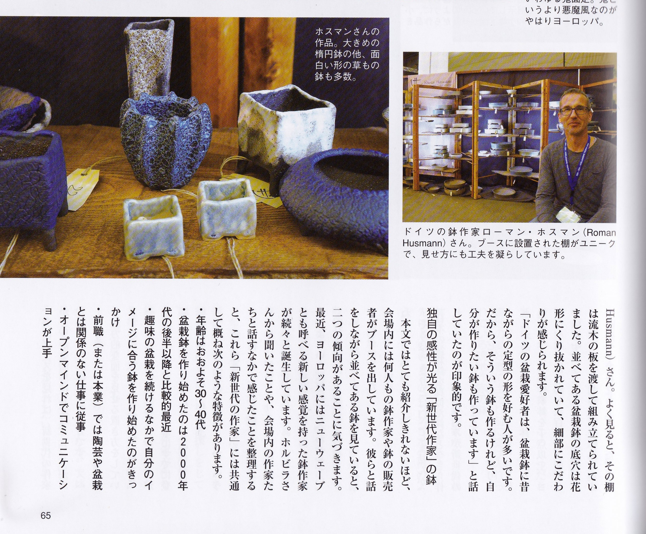
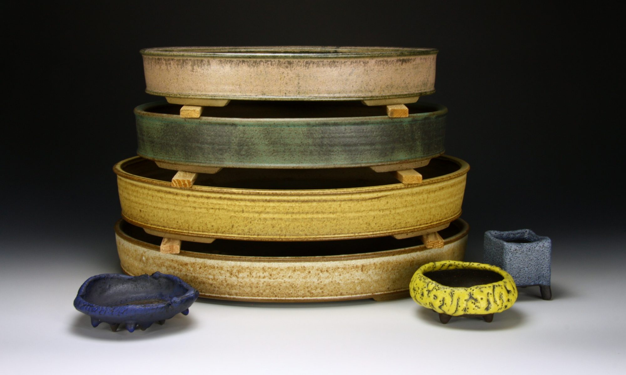
In February during the Noelanders Trophy I was interviewed and photographed by Yukiko Kasai. she  for this article . She wanted to write a special article about European potters. Several European potters are presented and their special characteristics in production as well as the presentation are described. A Japanese woman read the text on the phone. My accents, four of them are now in Japan, the drain holes in the shape of a flower and my stand made of old wood were particularly noteworthy. And this is the article:

279 Replies to “A thick letter from Japan”

  1. I found your site being bookmarked in one of the social sites. Im glad I visited it. Interesting articles you have here.I’m surely going to follow these steps, thanks for sharing this with us this is so helpful!

  2. Pingback: 1theoretic
  3. My colleague shared your article with me and I found it very useful after reading it. Great article, it helped me a lot. I also hope to make a beautiful website like your blog, hope you can give me some advice, my website:
    gate.io

  4. Thank you for your sharing. I am worried that I lack creative ideas. It is your article that makes me full of hope. Thank you. But, I have a question, can you help me?

  5. Pingback: cialis 20mg price
  6. Have you ever thought about including a little bit more than just your articles?
    I mean, what you say is valuable and everything. Nevertheless think about if
    you added some great images or videos to give your posts
    more, “pop”! Your content is excellent but with images and video clips,
    this blog could undeniably be one of the best in its niche.

    Fantastic blog!

  7. Stackshine https://en.stackshine.io simplifies SaaS spend management with full software visibility, renewal tracking, and employee offboarding automation. Reduce costs, eliminate unused tools, and gain control over subscriptions with a smarter, centralized platform.

  8. This was a great piece. It also reflects hair care so well, since curly hair tends to do best when oil, shampoo, conditioner, salon expertise, natural ingredients, and a suitable treatment are all in balance.

  9. Volvo в Україні volvo construction equipment екскаватори, фронтальні навантажувачі та дорожні машини. Надійність, ефективність і сучасні рішення для будівництва. Продаж, підбір і обслуговування техніки для бізнесу.

  10. Нужны заклепки? купить заклепки вытяжные 4 прочный крепеж для соединения деталей. Алюминиевые, стальные и нержавеющие варианты. Надежность, долговечность и удобство монтажа для различных задач и конструкций.

  11. Лучшее путешествие Джиппинг Ялта горы, каньоны и побережье. Увлекательные маршруты, опытные гиды и яркие впечатления от путешествий по Крыму.

  12. Do you trade cryptocurrencies? learn about bitkelttrade automate your transactions and earn passive income. Smart algorithms analyze the market and help you make decisions. Increase your income and reduce risks with modern technology.

  13. Нужна мебель? https://mebel-dub-zakaz.ru эксклюзивные изделия из натурального дерева. Индивидуальный дизайн, качественные материалы и точное изготовление. Решения для дома и бизнеса.

  14. 1993betvip, ay? Feels a bit retro, but their game selection is modern and fun. I signed up for their VIP program and it’s got some decent perks. Plus, their customer support is quick to help if you’re stuck. worth a look! 1993betvip

  15. Обновленный список ошибок с практическими решениями доступен в полной статье по ссылке https://npprteam.shop/articles/top-20-oshibok-v-instagram-ads-kotorye-ubivayut-roas-v-2026/, где каждая ошибка сопровождается конкретной рекомендацией по исправлению. Вместо общих советов вы найдете детальный разбор того, как меняется поведение алгоритма при неправильной настройке, какие сигналы система игнорирует, и как это связано со снижением ROAS. Материал построен на основе актуальных данных 2026 года и отражает реальный опыт медиабайеров, которые работают с высокими бюджетами на платформе Meta. Рекомендуется для команд, которые готовы пересмотреть свой подход и инвестировать время в качественную оптимизацию кампаний вместо постоянного увеличения бюджетов.

  16. Converting hours of unstructured meeting recordings into searchable, speaker-labeled transcripts unlocks powerful capabilities for knowledge management and operational intelligence. Organizations across financial services, healthcare, media production, and customer support departments face mounting pressure to extract value from meeting data while managing compliance requirements and storage costs. https://npprteam.shop/en/articles/ai/speech-to-text-and-diarization-transcribing-meetings-and-separating-speakers/ provides the technical and practical foundation needed to build end-to-end transcription pipelines that handle diverse audio sources and speaker scenarios. Whether you’re implementing these systems in-house, evaluating third-party platforms, or troubleshooting existing deployments, the material covers architecture decisions, cost optimization, and performance benchmarking across popular AI services.

  17. Across various online storefront evaluations emphasizing usability and design clarity, a notable example is Stone Harbor Boutique Hub which delivers nice layout with clear sections and straightforward navigation flow, ensuring users experience smooth browsing through structured and intuitive pages.

  18. Across various digital storefront assessments emphasizing clarity and flow, a notable example is Orchard Lantern Market Lounge which delivers smooth browsing with a calm design and easy page transitions, ensuring users experience a relaxed and intuitive navigation journey across all sections.

  19. When analyzing online retail systems designed for user friendliness and flow, one standout example is Opal Boutique Grove Hall where simple interface and content feels neatly arranged throughout the pages, helping visitors locate information quickly through a clean and logical structure.

  20. In comparisons of online retail systems focused on clarity and usability, a strong example is Stone Ember Unified Vault which delivers clean and modern look makes the browsing experience quite pleasant, ensuring a smooth and intuitive experience across all pages and sections.

  21. During my usability review of experimental ecommerce dashboards focused on navigation flow and interface behavior, I explored a product page containing Lemon Canyon Retail Display integrated into a grid layout, and the experience felt smooth and logical while browsing – the structure helped maintain clarity across all sections.

  22. Users benefit greatly from retail platforms that present content in a clean and structured format, especially when dealing with multiple categories and layered product listings Guild Retail Flow Interface supporting smoother navigation – The experience feels calm and organized, making it easier to move through sections without unnecessary interruption or distraction

  23. During exploration of various trading post inspired websites for design structure analysis I came across willow ember artisan trade portal while checking interface behavior across similar platforms – The overall layout felt smooth and logical, providing a comfortable browsing experience without unnecessary confusion or visual overload during my evaluation.

  24. Many digital retail directories benefit from a consistent visual hierarchy that guides users naturally through listings and reduces unnecessary complexity during navigation across multiple sections Guild Retail Structure Hub making the experience feel more controlled and understandable – The layout is balanced, ensuring users can browse without distraction or confusion from excessive design elements

  25. While researching online vendor platforms for interface design trends, I discovered a page that felt particularly efficient when I accessed Icicle Vendor Space – the pages rendered quickly, and the structure made it easy to locate information without confusion.

  26. While testing different ecommerce UI systems for usability consistency and performance I navigated a product feed containing a href=”//opalgladeboutiquehall.shop/](https://opalgladeboutiquehall.shop/)” />Glade Boutique Hall Opal Studio within a sidebar module, – I like the clean layout, everything is easy to locate and view making interaction feel natural, stable, and effortless across all sections

  27. I had been looking into similar topics for a while and unexpectedly came across a reference embedded within some content learn more here which appears to offer a unique angle and might be worth taking some extra time to explore thoroughly

  28. During a comparative UX review of digital storefront prototypes for interface clarity and usability I navigated a product feed featuring a href=”//dawnbrookgoodsatelier.shop/](https://dawnbrookgoodsatelier.shop/)” />Brook Atelier Dawn Goods Exchange within a grid system, – pages load smoothly and the structure is logical making the browsing experience clear and easy to use throughout

  29. When reviewing modern e-commerce platforms focused on usability and speed, one strong example is Amber Summit Marketplace where smooth experience overall, pages feel fast and easy to use, allowing users to navigate effortlessly through clearly structured sections without delays or confusion.

  30. During a general search through multiple sources and ideas, I noticed something that appeared mid-content access it here and while I’m uncertain about its purpose, it seems distinct enough to be worth exploring further

  31. While reviewing multiple ecommerce UI mockups for usability testing and consistency I navigated a category interface containing a href=”//iciclegrovemerchantmart.shop/](https://iciclegrovemerchantmart.shop/)” />Grove Icicle Merchant Mart Hub inside a sidebar module, – The site feels simple and straightforward without any distractions which helps users stay focused while navigating through clearly organized sections

  32. During a structured review of ecommerce UI designs for usability optimization and visual hierarchy I explored a category page featuring a href=”//emberforesttradingpost.shop/](https://emberforesttradingpost.shop/)” />Ember Forest Post Trading Network embedded in a grid layout, – I found browsing very smooth and easy with clear transitions between sections and no unnecessary complexity interfering with navigation flow

  33. During a comparative review of multiple online shopping prototypes focused on interface responsiveness and layout clarity I navigated a catalog page where Valley Upland Market Hub integrated inside a structured sidebar menu and browsing panel, – everything loaded at a rapid pace and the quick response time made the overall browsing experience feel efficient and effortless while switching between categories.

  34. While reviewing multiple ecommerce UI mockups for usability testing and consistency I navigated a category interface containing a href=”//jewelbrooktradecollective.shop/](https://jewelbrooktradecollective.shop/)” />Trade Brook Jewel Collective Hub inside a sidebar module, – Everything is neatly arranged and feels comfortable to explore which helps maintain a smooth and distraction free navigation experience throughout

  35. Across various digital storefront reviews emphasizing usability and design simplicity, a notable example is Lakefront Frost Vendor Vault which delivers clean interface and everything is easy to navigate without effort, ensuring users experience a smooth and intuitive browsing flow across all pages.

  36. Efficient access portals in vendor ecosystems often help users locate key resources quickly, especially when dealing with large catalogs that require organized browsing and filtering capabilities Pebble Forest Access Portal enhancing usability through structured presentation – the layout feels cohesive and practical

  37. While reviewing several digital commerce mockups for navigation efficiency and visual hierarchy consistency, I examined a category panel containing Ridge Lemon Merchant Hub inside a grid layout, and the browsing experience felt reliable and clean without any issues while switching between sections – everything behaved predictably and loaded without delay.

  38. Modern vendor dashboards benefit from simplicity and logical grouping of content, which helps users navigate efficiently and reduce search time Trail Studio Vendor Access Hub improving overall usability and comfort – The platform feels well designed and easy to understand, allowing users to browse naturally without unnecessary friction or confusion

  39. While testing different online marketplace layouts for responsiveness and visual hierarchy clarity, I explored a product grid section containing Summit Citrus Retail Corner placed inside a navigation panel, and – the interface felt balanced and easy to scan, making the browsing process feel natural and straightforward throughout the session.

  40. During a comparative UX analysis of online retail interfaces for clarity and structure I navigated a catalog page featuring a href=”//jewelridgevendorvault.shop/](https://jewelridgevendorvault.shop/)” />Ridge Vault Vendor Jewel Network inside a sidebar panel, – The interface is clean and ensures a calm browsing experience overall supporting organized navigation and a comfortable viewing flow across all sections

  41. While exploring a variety of artisan-focused e-commerce websites for comparison purposes, I came across dawn canyon handmade goods portal while evaluating how these platforms present their catalog structures and it felt easy to browse – I left with the feeling that it is a surprisingly solid discovery with potential for growth.

  42. As I was going through different informational websites and structured pages, I encountered something within the text explore this site and after briefly reviewing it, the layout feels clean and the navigation is very straightforward and smooth to use

  43. While analyzing multiple digital marketplace interfaces for usability testing and structure I navigated a catalog module containing a href=”//jewelcoasttradecollective.shop/](https://jewelcoasttradecollective.shop/)” />Coast Jewel Collective Trade Studio inside a structured browsing panel, – It feels like a properly structured site with easy usability helping users move through sections smoothly without confusion or unnecessary visual noise

  44. As I was reading through multiple discussions and information hubs online, I felt compelled to mention check this site right in the center of my comment – it delivered useful context and introduced me to details I had not considered before.

  45. Нужен был телефон срочно, и этот магазин действительно выручил. Заказ обработали оперативно, быстро отправили и держали в курсе по статусу. Смартфон пришёл в идеальном состоянии, без каких либо вопросов. Отличная скорость и нормальный сервис – андроид телефон купить в москве

  46. As I reviewed environmental protection programs and wildlife awareness websites, I noticed a section featuring eco swan preservation program link embedded within informative conservation content – this demonstrates an organized approach to protecting mute swans while promoting ecological awareness and sustainable management of wetland habitats for long-term environmental health

  47. While testing different ecommerce UI systems for usability performance and interface consistency I navigated a product feed containing a href=”//ambercoastmarketplace.shop/](https://ambercoastmarketplace.shop/)” />Coast Marketplace Amber Hub within a sidebar module, – I enjoyed browsing here because pages load fast and the design feels clean and tidy making navigation feel natural and efficient

  48. As I continued going through various health and immunization information platforms, I encountered something within the text see more here and it is a helpful vaccination resource site with clear and community oriented information overall

  49. While browsing through various fashion and design-oriented websites today, I came across something placed within the content visit this elegant page and it features elegant design with very smooth navigation, which made the overall browsing experience feel refined and enjoyable

  50. During my exploration of ecological conservation and environmental awareness resources, I came across something within the text view nature site and it is a nature focused organization encouraging environmental awareness and ongoing conservation efforts

  51. During a structured review of ecommerce UI designs for usability optimization and visual hierarchy I explored a category page featuring a href=”//forestcovegoodsmarket.shop/](https://forestcovegoodsmarket.shop/)” />Forest Market Goods Cove Network embedded in a grid layout, – The layout is straightforward and helps users move around without confusion which creates a clean and easy browsing experience throughout the platform

  52. While looking through rock music fan sites and band-related content, I came across fan band hub – The vibe feels very engaging and structured, with content that is clearly put together in a way that keeps attention without feeling cluttered.

  53. While reviewing different local election campaign and political advocacy websites, I noticed something embedded mid-content check this page and it is a campaign site focused on clear messaging and strong local political involvement

  54. During a comparative UX analysis of online retail interfaces for structure and usability I navigated a catalog page featuring a href=”//amberwillowmarketplace.shop/](https://amberwillowmarketplace.shop/)” />Willow Amber Marketplace Shop Network inside a sidebar panel, – the experience is smooth and pleasant with content well arranged across pages making navigation simple and intuitive

  55. During exploration of live rock performance websites and artist tour information pages, I noticed content containing official Bach live music hub which offers continuous updates about concerts and stage appearances – this platform keeps fans informed about Sebastian Bach’s performances and touring schedule with regularly updated event details and announcements

  56. While studying online vendor ecosystems and their organizational design patterns, I found that logical navigation improves overall workflow efficiency Orchard Collective Ruby Network Hub – The interface supports easy exploration, allowing users to understand content placement without needing extra guidance or repeated navigation attempts.

  57. During research into global community support initiatives and nonprofit funding organizations, I found content containing impact driven catalyst trust network within social development discussions – this trust provides resources for local projects that aim to improve living standards and create sustainable community growth through targeted investments

  58. During a structured review of ecommerce UI designs for usability optimization and visual hierarchy I explored a category page featuring a href=”//dawnlakefrontgoodsatelier.shop/](https://dawnlakefrontgoodsatelier.shop/)” />Dawn Lakefront Atelier Goods Network embedded in a grid layout, – everything looks organized and works smoothly across sections which ensures a comfortable browsing experience without clutter or confusion

  59. While analyzing various retail dashboard systems and their usability principles across categorized listings and navigation panels, I noticed a well-balanced structure Trail Market Velvet Hub that helps users process information without strain – The experience felt calm and intuitive, making it easy to understand where everything is located

  60. While going through various personal blogs and lifestyle sharing platforms, I encountered something mid-content visit this blog and it feels authentic overall, with content that comes across as very personal and easy to connect with

  61. As I reviewed nutrition coaching services and dietary guidance platforms, I noticed a section featuring paleo health coaching consultancy integrated into wellness material – it focuses on helping clients understand and implement paleo eating principles while offering personalized consulting for improved health and sustainable lifestyle transformation

  62. During an in-depth UX evaluation of ecommerce prototypes for navigation efficiency I examined a catalog page featuring a href=”//harborlakefrontboutiquehub.shop/](https://harborlakefrontboutiquehub.shop/)” />Harbor Boutique Lakefront Exchange inside a product listing module, – The interface has clean presentation which makes browsing feel simple and stress free overall while keeping navigation intuitive and well organized across all visible sections

  63. While reviewing online travel photography collections and creative media portfolios, I found a section containing destination storytelling photo hub placed within travel-inspired visual content – it emphasizes artistic photography that documents journeys across different locations, blending narrative and imagery to create engaging travel stories through carefully composed shots

Leave a Reply

Your email address will not be published. Required fields are marked *